Affordable Blush Pink Heart Wedding Invitations Iwi329
| Step | When To Do It | What To Complete |
| Pick Design | 6 Months Before | Choose Iwi329 style and color finish |
| Finalize Wording | 4–5 Months Before | Confirm names, date, venue, and wording |
| Place Order | 3–4 Months Before | Approve proof and order extra copies |
| Prep Mailing | 10–12 Weeks Before | Address envelopes and assemble suites |
| Mail Invitations | 8–10 Weeks Before | Send invites and track delivery |
| Track RSVPs | 4–6 Weeks Before | Follow up and finalize guest count |
Why Wedding Invitations Still Matter
- First Impression: Your invitation is the first real glimpse guests get of your wedding style. Before they see the venue, the dress, or the flowers, they see the paper in their hands. That’s why a well-designed invitation like Iwi329 matters. It sets the tone right away and makes your celebration feel thoughtful from the start.
- Excitement Builder: A wedding invite does more than share details. It builds anticipation. When someone opens an envelope and sees a blush pink palette with sweet heart details, it creates a warm, romantic feeling that makes them look forward to the day.
- Keepsake Value: Invitations become part of your memories. Many couples save one for their wedding album, frame it, or keep it in a memory box. Guests do this too, especially when the design looks polished and meaningful. Iwi329 works well as both an invite and a keepsake because it feels timeless rather than trendy.
What Makes Iwi329 Invitations So Popular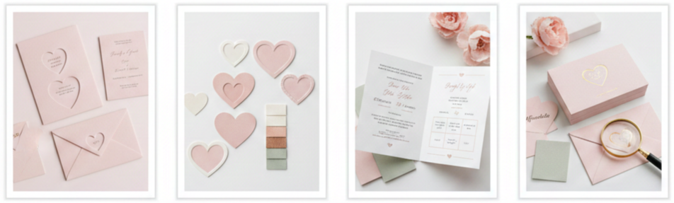
- Blush Pink That Feels Soft, Not Overdone: Blush pink works because it feels romantic without being loud. Iwi329 uses this color in a way that stays gentle and classy, making it easy to match with many popular wedding color palettes like ivory, champagne, rose gold, greenery, dusty blue, and even soft gray.
- Heart Details That Stay Elegant: Hearts can sometimes look too playful, which isn’t ideal for wedding stationery. Iwi329 avoids that problem by using heart designs in a simple, clean way. The result feels romantic and intentional, not cheesy.
- Clear Layout That Guests Can Read Easily: A lot of wedding invitations look beautiful, yet they bury the important details. Iwi329 keeps things organized so guests can instantly find what they need, like your names, date, time, venue, and RSVP instructions.
- Affordable Pricing With a Premium Look: The biggest reason couples keep choosing Iwi329 is because it looks high-end without demanding a high-end budget. It gives you a refined, professional design while keeping costs manageable, especially for larger guest lists.
Personalizing Your Iwi329 Invitations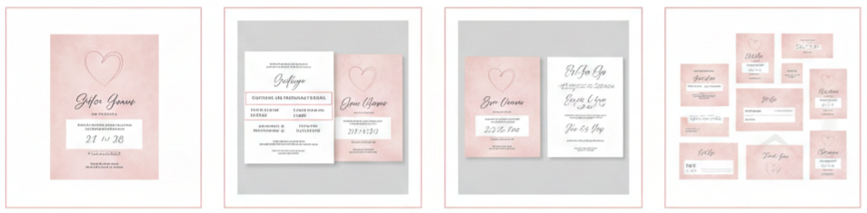
- Custom Names and Wedding Details: Iwi329 allows you to personalize all the essentials. You can customize your names, the wedding date, ceremony time, venue address, and even extra notes like attire suggestions or venue entry instructions. This makes the invitation feel personal and tailored rather than mass-produced.
- Wording That Matches Your Wedding Tone: Some weddings feel formal, while others feel relaxed and intimate. The wording on your invitation should match that tone. Iwi329 works well with both styles because the design stays versatile, and the text can be adjusted to suit how you want your guests to feel.
- Font Options That Change the Entire Mood: Fonts make a huge difference. A romantic script font adds softness, while a classic serif font gives a timeless feel. A clean sans-serif font works better for modern minimalist weddings. Iwi329 can adapt based on the font pairing you choose.
- Matching Stationery Pieces: A coordinated suite makes your stationery feel complete. If you want a full set, you can pair Iwi329 with matching RSVP cards, details inserts, save-the-dates, and thank-you cards. That kind of consistency makes your entire wedding feel more cohesive.
Perfect for a Wide Range of Wedding Styles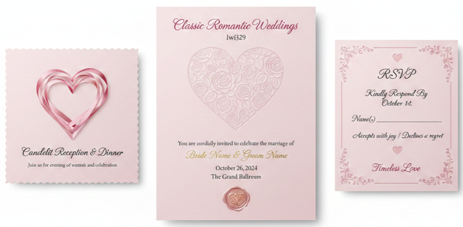
Classic Romantic Weddings
Iwi329 fits beautifully with candlelit receptions, soft floral arrangements, satin textures, and timeless venues like ballrooms or historic churches. The blush tones and heart motif support that romantic theme without overpowering it.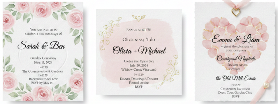
Garden and Outdoor Weddings
Blush pink looks amazing in natural light, especially when paired with greenery and flowers. If your wedding includes a garden, vineyard, courtyard, or open-air ceremony, Iwi329 will match the soft, airy mood.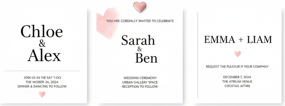
Modern Minimalist Weddings
Iwi329 can still look modern when paired with clean typography and simple styling. The blush becomes a subtle accent, and the hearts add warmth without making the design feel overly decorative.
Vintage-Inspired Weddings
The soft palette and romantic details pair well with lace, antique décor, muted floral tones, and classic styling. The invitation feels nostalgic, especially when printed on textured cardstock.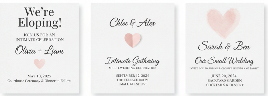
Small Weddings and Intimate Celebrations
Even small guest lists deserve a beautiful invitation. Iwi329 adds a thoughtful touch to micro-weddings, courthouse ceremonies, and smaller gatherings because it keeps things elegant without feeling extravagant.
Choosing Paper and Printing That Feels Luxe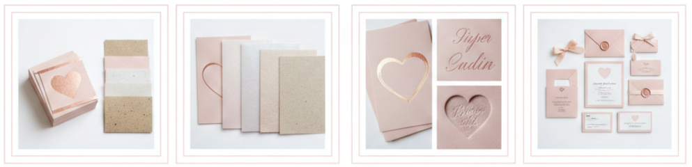
- Paper Options That Enhance the Design: The paper you choose affects how blush tones look and how the invitation feels in hand. Matte cardstock gives a soft, clean finish that works well for blush. Pearlescent cardstock adds a slight shimmer that makes the design feel elevated. Cotton or textured cardstock creates a premium touch, while recycled paper offers a natural look without losing elegance.
- Printing Styles That Match Your Budget: Digital printing is the most affordable option and still delivers crisp, professional results. If you want a small upgrade, foil stamping in rose gold or gold adds shine and instantly makes the invitation look more expensive. Thermography creates raised ink for a classic feel. Letterpress offers a deep impression into the paper, though it tends to cost more and works best for smaller orders.
Tips for Ordering Without Stress
Planning ahead saves money and avoids last-minute pressure. A smooth ordering timeline also gives you time to check proofs and make edits without rushing.
- Best Timeline for Ordering: We recommend choosing your invitation design about six months before your wedding. Finalize your guest list and wording four to five months before the date. Place your order around three to four months in advance, then mail invitations about eight to ten weeks before the wedding. For destination weddings or out-of-town guests, mail them around ten to twelve weeks ahead.
- Proofreading Before You Approve the Final Design: Before you approve your final proof, double-check that names are spelled correctly, the date matches the day of the week, the venue address is accurate, and your RSVP deadline is clear. If you’re including a wedding website or QR code, test it to make sure it works properly.
- Ordering Extra Copies Is Always Smart: Order a few extra invitations for keepsakes, flat-lay photography shots, last-minute guest additions, and vendor copies. Running out at the last minute leads to stress and additional printing costs.
Easy Upgrades That Make a Big Impact
A few small additions can make affordable invitations look much more premium. The key is focusing on presentation, not overloading your suite.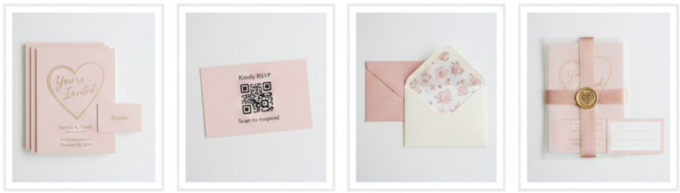
- Add a Details Card: A details insert is a simple way to keep your main invitation clean while including extra information like dress code, accommodations, transportation, or a wedding website.
- Include a QR Code for RSVPs: Digital RSVPs are convenient, and QR codes make it easy for guests to respond quickly. You can add the QR code to a details card or include it subtly on the invitation layout if you want a modern touch.
- Upgrade Your Envelopes: The envelope is the first thing guests see. You can choose blush envelopes for a coordinated look, ivory envelopes for a classic tone, or envelopes with blush liners for something soft and elegant.
- Use Finishing Touches That Look High-End: Wax seals, satin ribbon, vellum overlays, and address labels can instantly elevate the invitation suite. Even one of these additions can make your stationery feel luxurious without significantly increasing cost.
Why Iwi329 Feels More Expensive Than It Is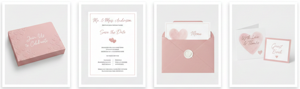
Iwi329 works because it combines thoughtful design with practical details. The blush tone looks soft and refined, the hearts give a romantic touch without being overwhelming, and the layout stays clear for guests. When you print it on high-quality cardstock and add even one upgrade, it creates the kind of invitation guests expect from high-end stationery brands. It also pairs well with matching signage, thank-you notes, menus, and reception stationery, which makes your wedding branding feel polished from beginning to end.
Mistakes to Avoid When Ordering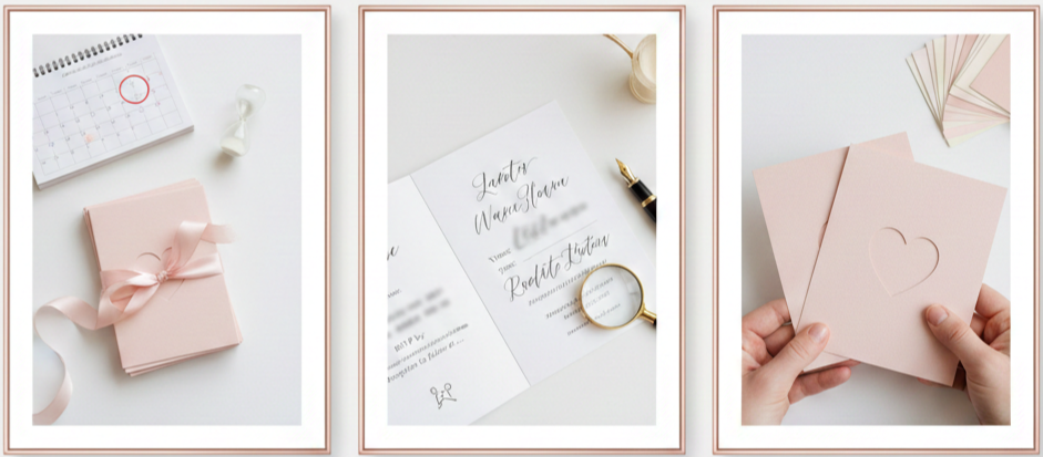
- Waiting Too Long to Place Your Order: Delaying your order can lead to rush fees, fewer customization options, and tighter shipping timelines. Ordering early keeps everything smooth.
- Using Unclear Wording: Guests need clear instructions. Always include full venue addresses, start times, RSVP details, and any multi-location instructions if your ceremony and reception are in different places.
- Skipping a Sample: A sample shows you the true paper quality, the real blush tone, and how the printing looks in person. It’s the best way to avoid disappointment before placing a bulk order.
Conclusion
Affordable Blush Pink Heart Wedding Invitations Iwi329 make it easy to create a romantic first impression without overspending. The design feels soft and elegant, the layout stays easy for guests to understand, and the customization options make the invitation feel personal. Whether you’re planning a classic wedding, a garden celebration, or something modern and minimal, this invitation style fits beautifully while keeping your budget realistic. With the right paper, careful proofreading, and a few small upgrades, Iwi329 gives you a polished invitation suite that looks far more expensive than it is.
Key Takeaway: Iwi329 invitations stand out because they combine romantic blush tones, elegant heart details, clear readability, and budget-friendly pricing. They offer a premium look without forcing you to sacrifice other important wedding expenses.
FAQs
How many invitations should we order?
Order invitations based on households, not the number of guests. Couples, families, and roommates typically receive one invitation per address. Ordering 10–15 extras is a smart buffer for keepsakes, photography flat-lays, vendors, and last-minute guest additions.
What’s the best way to address envelopes for this style?
Printed addressing gives a clean and consistent look, while handwritten calligraphy adds a classic, personal feel. Script fonts in black, charcoal, or rose gold pair nicely with blush pink and keep everything elegant.
Can we add a digital RSVP option to printed invitations?
Yes. You can include a QR code on a details card or at the bottom of the invitation. This makes RSVPs easy for guests while keeping the invitation suite formal and polished.
When should we send invitations to out-of-town guests?
For guests who need travel time, mail invitations around 10 to 12 weeks before the wedding. This gives them enough time to book flights, arrange accommodations, and plan without pressure.
How do we prevent blush pink from looking washed out when printed?
Request a printed sample before placing a full order. Matte cardstock usually keeps blush tones soft and consistent, while slightly deepening the blush shade can improve visibility without overpowering the design.
Leave a Reply