10 Perfect Trending Wedding Color Combination Ideas For 2014 Brides Blog11
| Color Combination | Best Season |
| Blush Pink & Gold | Spring, Summer |
| Navy Blue & Coral | Summer, Fall |
| Mint Green & Peach | Spring, Summer |
| Plum & Gray | Fall, Winter |
| Aqua & Lemon Yellow | Summer |
| Champagne & Ivory | All Seasons |
| Emerald & Cream | Winter, Fall |
| Coral & Teal | Spring, Summer |
| Lavender & Gray | Spring |
| Black, White & Gold | Winter, Fall |
Blush Pink and Gold: Romantic Meets Glamorous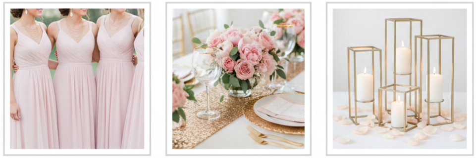
- Why Brides Loved It: Blush pink and gold was one of the most popular wedding color combinations for 2014 brides because it felt soft, romantic, and elevated at the same time. Blush brought a gentle, dreamy look that worked beautifully in photos, while gold added a polished finish that made everything feel more formal.
- Best Wedding Styles For This Palette: This combination fit perfectly in garden weddings, vintage-inspired celebrations, and classic ballroom receptions. Brides used it when they wanted a warm, welcoming setting that still felt elegant.
- How It Showed Up In Décor: Bridesmaids often wore blush dresses with gold jewelry, and wedding décor leaned into gold-rimmed glassware, metallic candle holders, sequined table runners, and blush florals in soft arrangements. Many couples paired this palette with neutral shades like ivory or beige so the overall design felt cohesive rather than overly pink.
Navy Blue and Coral: Bold With a Splash of Fun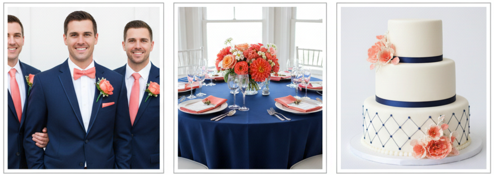
- Why Brides Loved It: Navy and coral gave weddings a balanced contrast that looked fresh and modern. Navy brought depth and tradition, while coral added brightness and energy. Brides in 2014 loved this palette because it felt bold without becoming too loud.
- Best Wedding Styles For This Palette: This pairing worked especially well for coastal weddings, nautical themes, outdoor ceremonies, and destination receptions. Couples also used it for spring and summer weddings because coral naturally matched seasonal flowers.
- How It Showed Up In Décor: Navy suits for groomsmen paired well with coral ties, pocket squares, or boutonnieres. Coral centerpieces stood out beautifully against navy linens. Stationery often used navy fonts with coral accent borders, and wedding cakes featured coral florals or navy detailing that made the design stand out.
Mint Green and Peach: Soft, Sweet, and Fresh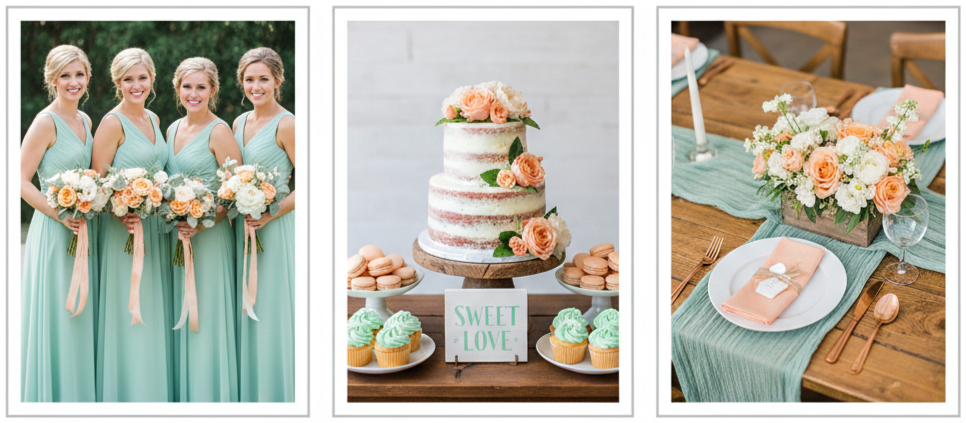
- Why Brides Loved It: Mint and peach became a go-to pastel pairing in 2014 because it felt light, playful, and romantic. Mint created a refreshing base, and peach added warmth without overpowering the softness of the palette.
- Best Wedding Styles For This Palette: Brides used this color combination for rustic barn weddings, outdoor garden events, spring ceremonies, and casual receptions with a bright, airy vibe. It also worked well for couples who wanted a pastel theme without relying on pink.
- How It Showed Up In Décor: Mint appeared through bridesmaid dresses, table runners, and small décor details like painted signage or jars. Peach was usually introduced through floral arrangements with roses, ranunculus, or dahlias. Couples also carried this palette into dessert tables through peach macarons, mint cupcakes, or patterned candy displays that matched the theme.
Plum and Gray: Rich, Deep, and Elegant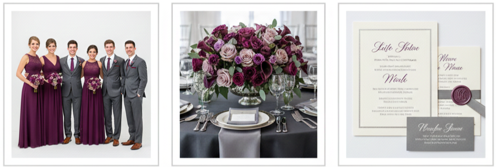
- Why Brides Loved It: Plum and gray offered a deeper, more mature wedding palette that still felt stylish and romantic. Plum created a dramatic focal point, while gray provided a smooth neutral that tied the entire look together. Brides loved this pairing for its elegance and seasonal versatility.
- Best Wedding Styles For This Palette: This combination fit fall and winter weddings especially well. It also worked for formal evening receptions, historic venues, and indoor ceremonies where lighting and décor could highlight rich tones.
- How It Showed Up In Décor: Bridesmaids often wore plum dresses, while groomsmen wore gray or charcoal suits. Tables were decorated with plum-toned florals, gray linens, and accents in silver or lavender. Stationery frequently used gray as the base with plum fonts or borders, creating a polished look that felt cohesive from the invitation to the reception.
Aqua and Lemon Yellow: Bright and Breezy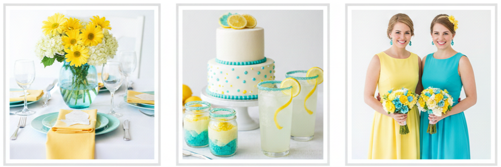
- Why Brides Loved It: Aqua and lemon yellow felt cheerful, sunny, and energetic. Brides who wanted a fun summer vibe leaned into this palette because it instantly made a wedding feel more upbeat and welcoming. The colors also photographed beautifully in natural light.
- Best Wedding Styles For This Palette: This pairing worked best for summer weddings, beach ceremonies, backyard events, and destination celebrations. Couples used it when they wanted something vibrant that still felt clean and fresh.
- How It Showed Up In Décor: Décor often featured aqua glass vases with lemon-yellow flowers, bright napkins paired with aqua plates, and signage with playful fonts. Brides also tied this palette into details like cocktail garnishes, dessert styling, and even bridal party accessories, such as aqua jewelry paired with yellow dresses.
Champagne and Ivory: Timeless and Elegant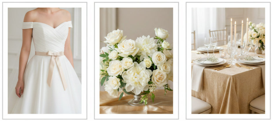
- Why Brides Loved It: Champagne and ivory created a classic wedding look that felt refined without relying on bold color. Brides in 2014 leaned into this palette when they wanted the entire wedding to feel graceful, formal, and timeless. It also worked well for couples who preferred neutral wedding photography and elegant styling.
- Best Wedding Styles For This Palette: This combination suited traditional weddings, formal ballroom receptions, church ceremonies, and upscale venues with historic architecture. It also paired naturally with crystal décor, vintage elements, and soft floral designs.
- How It Showed Up In Décor: Brides wore ivory gowns with champagne accents like satin sashes or soft beading. Floral arrangements often featured ivory roses, cream peonies, and neutral greenery. Table décor included champagne linens, ivory candles, and layered textures that made the design feel luxurious without needing strong contrast.
Emerald and Cream: Bold With a Touch of Softness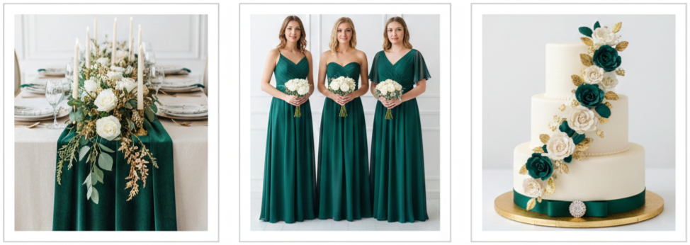
- Why Brides Loved It: Emerald continued trending into 2014 because it offered a rich, luxurious tone that felt modern and dramatic. When paired with cream, it created a balanced look that stayed elegant and romantic instead of overly heavy. Brides loved how this palette made décor look expensive and intentional.
- Best Wedding Styles For This Palette: Emerald and cream worked well for winter weddings, black-tie receptions, formal indoor venues, and evening ceremonies. It also suited couples who wanted a jewel-tone theme without using darker shades like black or burgundy.
- How It Showed Up In Décor: Emerald was often used in velvet table runners, bridesmaid dresses, and bold floral accents. Cream softened the look through candles, neutral flowers, and lace textures. Many couples also brought in gold accents alongside this palette to elevate the overall design even further.
Coral and Teal: Fun, Bright, and Unique
- Why Brides Loved It: Coral and teal created a lively, eye-catching pairing that felt creative and expressive. Brides chose it because it gave their wedding a playful personality while still looking cohesive in décor and photos. It also allowed couples to build colorful floral arrangements that felt vibrant and modern.
- Best Wedding Styles For This Palette: This pairing worked beautifully for beach weddings, boho themes, tropical-style celebrations, and DIY receptions. Couples also used it for spring and summer weddings where brighter tones naturally fit the season.
- How It Showed Up In Décor: Teal linens and coral flowers created a strong visual contrast. Bridesmaids sometimes wore mix-and-match dresses in both shades, and stationery often featured watercolor designs. Couples also brought the colors into photo booth props, cocktail styling, and dessert displays to keep the theme consistent.
Lavender and Gray: Light and Dreamy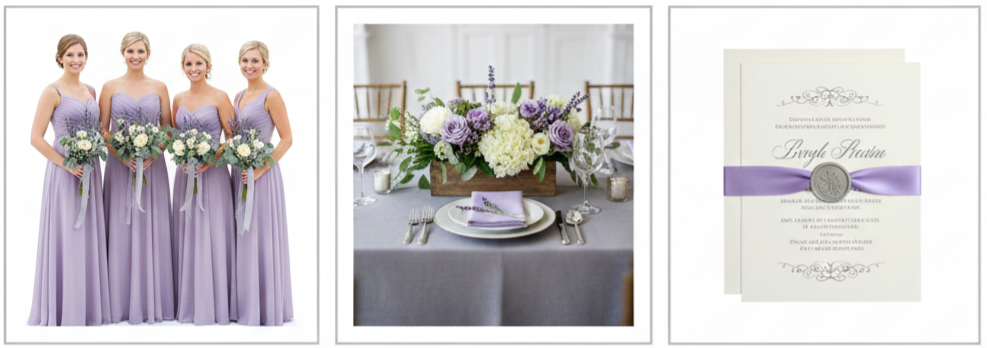
- Why Brides Loved It: Lavender and gray created a soft, romantic mood that felt calm and timeless. Lavender added a gentle wash of color, while gray made the palette feel more polished and sophisticated. Brides loved this pairing because it felt delicate without looking overly sweet.
- Best Wedding Styles For This Palette: This combination worked best for spring weddings, garden ceremonies, countryside venues, and outdoor receptions. It also fit well with rustic décor, floral-heavy designs, and weddings that wanted a peaceful atmosphere.
- How It Showed Up In Décor: Couples used lavender in bouquets, centerpieces, and bridesmaid gowns. Gray appeared in suits, table linens, and stationery. Many weddings also included lavender-scented favors or floral accents to reinforce the theme in small details that guests noticed.
Black, White, and Gold: Classic Meets Glam
- Why Brides Loved It: Black, white, and gold became a statement palette for brides who wanted a formal, high-impact wedding. Black and white created a timeless base, and gold brought luxury through metallic accents. This combination also worked across every detail, from fashion to décor to lighting.
- Best Wedding Styles For This Palette: This trio worked best for black-tie weddings, formal evening receptions, upscale hotel venues, and city weddings. Couples used it when they wanted a dramatic aesthetic with bold contrast and clean styling.
- How It Showed Up In Décor: Stationery featured gold embossing with black and white fonts. Groomsmen wore tuxedos, tables used gold chargers and black accents, and wedding cakes often included gold leaf detailing. Some couples also added black-and-white dance floors or modern lighting to enhance the glam feel.
Tips for Picking a Color Scheme That Works
Choosing a wedding palette is more than picking colors that look pretty together. Brides in 2014 found success by matching their palette to their venue, season, and overall vibe. A soft pastel palette looks natural outdoors in spring, while richer tones feel stronger in indoor evening receptions. Couples also made smarter decisions by thinking through flowers and décor availability early on. A cohesive palette works best when it shows up consistently throughout the wedding in small details, not just one or two décor items.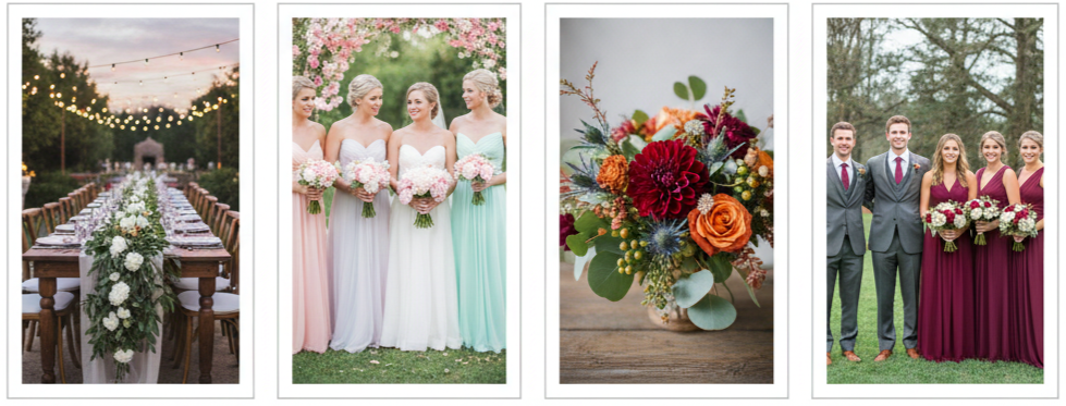
- Venue Compatibility: Choose colors that complement your venue’s walls, flooring, and lighting so the palette looks intentional.
- Seasonal Influence: Select tones that match the season naturally, such as mint and peach for spring or plum and gray for fall.
- Floral Availability: Confirm that your preferred flowers come in the shades you want so you do not need to force substitutions late.
- Bridal Party Coordination: Consider how the colors will look on dresses, suits, and accessories in photos and real lighting.
- Theme Consistency: Keep the same palette across stationery, décor, florals, and table styling so everything feels connected.
Conclusion
The wedding color combinations that trended in 2014 became popular because they gave brides a strong mix of style, personality, and timeless appeal. From blush and gold to black, white, and gold, each palette offered a different mood while still feeling elegant and photogenic. Brides who chose these combinations created weddings that looked polished from every angle because the colors worked consistently across outfits, flowers, décor, and paper details. These trends continue to inspire modern weddings because they provide flexible options that still feel fresh.
Key takeaway: The strongest wedding color palette is one that reflects your personality, fits your season and venue, and stays consistent across every detail from attire to décor.
FAQs
What’s the easiest way to keep wedding colors looking consistent in photos?
Choose one dominant color and repeat it through bridal party outfits, florals, and table décor. Keeping lighting consistent and using the same shades across details makes photos look more cohesive.
How do we choose wedding colors that look good with the venue’s existing décor?
Start by identifying the venue’s dominant tones, such as wood finishes, wall colors, and lighting. Then choose a palette that complements those features rather than fighting them.
What colors work best when we want a wedding that feels modern, not overly traditional?
Navy and coral, coral and teal, and black, white, and gold were popular in 2014 because they felt current and stylish while still looking formal.
How do we make pastel colors look elegant instead of childish?
Pair pastel shades with metallic accents, neutral linens, and structured styling. Pastels like mint, peach, blush, and lavender look more refined when balanced with gold, gray, ivory, or champagne details.
What’s a smart way to add wedding colors without overusing them?
Use your main colors in key areas like floral arrangements, stationery, and bridesmaid attire, then keep everything else neutral. This approach keeps the palette visible without overwhelming the design.
Leave a Reply