Color Combinations For Spring Wedding Theme
| Color Combination | Best For |
| Blush Pink & Sage Green | Romantic Garden |
| Lavender & Dusty Blue | Elegant Outdoor |
| Peach & Mint | Playful Rustic |
| Coral & Teal | Bold Modern |
| Yellow & Gray | Minimalist Chic |
| Fuchsia & Navy | Stylish Urban |
| Terracotta & Ivory | Earthy Vineyard |
| Olive Green & Cream | Nature-Inspired |
| Champagne & Dusty Rose | Classic Formal |
Why Spring Colors Shape the Whole Wedding Experience
Spring brings softer light, blooming landscapes, and lighter fabrics, which means your colors should work with the season rather than fight it. The right palette helps everything flow visually and keeps your wedding feeling intentional.
- Mood And Atmosphere: Colors set the emotional tone, whether you want romantic, cheerful, elegant, or relaxed.
- Visual Consistency: A clear palette keeps attire, florals, stationery, and décor aligned.
Photography Results: Spring-friendly colors photograph better in natural light and outdoor settings. - Personal Style: Your chosen shades reflect your personality as a couple and help your wedding feel personal rather than generic.
Classic Spring Color Combos That Always Work
Some color combinations continue to work year after year because they naturally complement the season. These pairings feel effortless, elegant, and easy to style.
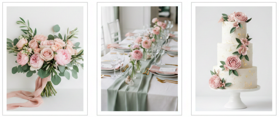
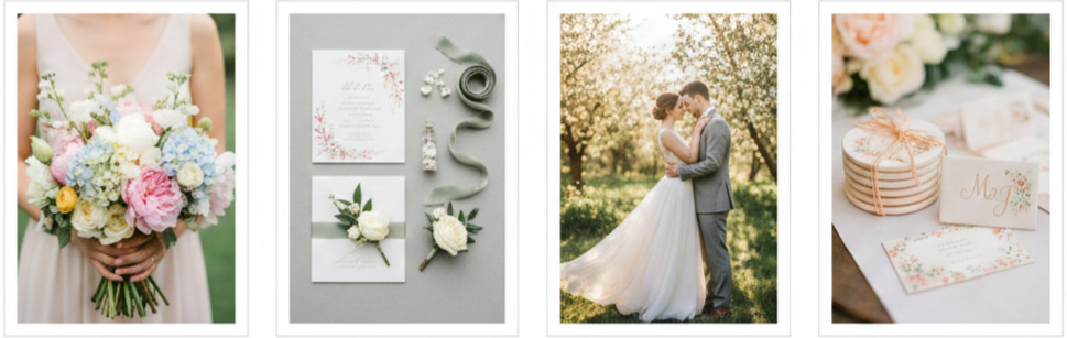
Blush Pink And Sage Green
This combination feels soft and romantic without being overly sweet. Blush pink brings warmth and gentleness, while sage green adds a grounded, natural touch. Together they work beautifully for garden weddings, floral-heavy décor, and outdoor venues surrounded by greenery.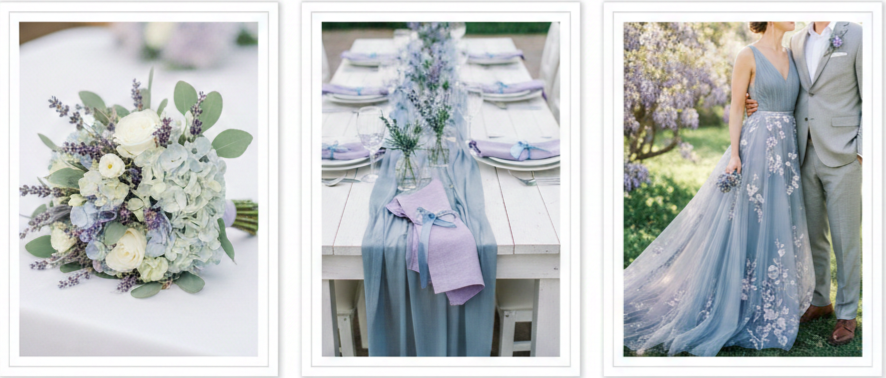
Lavender And Dusty Blue
Lavender adds a floral-inspired softness, while dusty blue balances it with calm elegance. This pairing works especially well for spring afternoons or early evening weddings and looks stunning in flowing fabrics, light florals, and subtle table décor.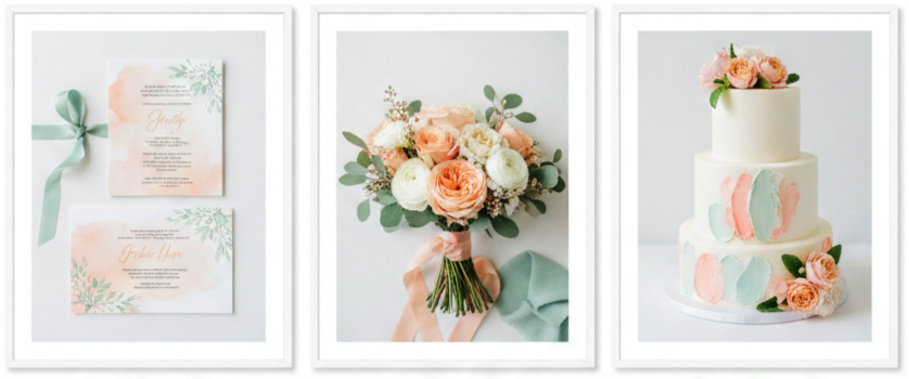
Peach And Mint
Peach offers warmth and brightness, while mint adds a refreshing, cool contrast. This pairing feels playful and cheerful, making it ideal for couples who want a lighthearted spring wedding that still feels polished and intentional.
Bolder Color Pairings That Still Feel Like Spring
For couples who want something a bit more eye-catching, bold colors can still work beautifully in spring when balanced properly.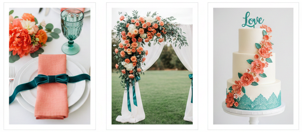
Coral And Teal
Coral brings energy and vibrancy, while teal grounds the look with richness and depth. This pairing works well for modern weddings and adds personality without overwhelming the space. Coral florals paired with teal table accents create a striking yet balanced look.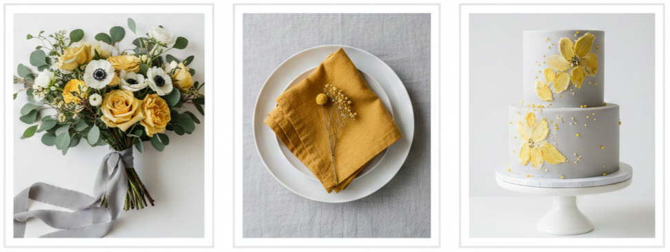
Yellow And Gray
Yellow brings sunshine and optimism, while gray adds structure and calm. This combination feels modern and clean, making it a great option for minimalist weddings or contemporary venues where simplicity matters.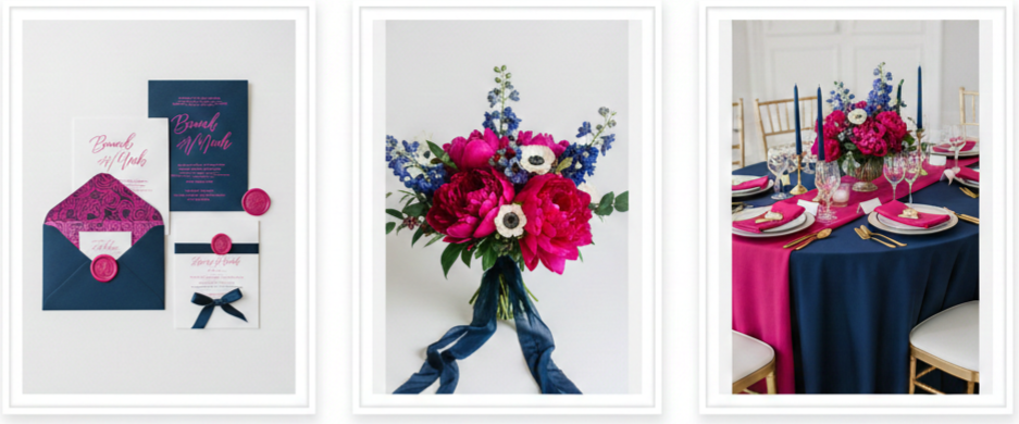
Fuchsia And Navy
Fuchsia adds drama and color, while navy anchors the palette with sophistication. This pairing works especially well for evening receptions or city weddings where a bolder look feels natural and refined.
Earthy And Neutral Tones That Feel Fresh And Natural
Earth-inspired palettes are perfect for couples who want their spring wedding to feel relaxed, organic, and timeless.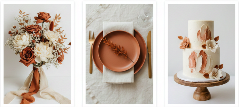
Terracotta And Ivory
Terracotta introduces warmth and depth, while ivory keeps the palette soft and romantic. This combination works beautifully for rustic venues, vineyards, or outdoor weddings with natural textures like wood and stone.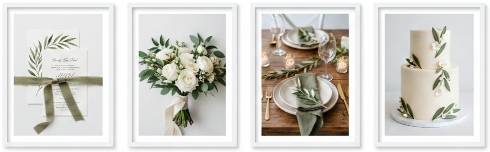
Olive Green And Cream
Olive green blends seamlessly with outdoor environments, while cream adds balance and softness. This palette works well for nature-inspired weddings and pairs nicely with eucalyptus, simple florals, and natural fabrics.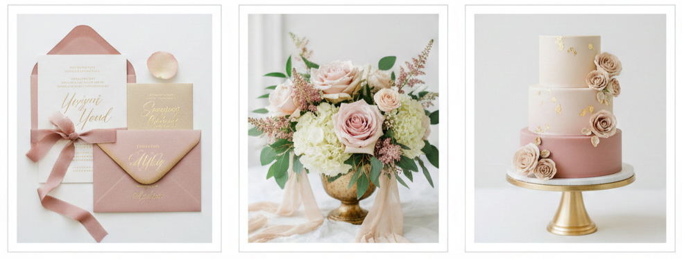
Champagne And Dusty Rose
Champagne adds a subtle sense of luxury, while dusty rose brings gentle color without feeling overpowering. This pairing suits classic spring weddings and works well with metallic accents and elegant décor.
Smart Tips For Choosing Your Color Palette
Choosing your wedding colors becomes much easier when you approach it thoughtfully and practically.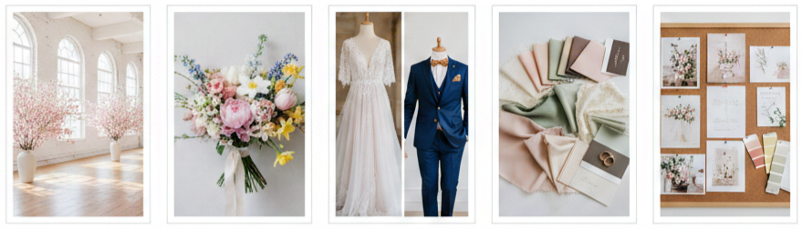
- Venue First: Start by looking at your venue’s surroundings, walls, flooring, and lighting to see which colors naturally complement the space.
- Seasonal Florals: Spring flowers can guide your palette naturally, making styling easier and more cohesive.
- Personal Style: Think about whether you prefer soft and romantic, bold and modern, or calm and neutral.
- Limited Palette: Stick to two to four main colors and rely on neutrals to tie everything together.
- Visual Planning: Mood boards and color swatches help you see how different shades work together before committing.
How To Weave Your Wedding Colors Into Every Detail
Once you settle on your palette, consistency becomes key. Your colors should appear throughout the wedding in a balanced and intentional way.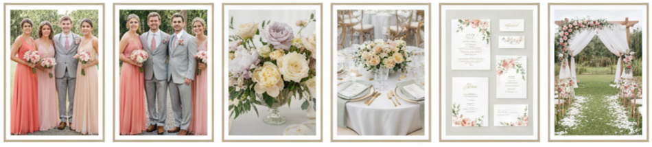
- Bridal Party Attire: Bridesmaid dresses, ties, pocket squares, and accessories should reflect your palette. Mixing different shades within the same color family keeps things visually interesting while staying cohesive.
- Floral Arrangements: Florals are one of the most impactful ways to showcase your colors. Use your main shades for focal flowers and rely on greenery or neutrals to soften the look.
- Table Settings And Decor: Table linens, napkins, candles, and centerpieces can subtly reinforce your color scheme. You do not need every item to match exactly, as variation adds depth.
- Stationery: Invitations, menus, signage, and place cards should carry your palette from the very beginning. Consistent colors help your wedding feel thoughtfully planned.
- Ceremony Setup: Aisle décor, arches, and seating details are great places to introduce color in a soft and natural way that complements the setting.
- Desserts And Cake: Cakes, cupcakes, and dessert tables offer creative opportunities to reflect your palette through florals, icing accents, or subtle design elements.
Conclusion
Choosing the right color combinations for a spring wedding is about balance, intention, and personal style. Whether you lean toward soft pastels, bold contrasts, or earthy neutrals, your palette should feel natural within the season and meaningful to you as a couple. When your colors flow seamlessly across attire, décor, florals, and details, your wedding feels cohesive and visually memorable without trying too hard.
Key Takeaway: Your spring wedding colors act as the visual thread that connects every element of your celebration. A thoughtful palette enhances the season’s beauty while allowing your personal style to shine through in a way that feels effortless and timeless.
FAQs
Is it okay to mix warm and cool tones in a spring wedding color palette?
Yes, mixing warm and cool tones works well when one acts as the dominant color and the other serves as an accent. This balance keeps the palette interesting without feeling chaotic.
Are pastel colors required for spring weddings?
Pastels are popular, but they are not required. Earthy tones, jewel accents, and neutral-based palettes work just as well when styled thoughtfully.
How many accent colors should a spring wedding include?
One or two accent colors are usually enough. Too many accents can make the design feel cluttered instead of cohesive.
Do outdoor spring weddings need lighter colors?
Lighter colors photograph beautifully outdoors, but deeper tones can still work when paired with soft neutrals or greenery to balance the look.
What should I do if my partner and I prefer different colors?
Combine elements from both preferences by choosing one primary color from each side and blending them with neutral shades for harmony.
Leave a Reply