Pink Wedding Invitations
| Season | Recommended Pink Shades | Pairing Colors |
| Spring | Blush, Peony | Mint, Ivory, Lavender |
| Summer | Hot Pink, Coral | Green, Yellow, White |
| Fall | Dusty Rose, Mauve | Copper, Burgundy, Sage |
| Winter | Pale Pink, Rose Gold | Silver, Gray, Deep Navy |
Why Pink Wedding Invitations Never Go Out of Style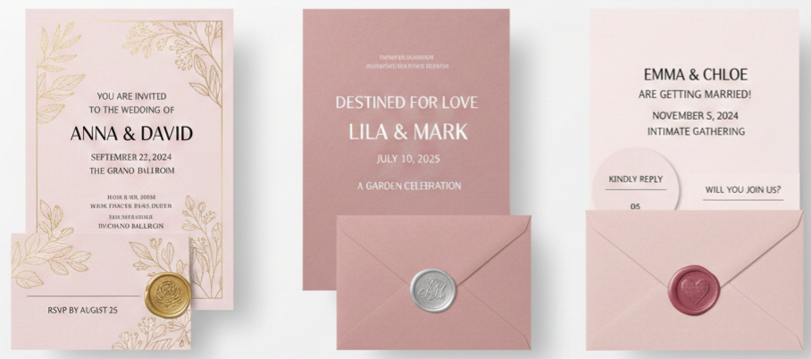
Pink wedding invitations have a natural charm that instantly adds warmth and romance to your celebration. The color is flexible enough to match any style, whether you’re envisioning a garden wedding, a glamorous ballroom event, or something simple and intimate. Pink blends effortlessly with a wide range of colors, allowing you to pair it with ivory, gold, silver, earth tones, or bold accents depending on your theme. It’s a color that never feels outdated, which is why it remains one of the most popular choices for wedding stationery.
Shades of Pink That Make an Impression
Pink comes in many tones that carry their own personality, so choosing the right shade helps set the tone for your entire event. Below are the most popular shades and what makes each one special.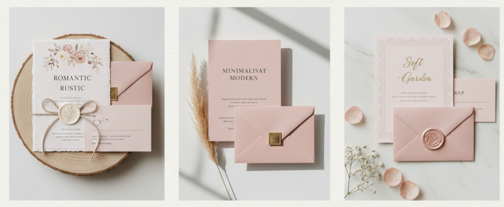
Blush Pink
Blush pink gives off a soft and delicate feel. It’s popular for romantic, rustic, or minimalist weddings because it works well with natural textures and lighter accent colors.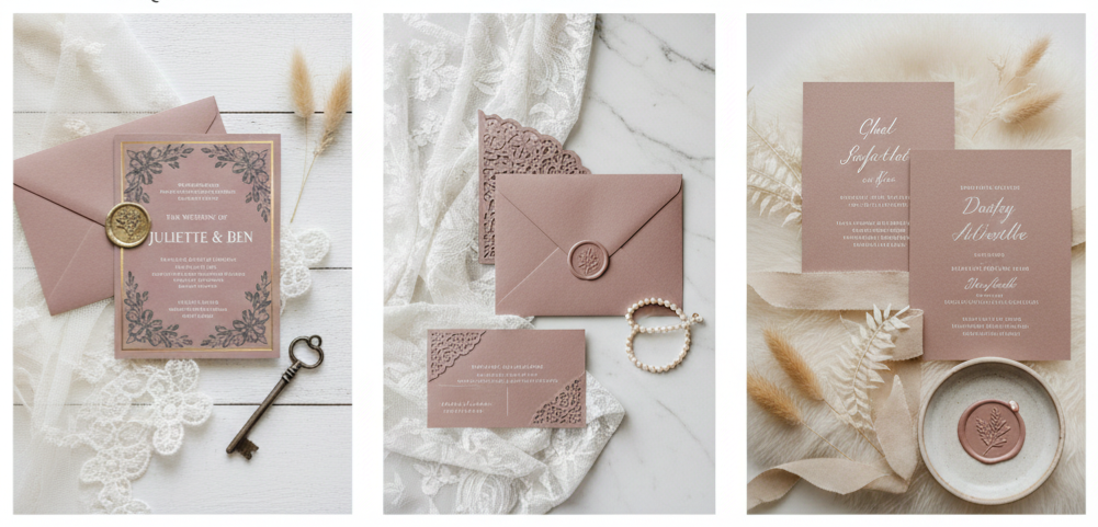
Dusty Rose
Dusty rose offers a muted, vintage-inspired tone that pairs beautifully with antique themes, lace patterns, and soft neutral décor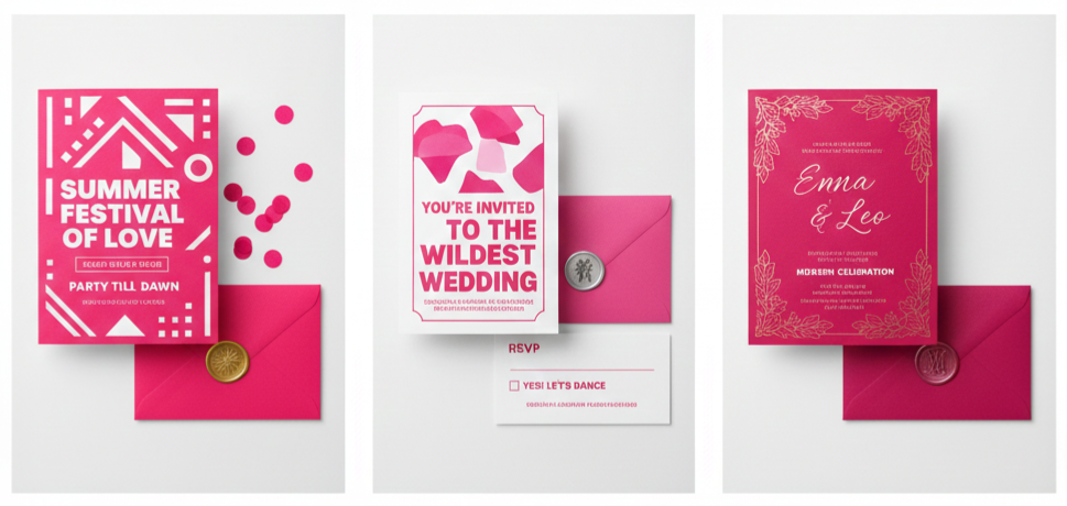
Hot Pink
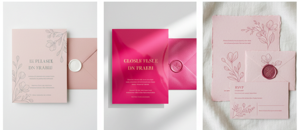
Hot pink stands out with its bold and energetic vibe. If you’re planning a lively summer celebration or want something modern and fun, this shade adds personality without feeling overwhelming.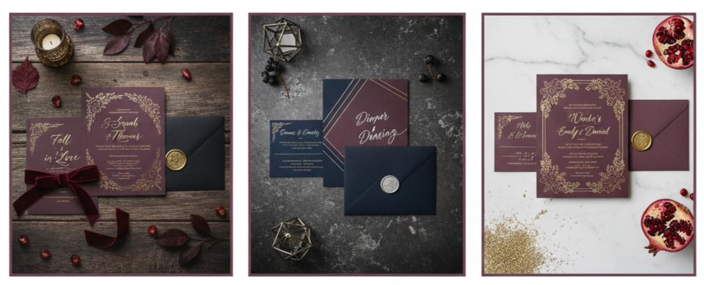
Mauve
Mauve leans toward a deeper, more moody tone. It’s perfect for fall or winter weddings and looks stunning when mixed with navy, burgundy, or metallic accents.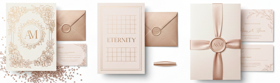
Rose Gold
Rose gold gives a luxurious twist to traditional pink by adding metallic shimmer. It’s ideal for upscale weddings and works well with foil printing or embossed details.
Design Styles That Bring Pink to Life
Different design styles complement pink beautifully. Whether you lean toward whimsical, modern, vintage, or boho, there’s a style that brings your pink invitations together.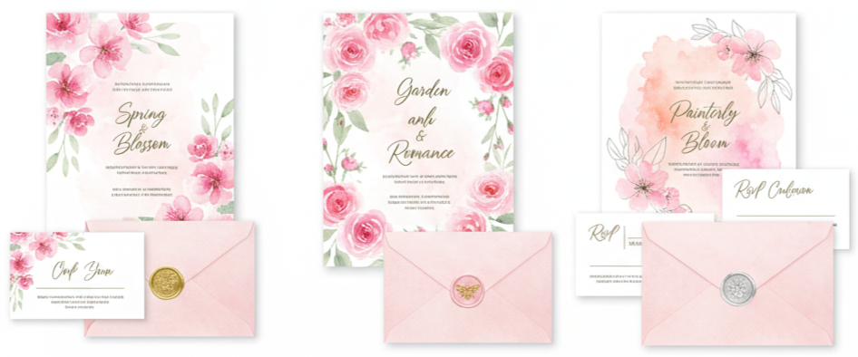
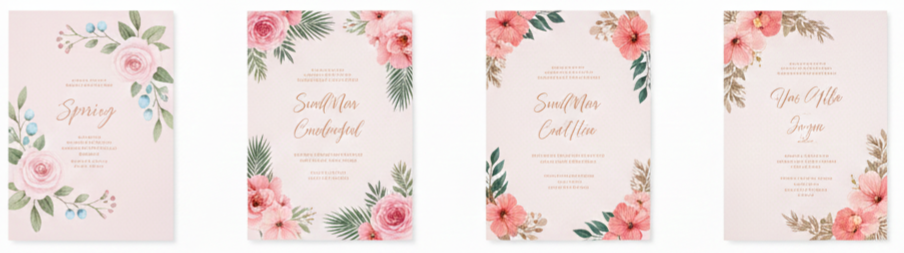
Floral and Watercolor
Floral illustrations and watercolor washes in various pink tones create a soft, romantic effect. This style works especially well for spring and garden weddings.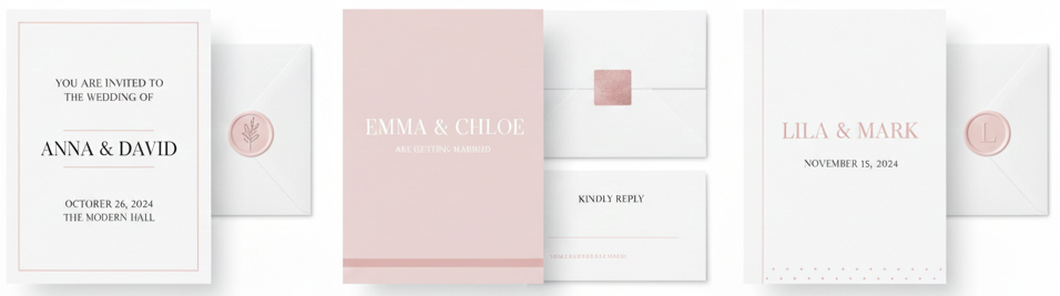
Minimalist Layouts
For a clean, modern look, use pink as an accent instead of the main color. Small touches like pink text or subtle borders make invitations feel elegant and simple.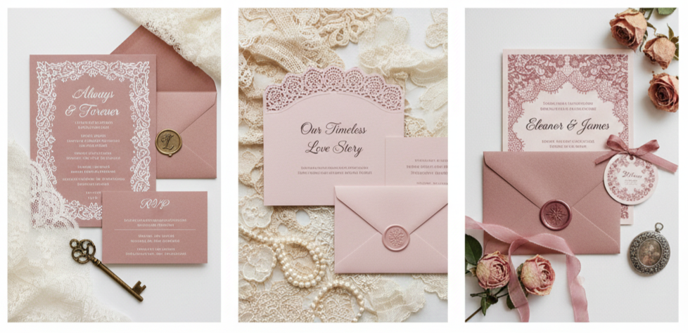
Vintage Themes
Vintage lace patterns look gorgeous in dusty pink or blush. These designs add timeless elegance and pair well with classic or antique décor.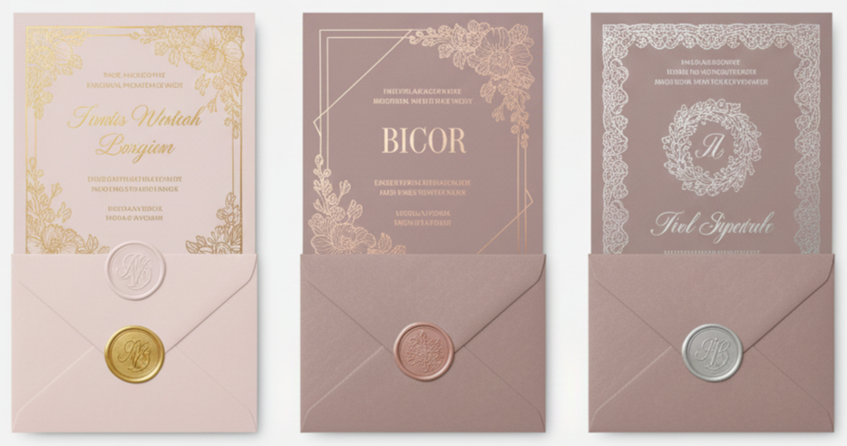
Metallic Foil and Embossing
Gold, rose gold, or silver foil detailing adds a luxurious touch. Embossed florals, borders, or monograms create texture that enhances pink backgrounds.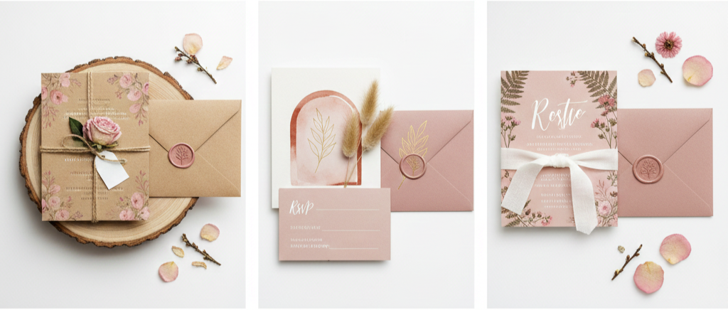
Rustic and Boho
Soft pink tones complement rustic materials like kraft paper, twine, and pressed flowers. This style works beautifully for outdoor or bohemian weddings.
Paper and Finish Options That Elevate Pink Designs
Choosing the right paper and finish affects how your pink invitation looks and feels. Pink tones behave differently depending on the surface they’re printed on, so this choice matters more than most people realize.
- Matte Finish: Matte paper gives pink invitations a soft, sophisticated look. This finish is gret if you’re working with lighter tones or minimalist designs.
- Glossy Finish: Glossy finishes brighten pinks and make them appear more vivid. Hot pink and coral shades stand out especially well on glossy paper.
- Textured or Handmade Paper: Handmade or textured paper elevates the look with artistic detail. Deckled edges, cotton textures, or linen finishes give pink a unique depth.
- Vellum Overlays: Vellum introduces a translucent layer that softens strong pink tones and adds a stylish layered effect. It’s popular for modern and romantic themes.
- Eco-Friendly Paper: Recycled and eco-friendly paper options in pink shades allow you to stay sustainable without sacrificing beauty or quality.
Ways to Customize Pink Wedding Invitations
Adding custom elements makes your invitations feel like a reflection of your story and style. Pink offers a great canvas for these personal touches.
- Monograms: Custom monograms in matching pink or metallic foil help your invitations feel personal and polished.
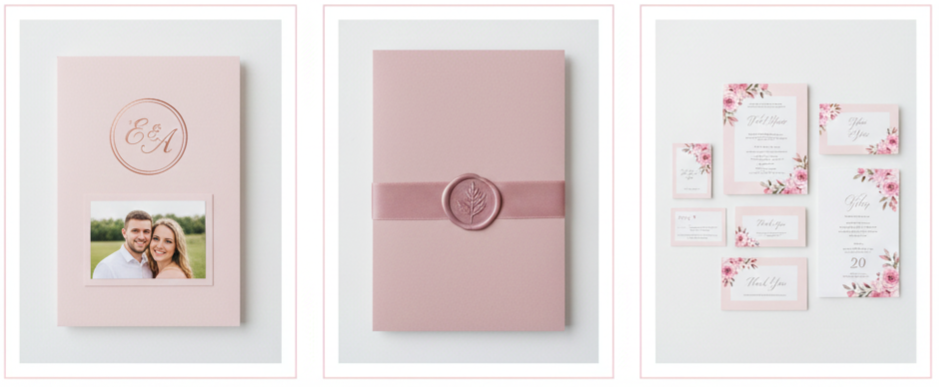
- Photo Inserts: Including an engagement photo bordered in pink adds warmth and helps guests feel connected to your story.
- Wax Seals: Wax seals in blush, mauve, or rose gold add elegance and a handcrafted touch.
- Ribbons and Lace: Silk ribbons, lace wraps, or decorative ties in complementary pink tones give your invitations texture and charm.
- Coordinated Stationery: Matching your RSVP cards, thank-you notes, menus, and day-of signage with pink details creates a cohesive overall look.
How Pink Invitations Work for Every Season
Pink is one of those colors that works beautifully year-round. You just need to adjust the shade and design to match the mood of the season.
- Spring Weddings: Light pinks pair well with floral designs, greenery, and pastel accents.
- Summer Weddings: Bright, bold pinks such as fuchsia or coral feel lively and work well with tropical or vibrant themes.
- Fall Weddings: Dusty rose and mauve blend perfectly with fall tones like rust, copper, and deep greens.
- Winter Weddings: Pale pinks mixed with silver, gray, or rose gold capture a frosty, elegant winter aesthetic.
Tips for Picking the Right Pink Invitation
Choosing your wedding invitation involves more than picking a shade you like. Consider how your design fits into the bigger picture of your celebration.
- Match Your Theme: Your invitation should reflect the style, colors, and formality level of your wedding.
- Check Printed Samples: Request samples to see how colors look in real lighting and on different paper types.
- Keep Text Readable: Make sure fonts stand out clearly against your pink background. Dark text works well on lighter pinks, while white or metallic fonts enhance deeper shades.
- Choose Quality Printing: Techniques like foil stamping, letterpress, or embossing bring richness to pink invitations.
- Stay Consistent With Décor: Carry the same shade of pink throughout your flowers, linens, and other design elements for a cohesive feel.
Conclusion
Pink wedding invitations offer a blend of romance, style, and versatility that few other colors can match. Whether you’re drawn to the softness of blush, the boldness of hot pink, or the elegance of rose gold, there’s a shade that complements your vision perfectly. With endless customization options, pink gives you the freedom to create invitations that truly feel personal and memorable. No matter the season or your wedding theme, pink invitations help set the tone with beauty and warmth from the moment your guests open the envelope.
Key takeaway: Pink wedding invitations let you express your personality, match your wedding theme, and create a memorable first impression with their versatility, charm, and timeless appeal.
FAQs
What’s a good pink shade that doesn’t feel overly feminine?
Shades like dusty rose or mauve offer a more neutral look while still giving you the warmth of pink. They pair nicely with darker or earth-toned accents.
Can pink invitations work for themed weddings?
Yes, pink fits many themes. Hot pink works well in tropical settings, while blush or dusty rose is perfect for rustic or boho celebrations.
Do pink invitations look good in digital formats?
Pink translates well digitally, especially when using high-resolution designs. Just check how colors display on both desktop and mobile screens.
What font colors work best with pink backgrounds?
Darker shades such as charcoal, black, or deep brown look great with light pinks. White and metallic fonts stand out on bold or deeper pink tones.
When should I order my pink wedding invitations?
It’s best to order them at least 3–4 months before your wedding to allow time for printing, delivery, and addressing.
Leave a Reply