Charming Gradient Blue Wedding Invitation Iwi073 P 73
| Feature | Options Available |
| Names & Dates | Editable font, size, alignment |
| Font Styles | Script, serif, modern combinations |
| Language Support | Single or bilingual layout |
| Color Adjustments | Light or deep blue tone variations |
| Insert Add-ons | RSVP card, detail card, map insert |
| Envelope Choices | Plain, lined, wax seal, calligraphy |
| Foil Accents | Optional upgrade (gold/silver tones) |
| Matching Suite Items | Save-the-date, thank you, menu cards |
Why Gradient Blue Makes a Lasting First Impression
A wedding invitation does more than share a date and location. It gives guests their first real glimpse of the style, mood, and energy of your wedding day. That’s exactly why the Charming Gradient Blue Wedding Invitation Iwi073 P 73 stands out—it feels calm, elegant, and modern all at once.
The gradient blue design instantly feels soothing. It moves from soft, airy tones into deeper, richer shades, creating a smooth visual flow that looks polished without trying too hard. Blue is also one of the most loved colors in wedding design because it naturally suggests trust, loyalty, and serenity. When guests open an envelope and see this color palette, it immediately sets a peaceful and refined tone.
Gradient designs are also popular right now because they add depth and movement without needing loud patterns or bold graphics. A flat color can feel simple, which works for some weddings, but gradient backgrounds add subtle detail that makes the invitation look more premium. With the Iwi073 P 73, the gradient effect keeps the stationery modern while still feeling timeless, which makes it a safe choice for couples who want something stylish that won’t look outdated years later.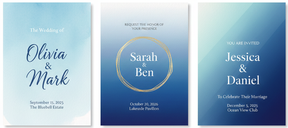
- Color Meaning: Blue is tied to calm, commitment, and trust, which fits the tone of a wedding celebration.
- Modern Appeal: A gradient background adds depth and visual interest without overwhelming the design.
- Easy Pairing: The blue tones coordinate well with silver, white, gold, and neutral wedding palettes.
- Strong First Look: The design feels intentional, polished, and memorable right away.
Design Details That Add a Touch of Class
The Iwi073 P 73 is designed to feel elegant without being overly formal. It has a clean layout, balanced spacing, and a smooth color transition that supports the text instead of distracting from it. Everything about the design feels “put together,” which matters because wedding stationery often becomes part of your wedding keepsakes.
The invitation is printed on thick, smooth cardstock that makes it feel substantial in hand. That physical quality makes a real difference. Guests notice when invitations feel lightweight or flimsy, and this one avoids that completely. The paper’s finish also helps the gradient appear rich and consistent, showing the full range of blues without dull patches or color shifts.
Typography is another strong point. The text layout is modern, readable, and well-spaced. Whether you choose a refined serif typeface, a romantic script, or a mix of both, the design keeps the text clean and easy to scan. It doesn’t feel cluttered, which is especially important when you include formal details like ceremony time, venue address, and RSVP instructions.
You can also elevate the invitation further with optional upgrades. Metallic accents, subtle decorative details, and coordinating envelope enhancements can make the suite feel even more complete. These upgrades work especially well with gradient designs because they add a touch of light-catching contrast to the smooth color background.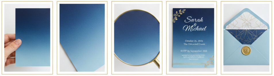
- Cardstock Quality: Thick, sturdy material gives the invitation a premium feel.
- Print Finish: The gradient prints cleanly and evenly for a rich, polished look.
- Typography Balance: Fonts and spacing are arranged for clarity without losing elegance.
- Upgrade Options: Foil accents and decorative touches can add a refined finish.
- Envelope Pairing: Matching envelopes or liners complete the invitation suite beautifully.
Make It Yours With Custom Options
One of the best things about the Iwi073 P 73 is how easy it is to personalize while keeping the design elegant. You can adjust the details to match your wedding style, your wording preferences, and your guest needs without losing the invitation’s original charm.
Personalization starts with the basics: names, wedding date, venue address, and ceremony time. From there, you can fine-tune the layout and font selections based on the tone you want. A script font might give it a softer, more romantic look, while a serif font makes it feel more formal and classic.
The layout is also flexible enough to include extra information when needed. If you want to add dress code guidance, parking notes, or a short message to guests, the design can usually accommodate it through inserts or subtle spacing adjustments. Multilingual versions are also possible, which is helpful for weddings with international guests or bilingual families. The invitation can still look balanced even when the language changes, as long as the spacing and structure are handled correctly.
You can also build a full invitation suite to match. RSVP cards, detail cards, and Save-the-Date designs can follow the same gradient style so everything feels cohesive. A consistent suite makes your wedding look more organized and intentional, and guests tend to appreciate that level of polish.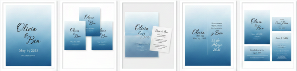
- Name and Date Customization: Personal details can be styled and formatted to match your preferred design look.
- Font Adjustments: Choose between script, serif, or mixed styles depending on your wedding tone.
- Extra Details: Add information through inserts or carefully spaced layout updates.
- Multilingual Options: Support bilingual or multilingual wording without sacrificing design balance.
- Matching Suite Pieces: Pair with RSVP cards, Save-the-Dates, and detail inserts for a cohesive set.
Wedding Styles That Match This Invitation
The Iwi073 P 73 is versatile, which makes it easy to match with different wedding themes. Some invitations feel limited to one specific style, but this one works across a wide range of settings because gradient blue is both neutral and visually rich.
For beach weddings, the blue tones naturally echo the ocean and sky, making the invitation feel connected to the setting. For formal ballroom weddings, the invitation can look even more upscale with the addition of metallic accents and classic typography. Minimalist weddings also benefit from this design because it stays clean, structured, and modern without needing excessive decoration.
Garden weddings and outdoor ceremonies also pair nicely with this palette because cool blues complement florals and greenery well. Winter weddings are another natural match. The gradient effect feels icy and sophisticated, which fits seasonal celebrations that use silver, white, or deep blue décor.
The invitation also works for weddings that blend styles. If you’re planning something that feels modern but still traditional in certain elements, this design sits comfortably in that middle space. It doesn’t lean too far into trendy territory, and it doesn’t feel overly old-fashioned either.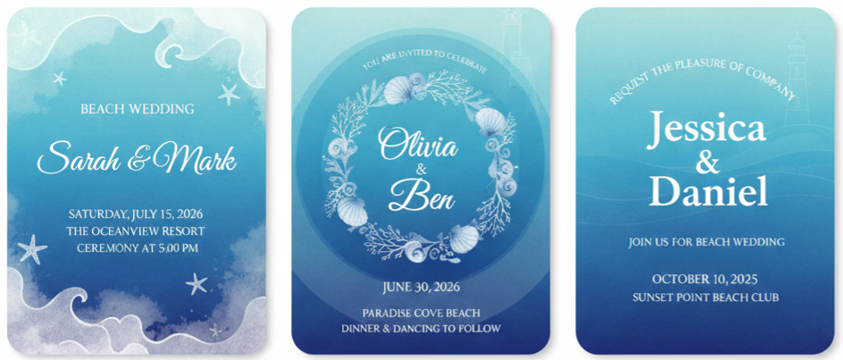
Beach Weddings
Blue gradients pair naturally with ocean views and coastal décor.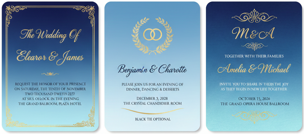
Ballroom Weddings
Foil accents and formal fonts bring out a classic luxury vibe.
Minimalist Weddings
Clean design and modern layout fit a simple aesthetic.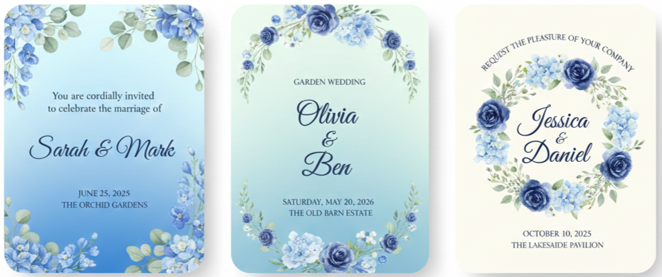
Garden Weddings
Soft blues match florals, greenery, and outdoor lighting.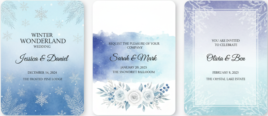
Winter Weddings
Cool tones reflect seasonal themes and elegant winter palettes.
Why Couples Keep Choosing the Iwi073 P 73
Couples tend to choose this invitation for a few clear reasons: it’s beautiful in person, easy to coordinate, and visually calm without being boring. It makes a strong impression while still feeling tasteful and refined.
One of the biggest reasons people gravitate toward this invitation is the balance. It doesn’t feel too busy, but it still looks special. The gradient adds enough detail to keep it interesting, and the overall structure keeps it formal enough for traditional weddings. That makes it appealing to a wide range of couples, even those who have different style preferences.
Another reason is print quality. Gradient designs can look uneven or dull when printed poorly, but this one is designed to hold its color depth well. Couples appreciate that the printed invitation matches the digital preview closely, which reduces stress during planning.
The color itself is also a safe and elegant choice. Blue doesn’t clash easily. It pairs with neutral outfits, soft florals, and a variety of décor themes. It also tends to feel universally appealing, which matters when you have guests of different ages and backgrounds.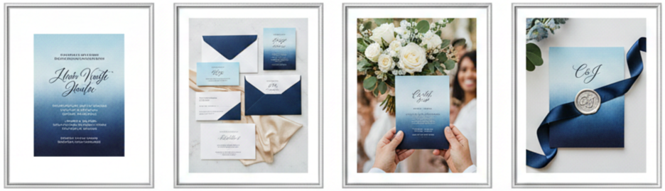
- Elegant Balance: The design feels refined, modern, and timeless at the same time.
- Print Consistency: The gradient holds its richness and matches previews well.
- Easy Coordination: Blue blends with many wedding colors and décor styles.
- Universal Appeal: Guests tend to respond well to the calm, classic color palette.
- Memorable Look: The gradient detail makes the invitation feel special and intentional.
How Ordering Works
Wedding planning involves enough stress, so ordering invitations should feel simple and clear. The Iwi073 P 73 ordering process is straightforward, and it’s designed to help you avoid mistakes and last-minute surprises.
You start by customizing the invitation online. Once you enter your details and select fonts, you receive a digital proof that shows how everything will look when printed. This step is important because it gives you a chance to review spelling, spacing, and formatting before production begins.
After you approve the proof, the order moves into production. A design team typically checks alignment and layout consistency before printing. Standard turnaround is often around a week to ten business days, depending on volume and upgrades. If you’re on a tight timeline, rush printing and faster shipping are usually available.
You can also order in quantities that match your guest list. Many couples start at 25 invitations and increase from there. If you later realize you need more, reorders are typically available using the same design proof so everything stays consistent.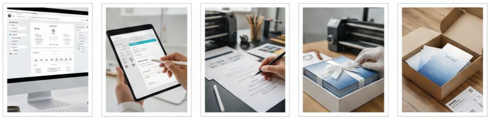
- Customize your invitation details and font options online.
- Review the digital proof carefully for accuracy and spacing.
- Approve the proof so the design team can finalize it for print.
- Choose standard or rush production based on your timeline.
- Receive your invitations securely packaged and ready to send.
Conclusion
The Charming Gradient Blue Wedding Invitation Iwi073 P 73 is a strong choice for couples who want their wedding stationery to feel calm, refined, and visually impressive. The gradient design creates a modern look that still feels timeless, and the overall layout keeps the invitation clean, readable, and polished. Whether your wedding is coastal, formal, minimalist, or seasonal, this invitation blends into your theme easily and gives guests a beautiful first impression the moment they open the envelope.
Key Takeaway: The Iwi073 P 73 delivers a premium look with a soothing gradient design, flexible customization, reliable print quality, and broad theme compatibility, making it an ideal invitation for couples who want elegance without overcomplication.
FAQs
Can I request a digital version for email or wedding websites?
Yes, digital versions of the invitation design are available, and they work well for wedding websites, online RSVPs, or email announcements.
Are foil accents included in the standard design?
Foil accents are optional upgrades. You can add them during customization if you want a more elevated finish.
Do I need to assemble the invitations myself?
Most invitations arrive flat and ready to send. However, upgrades like ribbons, belly bands, or specialty inserts may require minimal assembly.
Can I order in batches or reorders later?
Yes, reorders are usually available as long as you keep your final design proof so the printing stays consistent.
Is there a rush printing option available?
Yes, rush production and expedited shipping options are available if your wedding timeline is tight.
Leave a Reply