Wedding Colors
| Wedding Theme | Suggested Color Pairings |
| Bohemian | Terracotta, Rust, Sage |
| Rustic | Dusty Rose, Olive, Beige |
| Classic | Ivory, Black, Gold |
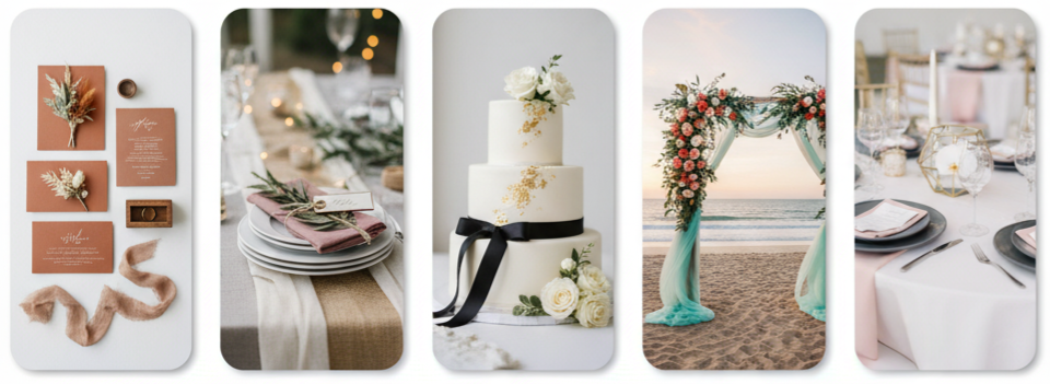
| Beach/Destination | Aqua, Coral, Sand |
| Modern | White, Charcoal, Blush |
Why Wedding Colors Matter
Wedding colors do more than make your day beautiful—they set the entire tone of your celebration. The colors you choose influence everything from décor to attire, tying your event together in one cohesive look. Whether your goal is soft and romantic or bold and modern, your color palette defines your wedding’s atmosphere.
Having a coordinated set of colors helps bring harmony to your ceremony and reception. Everything, from your floral arrangements to your invitations, connects visually when you stick to a consistent palette. It’s more than decoration—it’s a way to express your personal style and story.
Tips for Choosing Your Wedding Colors
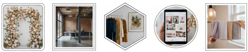
Choosing the right colors might seem tricky at first, but a few thoughtful steps make the process easier and more fun. Start by thinking about your surroundings and the mood you want to create.
- Start with your venue: The space you choose often influences your colors. Outdoor gardens pair well with floral pastels, while industrial lofts look stunning with metallic or moody tones.
- Reflect your personal style: Look at the colors you already love—your wardrobe, your home, or even your favorite artwork. These details reveal what truly represents you.
- Create a mood board: Use Pinterest or Canva to collect inspiration and see which colors naturally fit together. Visualizing combinations helps narrow down your choices.
- Limit your palette: Stick to two to four colors. A small selection keeps your design balanced and avoids clashing tones.
- Test lighting: Colors change under different light sources. Always test your palette in lighting similar to your venue to make sure the shades appear as you expect.
Key takeaway: Choose wedding colors that reflect your personal taste and venue while ensuring they look great under your wedding’s actual lighting conditions.
Trending Wedding Color Combos
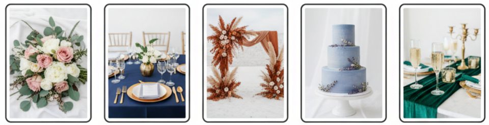
Color trends evolve every year, but some timeless pairings continue to win hearts. These combinations work across styles and seasons, giving your wedding a memorable look.
- Sage Green and Blush Pink: This modern favorite blends earthiness with romance. It’s perfect for garden or outdoor weddings in spring.
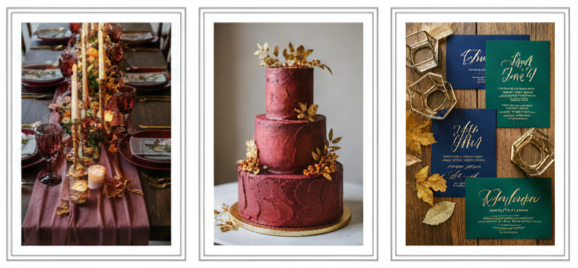
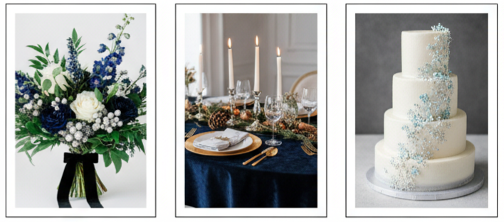
- Navy Blue and Gold: Elegant and bold, this duo suits fall and winter weddings. Navy adds sophistication, while gold adds warmth and richness.
- Terracotta and Rust: These earthy tones are popular in bohemian and desert-themed weddings. They bring a cozy, intimate touch to rustic settings.
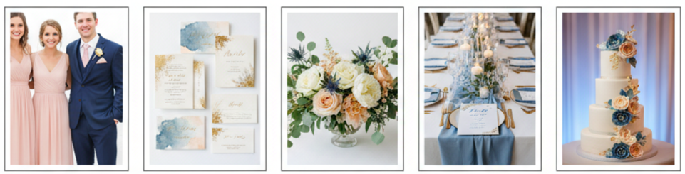
- Lavender and Dusty Blue: Soft and calming, these hues create a dreamy, airy feel that works beautifully for lakeside or spring weddings.
- Emerald and Champagne: This pairing feels luxurious and timeless, ideal for evening or ballroom celebrations with a touch of glamour.
Each combination offers a unique mood and can easily be customized with neutral or metallic accents to make it truly your own.
Wedding Colors by Season
Each season brings its own natural color inspiration. When your palette matches the season, it enhances the overall harmony of your wedding.
Spring
Spring weddings thrive on freshness and light. Pastel tones such as lavender, mint, blush, and baby blue feel soft and romantic. Ivory or light gray neutrals balance them perfectly. Florals are in full bloom during this time, making it easy to find natural color matches.
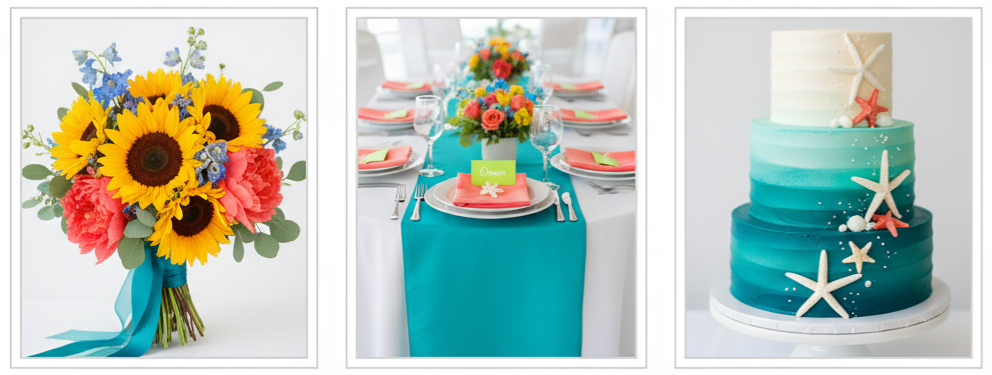
Summer
Summer is full of bold and lively colors. Bright corals, sunflower yellows, and teal blues capture the vibrance of the season. If you’re having a beach or destination wedding, aqua and white or navy and pink can create a playful yet elegant look. Summer is also great for experimenting with unexpected pops of color like citrus orange or lime green.
Fall
Fall weddings are all about warmth and depth. Deep reds, burnt oranges, and golden yellows complement the natural tones of the season. Jewel tones like emerald and sapphire add richness to the atmosphere. Using wood, candles, and metallic accents enhances the cozy, inviting feel.
Winter
Winter calls for drama and elegance. Darker colors such as navy, emerald, and black pair beautifully with silver or gold details. If you want a frosty, fairytale effect, icy blues and whites also shine in this season. Velvet fabrics, twinkle lights, and crystal décor help complete the look.
Color Palettes That Match Wedding Themes
Your wedding theme plays a huge role in determining which colors work best. Matching your palette with your chosen theme ensures a unified and intentional design.
- Bohemian Weddings: Earthy colors like terracotta, sage, and rust bring out a free-spirited vibe. Layer these with natural textures such as wood and dried florals for a laid-back look.
- Rustic Weddings: Dusty rose, beige, and olive green are cozy and natural choices. Combine them with burlap, string lights, and wooden details for a warm, countryside feel.
- Classic Weddings: Elegant pairings like ivory, black, white, and gold never go out of style. These shades create a timeless atmosphere that photographs beautifully.
- Beach Weddings: Aqua, coral, and sandy neutrals reflect the seaside setting. Light fabrics and minimalist arrangements keep things breezy and bright.
- Modern Weddings: Simple, clean palettes like white, charcoal, and blush feel fresh and sophisticated. Pairing these with sleek lines and geometric décor creates a polished look.
Each theme brings its own personality, and your color palette should enhance that rather than compete with it.
Common Color Mistakes to Avoid
Even the best intentions can go sideways if color choices aren’t planned carefully. Here are some pitfalls to avoid:
- Using too many colors: More isn’t always better. Limit your palette to a few key shades to maintain visual balance.
- Ignoring your venue’s details: Venues with strong colors or patterns can clash with your palette. Always consider your surroundings.
- Chasing trends blindly: Just because a color is popular doesn’t mean it suits your style or will age well in photos. Choose what feels authentic.
- Forgetting lighting conditions: Indoor lighting, candles, and natural daylight can alter how colors look. Always test them in real conditions.
- Not coordinating with attire and florals: Some colors are hard to replicate in fabrics or flowers. Confirm availability before finalizing your palette.
By avoiding these mistakes, you’ll create a wedding look that feels natural, cohesive, and true to your vision.
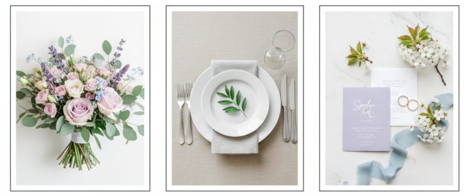
Where to Use Wedding Colors
Once you’ve decided on your palette, it’s time to weave those colors into your wedding details. Consistency is key to keeping everything cohesive.
- Attire: Dress your bridal party in coordinating shades—from bridesmaid dresses to groomsmen ties. Small details like shoes, jewelry, or pocket squares can also tie in your color palette beautifully.
- Stationery: Your invitations, menus, and signage are the first hints of your color story. Use consistent shades and fonts to set the mood early.
- Florals: Bouquets, centerpieces, and ceremony arrangements are perfect for showcasing your main colors. Use greenery or neutral tones to balance brighter shades.
- Reception Décor: Table linens, candles, and seating charts help carry your theme through the reception.
- Cake and Lighting: Custom cakes with color accents and lighting in your main hues can transform the space into a reflection of your chosen palette.
When all these elements connect visually, your guests will instantly feel the thought and harmony behind your design.
Conclusion
Wedding colors are one of the most defining aspects of your big day. They set the tone, tie every element together, and express your personality as a couple. Whether you’re drawn to romantic pastels or bold jewel tones, thoughtful color coordination ensures that your celebration feels beautiful, balanced, and uniquely yours. The key is to stay intentional—let your colors tell your story from start to finish.
Key takeaway: Choose a color palette that represents who you are, works with your venue and season, and carries through every detail of your wedding for a polished and memorable look.
FAQs
What should we do if we like too many colors?
Pick one dominant color and two or three accent shades that complement it. Keeping the palette small ensures your design stays cohesive and visually pleasing.
Are metallics considered wedding colors?
Absolutely! Metallics like gold, silver, and copper add a touch of glam to your palette. They work best as accents—think tableware, décor details, or accessories—to give everything a polished finish.
Can we change our wedding colors after choosing them?
You can, but it’s easier to do early in the planning process. Once you’ve ordered décor, attire, or printed items, changing the palette becomes difficult and expensive.
Should our wedding party wear the same color as our theme?
Their attire doesn’t need to match exactly. Instead, choose complementary shades that fit within your palette to create visual balance in photos.
How do we make sure our wedding colors photograph well?
Ask your photographer for advice based on lighting conditions. Natural light enhances soft hues, while darker colors often pop under artificial lighting.
Leave a Reply