weddinginvites
2 Stunning Rustic Wedding Decor Ideas
| Element | Best Use |
| Wooden Farm Tables | Reception dining setup |
| Burlap & Lace Runners | Table layering and texture |
| Mason Jars | Centerpieces and lighting |
| Edison String Lights | Overhead ambiance lighting |
| Wooden Arches | Ceremony backdrop |
| Logs & Tree Slices | Aisle decor, dessert stands |
| Potted Herbs | Aisle markers, guest tables |
| Hay Bale Seating | Outdoor ceremonies, casual vibe |
| Chalkboard Signs | Directional signage, menus |
| Vintage Rugs | Aisle runners, lounge setups |
Rustic Decor Idea #1: Barn-Inspired Tablescape with Organic Elegance
A barn-inspired tablescape is one of the easiest ways to bring rustic charm into your wedding, even if you’re not hosting your celebration in an actual barn. It creates that cozy countryside feel right away and gives your reception a warm, welcoming look that guests naturally gravitate toward. We love this decor idea because it blends natural textures, soft lighting, and small personal touches that make the entire space feel intentional without feeling overly styled.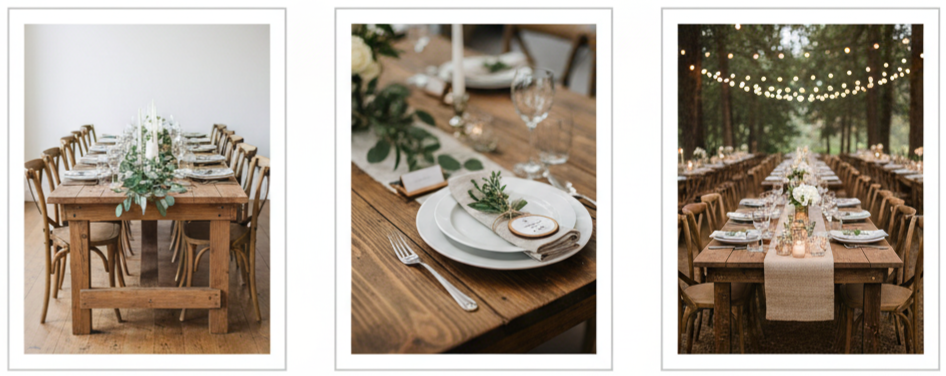
Wood Tables
Skip the heavy tablecloths and let the natural wood shine. Long farmhouse tables instantly give you that rustic foundation, especially when you can see the grain and texture. If you want a more relaxed look, mix chair styles slightly, like adding a few vintage wooden chairs alongside cross-back seating. Keeping the layout symmetrical helps everything stay clean and balanced.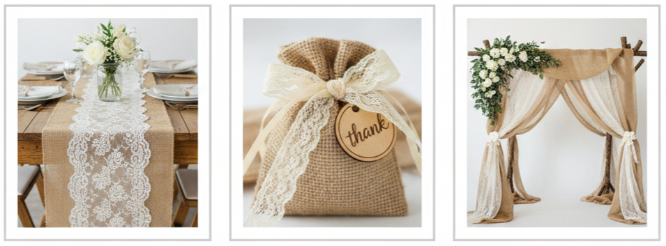
Burlap And Lace
Burlap runners keep the design grounded, and lace adds softness without taking away from the rustic theme. We suggest sticking with neutral lace, like ivory or beige, so it blends into the tablescape and doesn’t compete with your florals or place settings. This combination gives you the best of both worlds: rustic charm with a romantic finish.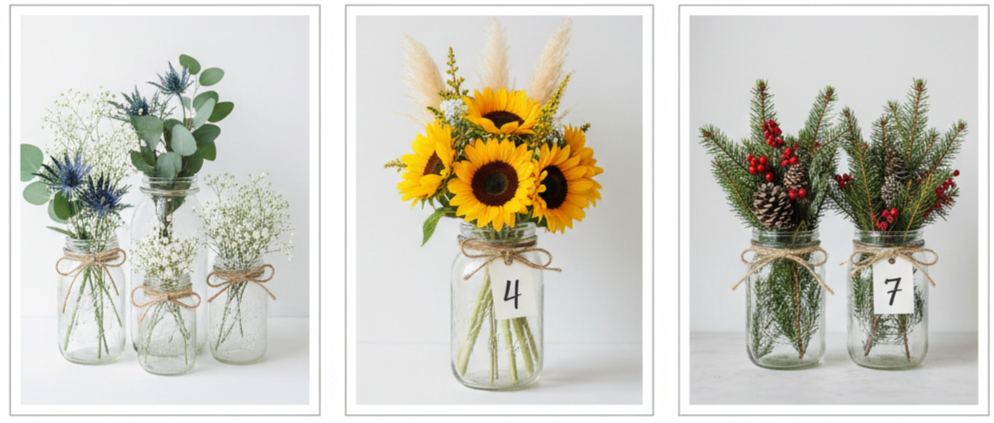
Mason Jar Centerpieces
Mason jars are classic for a reason. They’re affordable, easy to style, and instantly rustic. Use different jar sizes and group them together for more dimension. Fill them with seasonal flowers like wildflowers, baby’s breath, sunflowers, pampas grass, or evergreen sprigs depending on your wedding date. Tie twine around the rims or add handwritten tags for table numbers to make them feel customized.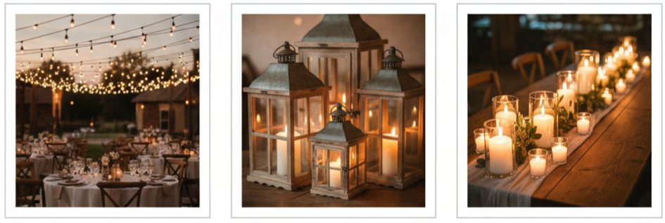
Warm Lighting
Lighting is what makes the reception feel magical once the sun goes down. String Edison bulb lights overhead for that barn-like glow, then add lanterns and candles down the center of the tables for extra warmth. Keeping candles unscented helps avoid overpowering dinner aromas while still giving you that soft flicker that makes everything feel intimate.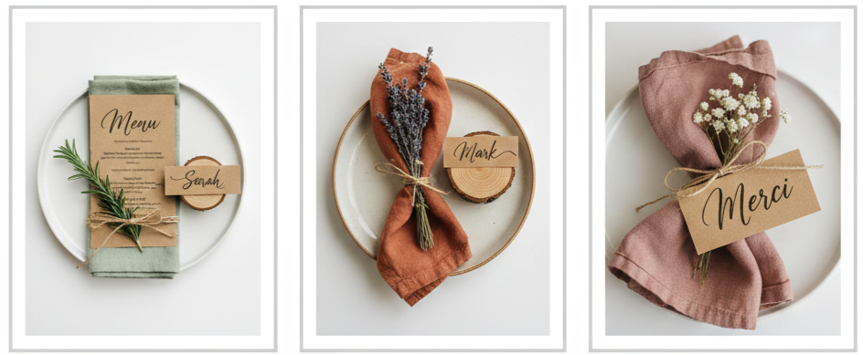
Rustic Place Settings
Kraft paper menus printed in a simple calligraphy-style font fit perfectly into a rustic theme. Place them on plates and add cloth napkins in earthy tones like sage, terracotta, dusty rose, or cream. Tuck in a small herb sprig, like rosemary or lavender, tied with twine for a clean, natural detail. For name cards, small wood slices or mini tree stump holders add a charming rustic touch that also works as a keepsake.
These elements come together naturally and effortlessly, with each detail serving a purpose. Wood, florals, lighting, and textures create a warm, inviting, and memorable space without any flashy touches.
Rustic Decor Idea #2: Whimsical Woodland Ceremony Setup
A woodland ceremony setup is perfect when you want your wedding to feel dreamy, romantic, and a little magical. It works beautifully for outdoor ceremonies, forest venues, garden weddings, and even backyard setups. The key is to let nature take the lead and then layer in rustic details that enhance the environment instead of overpowering it. When done right, it feels like you’re stepping into a quiet enchanted space designed specifically for your ceremony moment.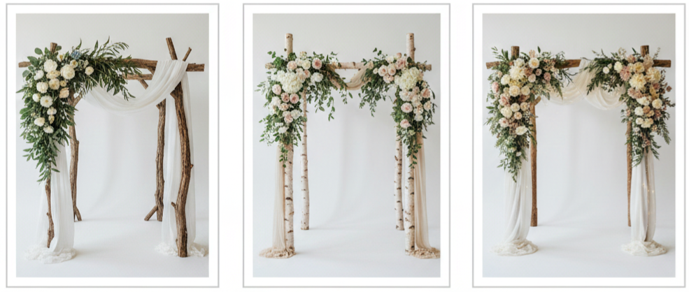
Floral Arch
Start with a wooden arch made from reclaimed wood, birch branches, or natural timber. Then drape it with fabric like muslin or soft tulle so it flows naturally. We recommend layering greenery like ivy, ruscus, or eucalyptus for volume, then adding floral clusters to tie in your color palette. You can keep the florals concentrated in one corner for a more relaxed and modern look, or make it symmetrical if you want it to feel more formal.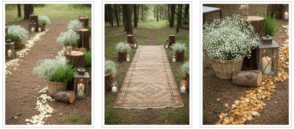
Nature-Inspired Aisle
Instead of covering the aisle, use the natural ground as part of the design. Line the path with logs, lanterns, potted herbs, or baskets filled with baby’s breath. Adding dried petals works well too, especially if you want soft color along the walkway. For extra charm, vintage rugs in earthy tones can create that laid-back woodland look without feeling too staged.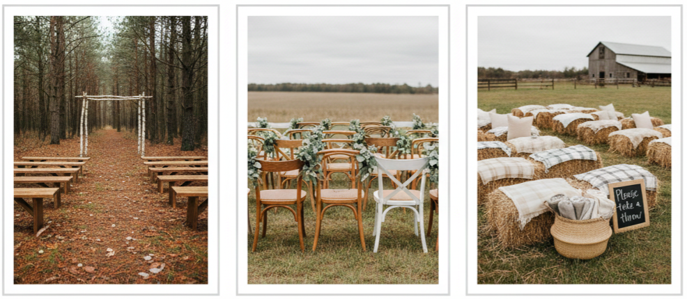
Rustic Seating
Woodland ceremonies look best when seating feels organic. Wooden benches, mismatched chairs, or hay bales with neutral blankets all fit well. If the weather is cool, baskets of throws placed at the entrance are both practical and on-theme. Keeping the seating simple allows your arch and aisle decor to stand out without cluttering the space.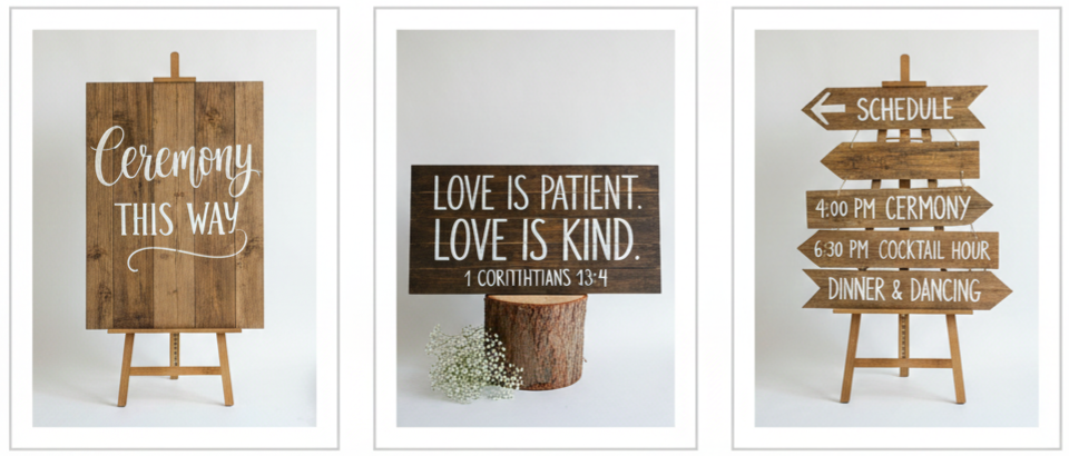
Wooden Signs
Rustic wooden signs can guide guests while also adding personality. You can use them to direct guests toward the ceremony, share a short quote, show the schedule, or display seating instructions. Reclaimed wood boards with white lettering or chalk-style writing look clean and timeless. Place them on easels or lean them against tree stumps for an effortless feel.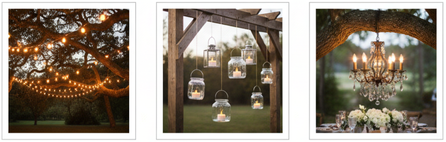
Overhead Lighting
Hanging string lights from tree branches creates instant woodland magic. Glass lanterns, hanging mason jars with battery tea lights, or even a small chandelier adds a fairytale vibe that photographs beautifully. If your ceremony runs into the evening, this lighting turns the space into a glowing, intimate scene that feels unforgettable.
This decor idea works because it makes the ceremony feel calm and personal while letting nature frame the moment. Even simple elements, like a wooden arch and warm lighting, can completely transform a space when they’re styled with care.
Extras to Pull It All Together
Rustic decor feels most complete when it runs through the entire wedding day, not just the ceremony or reception. Small details in guest areas, photo spaces, and dessert displays make the whole celebration feel cohesive and polished. These extras are also where couples can add personal touches without needing major design changes.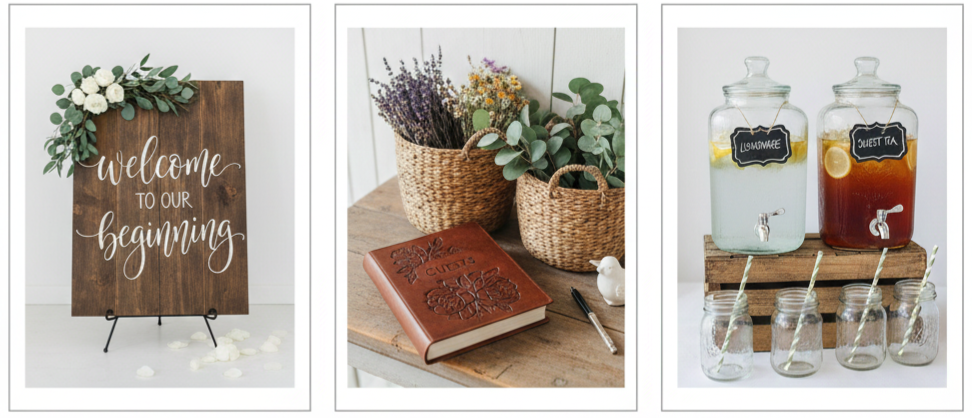
Welcome Table
Set up a simple welcome table near the entrance so guests immediately step into the rustic theme. A wooden welcome sign, a vintage guestbook, and small baskets filled with dried florals or eucalyptus bundles create a warm first impression. Glass drink dispensers with handwritten chalk labels add a thoughtful touch and also make guests feel comfortable as soon as they arrive.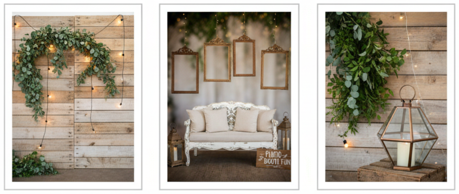
Photo Booth Area
A rustic photo corner gives guests something fun to do while also creating more photo opportunities. A pallet wall with greenery and string lights works well for a backdrop. You can add vintage frames hanging from hooks, a rustic loveseat with neutral pillows, and simple props like lanterns or wooden signs. Keeping the decor neutral ensures the photos look timeless and not overly trendy.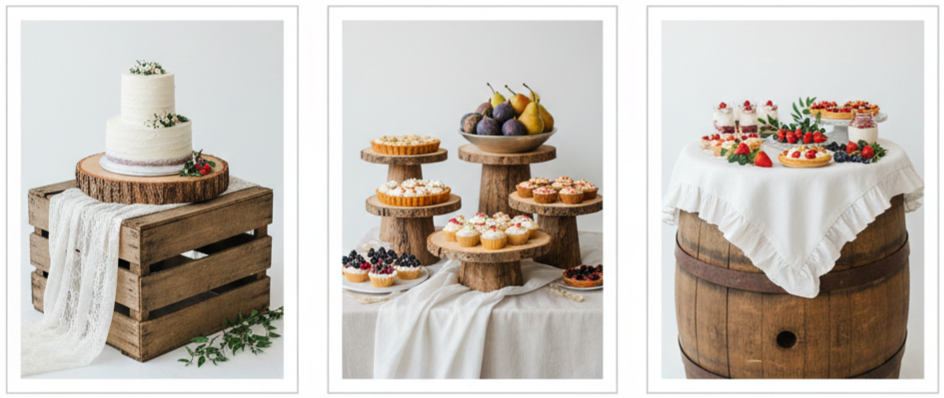
Dessert Display
A rustic dessert setup can look stunning without being complicated. Display the cake on a wooden barrel, stacked crates, or a thick tree slice. Add layered dessert stands made of wood and decorate with seasonal fruit like berries, pears, or figs to keep everything looking fresh and natural. Draping linen or lace beneath dessert trays adds texture while keeping the style consistent.
These extras help your rustic theme feel intentional and complete. They also give your guests more places to connect with the wedding atmosphere, which makes the celebration feel immersive and memorable.
Conclusion
Rustic wedding decor has a special way of making a celebration feel warm, genuine, and inviting. It doesn’t rely on flashy trends or overdone styling. Instead, it focuses on natural materials, simple textures, and lighting that creates a cozy mood. When you combine a barn-inspired tablescape with a whimsical woodland ceremony setup, you get a wedding style that feels timeless and personal at the same time. The best part is how flexible rustic decor can be. Whether you’re hosting your wedding in a barn, a backyard, a garden, or a modern indoor venue, these ideas can be adjusted to fit your space while still giving you that rustic charm you want.
Key Takeaway: Rustic wedding decor stands out because it feels natural and intentional. Wood tables, mason jars, soft greenery, warm lighting, and simple handmade details create a setting that feels personal, romantic, and unforgettable without feeling overly styled.
FAQs
How do we keep rustic decor from looking too casual?
Rustic decor looks elevated when you mix raw textures with refined details. Pair wood and burlap with soft florals, warm lighting, clean place settings, and neutral color palettes. Keeping everything balanced makes rustic styling look intentional rather than messy.
What’s the easiest rustic decor item to DIY?
Mason jar centerpieces are one of the simplest DIY options. You can decorate jars with twine or lace, fill them with seasonal flowers, and group them in sets of three for a full centerpiece look without needing expensive arrangements.
Can rustic decor work in a formal wedding venue?
Yes, rustic decor can fit formal indoor venues when you choose more polished rustic elements. Use wood accents, greenery, and soft candle lighting while keeping linens, tableware, and florals clean and classic. This approach blends rustic charm with a more formal setting.
What are good rustic wedding decor alternatives to fresh flowers?
Dried florals, pampas grass, eucalyptus bundles, lavender, rosemary, and wheat arrangements all fit rustic themes beautifully. They also last longer than fresh flowers and can be reused for multiple areas of the wedding.
How can we make rustic decor feel more unique?
Focus on personalized details like handwritten signage, custom table numbers, family heirloom decor pieces, vintage photo displays, or a themed lounge area. These small additions make rustic decor feel personal and memorable instead of generic.
18 Must Have Fun Wedding Photo Ideas That You’ll Love
| Photo Idea | Best Time To Capture |
| First Look Reactions | Before the ceremony |
| Confetti Toss | Ceremony exit |
| Champagne Pop | Before reception |
| Getaway Ride | End of reception |
| Bridesmaids’ Fun Poses | During getting ready |
| Groomsmen Comedy Shots | Before ceremony |
| Veil or Train in Motion | Couple portraits |
| Dip Kiss | First dance or portraits |
| Photobombs | Anytime during the day |
| First Dance Twirl | During reception |
| Candid Laughs | All day |
| Cake Smash | During cake cutting |
| Wedding Party Jump | After ceremony |
| Sock and Shoe Reveal | Before ceremony |
| Drone Crowd Shot | After ceremony |
| Reflection Shots | During portraits |
| Sunset Silhouette | Golden hour |
| Sparkler Send-Off | End of the night |
First Look Reactions That Say It All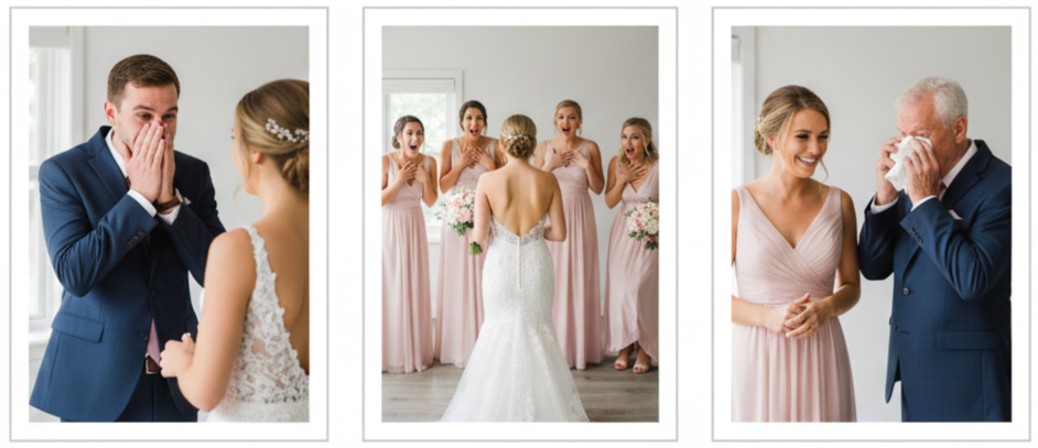
- Why It’s A Must: The first look is one of the most emotion-packed moments of the day, and it usually happens in a quiet space where you can truly react without distractions. We get real expressions here, not the “camera-ready” ones.
- How To Make It Fun: We can add playful energy by doing a first look with your bridal party, your parents, or even your pet before the official couple reveal. Those reactions are always gold.
- Best Time To Capture It: We recommend doing it before the ceremony so you have time to enjoy it and let your photographer shoot without rushing.
Confetti Toss or Petal Shower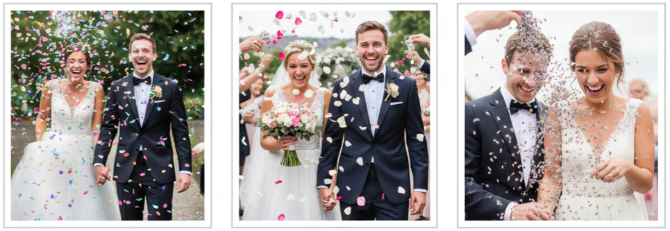
- Why It’s A Must: Confetti and petals instantly make photos look festive, full of movement, and packed with celebration.
- What Works Best: Biodegradable confetti, flower petals, or dried lavender work well and look great in photos.
How To Plan It: We should set a quick cue for guests—like “toss on three”—so the toss happens all at once and looks full and dramatic.
Popping Champagne With Style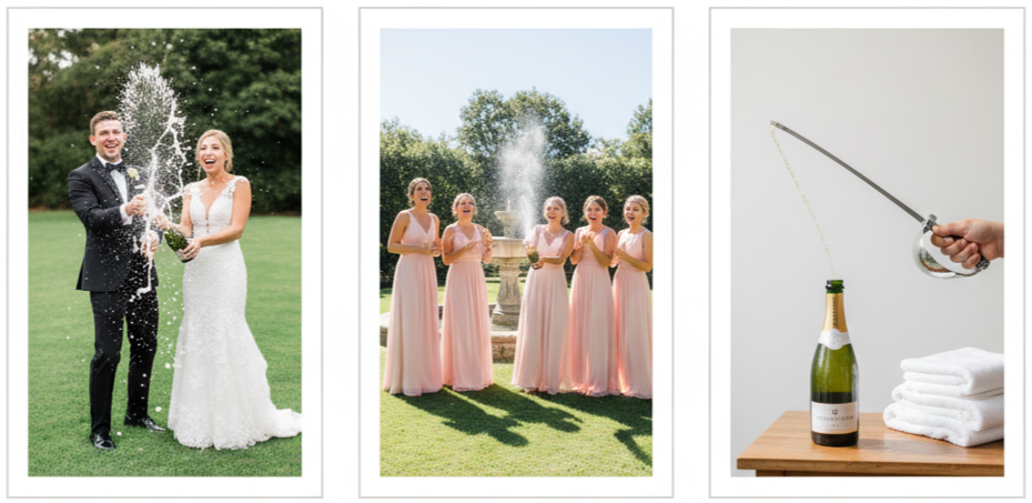
- Why It’s A Must: Champagne pops bring energy and excitement into the photos, especially when everyone reacts naturally.
- Where To Do It: Outside the venue, in a garden, or near the reception entrance works well for lighting and space.
- How To Keep It Clean: We can keep towels nearby or use a champagne bottle specifically for photos so you don’t waste the good stuff meant for the toast.
Getaway Ride With a Twist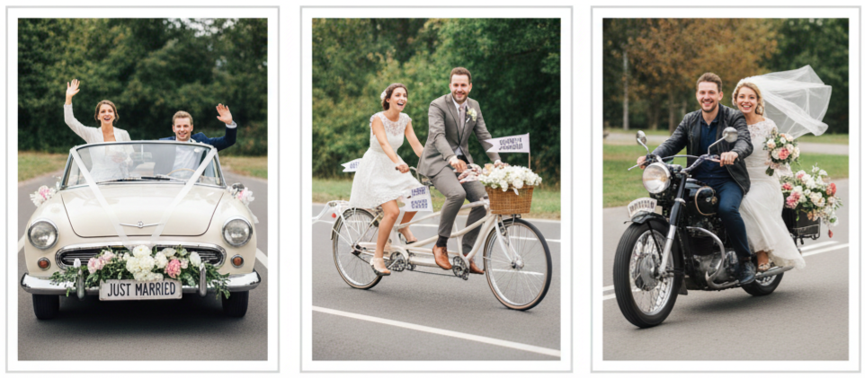
- Why It’s A Must: Your exit photo is one of your last “big story” shots, so it should look fun and personal.
- Ideas To Try: A vintage car, golf cart, bicycle, scooter, motorcycle, or even a boat if your venue allows it.
- How To Make It Photo-Worthy: We can decorate it with ribbons, florals, “just married” signage, and a few playful details that match your theme.
Bridesmaids Bringing the Sass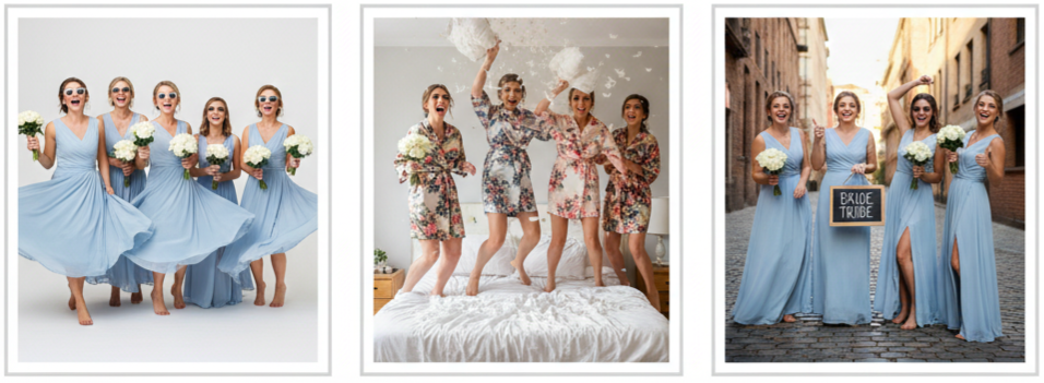
- Why It’s A Must: Bridesmaid photos don’t have to be stiff. They should feel like you and your closest friends enjoying the day.
- Photo Ideas That Work: We can capture twirls, synchronized walks, group hugs, dramatic “model-style” poses, or even chaotic laughter moments.
- Easy Props To Add: Sunglasses, mini bouquets, fun signs, matching robes, or anything that feels true to your group.
Groomsmen With a Comedic Spin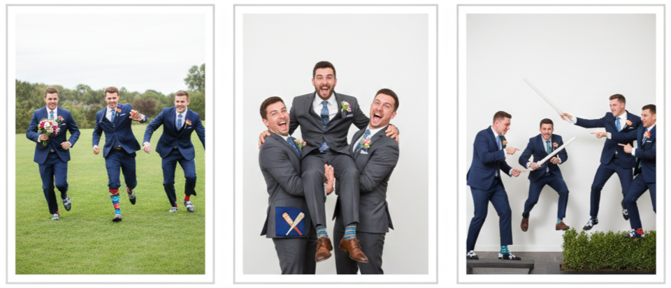
- Why It’s A Must: Groomsmen shots always end up as the funniest photos in the album when everyone leans into their personality.
- What We Can Capture: Pretend chases, fake fights, group lifts, or goofy action scenes that feel like a movie moment.
- Hidden Details That Shine: Matching socks, funny pocket squares, themed shoes, or personalized accessories make this even better.
Veil or Train in Dramatic Motion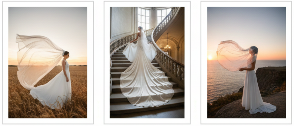
- Why It’s A Must: A moving veil or flowing train adds drama and elegance, while still keeping the moment fun and natural.
- How It Happens: We can toss the veil slightly, capture it in the wind, or have someone gently fan it out behind you.
- Where It Looks Best: Open outdoor spaces, long hallways, staircases, and wide fields create the best background for this style of shot.
The Romantic Dip Kiss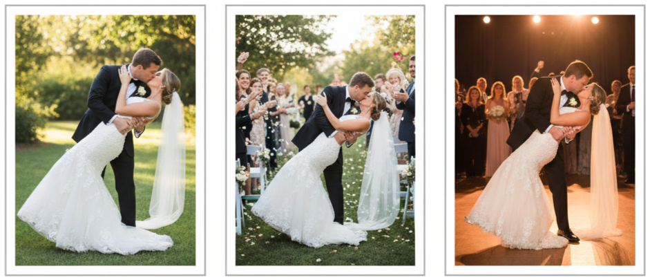
- Why It’s A Must: It’s playful, romantic, and cinematic all at once—perfect for couples who want a “movie scene” moment.
- When To Do It: We can do it during portraits, the ceremony exit, or during the first dance.
- How To Nail It: Practice once before the wedding so the pose feels natural and safe, especially if you’re wearing heels.
Photobombs That Steal the Show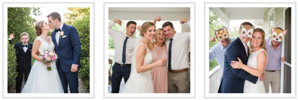
- Why It’s A Must: Photobombs add humor and surprise, and they often become the photos everyone talks about later.
- Who Should Do It: Flower girls, ring bearers, your best friends, or even your parents if they’re up for it.
- How To Make It Work: We can plan one or two “intentional photobombs” while leaving space for spontaneous ones too.
The First Dance Twirl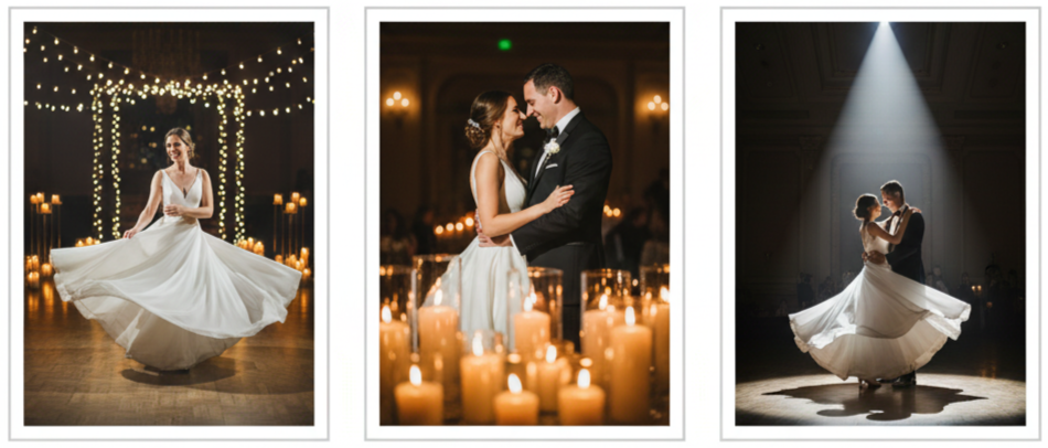
- Why It’s A Must: A twirl adds movement, gives your dress a moment, and creates that joyful “living in the moment” look.
- How To Make It Stand Out: We can capture it under soft lights, near candles, or during a dramatic song moment.
- Best Top: Don’t focus on perfection—focus on enjoying the dance and letting the camera capture the real energy.
Candid Mid-Laugh Moments
- Why It’s A Must: These photos feel real and timeless because they show your personality, your connection, and your genuine joy.
- Where They Happen: During speeches, while chatting with guests, during the ceremony, or while dancing.
- How To Encourage Them: Stay present. Don’t worry about the camera. The best candid moments happen when you forget it’s there.
Cake Smash Surprise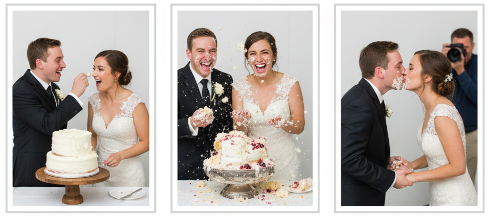
- Why It’s A Must: It’s one of the most classic playful moments, and it always creates fun reactions.
- How To Decide Your Style: Some couples go for a gentle frosting dab. Others do the full smash. Either way works as long as you both agree.
- How To Make It Photo-Friendly: We should give your photographer a quick heads-up so they’re ready for the exact moment.
The Wedding Party Jump Shot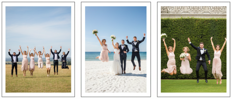
- Why It’s A Must: It’s energetic, memorable, and shows everyone’s excitement in one photo.
- How To Make It Look Great: We can do it in a wide open space with a clean background.
- Quick Tip: Don’t worry about matching jumps. The best jump photos look fun because everyone jumps differently.
Sock and Shoe Reveals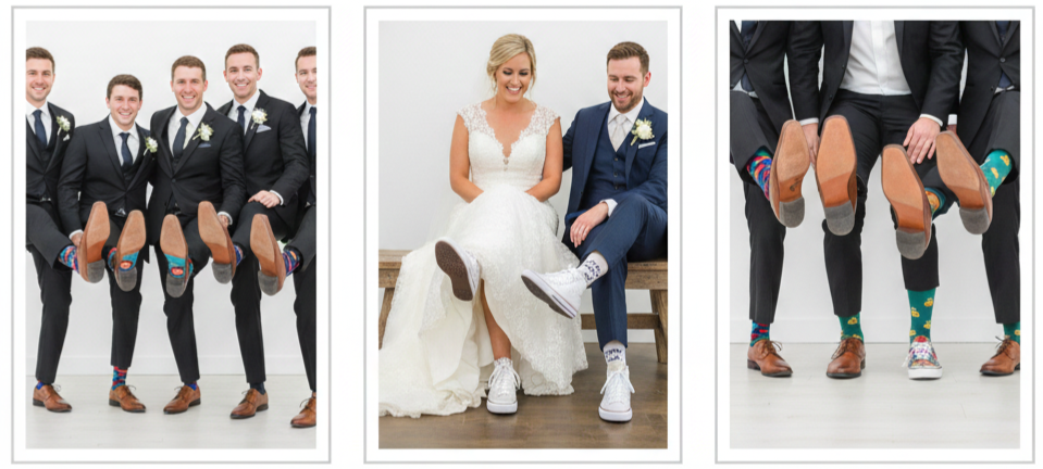
- Why It’s A Must: These shots are funny, easy, and they highlight details people don’t always notice during the day.
- What Works Best: Matching socks, themed socks, sneakers under the dress, custom shoes, or playful wedding party footwear.
- How To Shoot It: We can line up the group and do a quick “shoe kick” shot to show the details clearly.
Drone Crowd Shots From Above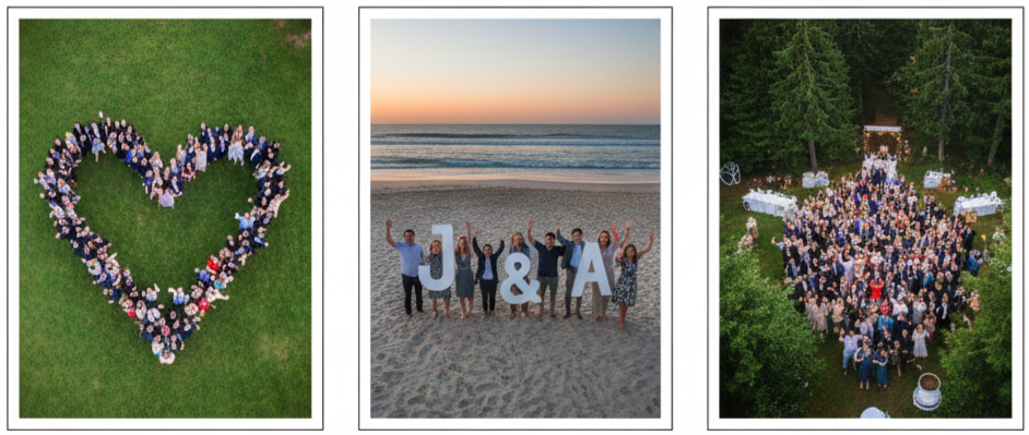
- Why It’s A Must: Drone shots give your wedding album a cinematic feel and show the full scene from a unique angle.
- What We Can Do: Guests forming a heart, waving, holding signs, or even creating initials.
- Things To Confirm: Make sure your venue allows drones and check local rules before planning this shot.
Mirror and Reflection Angles
- Why It’s A Must: Reflection photos feel artistic and modern, and they give your album variety beyond standard angles.
- Where It Works: Mirrors in bridal suites, windows, shiny floors, puddles after rain, or even reflective décor pieces.
- How To Make It Natural: We can use reflection shots during calm moments like getting ready or during couple portraits.
Sunset Silhouette Snaps
- Why It’s A Must: Sunset silhouettes are romantic, dramatic, and naturally beautiful without needing extra props.
- What Makes It Work: Strong backlighting from the sun and a clean horizon line.
- Fun Ways To Pose: A kiss, a lift, holding hands, a slow dance, or even a playful spin creates a great silhouette.
Sparkler Send-Off Magic
- Why It’s A Must: A sparkler exit looks magical in photos and gives you a grand, joyful ending shot.
- How To Plan It: We should give guests a clear cue to light sparklers at once to avoid gaps and delays.
- Safety Tip: Use longer sparklers so the moment lasts longer and doesn’t feel rushed.
Tips for Capturing Fun Wedding Moments
We don’t have to over-plan every shot to get fun photos, but we do need a little structure so the day flows smoothly and nothing gets missed. Fun wedding photos work best when everyone feels relaxed and your photographer has space to catch moments naturally. A quick shot list helps your photographer understand what matters most to you, especially if you’re excited about confetti tosses, jump shots, or a sparkler exit. It also helps to give your wedding party a heads-up, since the best fun photos happen when your friends and family feel confident being themselves. Props, timing, and lighting all matter too, but the biggest difference comes from your energy. When you stay present and enjoy the moment, your photos will reflect it.
- What To Do First: Choose a photographer who shoots candid moments and knows how to work quickly during fast-paced wedding timelines.
- What To Share With Them: A short list of your must-have fun shots, plus any props or special moments you already planned.
- What To Tell Your Wedding Party: Encourage them to relax, stay playful, and be open to spontaneous photos.
- What To Build Into Your Timeline: A few minutes here and there for creative shots so you don’t feel rushed between formal events.
Conclusion
Your wedding photos should feel like your day—not a staged version of it. These fun wedding photo ideas give you more than pretty pictures. They create memories you’ll actually feel every time you look back at them. Whether it’s a spontaneous laugh, a champagne spray, a photobomb, or a sparkler exit, the best images always come from moments that feel real and full of life. When we focus on joy, movement, and personality, your album becomes a story you’ll never get tired of revisiting.
Key Takeaway: Fun wedding photos are the ones that capture real energy, genuine connection, and the little moments that make your wedding day feel unforgettable.
FAQs
Do we need to plan every fun photo idea in advance?
No. Planning a few key moments works well, and spontaneous photos usually bring the best results. We recommend sharing only your top favorites with your photographer so everything still feels natural.
What if our wedding party feels awkward posing for playful photos?
That’s normal. The easiest way to get great shots is to keep things simple, give one clear idea, and let everyone react naturally. The laughter that happens in between is usually the best part.
Can we do these photo ideas without a big wedding venue?
Yes. Fun wedding photos aren’t about the size of the space. We can use small outdoor areas, a driveway, a quiet corner, or even your reception floor to create fun and meaningful shots.
How do we make sure guests cooperate for group fun photos like confetti or drone shots?
A quick announcement from your coordinator or DJ works best. Guests just need clear timing and simple instructions. When they know what to do, the photo comes together quickly.
What’s the best way to capture fun photos at night?
Good lighting and timing matter most. Sparkler exits, glow sticks, string lights, and uplighting all make night photos look amazing. Your photographer can adjust settings, and we can plan the moment so it doesn’t feel rushed.
15 Tips To Plan A Perfect Vintage Wedding Blog06
| Era | Style Highlights | Common Colors | Music Style |
| 1920s | Art Deco, beading, glam | Gold, black, ivory | Jazz, swing |
| 1950s | Tea-length dresses, lace, pearls | Pastels, navy, white | Rockabilly, Motown |
| 1970s | Boho, flowing fabrics, florals | Earth tones, rust, cream | Folk, classic rock |
Choose Your Vintage Era Wisely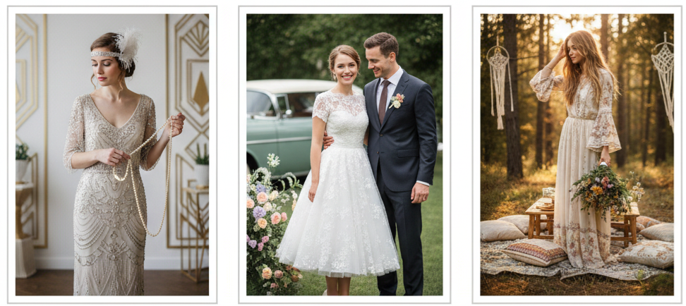
- Pick A Decade: Every vintage wedding starts with choosing an era that feels like you. Maybe you love the sparkle of the 1920s, the soft romance of the 1950s, or the carefree energy of the 1970s. Once we lock in a decade, it becomes much easier to create a wedding that feels intentional instead of random.
- Stay Consistent: A clear era keeps everything aligned, from your invitations and outfits to your décor and music. That consistency is what makes the wedding feel like a true throwback experience rather than a mix of vintage pieces that don’t belong together.
- Match Your Personality: We always recommend choosing an era that fits your personality and comfort level. Some decades feel bold and dramatic, while others feel warm, simple, and relaxed.
Select a Venue That Matches the Theme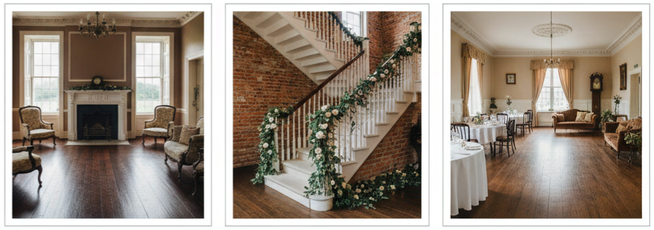
- Look For Real Character: A vintage theme works best when the venue already has charm built into it. Think historic buildings, old estates, refurbished barns, gardens, antique hotels, or theaters. Those spaces naturally give you the mood you want without needing heavy decorations.
- Use The Venue’s Details: Features like original wood floors, antique lighting, brick walls, vintage staircases, and grand fireplaces do a lot of the visual work for you. Instead of covering them up, we want to highlight them.
- Keep It Practical: While a venue should look great, it also needs to be functional. Make sure the space fits your guest count and offers enough areas for dining, dancing, and quiet conversation.
Send Invitations With a Retro Touch
- Set The Tone Early: Invitations are your first chance to tell guests what kind of wedding you’re planning. Vintage invitations immediately create excitement because they feel special and unexpected.
- Use Authentic Styling: Go for paper textures, older-style fonts, muted tones, and classic details like wax seals or lace-style patterns. These small choices instantly feel nostalgic.
- Add Personal Touches: If you want your invitations to feel even more personal, include handwritten addresses or add a simple vintage-style insert card with details like a dress code or music theme.
Dress in Vintage-Inspired Wedding Attire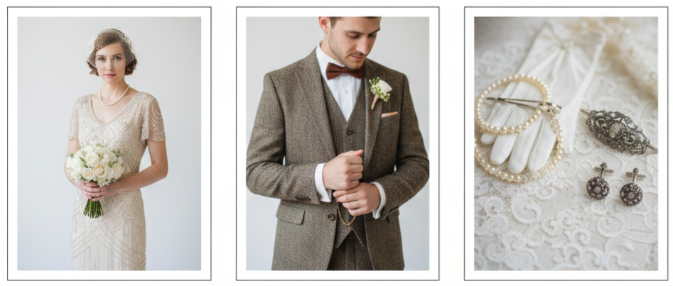
- Choose An Era-Appropriate Dress: Vintage bridal styles vary a lot depending on the decade. A 1920s look might include beading and a drop waist, while a 1950s style leans toward a cinched waist and softer lace. A 1970s look usually includes flowing sleeves and boho textures.
- Style The Groom Too: The groom’s outfit matters just as much for the theme. Suspenders, vests, tweed suits, bow ties, pocket watches, and classic loafers all bring the era to life.
- Use Accessories To Elevate The Look: It’s usually the accessories that make the outfit feel truly vintage. Gloves, brooches, pearls, birdcage veils, antique hair clips, and old-style cufflinks pull everything together without needing an entirely vintage wardrobe.
Incorporate Antique Decor Elements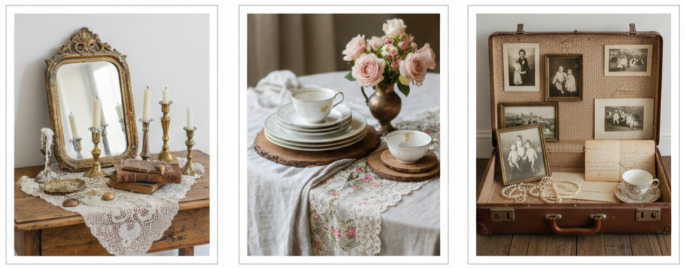
- Add True Vintage Pieces: This is where the wedding starts looking like a movie scene. Antique mirrors, stacked books, brass candleholders, lace runners, and vintage frames can transform even a simple setup.
- Mix Textures And Layers: Vintage décor looks best when it feels collected over time. Combine lace with wood, brass with florals, and old paper with soft fabrics for a more natural and lived-in look.
- Use Meaningful Items: We love when couples include family heirlooms like old photos, passed-down china, or vintage suitcases. Those pieces look beautiful and make the wedding feel more personal.
Add Charm With Vintage Furniture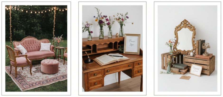
- Create Lounge Spaces: Vintage furniture makes the wedding feel cozy and inviting. A velvet loveseat, antique chairs, or a tufted sofa creates a relaxed area where guests can take breaks from the dance floor.
- Use Furniture As Decor: A vintage desk can become your guestbook station. A vanity table can display desserts. An antique dresser can hold candles, photos, or favors. When furniture serves double purpose, it makes the design stronger and more efficient.
- Rent Or Borrow Strategically: Renting vintage furniture is easier than buying everything. If budget is tight, borrow a few statement pieces and style them with smaller vintage accents.
Pick a Nostalgic Color Palette
- Stick To Soft Shades: Vintage color palettes usually look best in muted tones. Dusty rose, sage, champagne, ivory, and faded blue are popular because they feel timeless and romantic.
- Add A Rich Accent: To keep the look from feeling too pale, include one deeper tone like navy, rust, burgundy, or antique gold. That contrast makes your décor and photos look richer.
- Keep Everything Coordinated: Your palette should carry through your florals, linens, outfits, signage, and table settings. We don’t want every detail to be perfectly matched, yet we do want the tones to belong together.
Use Floral Arrangements That Reflect the Time Period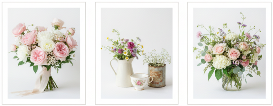
- Choose Romantic Blooms: Garden roses, peonies, wildflowers, and baby’s breath work beautifully for vintage weddings because they feel soft and classic.
- Use Unique Containers: Instead of modern vases, try teacups, milk glass, antique tins, or ceramic pitchers. These pieces instantly communicate vintage style even with simple flowers.
- Keep Arrangements Natural: Vintage florals usually look best when they aren’t overly structured. Loose bouquets and slightly wild arrangements feel authentic and charming.
Feature Music That Matches the Era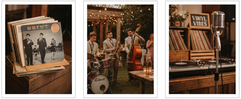
- Build A Theme Playlist: Music shapes how your wedding feels. Jazz and swing set the tone for a 1920s theme, Motown brings life to a 50s or 60s celebration, and folk or classic rock fits a 70s vibe.
- Use Live Music When Possible: A small jazz group or acoustic band creates instant atmosphere. Even during cocktail hour, vintage music makes the setting feel more immersive.
- Add Vintage Elements To The Setup: A vinyl DJ, record displays, or an old-style microphone adds both sound and style to your reception space.
Design a Cake With Timeless Elegance
- Choose Classic Finishes: Buttercream with delicate piping, lace patterns, pearl accents, or floral designs feels timeless and matches most vintage themes.
- Use Vintage Toppers: Porcelain figurines, old-style monograms, or even pressed flowers create a charming vintage look without making the cake feel overly trendy.
- Keep It Tasteful And Clean: A vintage cake looks best when it feels elegant and simple, not overloaded with decorations. The goal is classic beauty that fits the wedding mood.
Serve Food and Drinks With a Vintage Flair
- Offer Nostalgic Food Options: Tea sandwiches, mini tarts, classic pastries, and plated meals with traditional flavors all fit beautifully into a vintage wedding vibe.
- Create A Signature Cocktail Menu: Vintage-themed drinks like the French 75, Old Fashioned, Manhattan, or Mint Julep feel fun and classy. Pair them with stylish menu cards in vintage frames.
- Style The Presentation: Even basic food feels vintage when served on china, silver trays, or tiered stands. Presentation matters just as much as what you serve.
Arrive in Retro Transportation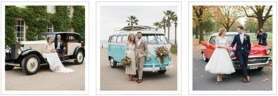
- Choose A Statement Vehicle: A vintage car makes a dramatic entrance and creates incredible photos. Rolls-Royces, Bentleys, classic Cadillacs, and retro convertibles all fit beautifully depending on your theme.
- Match The Era: A VW bus works well for a boho wedding, while a luxury classic car fits a 1920s or 1950s theme. We want the transportation to look like it belongs in your chosen decade.
- Use It For Photos Too: Even if you don’t ride in it for the full day, a vintage vehicle makes a stunning photo backdrop.
Set Up a Period-Style Photo Booth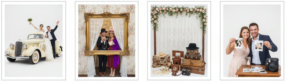
- Use Era-Friendly Props: Rotary phones, gloves, pearls, hats, old cameras, feather boas, and vintage suitcases make the photo area feel authentic.
- Pick The Right Backdrop: Lace curtains, vintage wallpaper, floral arches, or framed fabric panels look great and photograph well.
- Offer Instant Prints: Polaroid cameras or instant photo printers give guests something fun to take home and keep the experience interactive.
Use Handwritten Signage and Vintage Charts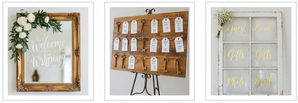
- Choose Handcrafted Displays: Chalkboards, mirrors, old window frames, wooden boards, and framed paper signs look far more vintage than modern prints.
- Add Creative Seating Charts: We can attach guest names to vintage keys, postcards, luggage tags, or mini envelopes pinned to a board. Seating charts become a design feature when they match the theme.
- Keep Fonts And Layout Consistent: Your signage should follow your invitation style so everything feels unified.
Offer Vintage-Inspired Wedding Favors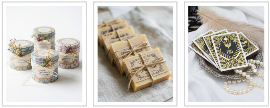
- Give Guests Something Useful: Tea tins, handmade soaps, mini candles, jam jars, or matchbooks are fun favors that guests actually enjoy.
- Package Them Properly: Presentation makes a big difference. Use kraft paper, lace ribbon, muslin bags, or old-style labels to keep the look consistent.
- Make It Feel Intentional: Vintage favors are most memorable when they tie into your theme. A tea favor works well with a garden wedding, while matchbooks fit beautifully with a 1920s theme.
Conclusion
A vintage wedding feels special because it tells a story through every detail. When we choose an era and stick to it, the wedding feels cohesive, thoughtful, and beautiful from start to finish. From your venue and attire to music and décor, the goal is to create a celebration that feels timeless, warm, and personal. The best vintage weddings blend nostalgia with creativity, giving guests an experience that feels unique while still honoring the past.
Key Takeaway: A perfect vintage wedding comes down to consistency. When every element reflects your chosen decade, the theme feels natural, immersive, and unforgettable.
FAQs
How do we find vintage clothing without spending too much?
Thrift stores, estate sales, and vintage rental shops are great starting points. Online marketplaces also offer a wide variety of vintage-inspired pieces, and many modern bridal stores sell dresses that borrow vintage elements without the high price of true antiques.
How do we decorate with vintage pieces without making the space feel cluttered?
Pick a few statement pieces and build around them instead of filling every surface. A vintage mirror, antique candleholders, and a single lounge setup can set the mood without crowding the room. Leaving space between items keeps the look clean and elegant.
What’s a simple way to make a modern venue feel vintage?
Use vintage-style lighting, antique-inspired table settings, and layered textures like lace or linen. Add a few key décor pieces such as framed signage, old books, and brass accents. A strong color palette also makes a huge difference.
Do we need a wedding planner for a vintage theme?
A planner is helpful when sourcing rentals, coordinating décor, and keeping the theme cohesive. If you plan everything yourself, staying organized and choosing vendors who understand vintage styling will make the process much smoother.
What are some vintage guest activities besides a photo booth?
A typewriter guestbook station, postcard-writing table, or classic lawn games like croquet and ring toss fit beautifully into a vintage theme. These activities also give guests more ways to interact and enjoy the celebration.
15 Fabulous Ideas To Decorate Your Wedding Chairs 2014 Blog26
| Wedding Theme | Chair Decoration Idea |
| Rustic | Burlap Wraps with Twine |
| Bohemian | Macramé Chair Backs |
| Romantic | Sheer Tulle Drapes |
| Vintage | Lace Covers with Pearl Pins |
| Modern | Acrylic Name Tags or Signs |
| Garden | Floral Garland Wraps |
| Beach | Seashell or Starfish Accents |
| Classic/Formal | Chair Covers with Satin Sashes |
| DIY/Whimsical | Pompom or Paper Flower Garlands |
| Seasonal (Fall/Winter) | Mini Wreaths or Pinecone Details |
Floral Garland Wraps for Natural Elegance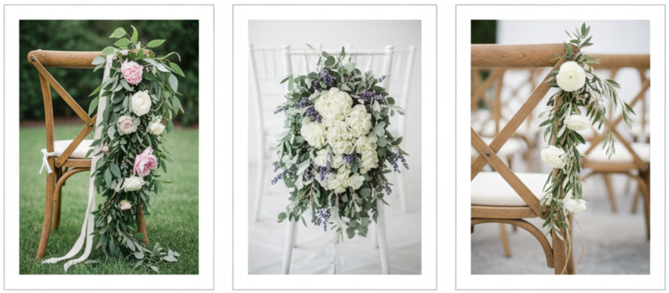
- Why It Works: Floral garlands instantly make plain chairs look lush and wedding-ready, especially in outdoor venues.
- Best Look: Drape a garland across the top of the chair back or let it cascade down one side for a soft, romantic effect.
- Style Tip: Use greenery like eucalyptus or olive branches mixed with roses, peonies, or hydrangeas to match your bouquet and table florals.
- Where It Fits: This looks especially beautiful on chiavari chairs or cross-back chairs because the design supports the weight of the garland and keeps it from slipping.
Personalized Name Tags for a Custom Touch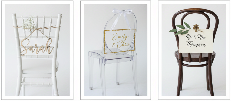
- Why It Works: Personalized name tags add a sweet detail while also functioning as seating assignments, which makes them both cute and practical.
- Best Look: Attach wooden cutouts, acrylic name signs, or calligraphy cards to the chair back using ribbon, twine, or floral clips.
- Style Tip: Keep the font consistent with your invitations and signage to make everything feel like one coordinated design.
- Where It Fits: This works best for smaller weddings where guests will notice and appreciate the personal touch, and it also looks great in photos.
Ribbons and Streamers to Add Movement and Color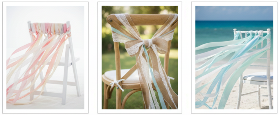
- Why It Works: Ribbons give your setup movement and energy, especially when there’s a breeze. They also add color without requiring a huge budget.
- Best Look: Tie satin or organza ribbons in your wedding colors and let the ends trail down the chair back.
- Style Tip: Mix ribbon widths and textures for a layered, styled look instead of using one ribbon type across every chair.
- Where It Fits: Outdoor ceremonies, beach weddings, garden venues, and any wedding where you want a soft, flowing effect.
Vintage Lace Covers for a Soft, Romantic Feel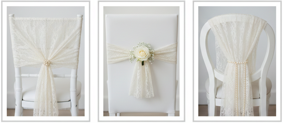
- Why It Works: Lace adds instant charm. It feels delicate, romantic, and timeless, especially if your theme leans vintage or classic.
- Best Look: Slip lace covers over the chair back or wrap lace fabric around the seat and tie it neatly.
- Style Tip: Add pearl pins or a small floral clip in the center to make the design look intentional and polished.
- Where It Fits: This works best in vintage, shabby chic, and rustic-romantic themes, especially when paired with soft florals and candlelight.
Miniature Wreaths for Seasonal Style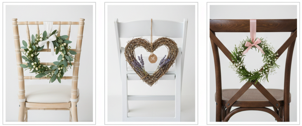
- Why It Works: Mini wreaths are cute, easy to personalize, and work in any season. They also create a cozy, welcoming look.
- Best Look: Hang small wreaths made from greenery, lavender, rosemary, or grapevine on the chair back using ribbon or twine.
- Style Tip: You can add a small name card, initials, or a tiny bow that matches your wedding color palette.
- Where It Fits: Rustic weddings, seasonal weddings, outdoor venues, and even indoor weddings that want a natural touch.
Burlap and Twine Accents for Rustic Weddings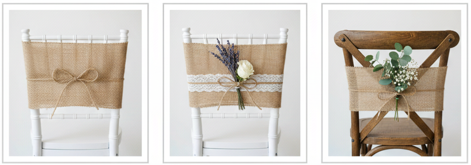
- Why It Works: Burlap and twine instantly set a rustic tone, and they’re one of the easiest decorations to DIY.
- Best Look: Wrap a wide strip of burlap around the chair back and tie twine into a clean bow or knot.
- Style Tip: If you want a softer look, add lace trim or tuck in a few dried flowers or wild blooms.
- Where It Fits: Barn weddings, backyard weddings, country venues, and rustic garden celebrations.
Monogrammed Chair Covers for a Signature Look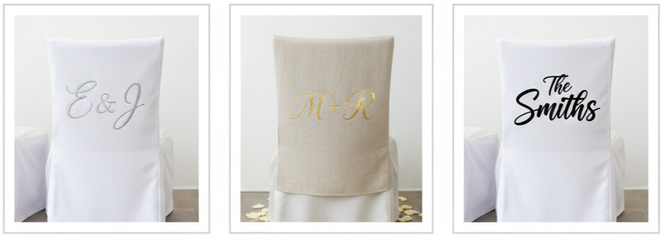
- Why It Works: Monogrammed chair covers feel personal and elevated, especially for the couple’s chairs.
- Best Look: Use covers in neutral tones like ivory, beige, or white and add initials in embroidery, vinyl, or elegant lettering.
- Style Tip: Keep the monogram simple and clean so it feels timeless and doesn’t overpower your other decor.
- Where It Fits: Sweetheart tables, head tables, formal venues, and weddings with a refined or classic theme.
Hanging Mason Jars with Flowers for DIY Flair
- Why It Works: Mason jars add charm, texture, and an easy DIY look that fits perfectly with rustic and outdoor weddings.
- Best Look: Hang jars from chairs using ribbon, twine, or wire, then fill them with baby’s breath, lavender, wildflowers, or small seasonal blooms.
- Style Tip: For evening receptions, swap flowers for fairy lights or add a battery tea light inside for a soft glow.
- Where It Fits: Garden weddings, rustic receptions, casual outdoor celebrations, and backyard venues.
Sheer Tulle Drapes for Soft Sophistication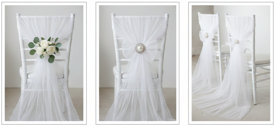
- Why It Works: Tulle creates a dreamy, airy look without costing much. It also makes chairs look softer and more romantic.
- Best Look: Drape tulle across the chair back, tie it into a loose bow, or let it trail slightly for a more dramatic effect.
- Style Tip: Add a brooch, pearl pin, or a small floral cluster where the fabric gathers to keep it neat and photo-ready.
- Where It Fits: Ballroom weddings, classic venues, romantic themes, and any setup where you want softness and elegance.
Macramé Chair Backs for Boho Vibes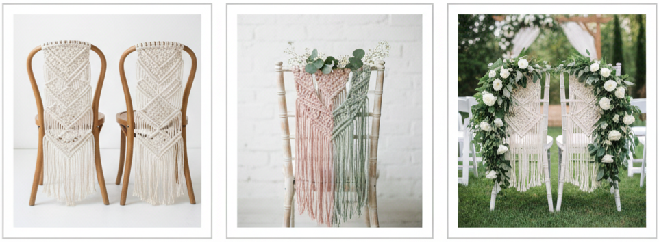
- Why It Works: Macramé adds texture and personality. It feels handcrafted, relaxed, and stylish without looking too formal.
- Best Look: Hang macramé panels over the backs of chairs, especially for the bride and groom or ceremony aisle seating.
- Style Tip: Use natural cord for a classic boho look or choose dyed pieces in muted tones that match your palette.
- Where It Fits: Bohemian weddings, beach weddings, forest weddings, desert venues, and backyard celebrations with earthy decor.
Chair Signs with Mr. & Mrs. for a Classic Statement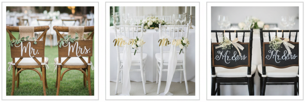
- Why It Works: Chair signs are simple, recognizable, and instantly create a focal point at the sweetheart table or head table.
- Best Look: Hang “Mr. & Mrs.” signs made of wood, acrylic, metal, or chalkboard directly onto the chair backs.
- Style Tip: Add ribbon tails or a small floral detail to tie the signs into the rest of the wedding decor.
- Where It Fits: Sweetheart table setups, formal receptions, rustic weddings, and any celebration where you want a clear couple centerpiece.
Seasonal Touches to Reflect the Date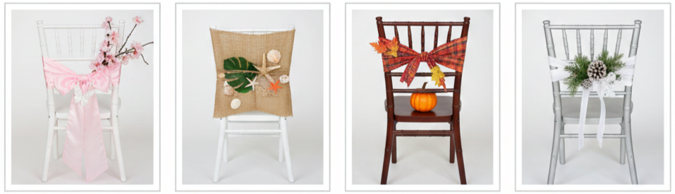
- Why It Works: Seasonal chair decor makes your wedding feel thoughtful and tied to the time of year, which makes everything feel more intentional.
- Best Look: Add small seasonal accents like these:
- Spring: pastel bows, butterflies, cherry blossoms
- Summer: seashells, starfish, tropical leaves
- Fall: mini pumpkins, autumn leaves, plaid fabric
- Winter: pinecones, evergreen sprigs, snowflake ornaments
- Style Tip: Keep seasonal accents small and neat so they feel like a detail, not a distraction.
- Where It Fits: Seasonal weddings, outdoor ceremonies, rustic venues, and couples who want a theme that feels personal.
Fabric Swags with Brooches for Glamorous Detail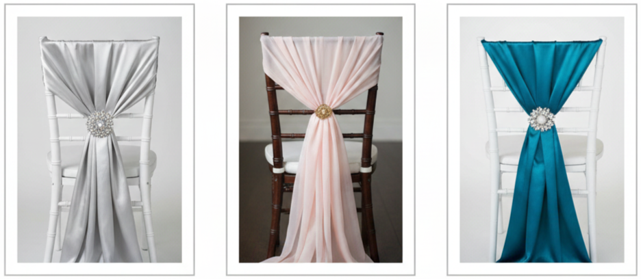
- Why It Works: Fabric swags give your chairs a luxurious, event-style look. They’re dramatic and elegant without requiring full chair covers.
- Best Look: Loop satin, organza, or silk across the chair back and secure the center with a jeweled brooch or decorative pin.
- Style Tip: Choose fabric that matches your table linens so the whole reception looks balanced and coordinated.
- Where It Fits: Formal weddings, black-tie receptions, ballroom venues, and glamorous themes.
Pompom or Paper Flower Garlands for Whimsical Touch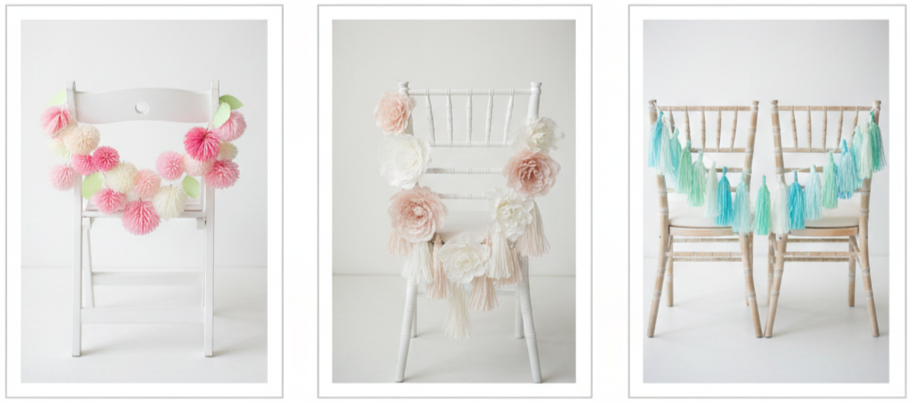
- Why It Works: These are playful, colorful, and budget-friendly. They’re also easy to customize for any color palette.
- Best Look: String tissue pompoms, paper flowers, or tassels across chair backs and keep the garland light so it hangs naturally.
- Style Tip: Mix two to three shades instead of using a rainbow of colors so your design still feels polished.
- Where It Fits: Casual weddings, outdoor celebrations, garden venues, and DIY wedding styles.
Chair Covers with Sashes for Timeless Elegance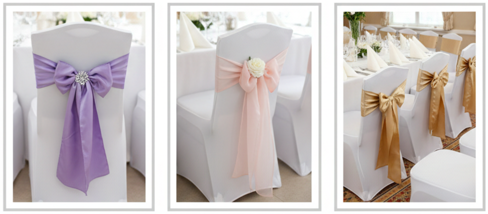
- Why It Works: This is the most classic chair styling option, and it instantly makes banquet chairs look formal and clean.
- Best Look: Use fitted chair covers and tie satin or organza sashes into bows or clean knots.
- Style Tip: Add a small floral clip or a decorative pin to the sash knot so the chair looks more upgraded and less “standard rental.”
- Where It Fits: Hotel receptions, banquet halls, formal indoor weddings, and venues where chairs need a polished finish.
Conclusion
Wedding chair décor might seem like a small detail, yet it changes the entire feel of your ceremony and reception. Chairs take up a huge part of your wedding space, and when they look styled, the whole venue feels more complete. Whether you love soft tulle drapes, rustic burlap wraps, boho macramé, or classic chair covers with sashes, each option adds personality to your wedding and keeps the design consistent from every angle. The best part is that you can keep things simple or go all out depending on your budget, theme, and how much time you want to spend on setup.
Key Takeaway: Wedding chair decorations are one of the easiest ways to make your venue look more intentional, more polished, and more connected to your theme, all while giving guests something beautiful to enjoy throughout the day.
FAQs
What’s the easiest chair decoration to DIY?
Ribbons and burlap wraps are the easiest options because they take almost no tools and still look stylish. You can pre-cut your materials, tie them on quickly, and adjust them without stress.
Do we need to decorate every single chair?
No, decorating every chair isn’t required. Many couples focus only on ceremony aisle chairs, the couple’s chairs, or the head table seating to keep the look balanced while saving time and cost.
How do we keep floral chair decorations from wilting?
Choose hardy flowers like carnations or greenery like eucalyptus. Keep the flowers cool until setup time, and avoid placing them in direct sunlight for too long.
Can chair decorations be reused between the ceremony and reception?
Yes, as long as the decor is easy to detach and move. Assign a helper or coordinator to transfer decorations during the cocktail hour so everything stays organized and smooth.
Are chair decorations still worth it if the tables already have centerpieces?
Yes, because chairs fill the space in a different way than table décor. Chair styling helps your ceremony and reception feel cohesive, especially in wide-angle photos and guest-facing views.
10 Perfect Trending Wedding Color Combination Ideas For 2014 Brides Blog11
| Color Combination | Best Season |
| Blush Pink & Gold | Spring, Summer |
| Navy Blue & Coral | Summer, Fall |
| Mint Green & Peach | Spring, Summer |
| Plum & Gray | Fall, Winter |
| Aqua & Lemon Yellow | Summer |
| Champagne & Ivory | All Seasons |
| Emerald & Cream | Winter, Fall |
| Coral & Teal | Spring, Summer |
| Lavender & Gray | Spring |
| Black, White & Gold | Winter, Fall |
Blush Pink and Gold: Romantic Meets Glamorous
- Why Brides Loved It: Blush pink and gold was one of the most popular wedding color combinations for 2014 brides because it felt soft, romantic, and elevated at the same time. Blush brought a gentle, dreamy look that worked beautifully in photos, while gold added a polished finish that made everything feel more formal.
- Best Wedding Styles For This Palette: This combination fit perfectly in garden weddings, vintage-inspired celebrations, and classic ballroom receptions. Brides used it when they wanted a warm, welcoming setting that still felt elegant.
- How It Showed Up In Décor: Bridesmaids often wore blush dresses with gold jewelry, and wedding décor leaned into gold-rimmed glassware, metallic candle holders, sequined table runners, and blush florals in soft arrangements. Many couples paired this palette with neutral shades like ivory or beige so the overall design felt cohesive rather than overly pink.
Navy Blue and Coral: Bold With a Splash of Fun
- Why Brides Loved It: Navy and coral gave weddings a balanced contrast that looked fresh and modern. Navy brought depth and tradition, while coral added brightness and energy. Brides in 2014 loved this palette because it felt bold without becoming too loud.
- Best Wedding Styles For This Palette: This pairing worked especially well for coastal weddings, nautical themes, outdoor ceremonies, and destination receptions. Couples also used it for spring and summer weddings because coral naturally matched seasonal flowers.
- How It Showed Up In Décor: Navy suits for groomsmen paired well with coral ties, pocket squares, or boutonnieres. Coral centerpieces stood out beautifully against navy linens. Stationery often used navy fonts with coral accent borders, and wedding cakes featured coral florals or navy detailing that made the design stand out.
Mint Green and Peach: Soft, Sweet, and Fresh
- Why Brides Loved It: Mint and peach became a go-to pastel pairing in 2014 because it felt light, playful, and romantic. Mint created a refreshing base, and peach added warmth without overpowering the softness of the palette.
- Best Wedding Styles For This Palette: Brides used this color combination for rustic barn weddings, outdoor garden events, spring ceremonies, and casual receptions with a bright, airy vibe. It also worked well for couples who wanted a pastel theme without relying on pink.
- How It Showed Up In Décor: Mint appeared through bridesmaid dresses, table runners, and small décor details like painted signage or jars. Peach was usually introduced through floral arrangements with roses, ranunculus, or dahlias. Couples also carried this palette into dessert tables through peach macarons, mint cupcakes, or patterned candy displays that matched the theme.
Plum and Gray: Rich, Deep, and Elegant
- Why Brides Loved It: Plum and gray offered a deeper, more mature wedding palette that still felt stylish and romantic. Plum created a dramatic focal point, while gray provided a smooth neutral that tied the entire look together. Brides loved this pairing for its elegance and seasonal versatility.
- Best Wedding Styles For This Palette: This combination fit fall and winter weddings especially well. It also worked for formal evening receptions, historic venues, and indoor ceremonies where lighting and décor could highlight rich tones.
- How It Showed Up In Décor: Bridesmaids often wore plum dresses, while groomsmen wore gray or charcoal suits. Tables were decorated with plum-toned florals, gray linens, and accents in silver or lavender. Stationery frequently used gray as the base with plum fonts or borders, creating a polished look that felt cohesive from the invitation to the reception.
Aqua and Lemon Yellow: Bright and Breezy
- Why Brides Loved It: Aqua and lemon yellow felt cheerful, sunny, and energetic. Brides who wanted a fun summer vibe leaned into this palette because it instantly made a wedding feel more upbeat and welcoming. The colors also photographed beautifully in natural light.
- Best Wedding Styles For This Palette: This pairing worked best for summer weddings, beach ceremonies, backyard events, and destination celebrations. Couples used it when they wanted something vibrant that still felt clean and fresh.
- How It Showed Up In Décor: Décor often featured aqua glass vases with lemon-yellow flowers, bright napkins paired with aqua plates, and signage with playful fonts. Brides also tied this palette into details like cocktail garnishes, dessert styling, and even bridal party accessories, such as aqua jewelry paired with yellow dresses.
Champagne and Ivory: Timeless and Elegant
- Why Brides Loved It: Champagne and ivory created a classic wedding look that felt refined without relying on bold color. Brides in 2014 leaned into this palette when they wanted the entire wedding to feel graceful, formal, and timeless. It also worked well for couples who preferred neutral wedding photography and elegant styling.
- Best Wedding Styles For This Palette: This combination suited traditional weddings, formal ballroom receptions, church ceremonies, and upscale venues with historic architecture. It also paired naturally with crystal décor, vintage elements, and soft floral designs.
- How It Showed Up In Décor: Brides wore ivory gowns with champagne accents like satin sashes or soft beading. Floral arrangements often featured ivory roses, cream peonies, and neutral greenery. Table décor included champagne linens, ivory candles, and layered textures that made the design feel luxurious without needing strong contrast.
Emerald and Cream: Bold With a Touch of Softness
- Why Brides Loved It: Emerald continued trending into 2014 because it offered a rich, luxurious tone that felt modern and dramatic. When paired with cream, it created a balanced look that stayed elegant and romantic instead of overly heavy. Brides loved how this palette made décor look expensive and intentional.
- Best Wedding Styles For This Palette: Emerald and cream worked well for winter weddings, black-tie receptions, formal indoor venues, and evening ceremonies. It also suited couples who wanted a jewel-tone theme without using darker shades like black or burgundy.
- How It Showed Up In Décor: Emerald was often used in velvet table runners, bridesmaid dresses, and bold floral accents. Cream softened the look through candles, neutral flowers, and lace textures. Many couples also brought in gold accents alongside this palette to elevate the overall design even further.
Coral and Teal: Fun, Bright, and Unique
- Why Brides Loved It: Coral and teal created a lively, eye-catching pairing that felt creative and expressive. Brides chose it because it gave their wedding a playful personality while still looking cohesive in décor and photos. It also allowed couples to build colorful floral arrangements that felt vibrant and modern.
- Best Wedding Styles For This Palette: This pairing worked beautifully for beach weddings, boho themes, tropical-style celebrations, and DIY receptions. Couples also used it for spring and summer weddings where brighter tones naturally fit the season.
- How It Showed Up In Décor: Teal linens and coral flowers created a strong visual contrast. Bridesmaids sometimes wore mix-and-match dresses in both shades, and stationery often featured watercolor designs. Couples also brought the colors into photo booth props, cocktail styling, and dessert displays to keep the theme consistent.
Lavender and Gray: Light and Dreamy
- Why Brides Loved It: Lavender and gray created a soft, romantic mood that felt calm and timeless. Lavender added a gentle wash of color, while gray made the palette feel more polished and sophisticated. Brides loved this pairing because it felt delicate without looking overly sweet.
- Best Wedding Styles For This Palette: This combination worked best for spring weddings, garden ceremonies, countryside venues, and outdoor receptions. It also fit well with rustic décor, floral-heavy designs, and weddings that wanted a peaceful atmosphere.
- How It Showed Up In Décor: Couples used lavender in bouquets, centerpieces, and bridesmaid gowns. Gray appeared in suits, table linens, and stationery. Many weddings also included lavender-scented favors or floral accents to reinforce the theme in small details that guests noticed.
Black, White, and Gold: Classic Meets Glam
- Why Brides Loved It: Black, white, and gold became a statement palette for brides who wanted a formal, high-impact wedding. Black and white created a timeless base, and gold brought luxury through metallic accents. This combination also worked across every detail, from fashion to décor to lighting.
- Best Wedding Styles For This Palette: This trio worked best for black-tie weddings, formal evening receptions, upscale hotel venues, and city weddings. Couples used it when they wanted a dramatic aesthetic with bold contrast and clean styling.
- How It Showed Up In Décor: Stationery featured gold embossing with black and white fonts. Groomsmen wore tuxedos, tables used gold chargers and black accents, and wedding cakes often included gold leaf detailing. Some couples also added black-and-white dance floors or modern lighting to enhance the glam feel.
Tips for Picking a Color Scheme That Works
Choosing a wedding palette is more than picking colors that look pretty together. Brides in 2014 found success by matching their palette to their venue, season, and overall vibe. A soft pastel palette looks natural outdoors in spring, while richer tones feel stronger in indoor evening receptions. Couples also made smarter decisions by thinking through flowers and décor availability early on. A cohesive palette works best when it shows up consistently throughout the wedding in small details, not just one or two décor items.
- Venue Compatibility: Choose colors that complement your venue’s walls, flooring, and lighting so the palette looks intentional.
- Seasonal Influence: Select tones that match the season naturally, such as mint and peach for spring or plum and gray for fall.
- Floral Availability: Confirm that your preferred flowers come in the shades you want so you do not need to force substitutions late.
- Bridal Party Coordination: Consider how the colors will look on dresses, suits, and accessories in photos and real lighting.
- Theme Consistency: Keep the same palette across stationery, décor, florals, and table styling so everything feels connected.
Conclusion
The wedding color combinations that trended in 2014 became popular because they gave brides a strong mix of style, personality, and timeless appeal. From blush and gold to black, white, and gold, each palette offered a different mood while still feeling elegant and photogenic. Brides who chose these combinations created weddings that looked polished from every angle because the colors worked consistently across outfits, flowers, décor, and paper details. These trends continue to inspire modern weddings because they provide flexible options that still feel fresh.
Key takeaway: The strongest wedding color palette is one that reflects your personality, fits your season and venue, and stays consistent across every detail from attire to décor.
FAQs
What’s the easiest way to keep wedding colors looking consistent in photos?
Choose one dominant color and repeat it through bridal party outfits, florals, and table décor. Keeping lighting consistent and using the same shades across details makes photos look more cohesive.
How do we choose wedding colors that look good with the venue’s existing décor?
Start by identifying the venue’s dominant tones, such as wood finishes, wall colors, and lighting. Then choose a palette that complements those features rather than fighting them.
What colors work best when we want a wedding that feels modern, not overly traditional?
Navy and coral, coral and teal, and black, white, and gold were popular in 2014 because they felt current and stylish while still looking formal.
How do we make pastel colors look elegant instead of childish?
Pair pastel shades with metallic accents, neutral linens, and structured styling. Pastels like mint, peach, blush, and lavender look more refined when balanced with gold, gray, ivory, or champagne details.
What’s a smart way to add wedding colors without overusing them?
Use your main colors in key areas like floral arrangements, stationery, and bridesmaid attire, then keep everything else neutral. This approach keeps the palette visible without overwhelming the design.
10 Creative And Budget Friendly Diy Wedding Ideas.html
Blog post imported from: https://www.invitesweddings.com/b/10-creative-and-budget-friendly-diy-wedding-ideas.html
Autumn Maple Leaves Pocket Wedding Invitation Kits Inps077
| Item | Purpose |
| Main Invitation Card | Shares date, time, venue |
| Pocket Folder | Holds inserts neatly |
| RSVP Card | Guest response card |
| RSVP Envelope | Returns RSVP card |
| Details Insert | Adds extra event info |
| Belly Band/Ribbon (Optional) | Keeps set secured |
| Outer Envelope | Mailing envelope |
| Envelope Liner (Optional) | Adds style inside envelope |
| Seal/Sticker (Optional) | Decorative closure |
Why Fall-Themed Weddings Are a Fan Favorite
There’s something special about fall weddings. The cool air, the changing leaves, and the earthy color tones create a warm, romantic vibe that’s hard to match. Whether you’re exchanging vows in a rustic barn or a scenic vineyard, autumn gives your big day a naturally stunning backdrop. That’s exactly what makes the Autumn Maple Leaves Pocket Wedding Invitation Kits Inps077 such a perfect fit—they echo all the best parts of the season with elegance and ease.
How Invitations Set the Tone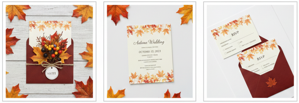
Your wedding invitation doesn’t just deliver the details—it gives guests their first impression of the day. It tells them what kind of experience to expect, whether it’s laid-back, formal, rustic, or sophisticated. With the Inps077 kit, you’re not just sending information—you’re setting a scene. The seasonal design and organized layout help your guests get excited and stay informed.
What’s Included in the Invitation Kit
Everything you need for a complete invitation suite comes with this kit, making your planning easier and more organized from the start.
- Main invitation card: Displays the essential event info—names, date, time, and location
- Pocket folder: Keeps your inserts organized and adds a clean, professional layout
- RSVP card with envelope: Lets guests reply easily and keeps your headcount accurate
- Details/reception insert: Includes extras like travel tips, dress code, or reception times
- Belly band or ribbon: Optional wraparound closure that pulls everything together
- Matching envelopes: Outer envelopes included, with upgrade options for printing and liners
Each item is crafted to match in style and tone, creating a seamless experience from the moment your guests open the envelope.
Ways You Can Customize Your Inps077 Kit
One of the standout features of this invitation kit is its customizability, letting you easily match your wedding’s exact style. 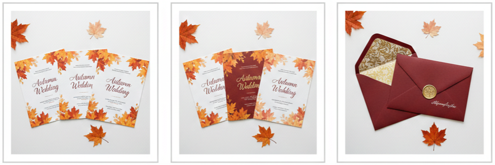
- Fonts and text styles: Choose from elegant script, classic serif, or clean modern options
- Color tweaks: Adjust the leaf tones to better match your chosen wedding palette
- Envelope details: Add liners, seals, or return address printing for a polished finish
- Wrap styles: Go with a belly band, ribbon, or seal that complements your decor
- Printed personalization: Include names and guest addresses to save time and keep things neat
These little tweaks go a long way in helping your invites reflect your unique personality and vision.
Perfect for DIYers and Budget-Savvy Couples
If you like to keep hands-on or you’re looking to save on stationery without losing out on quality, the Inps077 kit is a solid option. It’s easy to assemble and gives you that custom look without the custom price tag.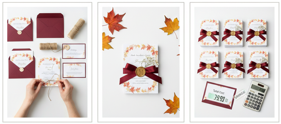
- Easy to assemble: Includes easy-to-follow instructions and doesn’t need any special tools
- DIY-friendly: Add your own ribbons, tags, or wax seals if you want to take it up a notch
- Budget-conscious: Gives a luxe appearance while staying cost-effective
- Bulk pricing available: Great for larger guest lists, with savings on higher quantities
This makes it a great pick for couples who want a personal touch in every part of their wedding without breaking the bank.
Tying the Invitations Into Your Wedding Decor
Your invitations can set the stage for the look and feel of the entire event. The autumn leaf theme and warm tones make it easy to coordinate the rest of your wedding decor to match.
- Table settings: Use leaf-inspired place cards, rustic napkin rings, or copper charger plates
- Floral arrangements: Choose fall blooms like mums, sunflowers, and dahlias to echo the color scheme
- Signage and print materials: Carry the theme through your ceremony programs, menus, and welcome signs
- Decor accents: Add lanterns, wooden signage, or burlap runners to keep the rustic vibe going
Keeping your theme consistent from invitation to reception makes the whole day feel thoughtful and tied together.
Conclusion
The Autumn Maple Leaves Pocket Wedding Invitation Kits Inps077 check every box for a fall wedding. They’re stylish, organized, and customizable, making them ideal for couples who want their wedding to feel warm, cohesive, and memorable. From the rich maple leaf design to the practical pocket layout, these kits bring together the best parts of fall and turn them into a polished first impression. Whether you’re keeping things casual or going full formal, these invitations are built to match your vision perfectly.
Key takeaway: The Inps077 kit brings fall wedding dreams to life with its seasonal design, easy customization, and thoughtful structure—all while staying stylish and stress-free.
FAQs
Can I order these invitations in smaller quantities for a small wedding?
Yes, many sellers offer minimum orders as low as 25 sets, which works great for micro-weddings or elopements.
Do the envelopes come with guest address printing options?
They do. Most vendors allow you to upload your guest list and have names and addresses printed directly on the envelopes.
Can I write on the invitations using metallic or gel pens?
Yes, the cardstock works well with metallic pens, calligraphy markers, and gel pens if you want to add handwritten details.
How long does it take to receive the full order?
It’s best to order at least 3–4 months before your wedding. That allows time for customization, shipping, and assembly.
Is there a way to preview the kit before placing a full order?
Absolutely. Ordering a sample is highly recommended so you can see the design and feel the materials before committing to a full purchase.
Austere Simple Wedding Invitation Iwi106
| Feature | Description | Available Choices |
| Text Personalization | Names, dates, RSVP info | Formal, casual, poetic |
| Font Selection | Style of lettering | Serif, sans-serif |
| Color Variations | Invitation and text colors | Neutral, pastel, deep tones |
| Envelope Options | Look and texture | Matte, textured, recycled |
| Add-Ons | Optional finishing touches | Wax seals, belly bands, liners |
Clean and Uncomplicated Design That Makes an Impact
The Austere Simple Wedding Invitation Iwi106 is everything modern couples look for when they want elegance without the extras. It features a soft, neutral palette—think white, beige, light gray—that brings a calm and clean look to the forefront. Instead of relying on over-the-top flourishes or flashy artwork, this design stays grounded in structure and space.
The layout is spaced out and easy to follow. Nothing feels crowded. The focus is on readability and style, from the couple’s names to the event details. What makes this invitation really shine is its typography. With either a classic serif or sleek sans-serif, the font does all the visual lifting, proving that sometimes less truly is more.
Why Minimalist Invitations Are Having Their Moment
More and more couples are choosing minimalist designs for their big day, and for good reason. These invitations say a lot without saying too much. They’re tasteful, timeless, and don’t distract from what the day is really about—celebrating love and connection.
- Simplicity keeps the message clear: Guests know exactly where to be and when without sorting through decorative clutter.
- Minimalist designs go with everything: Whether you’re having a beach wedding or a rooftop ceremony, the Iwi106 fits right in.
- They’re kind to your budget: Fewer layers, no foil, and clean lines often mean lower printing costs.
- Great for eco-conscious planning: Minimalism naturally uses fewer materials, making it an environmentally friendly option.
This design isn’t about skipping out on style—it’s about prioritizing purpose and clarity.
Customization Options That Make It Yours
Just because the Iwi106 is simple doesn’t mean it can’t reflect your personal touch. In fact, that’s part of its charm. It gives you room to make it yours while sticking to a clean, stylish foundation.
- Text personalization: You can include your names, wedding date, venue, RSVP info, and any other details you want to highlight—whether that’s formal or casual in tone.
- Font selection: Pick from a range of fonts that suit your style, from elegant and formal to modern and casual.
- Color variations: Neutral is standard, but you can ask for deeper tones like navy or muted greens to match your wedding palette.
- Envelope and material choices: Choose from matte finishes, recycled paper, or textured envelopes that match the minimalist feel.
- Optional upgrades: Want to add a wax seal, envelope liner, or belly band? You can do that without breaking the minimalist aesthetic.
All of these options let you customize the look while keeping the clean layout and calm design that define the Iwi106.
Great for Small and Intentional Weddings
Some wedding styles go hand-in-hand with this type of invitation. The Iwi106 is ideal for ceremonies that are heartfelt, intentional, and a little more low-key. It’s not trying to scream luxury—it’s quietly classy and personal.
- Perfect for micro weddings: With a smaller guest list, every detail matters. This design respects that vibe.
- Ideal for courthouse or elopement-style weddings: The simplicity of the invitation mirrors the intimate nature of the event.
- Excellent for eco-conscious celebrations: Less material and waste makes this invitation a good fit for sustainable weddings.
- Great for second weddings or vow renewals: When the focus is purely on the couple, a clean, respectful design says it best.
- Flexible for unique venues: Whether you’re getting married in the forest or on a mountaintop, this style fits right in.
The invitation doesn’t try to steal the spotlight. It supports the tone of your wedding in a graceful, quiet way.
What Makes the Iwi106 Stand Out
There are a lot of wedding invitations out there, but the Iwi106 holds its own by focusing on what matters most: quality and intention. It doesn’t compete for attention—it simply delivers a strong impression through design clarity and material excellence.
- Visually clean: There’s no visual noise or distraction. Every element is where it needs to be.
- Premium materials: Even though the look is simple, the materials used are luxurious and durable.
- Balanced craftsmanship: Everything from the spacing to the print quality feels carefully made.
- Effortless coordination: You can pair this invitation with nearly any theme or décor because of its neutral base.
- Timeless appearance: Trends change, but minimalism remains classy and relevant year after year.
Instead of trying to follow fads, the Iwi106 sticks to a design philosophy that always feels just right.
Tips for Writing Your Wedding Invitation Text
With a minimalist design like this, your words really stand out. That’s why you want to keep your text clean, warm, and clear.
- Start with your names: Make your names the central design element. They deserve to stand out.
- Keep details brief: Include the basics—date, time, and venue—but skip unnecessary extras.
- End with a short note: A sentence like “We look forward to celebrating with you” adds a friendly close.
- Choose your tone: Decide if you want a formal vibe (“request the pleasure of your company”) or something more relaxed (“join us for a fun evening”).
Because there are no flashy graphics or overwhelming colors, every word counts. Keep it personal and clear, and your message will shine.
Stationery That Complements the Look
If you want a fully coordinated paper suite for your wedding, the Iwi106 makes a great anchor piece. It works well with other minimal designs that follow the same style rules—clean lines, soft tones, and thoughtful spacing.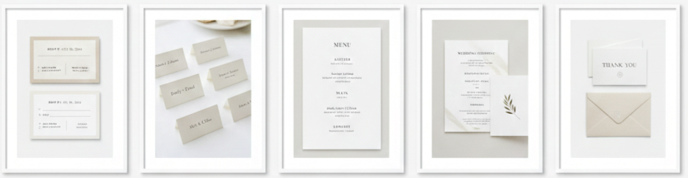
- RSVP cards: Simple boxes, clear deadlines, and matching fonts keep everything cohesive.
- Place cards: Small, neatly printed name cards in the same font add elegance to your tables.
- Menus: One-column layouts in neutral tones can easily be customized to match the theme.
- Programs: Use a single-page or folded layout to keep ceremony info brief and beautiful.
- Thank you notes: Finish strong with matching cards that offer gratitude in the same simple style.
These extras round out your wedding day presentation, helping everything feel intentional from start to finish.
Conclusion
The Austere Simple Wedding Invitation Iwi106 is a perfect choice for couples who want their wedding to reflect intentional design, understated beauty, and a meaningful celebration. It gives you all the customization you need without overwhelming your guests. Whether your wedding is casual, formal, large, or small, this invitation carries your message with grace and purpose. It’s thoughtful, flexible, and easy to fall in love with—just like your big day should be.
Key Takeaway: The Iwi106 is perfect for modern couples who want their wedding invitation to feel clean, personal, and intentional. It’s simple, customizable, and fits seamlessly with any wedding style or theme.
FAQs
Can I see a proof of the Iwi106 invitation before it’s printed?
Yes, most vendors offer a digital proof so you can double-check everything before printing starts.
How long does it take to receive the Iwi106 invitation after ordering?
It usually takes around 5–7 business days after you approve the design, but expedited options may be available.
Is there a digital version of this invitation for email or virtual invites?
Yes, many sellers offer digital formats so you can send the same design by email or through a wedding website.
Can I print the invitation in another language?
Definitely. Just provide your translated text and the layout will be adjusted to fit the new wording.
What if I need more envelopes or extra copies later?
You can order additional pieces separately in most cases, so last-minute guest list changes won’t be a problem.
Autumn Maple Leaves Brown Pocket Wedding Invitations Iwps077
| Task | Recommended Timeframe |
| Start customization | 6 months before wedding |
| Order sample | As early as possible |
| Finalize guest list | 4–5 months before wedding |
| Place full order | 3–4 months before wedding |
| Mail invitations | 8–10 weeks before wedding |
| Mail for destination/holiday | 12 weeks before wedding |
Celebrating Fall Romance Through Stationery Design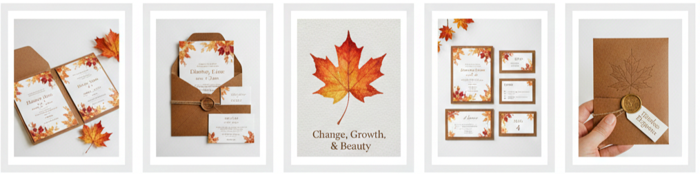
Fall weddings feel warm, romantic, and naturally beautiful. The colors outside are richer, the air feels crisp, and everything about the season makes celebrations feel a little more meaningful. That’s exactly the kind of energy the Autumn Maple Leaves Brown Pocket Wedding Invitations Iwps077 bring to the table. These invitations don’t just share your wedding details. They set the tone for your entire event in a way that feels intentional, cozy, and polished.
Maple leaves are one of the strongest symbols of autumn, and they instantly create a sense of season. They also represent change, growth, and beauty, which fits perfectly with a wedding. Paired with brown, orange, and golden tones, this invitation design feels grounded and elegant at the same time. It works beautifully for rustic outdoor ceremonies, barn weddings, woodland venues, and even formal receptions that still want a warm autumn look.
We also like how this invitation style feels timeless. It doesn’t look trendy in a way that will feel outdated later. It feels classic, seasonal, and refined, which makes it a great choice for couples who want their wedding stationery to age well when they look back at it years from now.
Design Details That Make It Stand Out
These invitations catch attention because they balance charm and structure. The pocketfold is the heart of the design. It holds everything in one clean presentation while keeping the invitation suite organized and easy to understand.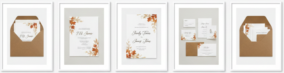
- Pocketfold Structure: The brown pocket enclosure keeps every insert neatly placed, so guests never feel overwhelmed by loose cards.
- Maple Leaf Artwork: The leaf design brings the fall theme forward without taking over the layout, so the invitation still feels clean and easy to read.
- Earthy Color Palette: Brown tones with soft autumn accents like burnt orange and subtle gold create warmth that feels both rustic and formal.
- Elegant Typography: The typefaces usually blend classic wedding style with strong readability, which helps the invitation feel polished while still being easy to scan.
- Layered Presentation: The suite feels more high-end because of the way the main invitation sits on top of the pocket, giving it depth and structure.
Because of these details, the Iwps077 suite works well for couples who want something seasonal yet elegant. It doesn’t lean too casual, and it doesn’t feel overly formal. It lands right in that balanced sweet spot that fits most fall wedding themes.
Premium Materials and Craftsmanship
An invitation can look great in a photo and still feel cheap in person. That’s not the case here. The Iwps077 suite is usually made with thicker cardstock, which gives it that solid, premium feel in the hand. Guests notice this instantly because the paper doesn’t bend easily, and the invitation feels like a keepsake instead of a disposable card.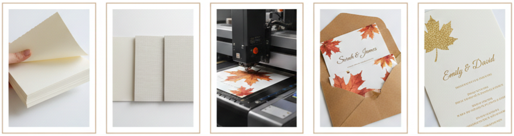
- Thick Cardstock: Most suites use 250–300gsm paper, which gives the invitation structure and a more luxurious feel.
- Finish Options: Depending on your supplier, you may be able to choose a matte finish, smooth finish, or lightly textured feel for a more handcrafted look.
- Clean Printing: Digital and offset printing methods keep the text crisp and the maple leaf artwork sharp, even with detailed color blending.
- Precise Pocket Cutting: Die-cut pocketfolds keep everything aligned and perfectly sized, so inserts slide in smoothly without shifting.
- Optional Upgrades: Some vendors offer foil stamping or embossing, which can add extra detail to the leaf artwork or highlight names and headings.
This kind of craftsmanship matters because the invitation is one of the first physical items guests interact with. When it feels premium, it makes the entire wedding feel more thoughtfully planned.
Personalization Options That Reflect Your Style
This suite works well because it doesn’t force couples into one fixed look. Instead, it gives you the freedom to personalize important details while keeping the autumn theme consistent. That makes it easier to match your invitation to your venue, wedding colors, and overall vibe.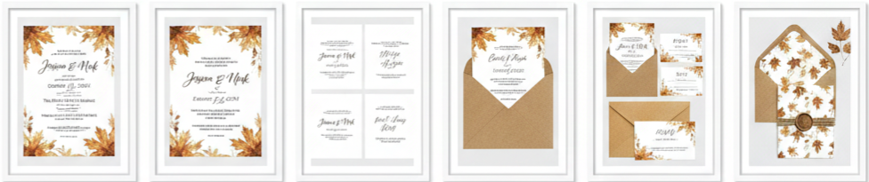
- Wording Customization: You can personalize names, dates, ceremony locations, reception details, and wording tone, whether you want it formal or slightly relaxed.
- Font Adjustments: Many vendors allow you to choose between different font pairings, which helps match your style, from traditional to modern rustic.
- Layout Tweaks: Some designs allow spacing and formatting changes so the invitation feels balanced, even when your details are longer than average.
- Matching Insert Cards: You can include RSVP cards, details cards, accommodations, directions, and even wedding weekend schedules with the same design style.
- Envelope Options: The suite pairs beautifully with kraft envelopes, warm-toned envelopes, or even custom liners for an added touch of elegance.
- Finishing Touches: Add-ons like belly bands, ribbons, twine wraps, or wax seals can complete the look and make the suite feel more personal.
The best part is that personalization makes the invitation feel like it was made for your wedding, not chosen from a generic template. That’s what elevates the experience for your guests.
Why Pocket Invitations Are a Smart Choice
Pocket invitations aren’t just a style choice. They’re also one of the most practical formats when you need to include multiple details without overwhelming your guests. The Iwps077 suite makes everything feel organized, which helps guests feel confident about where they need to be and what they need to do.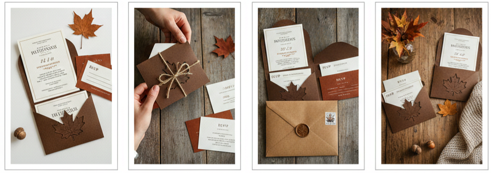
- Organized Information: Guests can easily separate the main invitation from additional details, which makes everything feel cleaner and easier to understand.
- Premium Presentation: The pocketfold format feels like a full invitation package, which adds instant sophistication.
- Less Clutter: Instead of handing guests several loose cards, the pocket keeps everything in one place from the moment they open it.
- Better Mailing Durability: The structured pocket design protects inserts, so the suite travels more safely in the mail without bending.
- Fits Many Themes: Pocket invites match rustic, vineyard, woodland, barn, outdoor, and even formal weddings that want a warm seasonal look.
If you want guests to feel like they’re receiving a thoughtfully curated invitation, pocket formats deliver that feeling instantly.
How to Match Your Decor With This Invitation
One of the easiest ways to create a cohesive wedding look is to start with the invitation suite and build from there. The Iwps077 design naturally sets you up for a warm, earthy wedding aesthetic. You can pull its tones into everything else, including florals, attire, table design, and signage.
- Color Pairings: Burgundy, copper, forest green, cream, and burnt orange blend beautifully with this invitation’s palette.
- Natural Decor: Maple leaves, pinecones, wood accents, and dried florals work well for centerpieces, aisle decor, and welcome signs.
- Lighting Choices: Candles, lanterns, and warm string lights recreate the soft glow that makes fall weddings feel cozy.
- Venue Compatibility: Rustic barns, forest lodges, vineyards, outdoor gardens, and mountain venues pair naturally with this invitation’s tone.
- Floral Styling: Dahlias, chrysanthemums, eucalyptus, pampas grass, and deep red roses match perfectly with the autumn design.
When your invitation and decor feel connected, everything looks intentional in photos, and guests feel immersed in the theme from beginning to end.
When to Order and How to Stay on Track
Good wedding stationery takes time. You want enough room to personalize, review proofs, and handle printing without rushing. A pocket invitation suite usually takes longer than a simple flat card, so planning ahead helps.
Here’s a step-by-step timeline that keeps things simple and stress-free:
- Start Customization 6 Months Before the Wedding: This gives you time to finalize wording and work through design proofs without pressure.
- Order a Sample Early: Samples help you check cardstock thickness, print quality, and color accuracy in person.
- Finalize Your Guest List 4–5 Months Before: Your guest count affects how many suites you need and prevents last-minute reorders.
- Order Your Full Suite 3–4 Months Before: This gives enough time for production, shipping, and assembly if you plan to add finishing touches.
- Mail Invitations 8–10 Weeks Before the Wedding: For destination weddings or holiday weekends, aim closer to 12 weeks.
This timeline gives you enough space to make thoughtful decisions while avoiding rushed printing or delivery delays.
Conclusion
The Autumn Maple Leaves Brown Pocket Wedding Invitations Iwps077 offer a beautiful balance of seasonal charm and polished presentation. The pocketfold design keeps everything organized, the maple leaf artwork captures autumn warmth, and the high-quality cardstock makes the suite feel premium the moment guests touch it. Whether your wedding feels rustic, elegant, or somewhere in between, this invitation style brings structure, beauty, and a clear first impression that fits the season perfectly.
Key Takeaway: The Iwps077 pocket invitation suite stands out because it combines practical organization with fall-inspired elegance, making it an ideal choice for couples who want their wedding stationery to feel warm, premium, and thoughtfully designed from the very first glance.
FAQs
Are envelope liners included with the Iwps077 suite?
Envelope liners are usually optional. Many sellers offer matching liners as an upgrade, including kraft, metallic, or patterned designs that pair with the maple leaf theme.
Can we request a digital version of this invitation too?
Some vendors provide a matching digital invitation or an editable template. This is useful if you want to share wedding details online while still sending printed invitations.
Can we print the invitation in more than one language?
Yes, many printing services allow bilingual formatting. You just need to provide your exact wording so the layout stays clean and easy to read.
How many insert cards fit into the pocket without making it bulky?
Most pockets hold three to four inserts comfortably. This usually includes an RSVP card, details card, accommodations card, and directions or schedule card.
Can we add foil stamping to the leaves or names?
Yes, foil stamping is often available as an upgrade. Gold, copper, and rose gold are popular choices because they match autumn color palettes beautifully.
Attractive Blue And White Snow Wedding Invitations Iwi007
| Option | Look | Feel | Best For |
| Matte | Smooth, non-gloss | Clean, modern | Minimalist winter themes |
| Shimmer | Soft sparkle | Light texture | Frosted or snow-inspired |
| Foil | Metallic shine | Sleek, upscale | Formal or glam weddings |
| Embossed | Raised detail | Textured | Elegant, tactile invitations |
Why Blue and White Is a Classic for Winter Weddings
- Blue Adds Depth And Formality: Blue naturally feels elegant and calm, which makes it perfect for winter weddings. Shades like icy blue, dusty blue, navy, and steel blue bring a cool seasonal feel without looking harsh. Blue also adds a sense of structure and refinement that works well for formal venues, evening ceremonies, and winter destination weddings.
- White Keeps The Look Clean And Timeless: White balances the blue tones and keeps the invitation design fresh, bright, and easy to read. White space makes the layout feel less crowded, which gives your names and important details room to stand out. It also connects directly to the snow theme without needing heavy seasonal graphics.
- A Snow Theme Without Feeling Overdone: When blue and white work together, they create an instant winter feel without leaning too hard into holiday-style visuals. That subtle seasonal vibe keeps Iwi007 elegant for classic weddings and still stylish for modern ones.
What Makes the Iwi007 Invitation Design So Attractive
- A Clean, Balanced Layout: Iwi007 works because guests can quickly find the information they need, like the wedding date, venue, and RSVP deadline. The spacing is intentional, which helps the invitation look polished and professional instead of cluttered.
- Snowflake Details That Feel Tasteful: The snowflake accents add charm and seasonal character without overwhelming the layout. The design focuses on elegance first, then adds winter elements in a way that feels light, refined, and visually appealing.
- Fonts That Feel Formal Yet Easy To Read: Iwi007 typically uses a mix of elegant script and clean supporting fonts. That contrast makes the invitation feel upscale while keeping every detail clear. Guests do not have to guess what the invitation says, which matters when planning travel and schedules.
- A Color Palette That Photographs Beautifully: Blue and white always look good in invitation flat lay photos. Iwi007 photographs well under warm indoor lighting and cool winter daylight, which makes it a great choice for couples who want their wedding details to look cohesive in professional photos.
When Iwi007 Works Best for Your Wedding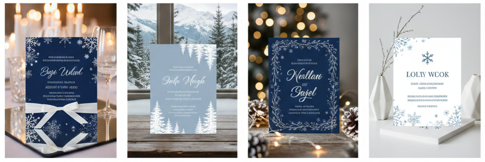
- Formal Ballroom Weddings: This invitation style fits beautifully with black-tie and semi-formal events. The blue and white palette blends well with silver décor, crystal accents, candlelit centerpieces, and elegant floral arrangements.
- Mountain Lodge And Resort Weddings: Iwi007 feels right at home for weddings surrounded by snow, pine trees, and scenic outdoor photos. The snowflake design feels natural, not forced, and it supports the cozy atmosphere that mountain venues provide.
- Holiday Season Weddings: This design works well for December weddings because it feels festive without looking like a holiday card. Couples who want a seasonal touch without using red and green usually prefer this style.
- Modern Minimal Winter Weddings: The design stays clean and structured, which makes it a strong choice for couples who love minimal décor. The snowflake accents still deliver winter charm, yet the overall invitation remains modern and sleek.
Customizing Your Iwi007 Invitations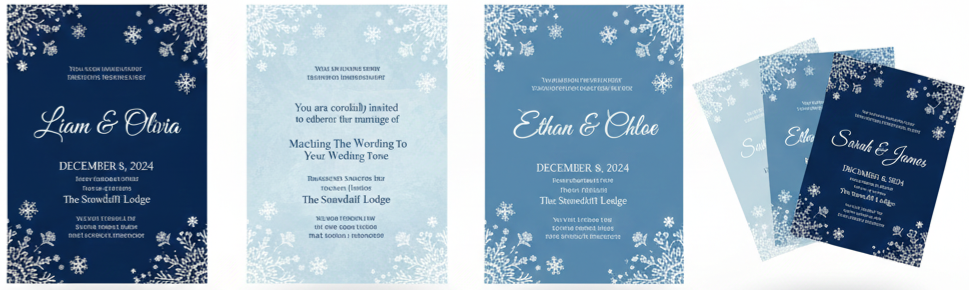
- Personalizing Names And Wedding Details: The couple’s names should stay as the centerpiece because it creates a personal connection and feels more meaningful than a template-style look. Your date, time, venue address, and RSVP deadline should remain clearly structured so guests can read everything quickly.
- Matching The Wording To Your Wedding Tone: The wording sets expectations right away, especially for dress codes and event formality. Iwi007 works for formal traditional wording, modern minimal wording, semi-formal phrasing, and even cultural or religious variations, as long as the text stays clean and balanced.
- Adjusting Fonts To Match Your Style: Font choices change the mood of the invitation instantly. Traditional couples may prefer refined serif fonts with classic script, while modern couples may lean toward cleaner fonts with less script. The structure of Iwi007 supports both directions.
- Choosing A Shade Of Blue That Fits Your Theme: You can keep the design icy and soft with pale blue tones, bold and formal with navy, romantic with dusty blue, or sleek with steel blue. Adjusting the blue allows the invitation to match your bridesmaid dresses, florals, or table décor without losing its winter theme.
Choosing the Right Paper and Print Style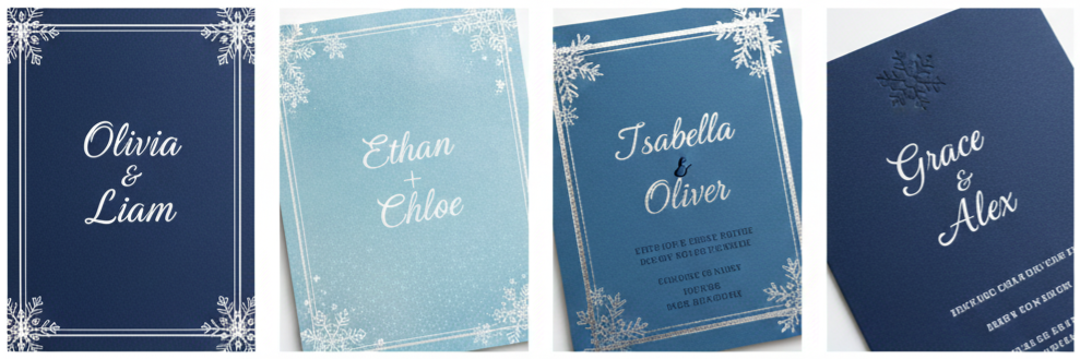
- Matte Paper For A Clean Modern Look: Matte paper gives the invitation a smooth and refined finish. It also reduces glare, which keeps your text crisp and easy to photograph. This is a great option for couples who want a minimal winter look.
- Pearl Or Shimmer Paper For A Frosted Effect: Shimmer paper adds a subtle sparkle that looks like frost or snow under light. It feels luxurious without needing extra embellishments, which makes it ideal for winter wedding stationery.
- Foil Accents For A More Elegant Finish: Silver foil works naturally with blue and white because it adds a cool metallic glow. Gold foil can also work if your wedding décor includes warm metallic accents. Foil is commonly used for names, borders, snowflakes, or monograms.
- Embossing And Raised Print For Texture: Raised print adds a tactile detail that guests notice immediately. Embossed snowflakes and raised names create a premium look and make the invitation feel like a luxury piece rather than standard stationery.
Building a Matching Wedding Stationery Set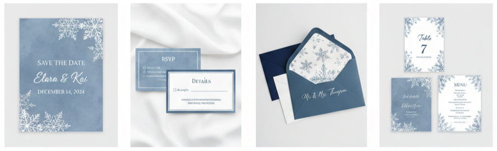
- Save The Date Cards That Match The Theme: A matching save-the-date keeps the entire stationery experience consistent. This is especially useful for winter weddings because many guests need extra time for travel planning.
- RSVP Cards And Details Inserts For Guest Clarity: Keeping the main invitation clean while adding inserts makes the suite easier to understand. Details inserts can include your dress code, hotel information, travel tips, reception location, and wedding website.
- Envelope Options That Elevate Presentation: Navy, dusty blue, or even icy blue envelopes look striking with white print. White envelopes are also a classic choice when paired with blue ink. Envelope liners featuring snow patterns or metallic finishes add an extra layer of luxury before guests even see the main invitation.
- Wedding Day Stationery That Keeps Everything Cohesive: Couples can extend the Iwi007 design across ceremony programs, menu cards, place cards, escort cards, seating charts, welcome signs, and table numbers. That consistency creates a polished guest experience and looks great in wedding photos.
Coordinating Decor With Iwi007 Invitations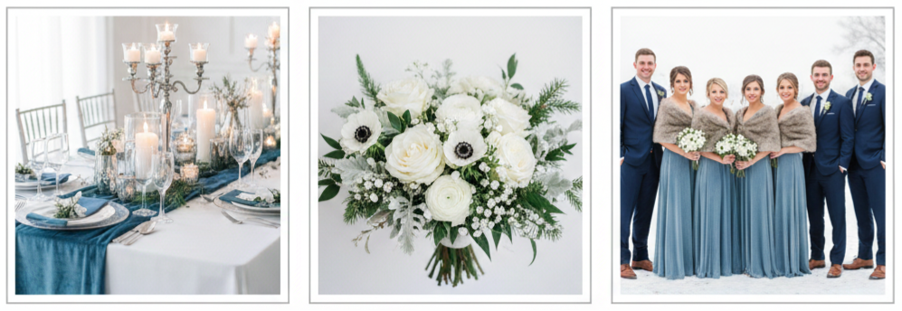
- Decor Pairings That Match Blue And White: Blue and white invitations pair beautifully with silver accents, glass décor, candlelight, velvet textures, and pine greenery. These elements support the winter theme without making the space feel too holiday-focused.
- Floral Choices That Work With Winter Palettes: Winter florals can still feel fresh and romantic. White roses, ranunculus, anemones, hydrangeas, baby’s breath, eucalyptus, dusty miller, and pine accents all match the Iwi007 vibe while staying elegant.
- Bridal Party Styling That Completes The Look: Dusty blue bridesmaid dresses, navy suits, silver jewelry, faux fur wraps, velvet ties, and soft winter tones all coordinate perfectly with the invitation palette. These choices make the entire wedding feel intentional without being overly matched.
Tips for Ordering Your Invitations Smoothly
- Order 10–12 Weeks Before The Wedding: Ordering early gives you time for edits, proofs, printing, shipping, and addressing envelopes. This is especially important for winter weddings when printing demand and holiday shipping delays are common.
- Request A Printed Sample When Possible: Colors and textures can look different in person than on a screen. A printed sample helps confirm the shade of blue and how the paper finish looks under real lighting.
- Double-Check Every Event Detail Before Printing: It is important to confirm venue spelling, addresses, start times, RSVP deadlines, website links, and reception location details. A beautiful design still needs accurate information.
- Mail Earlier Due To Winter Weather And Holiday Delays: Snowstorms and seasonal mail volume can slow delivery. Mailing a little early helps ensure guests receive invitations on time.
Why Guests Remember Invitations Like Iwi007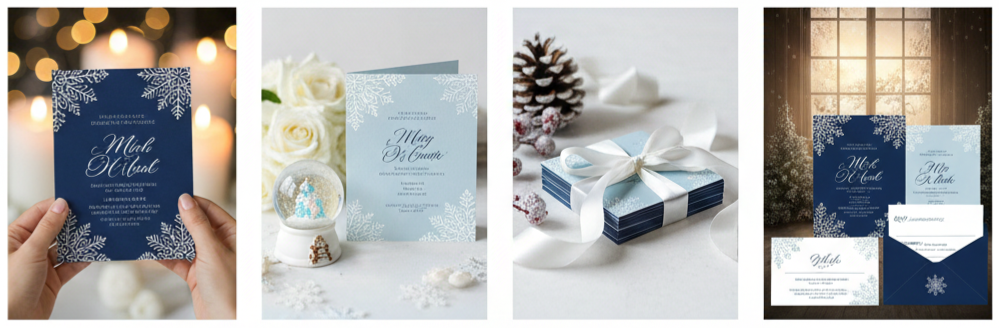
A wedding invitation is not just a piece of paper. It shapes how guests feel about your wedding before they arrive. When guests open a well-designed winter invitation like Iwi007, they immediately picture the atmosphere you are creating. They imagine candlelight, snowy scenery, elegant décor, and a thoughtful celebration. That feeling builds excitement and sets expectations. Iwi007 stands out because it feels premium, polished, and winter-themed without being overly seasonal.
Conclusion
Planning a winter wedding means thinking through details that feel cohesive and intentional, and your invitation is the very first piece of that experience. Attractive Blue And White Snow Wedding Invitations Iwi007 gives you a clean and elegant way to showcase your winter theme with subtle snowflake accents, refined typography, and a palette that feels timeless. With flexible customization options and the ability to build a full matching suite, this design works beautifully for formal ballroom weddings, mountain lodge celebrations, holiday ceremonies, and modern minimal events.
Key Takeaway: Iwi007 delivers a winter wedding invitation style that feels elegant, easy to personalize, and visually cohesive. The blue and white palette communicates seasonal beauty without looking overly themed, which makes it a strong choice for couples who want a refined snow-inspired wedding from the first impression onward.
FAQs
Can I use Iwi007 invitations for a destination wedding in the mountains?
Yes. Iwi007 fits perfectly with snowy mountain settings, lodge-style venues, and winter destination weddings. The snowflake elements feel natural and match the atmosphere guests expect.
Is it possible to add foil accents to the snowflake design?
Yes. Silver foil is a popular choice for winter invitations because it adds a frosted, premium look. Gold foil also works if your wedding décor includes warm metallic tones.
What kind of envelope liner works best with this design?
Envelope liners with subtle snowflake prints, watercolor blue washes, or metallic silver finishes work especially well. These liner styles add elegance without overpowering the invitation design.
Can I include a QR code linking to our wedding website?
Yes. A QR code works well on a details card or on the back of the invitation, depending on how clean you want the front layout to remain.
Do these invitations work for New Year’s Eve weddings?
Yes. The blue and white palette pairs beautifully with silver accents and sparkly décor, which makes it a strong match for New Year’s Eve celebrations.