weddinginvites
2015 Top 6 Amazing Fall Wedding Color Ideas
| Color Palette | Mood | Best For |
| Marsala & Blush | Romantic | Vintage, vineyard weddings |
| Navy & Gold | Elegant | Formal, black-tie events |
| Plum & Sage | Earthy | Rustic, garden settings |
| Burnt Orange & Grey | Modern | Industrial, loft venues |
| Cranberry & Peach | Playful | Early fall, backyard events |
| Emerald & Copper | Luxe | Woodland, vineyard weddings |
Marsala and Blush: Sophisticated with a Soft Side
Marsala and blush became a standout pairing in 2015 for couples who wanted a rich, romantic wedding look. Marsala, a bold wine-inspired hue, added depth and elegance, while blush softened the overall aesthetic with its gentle, feminine tone.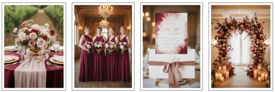
- Where it worked best: Vineyard weddings, vintage-themed receptions, and candlelit indoor ceremonies.
- How it was used: Marsala was popular in bridesmaid dresses, table linens, and bold florals. Blush appeared in bouquets, invitation designs, and centerpieces to create a soft contrast.
- Why it stood out: The two tones balanced each other beautifully—bold without being overpowering, soft without fading into the background.
This color combo struck the perfect balance between modern chic and timeless romance, which is why it became such a lasting favorite.
Navy and Gold: Timeless and Classy
Navy and gold offered a regal and polished color scheme that fit right in with formal and upscale weddings. Navy served as a strong, classic foundation, while gold introduced warmth and luxury without feeling overdone.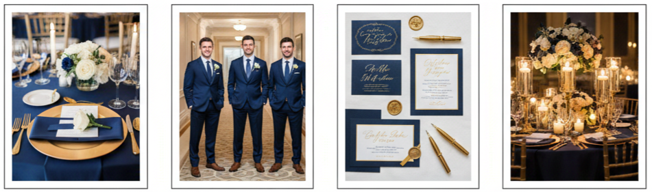
- Perfect settings: Black-tie weddings, hotel ballrooms, and elegant evening receptions.
- Common touches: Navy suits for the groom and groomsmen, gold-accented invitations, metallic décor, and candlelit gold holders.
- Why couples loved it: The contrast felt refined and classy, making it easy to style with both traditional and modern elements.
This pairing worked exceptionally well with neutral accents like cream or champagne, creating an elevated and cohesive visual experience.
Plum and Sage: Rich Meets Rustic
Plum and sage delivered a stunning mix of drama and calm, perfect for rustic outdoor weddings or nature-inspired venues. Plum brought the rich, moody vibe while sage introduced a soft green tone that grounded the overall look.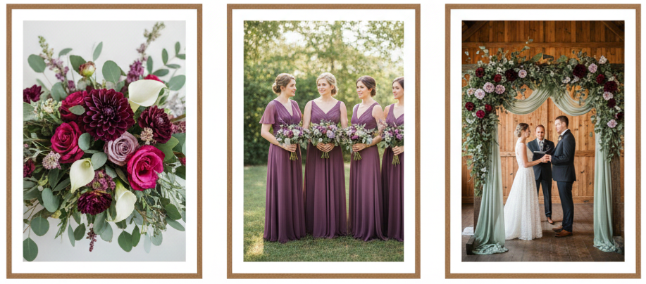
- Top pairings: Plum dahlias, roses, and calla lilies mixed with sage greenery such as eucalyptus or dusty miller.
- Popular uses: Plum bridesmaid dresses, sage garlands on ceremony arches, and earthy, organic floral arrangements.
- Best suited for: Outdoor barn weddings, garden ceremonies, and woodland settings.
This combination felt fresh yet cozy, allowing couples to incorporate seasonal beauty without leaning too heavily on traditional fall colors.
Burnt Orange and Grey: Modern Fall Done Right
For couples who wanted something different but still seasonal, burnt orange and grey offered a sleek and energetic alternative. Burnt orange brought warmth and vibrancy, while grey provided a neutral, modern base.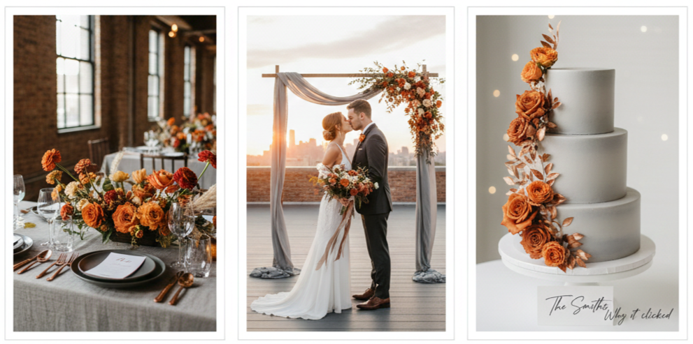
- Ideal venues: Urban lofts, industrial spaces, and open-air rooftops.
- Décor choices: Burnt orange florals like marigolds or ranunculus, grey linens, minimal centerpieces, and clean, sharp table settings.
- Why it clicked: It felt like a fresh take on autumn—a way to embrace fall without going full rustic.
This combo worked particularly well for minimalist couples who still wanted color but didn’t want to use overly traditional shades.
Cranberry and Peach: Bold with a Sweet Twist
Cranberry and peach combined boldness with softness in a playful yet elegant way. Cranberry brought depth and vibrancy to the color palette, while peach lightened the mood and added a cheerful, romantic touch.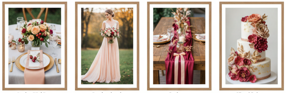
- Where it shined: Garden weddings, early fall ceremonies, and backyard receptions.
- Visual balance: Peach-colored gowns and florals alongside cranberry napkins, ribbons, or small decorative accents.
- What made it pop: The balance of deep and light tones gave it a cheerful energy that still worked beautifully for the fall season.
This pairing suited couples who wanted a fun and energetic aesthetic without straying too far from classic fall tones.
Emerald and Copper: Nature-Inspired with a Luxe Edge
Emerald and copper brought earthy tones and metallic shine together in a sophisticated blend. Emerald gave off a rich, forest-like feel, while copper introduced a warm glow that felt both cozy and upscale.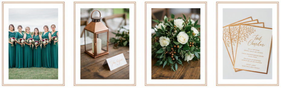
- Best elements to style: Emerald bridesmaid dresses, copper place cards or lanterns, foliage-rich centerpieces, and metallic foil on invitations.
- Great for: Vineyard weddings, rustic-chic barn receptions, or woodland-themed ceremonies.
- Why it worked: The blend of color and texture felt grounded yet luxurious, perfect for fall weddings with a refined edge.
This combination proved especially popular with couples who wanted to mix elegance with nature, offering both richness and restraint in the design.
Conclusion
Fall wedding color trends in 2015 gave couples the freedom to be bold, romantic, rustic, or modern. Whether it was the rich tones of Marsala, the timeless elegance of navy and gold, or the fresh energy of burnt orange and grey, each pairing allowed couples to design a day that reflected their personal style while celebrating the warmth of the season. These color ideas weren’t just trendy—they were versatile and memorable, and they still influence wedding palettes today.
Key takeaway: The best fall color combinations from 2015 blended richness, romance, and creativity, offering timeless inspiration for couples seeking the perfect autumn wedding aesthetic.
FAQs
What flowers complement a cranberry and peach wedding palette?
Use peach-toned blooms like garden roses or ranunculus with deep cranberry accents such as dahlias or peonies. Greenery helps tie the tones together.
Can I add a third color to these palettes without overwhelming the design?
Yes, neutral tones like ivory, champagne, or taupe work well as third accents and keep the palette cohesive without clutter.
How can I modernize a 2015 color trend for a wedding today?
Use updated elements like matte textures, minimalist fonts, or contemporary floral designs to keep the look fresh while honoring the original palette.
Is sage green too muted for fall weddings?
Not at all. Sage adds balance and works well with deeper tones. It enhances organic and rustic styles without fading into the background.
What’s the best way to test a wedding color scheme before finalizing it?
Create a digital mood board, request fabric or floral samples, and compare them under the venue’s lighting to see how the colors interact.
2015 Top 10 Useful Vintage Wedding Decoration Ideas
| Vintage Décor Item | Purpose |
| Mismatched China Sets | Unique and elegant table settings |
| Antique Typewriter | Interactive guestbook station |
| Lace Table Runners | Romantic and textured table décor |
| Vintage Suitcases | Card collection or display risers |
| Mason Jars & Milk Bottles | Rustic floral centerpieces |
| Window Frames & Doors | Backdrops or photo displays |
| Ornate Picture Frames | Menus, signage, or quotes display |
| Candle Lanterns | Aisle lighting or evening ambiance |
| Stacked Books | Centerpiece risers or décor layers |
| Decorative Birdcages | Floral arrangements or candle holders |
Mismatched China Sets for Table Styling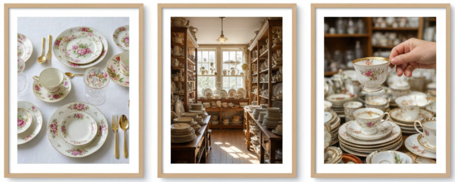
- Why It Works: Mismatched vintage china was one of the most loved wedding trends in 2015 because it made tables feel personal, charming, and full of character. Instead of using identical plates and cups, couples leaned into mixed patterns and soft, timeless colors to create a warm, collected look that felt intentional rather than random.
- What To Use: A good vintage set usually includes floral plates, gold-rimmed saucers, delicate teacups, and pastel-toned dishware. Mixing these pieces gives the table a layered feel, especially when paired with neutral table linens and fresh flowers.
- Where To Find Them: Antique shops, estate sales, flea markets, and vintage wedding rental companies are great places to start. If you want the look without buying a full set, renting is usually the easiest option and helps keep everything consistent.
Antique Typewriters as Guestbook Stations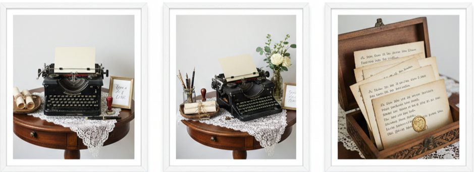
- Why Guests Love It: Typewriters were a standout vintage detail in 2015 because they made guest messages feel more meaningful. Instead of just signing a guestbook, guests got to type a note that felt thoughtful and unique, and the couple ended up with keepsakes that looked beautiful and nostalgic.
- How To Set It Up: Place the typewriter on a vintage side table near the entrance, the photo booth, or the reception lounge. Add a small sign inviting guests to type a note, and include paper that fits the theme, such as parchment-style sheets or lightly textured stationery.
- Extra Styling Tip: Add a small tray with envelopes, vintage pens, or wax seals next to the setup so the whole station looks styled and complete. Even if the typewriter does not work, it still looks amazing as a decorative centerpiece.
Lace Table Runners for a Soft Vintage Touch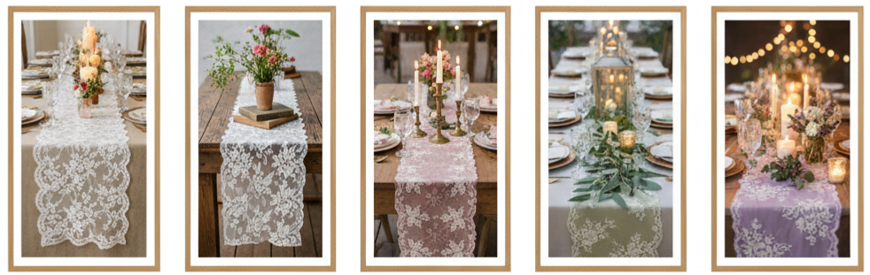
- Why Lace Always Wins: Lace was a major design element in 2015 vintage weddings because it instantly made tables look romantic and soft. It also blended well with rustic materials like wood and burlap, which helped couples balance elegance with a relaxed, natural vibe.
- How To Use It: Lace runners worked best when layered on top of neutral linens like ivory, beige, or soft gray. They also looked great on farmhouse tables without tablecloths, where the lace added texture without covering up the wood grain.
- Color Options: Most couples stayed with classic white or ivory lace, although dusty rose, sage, and lavender lace runners became popular for themed weddings. When paired with candlelight, lace adds depth and detail without overwhelming the table.
Stacked Suitcases for Cards and Decor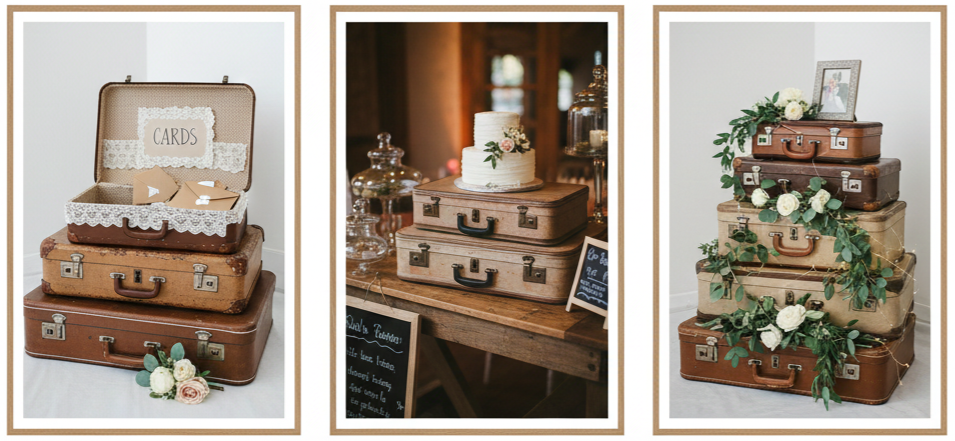
- Why Suitcases Became a Favorite: Vintage suitcases were a popular 2015 wedding décor choice because they were useful and decorative at the same time. Couples used them as card holders, display risers, and decorative stacks that filled empty corners in a venue without needing extra floral pieces.
- How To Use Them: Place one suitcase open with a “Cards” sign inside and line it with lace or linen to match the theme. Stack multiple suitcases in different sizes near the gift table, dessert table, or guestbook area to add height and make the space look designed.
- What To Look For: Leather suitcases, brass locks, faded fabric linings, and worn edges usually look the most authentic. The goal is to find pieces with a lived-in look that feel like they belong to another era.
Mason Jars and Milk Bottles as Floral Vases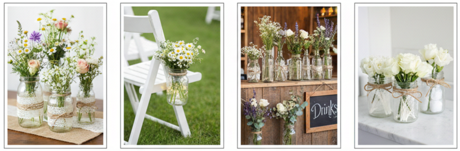
- Why They Still Work Today: Mason jars and milk bottles became iconic in 2015 vintage weddings because they were affordable and easy to style. They fit perfectly into rustic, garden, and farmhouse weddings while still giving off that nostalgic, old-time charm.
- Best Flowers To Use: Wildflowers, baby’s breath, small roses, and greenery work beautifully in these containers. The glass keeps the focus on the flowers, and the vintage look comes through when you add details like twine, lace wraps, or burlap accents.
- Where To Place Them: These vases work well as table centerpieces, aisle decorations, bar accents, and even restroom counter décor. When clustered in groups of three or five, they create a more layered centerpiece that feels full without needing large floral arrangements.
Old Window Frames and Doors as Backdrops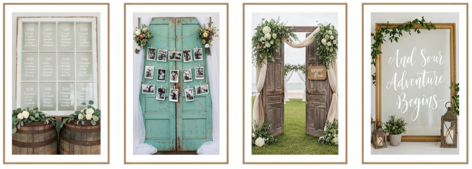
- Why They Stand Out: Vintage window frames and doors were a major décor highlight in 2015 because they created structure. They gave couples a large focal piece that could be used for photos, ceremonies, or signage without requiring a huge budget.
- Creative Ways To Use Them: Couples often used window panes to display seating charts, love quotes, or table assignments using white paint pens or calligraphy vinyl. Others hung twine across the frame to clip photos using mini clothespins, creating a sentimental photo display that doubled as décor.
- Styling Tip: Add trailing greenery, soft fabric drapes, or small floral clusters at the top corners for a romantic finish. Weathered wood and distressed paint make the piece feel authentic, so avoid overly polished frames if your goal is true vintage.
Framed Signs with Vintage Flair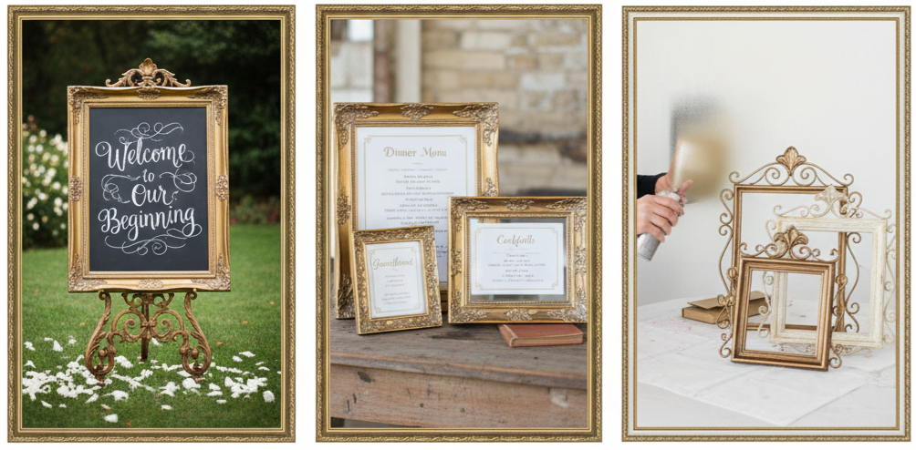
- Why Frames Elevate Everything: Ornate picture frames were widely used in 2015 because they made even simple signs look upscale. Whether you used them for menus, welcome notes, or directions, they added a formal vintage touch that still felt warm and approachable.
- How To Use Them: Insert chalkboard backing into the frame for reusable signage, or place printed paper signs inside for a cleaner look. Many couples used easels to display frames at the ceremony entrance, near the bar, or by the guestbook station.
- Color Matching Tip: Spray painting thrifted frames in gold, bronze, or antique white helped keep the décor consistent. Even when frames were different shapes, the same color made them feel like they belonged together.
Candle Lanterns and Candelabras for Ambiance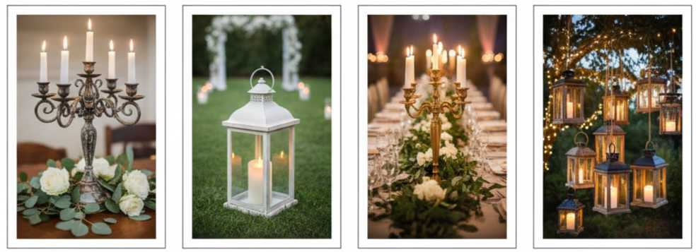
- Why Lighting Matters: In 2015, vintage weddings were all about mood, and candlelight delivered that instantly. Lanterns and candelabras made venues feel warm and intimate, especially during evening ceremonies or receptions.
- Where To Place Lanterns: Lanterns looked beautiful lining aisles, placed at the base of ceremony arches, or positioned along outdoor pathways. Hanging lanterns from shepherd hooks or tree branches gave outdoor receptions a dreamy glow.
- How To Use Candelabras: Candelabras became statement pieces on head tables and dining tables, especially when paired with greenery and soft florals. Wrought iron, brass, and distressed finishes worked best for vintage themes. LED tapers also worked well for venues that required flame-free setups.
Books and Typewritten Quotes for a Literary Feel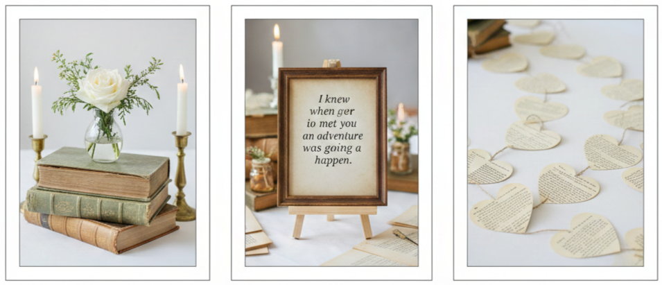
- Why Books Added Meaning: Vintage book décor was popular in 2015 because it felt personal. Stacked books added height to table centerpieces, while typewritten quotes added emotional value without being overly dramatic.
- How To Use Books: Couples often stacked hardcover books under floral arrangements, candles, or small décor pieces. Some used open books as display platforms, creating a romantic vintage look that still felt clean and tasteful.
- How To Add Quotes: Printing classic love quotes in a typewriter-style font brought the theme together. These quotes were often framed, placed on tables, or used as small signs near lounge seating. Old book pages also became garlands and table scatter, especially for weddings with a classic or academic feel.
Decorative Birdcages for Floral Arrangements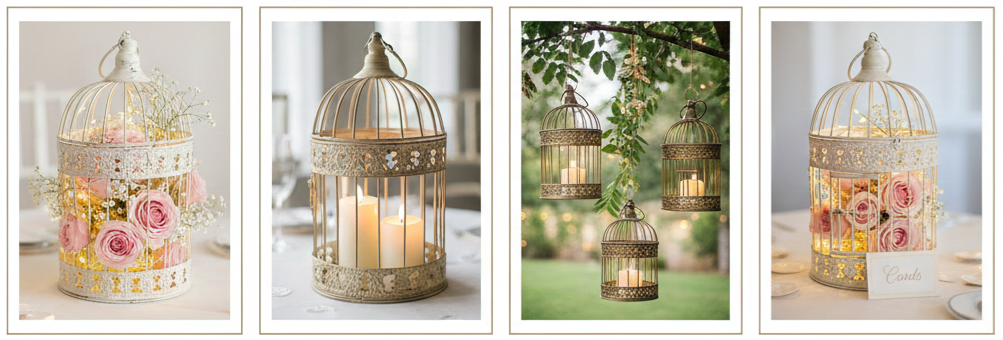
- Why Birdcages Worked So Well: Birdcages became a signature vintage wedding decoration in 2015 because they looked romantic and whimsical. They offered a creative way to display flowers, candles, and soft lighting without using traditional vases.
- How Couples Styled Them: Many filled birdcages with trailing greenery, blush roses, baby’s breath, and string lights. Others placed pillar candles inside for a warm glow. Birdcages were also used as aisle markers, hanging décor, or statement centerpieces.
- Best Finishes To Choose: White, brass, antique gold, or distressed pastel birdcages typically worked best. After the wedding, couples also reused them as home décor, making them a practical decorative investment.
Conclusion
Vintage wedding decoration ideas from 2015 brought warmth, charm, and personality into every venue. Each detail, from delicate lace runners to antique typewriters and mismatched china, made weddings feel more meaningful and less cookie-cutter. These décor choices worked so well because they told a story through textures, materials, and nostalgic pieces. Even today, couples still use these same ideas because they add character without feeling overly trendy. When we choose vintage décor with intention and balance it with clean styling, the wedding space feels timeless, inviting, and unforgettable.
Key Takeaway: Vintage wedding décor works best when we focus on meaningful, practical pieces that add warmth and character. When we combine items like lace, antique frames, books, lanterns, and mismatched china, the venue feels personal and timeless while still looking polished and well-styled.
FAQs
Where can we find affordable vintage wedding decorations?
Thrift stores, flea markets, estate sales, and online marketplaces like Etsy or Facebook Marketplace are great options. Many couples also borrow vintage décor from family members, which adds sentimental value while saving money.
What florals match vintage wedding décor best?
Soft and romantic flowers like garden roses, peonies, ranunculus, baby’s breath, and eucalyptus pair well with vintage containers like mason jars, birdcages, and teacups. Muted colors such as blush, ivory, dusty blue, and sage usually fit best.
How can we use vintage décor without making the wedding look outdated?
Balance makes the difference. Pair vintage décor with modern elements such as clean signage, fresh floral arrangements, and a consistent color palette. Keeping the layout uncluttered also helps the décor feel styled rather than overly themed.
Can we rent vintage decorations instead of buying them?
Yes, many wedding rental companies offer vintage décor collections including china, lanterns, frames, furniture, and props. Renting is a good option when you want consistency without needing storage afterward.
Is DIY vintage wedding décor a good idea?
Yes, vintage décor is one of the easiest styles to DIY. Repurposing frames, distressing wood pieces, wrapping jars in lace, and creating simple signage are all manageable projects that add personality without requiring professional-level skills.
2015 Hot Winter Wedding Color Ideas And Invitations
| Winter Wedding Colors | Best Invitation Style |
| Marsala And Gold | Foil Stamped + Classic Script |
| Navy Blue And Silver | Minimalist + Metallic Ink |
| Emerald Green And Champagne | Vintage Floral + Pocketfold |
| Blush And Burgundy | Watercolor + Soft Calligraphy |
| Icy Blue And White | Clean Layout + Frosted Design |
The Allure of Winter Weddings and Deep Color Palettes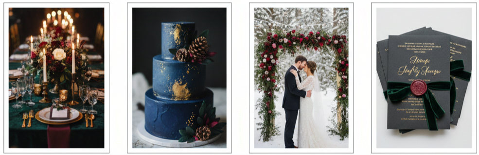
Winter weddings bring a cozy charm that’s hard to beat. With snowy backdrops, candlelight, and deep seasonal colors, couples in 2015 went all in on dramatic palettes and rich textures. These color choices weren’t just about style—they created warmth and elegance that made winter ceremonies feel timeless and romantic. Invitations played a big part, too, setting the stage for the celebration from the very start.
Marsala and Gold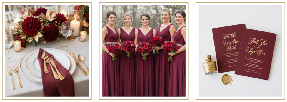
- Color mood: Marsala, Pantone’s 2015 Color of the Year, delivered a deep wine tone that was both bold and inviting. Paired with gold, it created a look that felt luxurious without being overdone.
- Style details: Bridesmaids wore Marsala dresses accented with gold jewelry or belts. Floral arrangements included burgundy dahlias and deep red roses alongside gold-painted leaves or vases.
- Decor inspiration: Table settings featured gold-rimmed plates, Marsala-colored napkins, and soft candlelight. The overall effect was warm, romantic, and perfect for indoor winter venues.
Navy Blue and Silver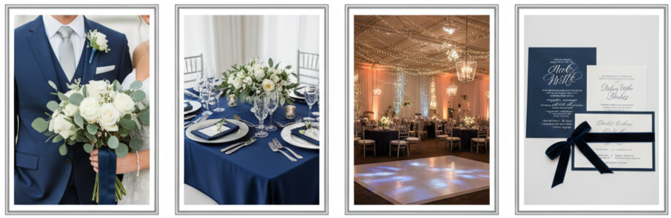
- Color mood: Navy offered a deep, stable base, while silver brought a cool, frosty shimmer that felt right at home in the winter season.
- Style details: Grooms chose navy suits with silver ties or cufflinks, while brides wore silver accessories or incorporated navy ribbon into their bouquets.
- Decor inspiration: Tables were set with navy linens, silver flatware, and white florals with silvery eucalyptus. Lighting was often used to enhance the sparkle and create a winter evening glow.
Emerald Green and Champagne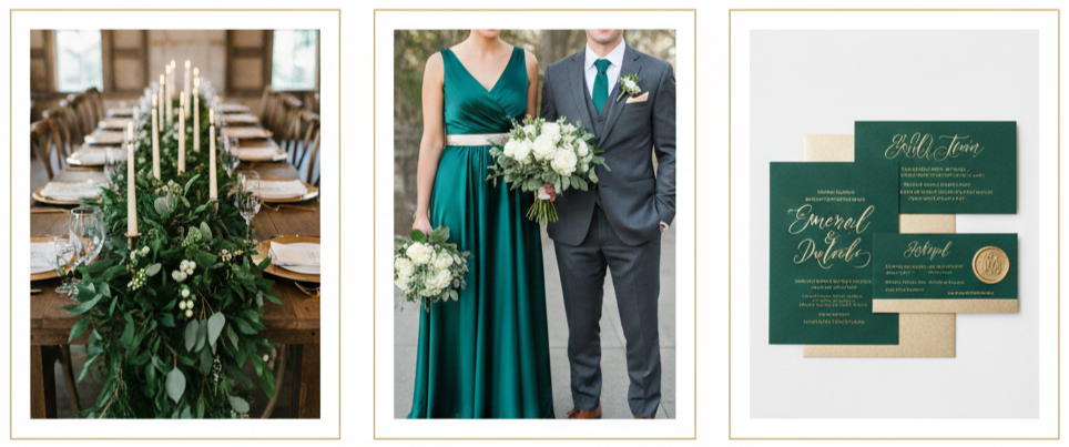
- Color mood: This combination delivered a lush, vintage feel with just the right amount of softness. Emerald added richness, and champagne softened the look with subtle sparkle.
- Style details: Bridesmaids wore emerald green dresses, while champagne details showed up in shoes, sashes, or jewelry. Grooms added emerald boutonnieres or champagne pocket squares.
- Decor inspiration: Greenery garlands draped over tables, paired with champagne-colored candles or charger plates, created a warm, elegant setup perfect for rustic or traditional venues.
Blush and Burgundy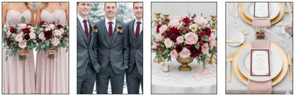
- Color mood: Blush added romance and lightness, while burgundy grounded the palette with deep tones. It struck a perfect balance between soft and bold.
- Style details: Blush gowns paired with burgundy wraps or florals stood out beautifully against neutral winter backgrounds. Burgundy ties or accents worked well for the groomsmen.
- Decor inspiration: Centerpieces combined soft pink roses with burgundy ranunculus and berries. Place settings included gold accents to tie the whole palette together.
Icy Blue and White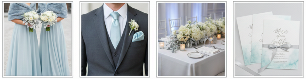
- Color mood: This combo brought in a light, dreamy vibe, like stepping into a real-life snow globe. Icy blue added color without overpowering the clean look of winter whites.
- Style details: Brides wore icy blue wraps or accessories, and bridesmaids stunned in pale blue dresses. Grooms added blue pocket squares or ties.
- Decor inspiration: White florals, silver branches, and icy blue lighting created an ethereal ambiance. Clear glassware and frosted elements added extra sparkle.
Matching Invitations with Winter Wedding Color Schemes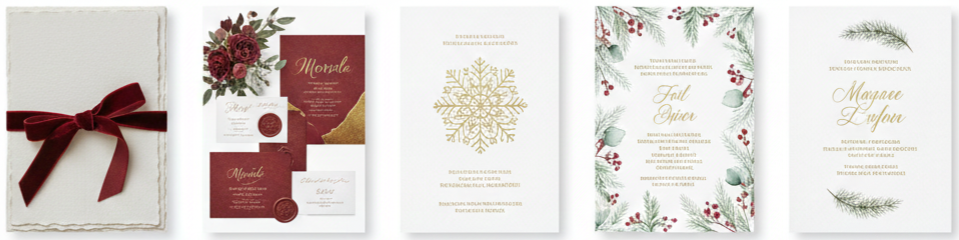
- Paper types: Couples in 2015 went for high-quality, textured papers like linen, shimmer, or matte cardstock. These choices added a tactile element that matched the elegance of the season.
- Color accents: Invitations often mirrored the wedding colors. For example, Marsala weddings used deep red ink or envelope liners, while navy and silver weddings included metallic details and dark backgrounds.
- Foil touches: Gold, silver, or rose gold foil stamping elevated the look of names, borders, or symbols like snowflakes and branches.
- Seasonal motifs: Pine trees, evergreen sprigs, snowflakes, and soft winter patterns appeared subtly in the design to reflect the winter setting without overpowering the layout.
- Typography style: Fonts were carefully chosen to reflect the wedding style. Romantic scripts were paired with simple serif fonts to create contrast and maintain readability.
Popular Invitation Styles for Winter Weddings in 2015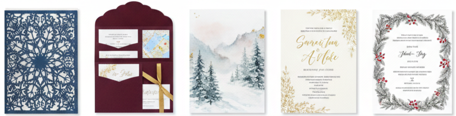
- Laser-cut invitations: These intricate designs looked like lace and were often shaped to include snowflakes, trees, or filigree patterns. They added a luxurious texture that stood out.
- Pocketfold invitations: With so many winter weddings involving travel or indoor venue changes, pocketfolds helped keep all the details organized. Couples could include RSVP cards, maps, and extra info—all wrapped in one elegant package.
- Watercolor touches: Light washes of color or hand-painted accents gave invitations a soft, artistic feel. Popular designs included snowy landscapes or abstract color blends in blue, blush, or burgundy.
- Calligraphy details: Whether hand-lettered or printed to look hand-drawn, calligraphy added a personal and romantic feel. It was used for everything from the names to the envelopes.
- Mixed themes: Vintage-inspired designs were combined with modern layouts. For example, antique-looking floral borders with clean lines and minimalist fonts gave a fresh spin on classic wedding aesthetics.
Personalizing Your Winter Wedding Invitations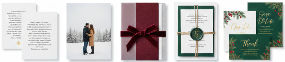
- Love story highlights: Some couples included a short note about how they met or why they chose a winter wedding. This made the invite feel more intimate and special.
- Engagement photos: Using a snowy photo from an engagement shoot was a great way to tie everything together. It gave guests a personal preview of the couple’s love story.
- Layered invitation suites: Vellum overlays, textured paper, and color-blocked cards added depth and interest. Tying the suite together with ribbon or string made it feel like a thoughtful gift.
- Wax seals and embellishments: Wax seals embossed with the couple’s initials or a winter symbol added a finishing touch. Other embellishments included twine, velvet ribbon, or custom stickers.
- Consistent design: From save-the-dates to programs and thank-you cards, using the same fonts, colors, and motifs created a cohesive look across all wedding stationery.
Conclusion
Winter weddings in 2015 brought together cozy elegance, bold colors, and meaningful design choices that helped couples create unforgettable moments. From rich tones like Marsala and emerald to cooler shades like icy blue and silver, each color palette offered a unique atmosphere that matched the season beautifully. Invitations were more than just paper—they were a first impression of the day to come, showing off the couple’s taste, personality, and attention to detail.
These weddings weren’t about copying trends but about crafting a celebration that felt true to the couple. The right colors and invitation designs pulled everything together, setting the tone and bringing the winter magic to life from the moment the envelope was opened.
Key Takeaway: The most memorable winter weddings in 2015 succeeded because they paired bold seasonal color palettes with thoughtfully designed invitations. When every detail—from paper texture to font style—matches the wedding vibe, it sets the perfect stage for a warm and stylish celebration.
FAQs
What materials make winter wedding invitations feel more elegant?
Linen cardstock, shimmer paper, and vellum overlays add texture and elegance. Pair them with foil stamping or embossed details for a polished look.
Is it okay to use unconventional colors for a winter wedding?
Absolutely. Colors like charcoal, lavender, or even copper can look beautiful with the right balance and details. It’s all about matching your style.
How can I make my winter wedding invitations more guest-friendly?
Include important weather tips, transportation options, and dress code guidance. A pocketfold style helps organize everything clearly.
What are some simple ways to personalize a wedding invitation?
Use your engagement photo, include a quote or poem, and consider adding a wax seal with your initials or wedding date.
Do I need to match all my wedding stationery to my invitation design?
While it’s not required, keeping a consistent design across save-the-dates, menus, and thank-you cards helps create a cohesive and polished wedding experience.
2014 Wedding Trends
| Category | Top 2014 Trend | Quick Note |
| Colors | Blush, Mint, Metallics | Soft tones with bold accents |
| Bridal Style | Lace, Sleeves, Illusion Necklines | Vintage-inspired looks |
| Groom Style | Slim-Fit Suits, Navy/Gray | Personalized accessories |
| Décor | Rustic Chic, Gatsby Glam | Styled themes dominated |
| Florals | Wild Bouquets, Succulents | Loose, organic arrangements |
| Food | Farm-to-Table, Food Stations | Interactive guest dining |
| Desserts | Naked Cakes, Mini Treats | Simple and shareable |
| Photo/Video | Candid, Highlight Reels | Story-focused coverage |
| Entertainment | Live Music, Photo Booths | Guest engagement focus |
| Venues | Outdoor, Destination | Experience-driven settings |
Modern Wedding Color Palettes Take Center Stage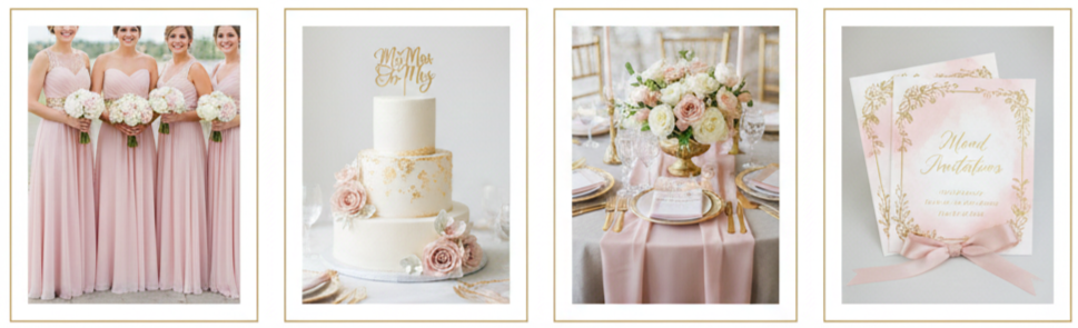
Blush and Gold
In 2014, weddings embraced soft, romantic tones—blush pinks paired with gold accents created an elegant, dreamy atmosphere. These tones were used in everything from bridesmaid dresses to cakes and table décor.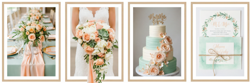
Mint Green and Peach
This combo gave spring and summer weddings a fresh, garden-inspired feel. It was a go-to choice for outdoor ceremonies with light and breezy vibes.
Bold Accents
For fall and winter celebrations, deep hues like navy, emerald, and plum added contrast and richness to softer tones, making color schemes pop.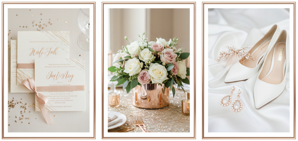
Metallic Infusions
Rose gold and champagne tones made their way into invites, centerpieces, and even bridal accessories, adding sparkle without overdoing it.
Wedding Dress Styles That Captivated 2014 Brides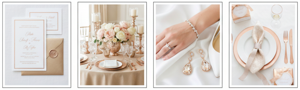
- Lace Detailing: Lace became a staple for 2014 brides. Designers like Monique Lhuillier and Marchesa showcased romantic lacework that added timeless beauty to gowns.
- Illusion Necklines: Sheer fabrics with appliqué created elegant necklines that gave the illusion of strapless styles but with more comfort and coverage.
- Sleeved Gowns: Long sleeves and cap sleeves gained popularity, offering modesty and vintage charm. These styles worked well for fall and winter weddings.
- Colored Dresses: Blush, gray, and pale blue dresses gave brides a unique look while still keeping it bridal. These soft colors added personality to traditional silhouettes.
Groom’s Style Evolves With Flair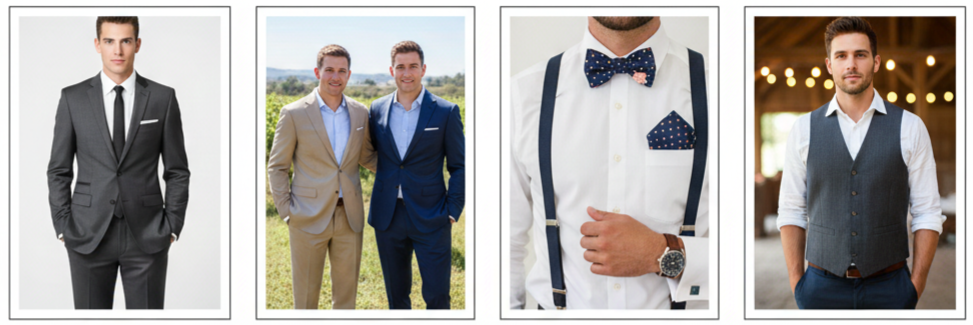
- Slim-Fit Suits: Tailored, slim-cut suits took over traditional tuxedos, giving grooms a sharp, modern look.
- Color Variety: Navy, tan, and gray suits became popular choices, especially for warm-weather weddings. Charcoal and midnight blue were perfect for cooler seasons.
- Unique Accessories: Grooms showed more personality through patterned bowties, floral pocket squares, suspenders, and colorful socks.
- Rustic Styles: For relaxed weddings, grooms often wore rolled sleeves, vests, or even denim, adding a casual twist without losing style.
Décor and Theme Inspirations That Defined 2014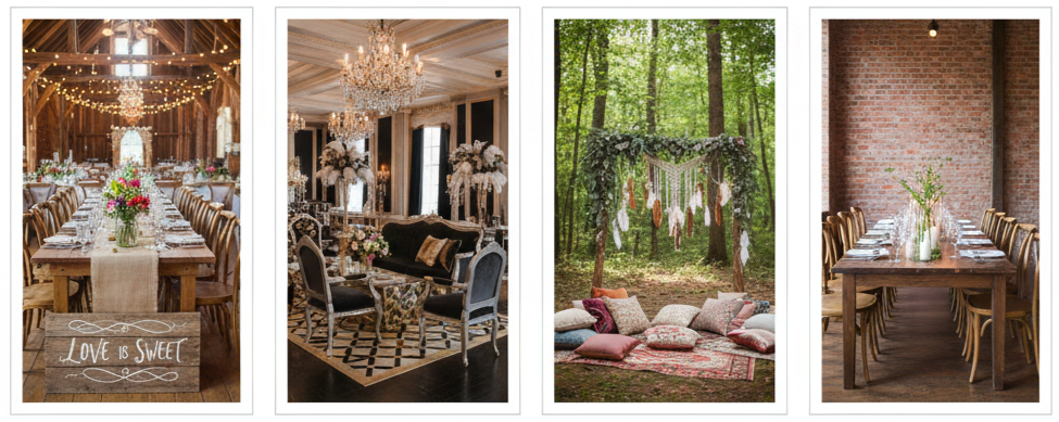
- Rustic Chic: Barn weddings with fairy lights, mason jars, burlap table runners, and wooden signs dominated the scene. It was a cozy, countryside look that felt authentic and warm.
- 1920s Glamour: Inspired by The Great Gatsby, some couples went all out with bold fonts, crystal accents, and vintage lounge setups to give their weddings a roaring ’20s vibe.
- Bohemian Touches: Outdoor weddings took on a free-spirited flair with elements like feather accents, low-seating areas, and an abundance of greenery.
- Urban Minimalism: Clean lines, exposed brick, and neutral tones created an elegant industrial look for city weddings. Paired with soft candlelight, it felt both edgy and romantic.
2014 Floral Arrangements Favored Organic Beauty
- Wildflower Bouquets: Brides opted for looser, hand-picked-looking bouquets using daisies, lavender, and eucalyptus for a soft, natural touch.
- Succulents and Greenery: These sturdy greens showed up in bouquets, boutonnieres, and centerpieces, offering a fresh look that lasted through the event.
- Peonies and Garden Roses: These soft, full blooms were favorites for spring and summer, adding classic romance to floral arrangements.
- Floral Crowns: Brides and bridesmaids often wore flower crowns, especially at bohemian or outdoor weddings. It was a fresh alternative to traditional veils or hairpieces.
Cuisine Trends: Flavor Meets Presentation
- Farm-to-Table Menus: Locally sourced ingredients and seasonal dishes became a top pick for eco-conscious couples wanting fresh and meaningful meals.
- Interactive Food Stations: Guests built their own plates at taco bars, pasta stations, or carving tables. These setups made the reception meal feel relaxed and personalized.
- Naked Cakes: These lightly frosted cakes showed off the layers and were often decorated with fruit or florals, offering a more organic, simple look.
- Mini Desserts: From pie bites to doughnut towers, bite-sized desserts gave guests a variety of options without committing to one slice.
- Signature Cocktails: Personalized drinks named after the couple or a shared memory added a thoughtful, fun element to the drink menu.
Photography and Videography Became More Intimate
- Candid Photography: Couples moved away from formal portraits in favor of photojournalistic styles that captured genuine laughter, tears, and surprises.
- Vintage Filters: Editing techniques with sepia tones, film grain, and light leaks gave photos a timeless feel.
- Highlight Reels: Videographers created short cinematic videos capturing the most memorable moments of the day—perfect for sharing with friends and family online.
- Same-Day Edits: Some videographers offered quick turnarounds, allowing couples to watch a recap of their big day right at the reception.
Entertainment and Guest Engagement Became Interactive
- Live Music: Acoustic bands and jazz ensembles added energy and intimacy during ceremonies and receptions.
- Photo Booths: These remained a fan favorite, with props, filters, and printouts giving guests a fun takeaway.
- Lawn Games: Cornhole, oversized Jenga, and ring toss gave guests something to enjoy during cocktail hour or downtime.
- Social Sharing: Custom hashtags encouraged guests to post photos and videos, creating a shared online album of the wedding day.
Stationery and Invitations Made a Lasting First Impression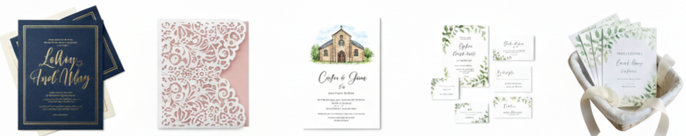
- Letterpress and Foil: Couples chose luxurious printing styles with deep impressions and shiny finishes for their wedding invites.
- Laser-Cut Designs: These detailed, intricate styles added a wow factor to invitations and matched ornate wedding themes.
- Custom Illustrations: From venue sketches to couple portraits, invitations felt more personal and artistic.
- Matching Suites: Menus, place cards, RSVP cards, and thank-you notes all followed the same design, tying the whole event together visually.
Outdoor and Destination Weddings Saw a Boom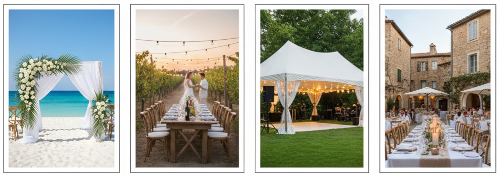
- Beach Weddings: These offered a relaxed, breezy atmosphere where shoes were optional and views were everything.
- Vineyard Venues: Perfect for wine lovers, vineyards blended natural beauty with built-in catering and drinks.
- Backyard Weddings: Couples transformed their own homes or family properties into elegant venues with tents, lighting, and thoughtful details.
- Destination Celebrations: Whether it was a Caribbean island or a European village, destination weddings gave guests a vacation and celebration in one. These weddings were often smaller but lasted multiple days for more quality time.
Conclusion
Weddings in 2014 were all about making the day reflect who the couple was. Every choice—from dresses and suits to food and florals—was intentional. The goal wasn’t just to follow trends but to create a unique experience that felt meaningful, stylish, and memorable. Couples blended vintage charm with modern convenience, making their weddings personal from the invitation to the final dance.
Key Takeaway: The 2014 wedding season highlighted creativity, customization, and personal flair. Whether it was through soft color palettes, rustic décor, or interactive food and entertainment, couples turned their big day into a one-of-a-kind experience that felt current, heartfelt, and true to them.
FAQs
What were some popular bridesmaid trends in 2014?
Bridesmaids wore mismatched dresses in complementary shades. Fabrics like chiffon in pastel tones were commonly chosen for a soft, romantic look.
Did couples include technology in their wedding planning?
Yes. Many used wedding websites for RSVPs and schedules. Live streaming, hashtag campaigns, and mobile apps helped keep guests informed and engaged.
How did wedding cakes differ in 2014?
Naked cakes were especially trendy, showing off cake layers with minimal frosting and topped with fresh flowers or fruits for a natural look.
Were weekday or off-season weddings popular in 2014?
Some couples opted for weekday or off-season weddings to save on costs and secure their preferred venues or vendors, especially for destination or outdoor events.
What types of favors were common for guests?
Favors included succulents, personalized mini bottles, homemade treats, or locally sourced goods that tied into the couple’s theme or region.
2014 Wedding Decoration Ideas Using Lanterns Blog21.
| Lantern Style | Best Use | Theme Match |
| Metal-Framed Vintage | Centerpieces, Aisle | Vintage, Shabby Chic |
| Rustic Wooden | Ceremony, Outdoor Decor | Rustic, Barn, Garden |
| Moroccan | Hanging, Lounge Areas | Boho, Destination |
| Floating Paper | Send-Offs, Water Features | Whimsical, Evening |
The Lantern Obsession of 2014 Weddings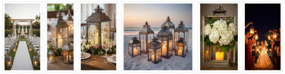
- What made lanterns so popular: Wedding styles in 2014 leaned toward nature-inspired, rustic, and vintage aesthetics. Lanterns fit perfectly because they were simple, visually appealing, and easy to adapt to any setting.
- How couples used them: Whether filled with candles, fairy lights, or flowers, lanterns appeared in every part of the wedding—from the aisle and altar to the reception and send-off. Their affordability and versatility made them a favorite among brides and grooms who wanted style without stress.
Types of Lanterns That Ruled the Wedding Scene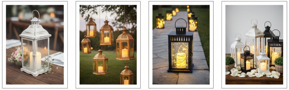
Metal-framed vintage lanterns
These were a go-to for vintage or shabby chic weddings. With glass panes, distressed finishes, and soft white, gold, or black colors, they added a romantic touch.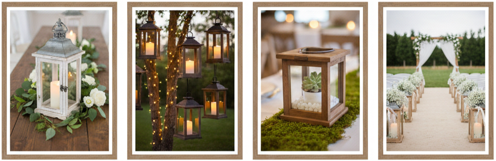
Rustic wooden lanterns
Wooden frames brought that country, down-to-earth feel—especially popular in barn or outdoor weddings. Their open-air design made them great for displaying candles or flowers. 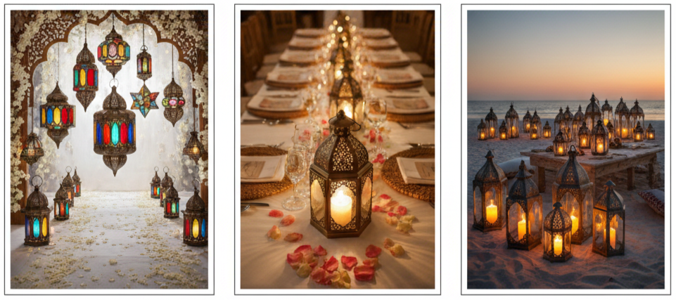
Moroccan lanterns
With their intricate cutouts and colorful stained glass, Moroccan-style lanterns offered a bold and boho flair. Perfect for destination weddings or eclectic themes.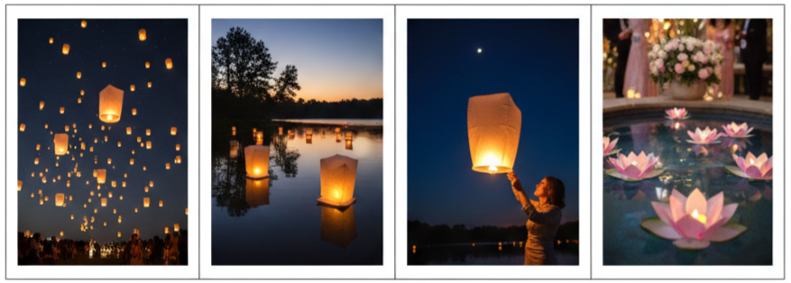
Floating paper lanterns
Couples loved using sky or water-floating lanterns for night ceremonies. These soft, glowing lights created dreamy scenes that felt magical.
How Couples Used Lanterns at the Ceremony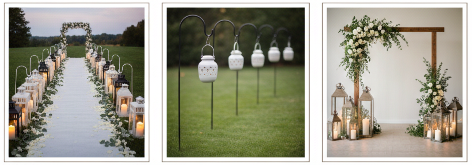
- Lining the aisle: Lanterns placed on either side of the aisle added a peaceful and romantic pathway. Many couples paired them with flower petals or greenery to tie in their color scheme.
- Hanging lanterns from shepherd hooks: For outdoor ceremonies, using hooks allowed lanterns to hang just above the aisle, giving a suspended, enchanted look.
- Framing the altar: Lanterns of varying heights placed around the altar made it the focal point. Adding candles or floral arrangements inside helped bring texture and warmth.
Creative Lantern Ideas for Wedding Receptions

- Lantern centerpieces: Instead of big floral arrangements, many couples used lanterns filled with candles or fairy lights as the table centerpiece. Some added moss, succulents, or seasonal flowers around the base.
- Overhead lantern installations: Hanging lanterns above the reception space—from tent ceilings, trees, or beams—brought a soft overhead glow. It helped define the space without feeling heavy.
- Lighting walkways: Lanterns lined walkways between different reception zones. Whether it was the bar, the lounge, or the dance floor, these glowing paths helped guests find their way and added a cozy vibe.
DIY Tips to Make Lanterns Your Own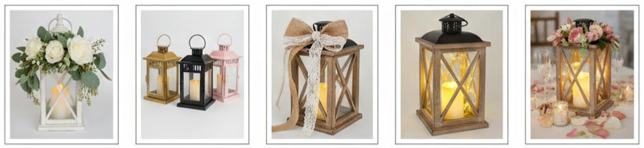
- Add florals: Wrapping the tops or handles with fresh blooms or greenery helped tie the lanterns into the wedding’s floral design.
- Paint to match your theme: Couples often spray-painted lanterns to match their wedding palette. Soft pastels, metallic gold, and matte black were all popular choices.
- Decorate with ribbons and lace: Adding materials like burlap, lace, or satin ribbons gave each lantern a custom look. Mixing textures made even the simplest lanterns look layered and intentional.
- Swap open flames for safe lights: Many used LED candles or fairy lights inside their lanterns. These options glowed all night without the worry of wind, fire, or wax mess.
Lanterns at Night: Creating a Soft Glow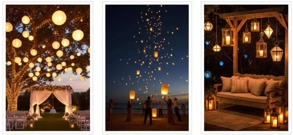
- Garden ceremonies with hanging lanterns: Stringing lanterns from tree branches or across ceremony arches created a magical space after sunset. It gave guests the feeling of stepping into a fairy tale.
- Floating lantern send-offs: As an alternative to sparklers, couples handed guests lanterns to release into the sky or float on water. These send-offs were symbolic, peaceful, and visually stunning.
- Lounge and photo areas: Lanterns were great for adding ambiance to relaxed seating zones or photo booths. Whether grouped on the floor or hung behind a backdrop, they created cozy corners perfect for candid pictures.
Keeping It Safe and Practical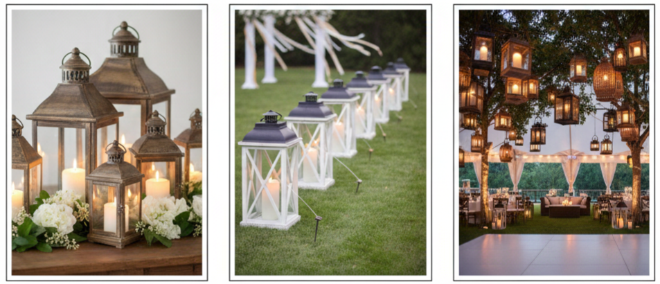
- Use enclosed lanterns for open flames: If real candles were used, glass-paneled lanterns kept the flame safe and contained.
- Plan for wind and weather: Outdoor weddings had to account for gusts. Couples used lanterns with sturdy bases or secured them to prevent tipping.
- Avoid crowding busy areas: Lanterns were kept out of walkways and away from dance floors. Hanging them up high or tucking them into corners helped maintain flow without sacrificing style.
Conclusion
Lanterns played a big role in shaping the look and feel of 2014 weddings. They were more than just decorations—they added atmosphere, personality, and charm to every moment. Whether they were hanging from trees, lighting a garden path, or sitting on reception tables, lanterns helped couples create warm and meaningful settings. And even though years have passed, the creative ways lanterns were used in 2014 still inspire couples today.
Key Takeaway: They were beautiful, affordable, and easy to personalize. No matter the wedding style—rustic, elegant, boho, or classic—lanterns made everything feel more magical and inviting.
FAQs
What kind of candles work best for lanterns at weddings?
LED candles or battery-operated lights are the best options for safety and convenience. If using real candles, choose slow-burning pillars and make sure they’re protected inside a glass-paneled lantern.
How many lanterns should I plan for a medium-sized wedding?
For a wedding with around 100 guests, you might use 20 to 30 lanterns for centerpieces and another 10 to 15 to line the aisle or decorate corners of the venue.
Are lanterns reusable after the event?
Yes! Many couples repurpose them as home décor, use them for future parties or anniversaries, or even give them away as keepsakes to close friends or family.
Can lanterns work with modern wedding themes?
Definitely. Sleek metal lanterns with minimalist shapes pair well with modern aesthetics. It’s all about choosing clean designs and matching them with your color scheme.
Where’s the best place to get budget-friendly lanterns?
You can find affordable lanterns at online bulk retailers, craft stores, secondhand shops, or even through wedding décor rental companies.
2014 Wedding Color Trends Coral Wedding Ideas And Invitations Blog03
| Season | Coral Shade | Pairing Colors | Theme Style |
| Spring | Soft peachy coral | Mint, blush, ivory | Romantic garden |
| Summer | Bright vivid coral | Turquoise, gold, citrus tones | Tropical, beach |
| Fall | Deep burnt coral | Gold, brown, olive | Rustic, warm |
| Winter | Bold coral accents | Silver, evergreen, navy | Modern contrast |
The Rise of Coral in 2014 Wedding Color Trends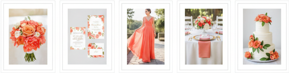
Coral completely owned the wedding world in 2014, and it makes sense why. It felt bright without being too loud, romantic without being too soft, and modern without being trendy in a way that dated quickly. Couples loved how coral could match different wedding styles, from beach ceremonies to formal ballroom receptions. It also worked well for spring and summer weddings, since it naturally fits sunny settings and outdoor venues.
Coral also became popular because it was showing up everywhere. Brides saw it in floral design boards, wedding magazines, runway-inspired bridal styling, and even home décor. Once coral hit Pinterest, it spread fast. People started using it as a main wedding shade, a supporting accent, or even a statement pop that gave the whole celebration more energy.
Popular Coral Wedding Color Combinations
Coral stands out because it pairs beautifully with so many colors. It can look sweet, dramatic, elegant, or tropical depending on what you mix it with. Here are some of the most popular combinations that showed up in 2014 weddings.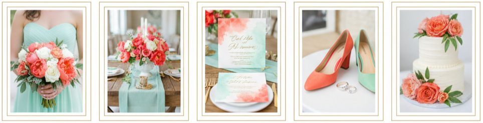
Coral and Mint
This combo feels light, fresh, and slightly vintage. Mint tones cool coral down just enough to give the palette a softer look, which makes it great for garden weddings or rustic venues with lots of greenery. Bridesmaid dresses in mint paired beautifully with coral bouquets, and coral centerpieces looked even brighter against mint table accents.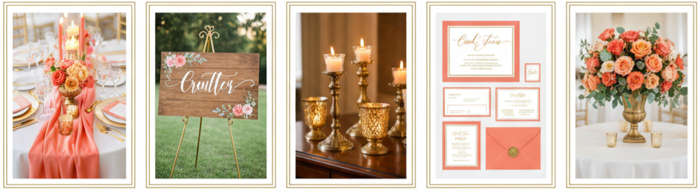
Coral and Gold
Coral and gold gave weddings a glamorous vibe without feeling too heavy. Gold details made coral look more refined, especially when used in table décor, signage, candle holders, and stationery. Coral florals in gold vases became a signature look in 2014, and this pairing worked especially well in formal venues where couples wanted a polished setup.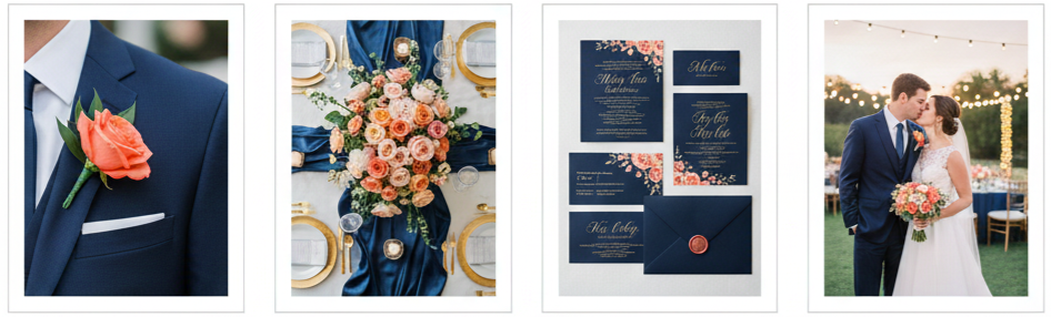
Coral and Navy
This pairing gave coral a deeper contrast and made the entire color scheme feel more structured. Navy works like a grounding shade, which means coral looks even more vibrant next to it. Navy suits with coral boutonnieres, navy table runners under coral florals, and navy invitations with coral accents created a bold wedding design that looked amazing in photos.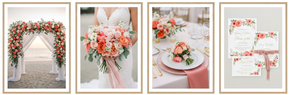
Coral and Blush
Coral and blush made weddings feel dreamy and romantic. Blush softens the intensity of coral while still keeping the palette warm. This was a favorite for couples who wanted a softer color scheme without going fully pastel. Floral arrangements using blush roses mixed with coral peonies gave the wedding a soft, elegant glow.
Coral Bridesmaid Dresses and Groom Accessories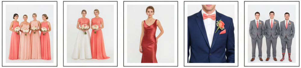
Bridesmaids wearing coral became one of the most recognizable looks of 2014 weddings. Coral dresses flattered many skin tones, which made it easier for brides to choose one color that worked across their whole bridal party. Coral also came in a lot of fabric options that fit different wedding styles. Chiffon gave it a soft, flowy feel for outdoor weddings. Lace made it feel more romantic and traditional. Satin added a sleek look for evening celebrations.
Grooms and groomsmen usually wore coral in smaller details instead of full outfits, which kept everything balanced. Coral ties, bow ties, pocket squares, and boutonnieres were the most common choices. Coral socks also became a fun touch for photos. The best part was that coral paired nicely with classic suit colors like gray, navy, tan, and even black, so it fit into almost any wedding theme without clashing.
Coral-Inspired Wedding Décor That Stands Out
Coral décor made weddings feel energetic and cheerful, especially when couples used it in the right places. It worked best when used as a statement color rather than something that covered every surface. Couples picked specific décor areas where coral could shine, and the result looked coordinated without feeling overwhelming.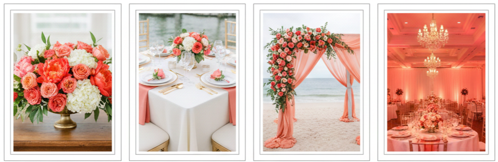
- Floral Arrangements: Coral flowers became the main décor feature in many 2014 weddings. Coral peonies, garden roses, ranunculus, dahlias, and tulips were used in bouquets, centerpieces, ceremony arches, and floral backdrops. Coral also looked beautiful when paired with greenery, white blooms, blush tones, or gold accents.
- Table Styling: Coral table décor usually showed up through napkins, chargers, runners, and place cards. Couples loved pairing coral with white linens to keep things clean and bright. Coral also looked great with gold-rimmed glassware and metallic flatware, especially in evening receptions.
- Ceremony Backdrops: Coral became a standout color for arches and photo-ready ceremony designs. Couples used coral fabric draping, coral floral installations, painted wood walls, or coral ribbon features. These backdrops looked stunning in photos and gave the ceremony space a clear focal point.
- Lighting Touches: Coral uplighting became a popular trick for indoor receptions. A coral glow warmed up the room, made white décor look more romantic, and gave the venue a sunset-like mood. Even when the décor was neutral, coral lighting created an instant theme.
Stylish Coral Wedding Invitations and Stationery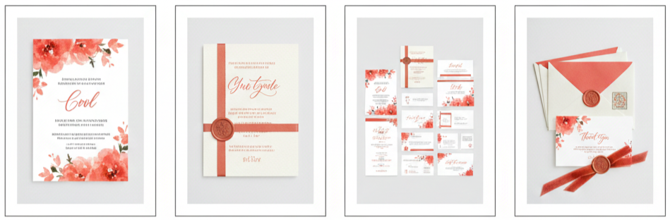
Coral invitations were one of the biggest ways couples introduced the theme early. In 2014, couples leaned into coral for everything from bold watercolor designs to subtle coral calligraphy on ivory cardstock. It worked well for modern stationery and also for vintage-inspired designs, depending on the typography and layout.
Coral also looked great when used consistently across an entire stationery suite. Many couples matched their save-the-dates, RSVP cards, menu cards, table numbers, and thank-you notes to their coral theme. Little details like coral envelope liners, coral wax seals, coral ribbon wraps, and custom stamps made everything feel coordinated and premium.
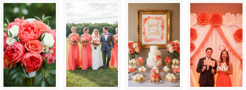
Coral Wedding Cakes and Dessert Displays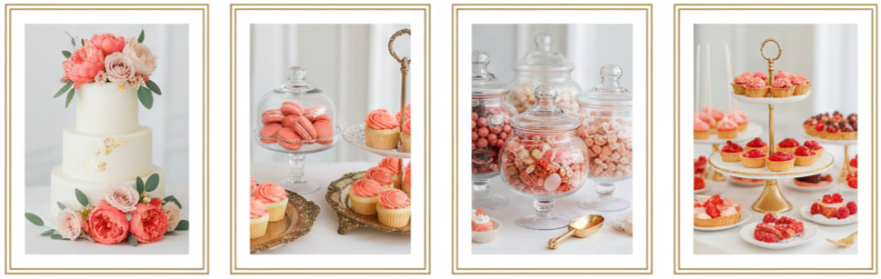
Dessert tables in 2014 became a major décor moment, and coral played a big role there too. Couples used coral on cakes in both subtle and bold ways. Some went for smooth coral fondant tiers with gold trim. Others added coral sugar flowers, coral buttercream textures, or floral toppers featuring real coral blooms.
Coral also worked beautifully for dessert displays beyond the cake. Couples added coral macarons, coral cupcakes, coral cake pops, and coral candy buffets. It wasn’t just about matching the color, either. Coral desserts made the table feel cheerful and inviting, especially when styled with clear jars, vintage trays, or gold stands that matched the wedding theme.
How to Balance Coral Throughout the Wedding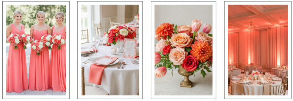
Coral is a strong color, so balance mattered. Couples who used it strategically ended up with a wedding design that felt stylish instead of overwhelming. The easiest way to balance coral was to choose a few main places to show it off and then let neutrals handle the rest of the décor.
Using coral in bridesmaid dresses, bouquets, centerpieces, and stationery gave the wedding strong visual consistency. Then, using ivory, beige, pale gray, or soft blush in the background kept everything clean and elegant. Couples also layered different coral tones to avoid everything looking flat. Mixing peachy coral with deeper coral shades gave more depth to floral arrangements, table décor, and signage.
Coral Favors and Guest Experience Enhancements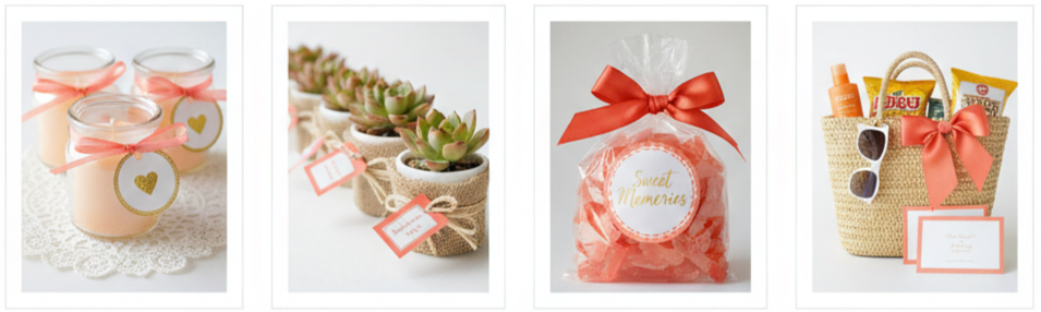
Coral-themed wedding favors helped carry the look beyond décor and into the guest experience. Couples used coral details in packaging, ribbon, and tags to make even simple favors feel intentional and on-theme.
Popular coral favor ideas included coral-scented candles, mini coral potted plants, coral candy bags, and personalized coral labels with the couple’s name and wedding date. For destination weddings, coral welcome bags became a favorite. These included snacks, travel-size essentials, sunglasses, and coral-themed note cards. These small details made the wedding feel thoughtful while keeping coral present throughout the guest experience.
Coral in Wedding Photography and Visual Planning
Coral photographed beautifully, which is one reason it became so popular. It stood out well against natural backgrounds like greenery, beaches, and gardens, and it also popped against neutral décor like white draping or soft wood tones. Coral bridal parties looked vibrant in outdoor photos, and coral flowers added warmth and texture to close-up shots.
Couples also used coral to style visual areas that mattered in photos, like seating charts, dessert tables, signage, and photo booths. Coral props, coral floral walls, coral lighting, and coral-themed backdrops created fun moments guests could interact with while giving photographers more color-rich detail shots.
Incorporating Coral Into Seasonal Wedding Themes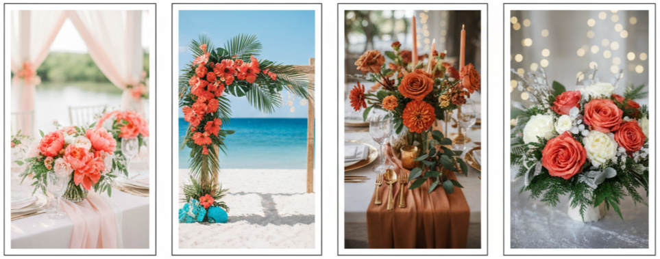
Coral worked differently depending on the season, and couples adjusted their coral palette based on the time of year.
Spring weddings used coral with soft pastels and lots of fresh florals. This created a light and romantic feel, especially for outdoor ceremonies. Summer weddings used coral in brighter tones and paired it with turquoise or citrus colors for a tropical vibe. This was especially popular for beach weddings and destination celebrations.
Fall weddings leaned into deeper coral shades that looked closer to terracotta or burnt orange. Paired with gold, brown, and warm greenery, coral fit nicely into autumn design. Winter weddings didn’t use coral as often, yet some couples made it work by pairing coral with silver, white, evergreen, or emerald accents for contrast. Coral also worked well in winter when used as a bold statement rather than a full theme.
Conclusion
Coral became one of the most memorable wedding color trends of 2014 because it blended fun, romance, and versatility in a way that fit almost any wedding style. Couples used coral in dresses, flowers, décor, invitations, and desserts because it created warmth and personality without losing elegance. Whether coral showed up as the main color or as a smaller accent, it gave weddings a bright, polished look that still feels inspiring today.
Key takeaway: Coral stood out as the signature wedding color of 2014 because it worked across themes, seasons, and details, while still looking timeless in photos and décor.
FAQs
What styles of shoes match coral bridesmaid dresses?
Neutral shoes like nude, gold, blush, or champagne work best because they let coral stay the main focus. Metallic shades also blend well with coral, especially in formal weddings, since they add shine without competing with the dress color.
Is coral suitable for wedding signage and welcome boards?
Yes, coral works beautifully for signage because it stands out clearly in photos and is easy to pair with white, ivory, gold, or navy backgrounds. Coral lettering, coral floral borders, and coral watercolor effects give signage a warm and welcoming look.
Can coral be used in wedding makeup themes?
Yes, coral makeup is a great match for weddings because it looks fresh and flattering in photos. Coral lipstick, peachy coral blush, and warm coral-toned eyeshadow work well for both soft daytime looks and more dramatic evening styles.
What fabrics hold coral dye best for décor?
Chiffon, satin, organza, and silk tend to hold coral tones well and look rich under lighting. These fabrics are also popular for table runners, chair sashes, and ceiling draping because they photograph well and add softness to the space.
How can coral wedding favors feel more personal?
Personalizing coral favors is easy through custom tags, printed labels, or stickers that include the couple’s name and wedding date. Coral ribbon, coral tissue paper, or coral wax seals also make simple favors feel more thoughtful and tied to the overall wedding theme.
2014 Wedding Color Schemes Blushing Wedding In Blush Pink Blog04
| Color Pairing | Style Effect |
| Blush + Gold | Elegant and glamorous |
| Blush + Mint | Fresh and spring-like |
| Blush + Navy | Bold and balanced |
| Blush + Ivory | Soft and vintage-inspired |
| Blush + Burgundy | Warm and romantic for fall |
| Blush + Silver | Cool and sophisticated for winter |
Why Blush Pink Was Everywhere in 2014 Weddings
Blush pink absolutely took over wedding color schemes in 2014. It was soft, charming, and elegant—everything couples were looking for when planning a romantic wedding. Instead of bold, dramatic shades, brides started leaning into tones that felt warm and subtle. That’s where blush pink came in. It fit every theme, from rustic barns to grand ballrooms.
It wasn’t just about trends though. Blush pink photographed beautifully and made every detail look cohesive. Whether you were walking down a rose petal-lined aisle or sipping rosé under soft string lights, this hue helped set the perfect mood.
How Blush Pink Showed Up in Wedding Fashion
- Bridal gowns and accessories: In 2014, more brides started moving away from plain white gowns. Designers introduced dresses in pale blush tones, often layered with tulle or detailed with lace. These gowns added a unique twist without being too far from tradition. Many brides also added blush accessories like shoes, belts, or veils for a hint of color.
- Bridesmaid dresses: Blush pink was the standout bridesmaid color that year. It worked with every skin tone, looked gorgeous in photos, and felt fresh but timeless. Some bridal parties wore matching dresses, while others mixed different styles in the same blush shade.
- Groom and groomsmen style: Guys added blush accents to their outfits too. Think ties, bowties, boutonnieres, or pocket squares. Paired with charcoal, navy, or light gray suits, those soft pink details pulled everything together in a stylish, subtle way.
Bringing Blush Into Every Part of the Wedding Decor
- Ceremony spaces: Whether couples said “I do” in a garden or chapel, blush pink helped create a romantic setting. It showed up in chair sashes, floral arrangements, ribbon-wrapped bouquets, and fabric draping across arbors. The goal was soft elegance, and blush totally delivered.
- Reception details: Blush was everywhere at the reception. Tablecloths, centerpieces, candles, and even dinner menus followed the theme. Blush sequin runners added sparkle, while blush glassware and candles created a cozy glow. Layering this color across different elements made everything look polished and connected.
- Stationery and signage: Invitations, programs, menus, and signage embraced blush tones too. Couples chose watercolor designs, floral borders, and metallic lettering to elevate the romantic feel. Welcome signs, seating charts, and even bar menus used blush accents to tie in with the overall look.
Wedding Flowers That Made Blush Shine
- Popular blush blooms: Florals played a huge part in bringing the blush theme to life. Peonies, roses, ranunculus, and sweet peas were top picks for their soft, natural pink tones. They added texture, volume, and color without feeling too loud or artificial.
- Perfect pairings: Blush florals looked great alongside ivory blooms, dusty greens like eucalyptus, and silvery leaves like dusty miller. For weddings in cooler seasons, couples often added deeper tones like burgundy or soft mauve to create contrast.
- Floral placements: From bouquets to centerpieces, arches to aisle markers, blush flowers were used just about everywhere. Florists combined them with neutral and metallic details to keep the overall look romantic and balanced.
Blush Wedding Cakes and Sweet Details
- Cake styles: Cakes became a huge design moment in 2014 weddings. Blush pink cakes came in ombré layers, ruffled buttercream textures, or hand-painted floral patterns. Some featured gold leaf or blush-toned sugar flowers for extra flair.
- Dessert tables: Many couples went beyond the cake and created entire dessert displays. Macarons, mini cupcakes, cookies, and candies in blush and ivory made for an eye-catching (and delicious) setup. These desserts often matched the cake’s design for a cohesive finish.
- Flavor touches: Some couples even coordinated flavors with the color scheme. Rosewater, raspberry, or strawberry fillings were popular options that complemented the look and gave guests a sweet surprise.
Blush Color Combos That Ruled the Year
Blush and gold
This pairing felt luxurious and refined. The shimmer of gold elevated the softness of blush, making it perfect for formal weddings. Gold chargers, cutlery, candleholders, and signage helped tie the theme together beautifully.
Blush and mint
This combo gave off a fresh and airy vibe—perfect for spring weddings. Mint table accents or greenery softened the look, while blush florals and bridesmaid dresses added elegance.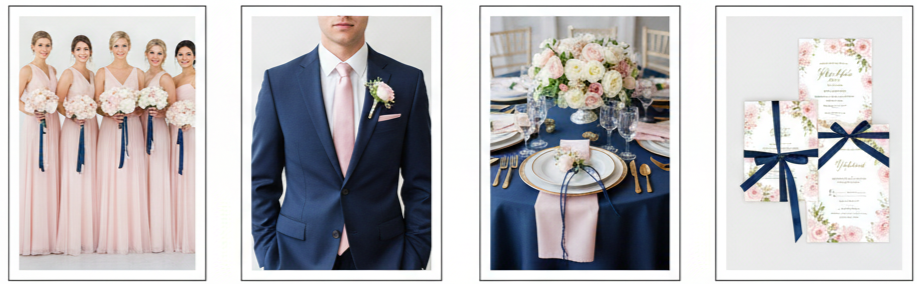
Blush and navy
For couples looking for contrast, blush and navy delivered. Navy suits and table linens grounded the design, while blush brought in a romantic tone. The balance between dark and light made it great for both modern and traditional weddings.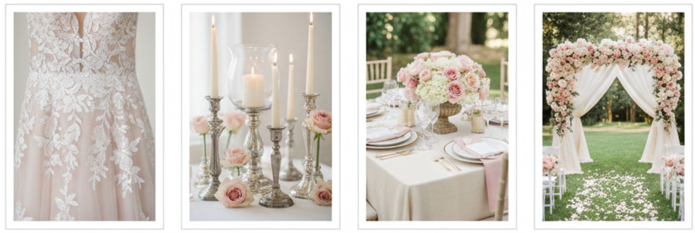
Blush and ivory
Soft, romantic, and classic—this duo felt vintage and effortless. Lace details, vintage candleholders, and antique-inspired decor worked well within this palette, especially for outdoor or garden weddings.
Blush Pink Through Every Season
Blush wasn’t just for spring. In 2014, couples used it all year round by adjusting the supporting colors and textures.
- Spring: Paired with lavender, mint, or sage for a light and floral look.
- Summer: Mixed with champagne, coral, or pale peach for a sunny, playful feel.
- Fall: Combined with marsala, burgundy, or bronze for a warm, moody vibe.
- Winter: Styled with silver, emerald, or charcoal, using velvets and satin to add depth and luxury.
No matter the month, blush had a way of fitting right in with seasonal palettes while still standing out.
Pro Planning Tips for a Blush Wedding
Planning a blush pink wedding doesn’t mean everything has to be pink. The key is balance and layering.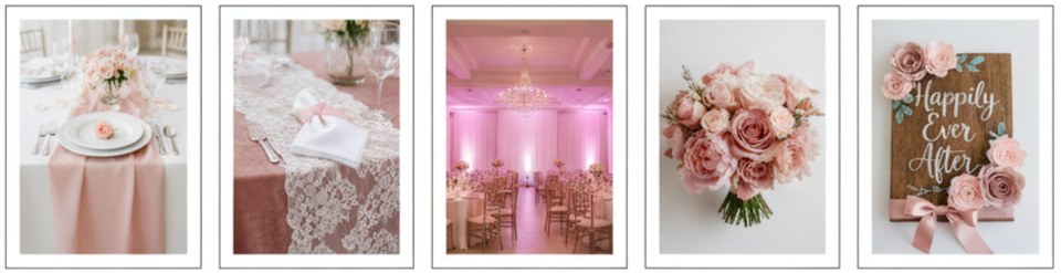
- Keep it subtle: Instead of using blush everywhere, spread it throughout the design—think linens, florals, accessories, and lighting. This keeps the look soft and elegant without overwhelming the space.
- Play with textures: Mix fabrics like lace, satin, tulle, and velvet to add depth. A blush velvet runner or lace overlay can elevate a simple table setup.
- Use blush lighting: Soft pink uplighting or candles in rose-tinted holders add warmth and bring the theme together, especially at evening receptions.
- Stick to a consistent tone: There are many versions of blush—from dusty rose to pale pink—so try to keep it cohesive across materials and florals.
- DIY touches: If you’re on a budget, small details like ribbons, napkins, hand-painted signs, or paper flowers in blush tones can go a long way.
Conclusion
Blush pink truly defined 2014 weddings. It wasn’t just a trendy color—it became a symbol of soft elegance and timeless romance. Whether it showed up in the bride’s dress, the flowers, or the cake, blush created a consistent visual theme that made every wedding feel connected, intentional, and personal. It worked for big weddings, small celebrations, modern designs, and vintage dreams. Even now, the charm of blush pink hasn’t faded. It’s still a beloved color because of its versatility, beauty, and ability to fit just about any couple’s vision.
Key Takeaway: Blush pink wasn’t just a trend in 2014—it became a staple in wedding color palettes. With its soft charm and flexible style, it brought a timeless and romantic look to weddings of every theme and size. Whether paired with bold tones or kept light and airy, blush pink helped create unforgettable moments.
FAQs
Can I use blush pink in a beach or destination wedding?
Absolutely. Blush works beautifully against ocean backdrops, sandy tones, and tropical greens. Keep fabrics light and decorations breezy for the best results.
How do I keep blush pink from feeling too “girly” at my wedding?
Balance it with strong accents like navy, charcoal, or wood tones. Structured decor and clean lines also help make it feel more refined and neutral.
What’s the best way to use blush pink in a modern wedding theme?
Go minimalist. Use blush sparingly with crisp whites, black, or metallics. Think sleek florals, modern signage, and geometric shapes.
Is blush pink still popular in weddings today?
Yes. While it peaked in 2014, blush pink remains a go-to color for couples who want a romantic and elegant feel. It’s now considered a wedding classic.
How can I include blush pink in a low-budget wedding?
Stick to small details. Use blush in table napkins, ribbons, DIY floral arrangements, or signage. Even paper decorations and candles in soft pink can make a big impact.
2014 Hot Wedding Trends
| Trend | What It Looked Like In 2014 |
| Bold Color Palettes | Coral, navy, emerald, plum, gold accents |
| Vintage Themes | Lace, antique décor, Gatsby-style glam |
| Mismatched Bridesmaids | Same color family, different dress styles |
| Food & Drink Stations | Taco bars, donut walls, signature cocktails |
| Unique Venues | Rooftops, barns, vineyards, beaches |
| Wedding Tech | Hashtags, livestreaming, digital RSVPs |
| Statement Gowns | Blush tones, open backs, illusion lace |
| Personalized Details | Custom signage, creative guestbooks, themed tables |
Bold and Vibrant Color Palettes Made a Statement
Weddings in 2014 weren’t afraid to turn up the volume with color. Couples moved away from the usual pastels and embraced daring combinations like coral and navy or mint and gold. Jewel tones like emerald green and plum also made bold appearances across wedding setups.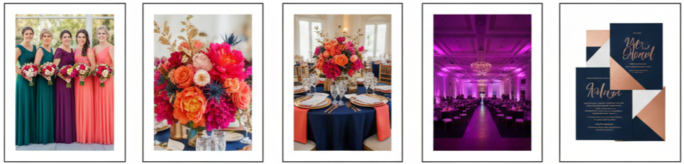
- Where the colors appeared: From bridesmaid dresses to floral arrangements, linens, and uplighting, vibrant colors were featured across every design element.
- Metallic accents: Gold, copper, and rose gold brought a luxurious touch, often incorporated into candleholders, centerpieces, and even invitation designs.
- The goal: Create a lively and unforgettable visual atmosphere that felt fresh and bold rather than safe or overly traditional.
Vintage-Inspired Weddings Brought Nostalgic Glamour
The vintage trend in 2014 leaned into the romance and charm of the past, heavily influenced by pop culture. Think old Hollywood, The Great Gatsby, or a touch of European elegance.
- Décor style: Antique mirrors, lace tablecloths, candelabras, and vintage-style furniture brought back the elegance of bygone eras.
- Wedding attire: Brides chose gowns with illusion necklines, long lace sleeves, or intricate embroidery. Grooms went for suspenders, bow ties, or vintage three-piece suits.
- Venue choices: Couples selected historic homes, restored barns, and classic ballrooms to match the throwback theme.
Mismatched Bridesmaid Dresses Redefined Coordination
Bridesmaid dresses got a major makeover in 2014. Rather than making everyone wear the same dress, brides allowed each bridesmaid to choose a style that suited her best—while still keeping a cohesive look.
- Color coordination: Brides often picked a color family (like neutrals or jewel tones) and let bridesmaids select their own shade within that group.
- Fabric variety: Mixing fabrics like chiffon, lace, or satin created texture and visual interest.
- The benefit: Each bridesmaid felt confident and comfortable while still fitting into the overall style of the wedding.
Creative Food and Drink Stations Elevated Guest Experience
Food wasn’t just about feeding guests—it became a part of the celebration in 2014. Couples added fun, interactive stations that gave guests more than just a meal.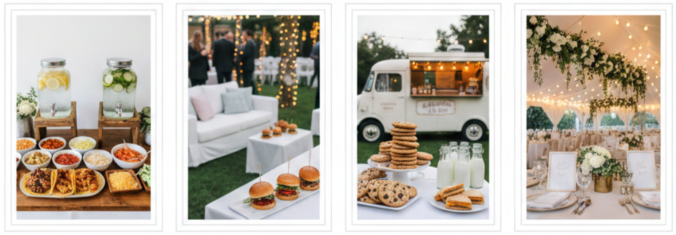
- Popular food setups: Taco bars, burger sliders, mac-and-cheese stations, and sushi rolling counters let guests customize their plates.
- Drink options: Signature cocktail bars and infused water stations became part of the décor and the experience.
- Late-night snacks: Think mini grilled cheese, milk and cookies, or food trucks offering post-dancing bites.
Unique Ceremony Locations Redefined Venue Expectations
Ceremony spaces in 2014 became more adventurous and personalized. Couples moved away from generic halls and leaned into settings that added to the vibe and storytelling of their big day.
- Venue types: Rooftop gardens, vineyards, forest clearings, beaches, and private estates were top choices.
- Décor approach: Many couples kept the decorations minimal to let the natural beauty of the space shine through.
- Why it worked: These venues brought a level of uniqueness and intimacy that traditional ballrooms couldn’t match.
Tech-Savvy Weddings Introduced Digital Engagement
Weddings got a modern upgrade in 2014 as couples used technology to bring people closer, streamline planning, and add a little flair.
- Hashtags and sharing: Couples created custom hashtags so guests could tag photos, making it easy to relive the memories online.
- Livestreaming options: Friends and family who couldn’t attend were able to watch the ceremony in real-time.
- Wedding websites: Couples used mobile-friendly platforms to host schedules, directions, travel info, and even RSVP tools.
- Photo booth upgrades: Digital filters, animated GIFs, and instant uploads replaced old-school printouts.
Statement Wedding Gowns Challenged Tradition
Bridal fashion in 2014 stepped out of the box. Brides started moving beyond plain white gowns and embraced color, texture, and unique design.
- Color choices: Blush, champagne, soft grey, and even powder blue added a fresh look to classic silhouettes.
- Design features: Open backs, illusion sleeves, detachable trains, floral embroidery, and subtle sparkle became signature elements.
- Styling goal: Brides wanted a dress that felt like them—not just one that fit tradition.
Personalized Wedding Details Added Sentimental Value
Personal touches were everywhere in 2014 weddings. Couples poured their stories and personalities into every part of the celebration.
- Signage and displays: Handwritten chalkboard signs, welcome messages, and framed quotes gave guests a peek into the couple’s relationship.
- Guestbooks with a twist: Instead of traditional sign-ins, couples used Polaroid pictures, fingerprint trees, or typewritten messages.
- Custom table names and favors: Tables named after places the couple traveled or shared experiences. Favors often included homemade goodies or items that reflected shared hobbies or family heritage.
Conclusion
The wedding scene in 2014 was all about personalization, bold decisions, and ditching outdated traditions. Couples created celebrations that felt more like them—colorful, emotional, fun, and full of details that guests would remember. Everything from the food and music to the location and gown told a story. It was less about doing what others had done and more about making the day feel unique and authentic.
Key takeaway: 2014 weddings weren’t about sticking to a formula. They were about telling a love story through colors, creativity, and experiences that meant something real.
FAQs
What types of entertainment were trending at 2014 weddings?
Live bands were incredibly popular, along with DJs who mixed up custom playlists. Some weddings even featured interactive entertainment like fire dancers, acoustic performances, or fun games during cocktail hour.
Were wedding favors still a thing in 2014?
Yes, but couples got more creative. Favors included practical items like candles or mini succulents, or personal gifts like homemade jam and small custom keepsakes.
How were engagement announcements handled in 2014?
Creative engagement photo shoots were big on social media. Some couples also created short videos or custom-designed announcements to share with friends and family.
Did eco-friendly weddings trend in 2014?
They definitely did. Many couples chose local flowers, digital invites, repurposed décor, and even donation-based favors to keep things sustainable.
What hairstyles were brides going for in 2014?
Loose waves, messy buns, and vintage-inspired updos topped the list. Hair accessories like floral crowns, jeweled pins, and delicate veils added the finishing touches.
2013 Hot Ribbon Wedding Invitations
| Ribbon Type | Best For |
| Satin | Classic or formal weddings |
| Grosgrain | Modern or minimalist styles |
| Organza | Spring or garden weddings |
| Lace | Vintage or romantic themes |
| Burlap/Twine | Rustic or outdoor weddings |
| Velvet | Winter or evening weddings |
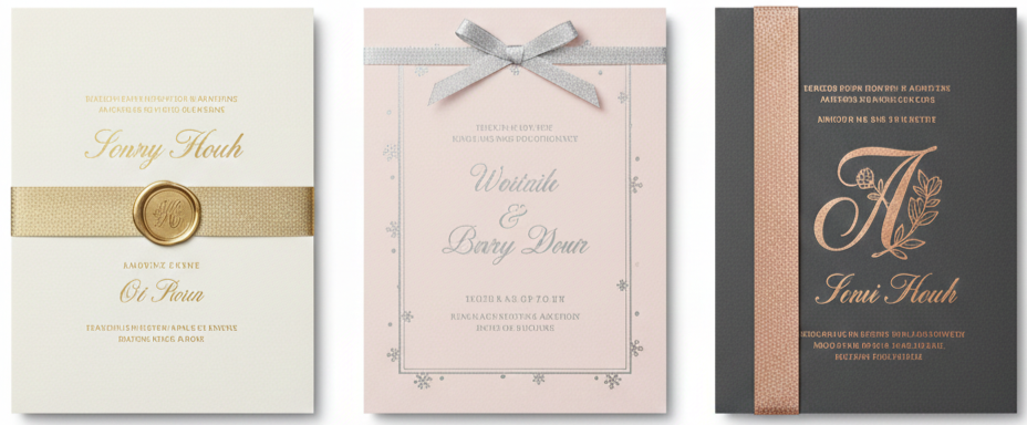
Why Ribbon Wedding Invitations Were a Big Deal in 2013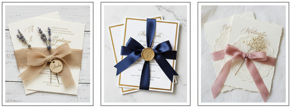
Ribbon wedding invitations were everywhere in 2013, and it made total sense. Couples wanted their invites to feel personal and stylish, not plain or overly formal. Ribbons gave invitations that extra touch that made guests pause before even opening the envelope. The moment someone saw a neatly tied bow or a ribbon wrap holding everything together, it instantly felt more thoughtful and intentional.
A big reason ribbons became so popular was the rise of romantic, vintage, and handmade wedding themes. Weddings in 2013 leaned heavily into softness, delicate details, and textures that looked handcrafted. Ribbons fit perfectly into that trend because they added depth and charm without needing complicated designs. Even a simple invitation looked elevated when paired with the right ribbon.
Ribbon accents also worked for almost every wedding style. A rustic outdoor wedding could use twine or burlap, while a black-tie wedding could use satin or velvet. That flexibility made ribbon invitations a go-to choice for couples who wanted their stationery to match their theme without feeling limited.
Types of Ribbons That Took Center Stage
Different ribbons created different moods, and 2013 couples had plenty of options. Some ribbons were soft and romantic, others were structured and modern, and some were bold enough to become the main design detail. The texture and finish mattered just as much as the color.
Satin Ribbons
Satin ribbons were smooth, shiny, and instantly elegant. They worked best for classic wedding suites, especially when paired with letterpress printing, metallic foil details, or monograms.
Grosgrain Ribbons
Grosgrain had a ribbed texture that felt more structured and crisp. It was a popular choice for modern weddings because it looked clean and tailored rather than soft and flowy.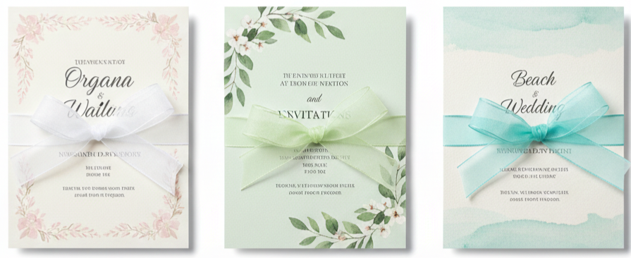
Organza Ribbons
Organza ribbons were sheer and lightweight, which made them perfect for spring and summer weddings. They added softness without hiding the invitation design underneath.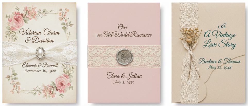
Lace Ribbons
Lace ribbon gave invitations a vintage and romantic look. Brides who loved antique-inspired weddings used lace to create a delicate, old-world feel that matched floral themes and soft palettes.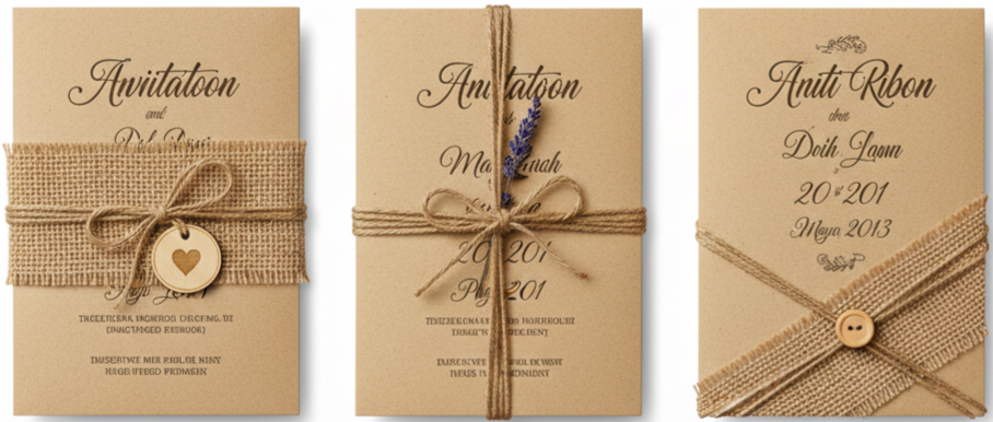
Burlap And Twine Ribbons
Rustic weddings were booming in 2013, and burlap or twine was a natural fit. These materials worked beautifully with kraft paper, wooden details, and handwritten calligraphy.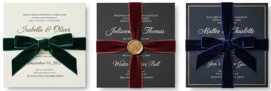
Velvet Ribbons
Velvet added drama and richness, making it ideal for winter weddings or evening celebrations. It created a luxurious look without needing extra embellishments.
Ribbon Styles That Defined 2013 Invitation Trends
Ribbons didn’t just sit on top of the invite as decoration. In 2013, designers used ribbon as part of the structure of the invitation suite. It held pieces together, acted as the “closure” for envelopes, or became the feature that tied the entire set into one cohesive bundle.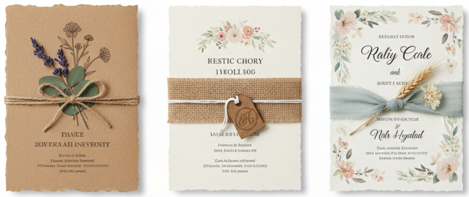
Rustic Charm
Rustic ribbon invitation styles focused on natural textures. Twine, burlap, and kraft paper were paired with soft florals, deckled edges, and sometimes even dried herbs. This style felt warm and handmade, which was exactly what many couples wanted.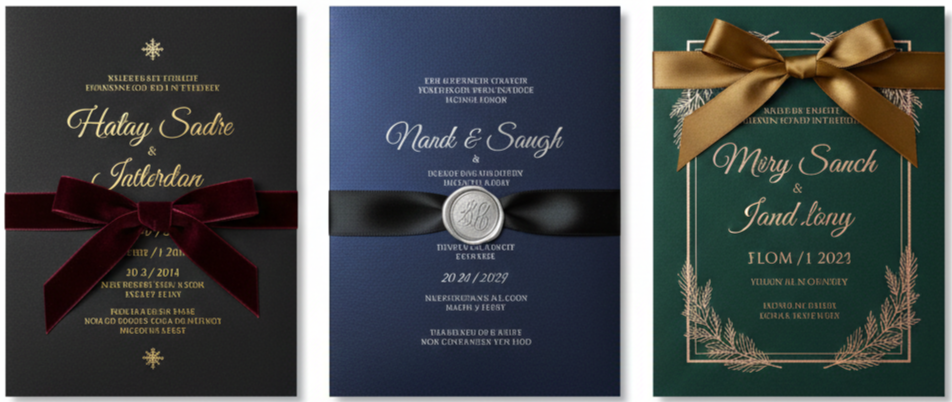
Glamorous Finishes
For formal weddings, satin or velvet ribbons in deep colors like navy, black, or burgundy looked sleek and polished. These invitations often featured foil stamping, thick cardstock, and refined typography.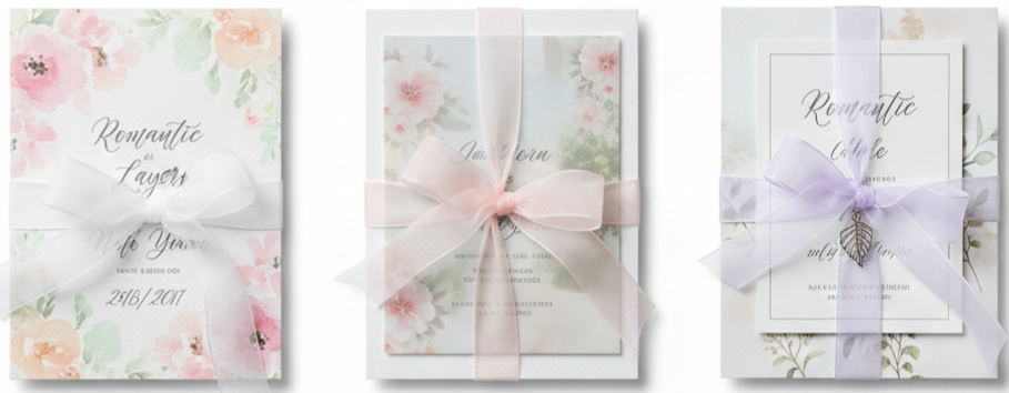
Romantic Layers
Soft layered invitation suites were a favorite for garden weddings and spring celebrations. Organza ribbons tied over watercolor florals, pastel prints, and dreamy layouts created a light and romantic feel.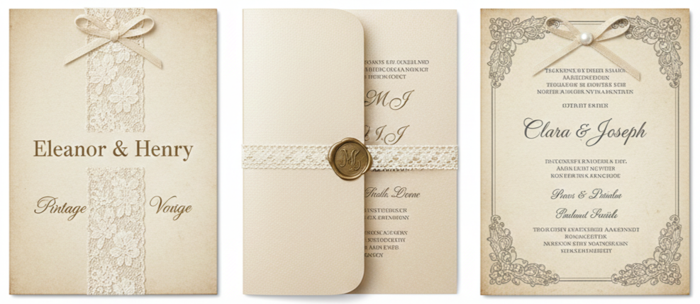
Vintage-Inspired Themes
Lace ribbon paired with antique paper tones and vintage fonts created invitations that felt nostalgic. Many couples leaned into old-fashioned charm through delicate textures and classic colors like ivory and champagne.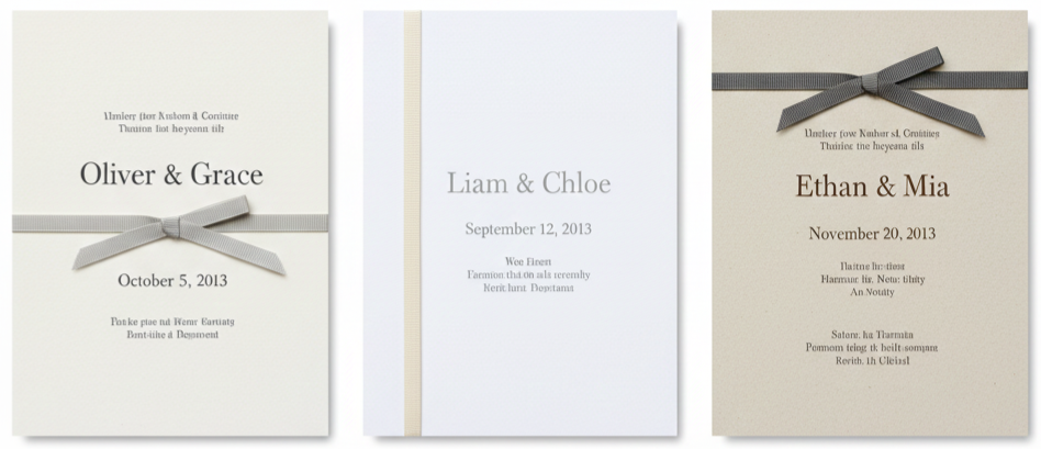
Minimalist And Modern
Modern couples used thinner grosgrain ribbons in neutral tones to add just enough detail without overwhelming the design. These invites usually had clean layouts, simple typography, and subtle textures.
Color Palettes That Made Ribbon Invites Pop
In 2013, ribbon color choices weren’t random. Couples used ribbon to create contrast, highlight their theme, and set the tone for the wedding day. Some chose ribbons that blended into the suite for a soft look, while others chose bold ribbon colors to make the invitation feel dramatic and memorable.
Soft Pastels
Blush, lavender, mint, peach, and soft blue were extremely popular for spring and summer weddings. Pastel ribbons added romance and worked beautifully with floral designs.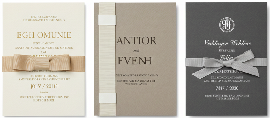
Neutral Elegance
Champagne, ivory, taupe, and gray were timeless choices. Neutral ribbons created a polished look and allowed the texture of the ribbon to stand out without making the invitation feel too busy.
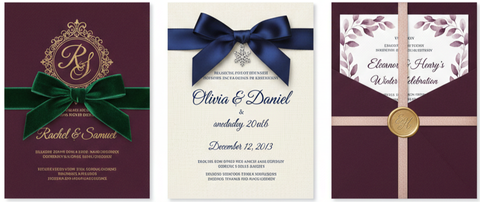
Bold Jewel Tones
Fall and winter weddings leaned into deep colors like emerald, navy, burgundy, and plum. Velvet and satin ribbons in these tones created a luxurious feel and instantly made the suite look formal and upscale.
Metallic Touches
Gold, silver, and rose gold ribbons were used for glam weddings and evening receptions. Metallic ribbons paired well with foil stamping and added shine that looked beautiful in photos.
DIY vs. Custom Ribbon Invitations—What Worked Best
In 2013, DIY weddings were incredibly popular, and ribbon invitations were one of the most common projects couples tackled. Ribbon made it easy to create something unique without needing a professional printer for everything. Couples could order simple printed invitations and then personalize them with ribbon wraps, bows, or tied bundles at home.
DIY ribbon invites worked best for couples who had smaller guest lists and enough time to assemble everything carefully. The biggest benefit was customization. Couples could choose exactly the ribbon type, width, and tying style that matched their theme. It also gave invitations that handmade touch guests appreciated.
However, DIY came with its own challenges. Ribbon invitation assembly could take hours, especially when the suite included multiple inserts. If ribbons weren’t cut evenly or tied consistently, the final look could feel messy instead of polished. Sourcing quality ribbon was also important because cheap ribbon frayed easily or looked dull.
Custom ribbon invitations were the better option for couples who wanted a clean, consistent look without spending weeks assembling stationery. Professional stationers knew how to attach ribbon securely and choose materials that matched the paper and print style. Although the cost was higher, the finished invitations were usually flawless and ready to mail.
A popular middle option was ordering professionally printed invitations, then adding ribbon details at home. This gave couples a professional base design with the added charm of a handmade finish.
Fun Ways Couples Used Ribbons Beyond the Invitation
Ribbons weren’t limited to stationery in 2013. Once couples chose a ribbon color and style for their invitations, many carried it throughout the wedding to make the entire event feel coordinated.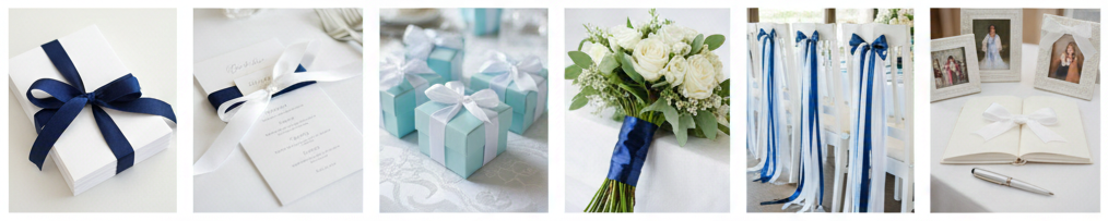
- Ceremony Programs: Couples tied programs with the same ribbon used on their invitations. This created a consistent look and made even simple programs feel polished.
- Escort Cards And Place Settings: Ribbon showed up on escort cards, menus, and napkin wraps. Some couples tied ribbon around menus or used it to secure name cards for a clean and elegant presentation.
- Favor Packaging: Small favor boxes and treat bags were often tied with ribbon in the wedding colors. It made the favors feel more thoughtful and created a pretty display at the reception.
- Bouquet Wraps: Brides and bridesmaids wrapped bouquets with matching ribbon to tie the stationery and florals together. This looked beautiful in photos and added a soft detail to the bouquet.
- Reception Decor: Ribbons were used for chair décor, backdrop designs, and table accents. Even a few ribbon strands added softness and movement to the space.
- Guest Books And Memory Displays: Couples used ribbon to decorate guest books, bind photo albums, or add detail to memory tables. It helped the decor feel consistent without needing extra expensive elements.
Conclusion
The ribbon wedding invitation trend of 2013 was more than just a design phase. It reflected how couples wanted weddings to feel personal, textured, and thoughtfully styled from the very first impression. Ribbon added dimension and charm in a way that print alone could not. Whether couples chose satin for elegance, twine for rustic warmth, or lace for vintage romance, ribbon invitations helped set the tone for a wedding that felt intentional and memorable. The best part was how adaptable the trend was, since ribbons worked beautifully across nearly every style, color palette, and season.
Key Takeaway: Ribbons were not just decoration in 2013. They were a simple and versatile design detail that added texture, personality, and a polished finish to wedding invitations, while also creating a consistent look across the entire wedding experience.
FAQs
How should I mail ribbon-tied wedding invitations to keep them safe?
Use padded mailers or invitation boxes instead of thin envelopes. This prevents ribbons from getting flattened, creased, or damaged during delivery. Many couples also requested hand-canceling at the post office to reduce machine handling.
What’s the best way to attach ribbons without damaging the paper?
Double-sided tape and glue dots are the most reliable for clean results. For thicker ribbons, a small amount of hot glue works, as long as it’s applied lightly to avoid warping the paper.
Can I use more than one type of ribbon in the same invite suite?
Yes, mixing ribbon types can look beautiful when done intentionally. Satin paired with lace creates a romantic look, and grosgrain paired with organza can balance structure with softness. Keep the colors consistent so the suite still feels cohesive.
What ribbon width works best for wrapping around invitations?
A ribbon between ½ inch and 1 inch is the most versatile. Thinner ribbons look modern and minimal, while wider ribbons make the ribbon a focal detail. The best width depends on how bold you want the wrap to appear.
Can ribbon elements be incorporated into digital wedding invitations?
Digital invitations cannot include physical ribbon, although designers can mimic the look using ribbon textures and graphic elements. This works well for couples who want the aesthetic without mailing physical stationery.
2012 The Best Black And White Wedding Cakes
| Venue Type | Ideal Cake Design |
| Ballroom | Tall tiers, scrollwork, damask detail |
| Garden/Outdoor | Lace piping, floral accents |
| Rooftop/Modern Loft | Geometric shapes, minimal styling |
| Vintage-Inspired Hall | Pearls, lace textures, soft florals |
| Evening/Candlelit | Black fondant, silver accents, drama |
Why Black and White Wedding Cakes Made a Splash in 2012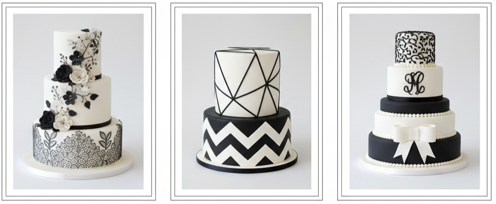
Black and white wedding cakes were everywhere in 2012, and they weren’t just a passing trend. Couples loved how the look felt elegant without feeling stiff, bold without feeling too dramatic, and timeless without looking outdated. The contrast made every detail pop, which is why these cakes worked so well for photography and reception décor. Whether the wedding theme leaned modern, vintage, glam, or minimalist, black and white cakes blended right in and still stood out in the best way.
A lot of couples in 2012 wanted wedding details that felt polished and intentional, and black and white cakes delivered that instantly. The palette looked clean and sophisticated, while the design options stayed endless. A cake could feel soft and romantic with lace and florals, or sharp and contemporary with geometric patterns and crisp fondant edges. That flexibility made these cakes a standout choice for couples who wanted their cake to feel like a centerpiece, not just dessert.
Cake Trends That Turned Heads That Year
Designers in 2012 leaned into texture, pattern, and structure. Instead of relying on bright colors or trendy shades, they used black and white as a foundation and then built interest through detail and contrast. These were the most noticeable trends that shaped the look of black and white wedding cakes that year: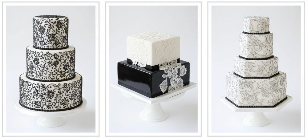
Lace-Inspired Detailing
Designers used piped icing, edible lace appliqués, or textured fondant to mimic bridal gown fabrics and add romantic depth to each tier.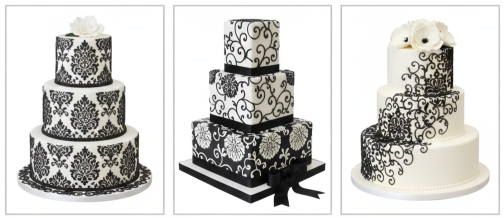
Damask And Scroll Patterns
Bold damask prints and elegant scrollwork gave cakes a formal, upscale feel that worked perfectly in classic venues.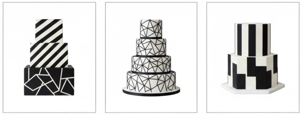
Geometric Lines And Modern Shapes
Clean lines, chevron patterns, and structured shapes became popular for couples who wanted something sharp, minimal, and contemporary.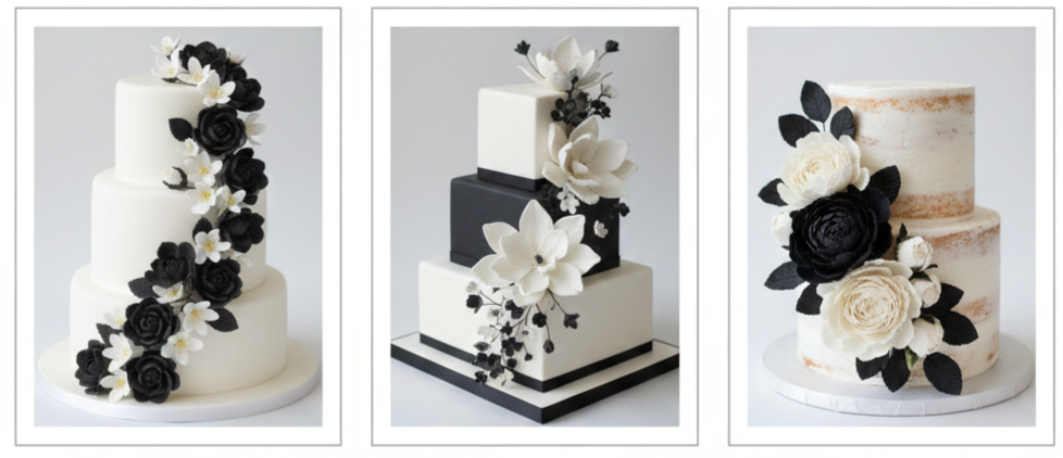
Monochrome Floral Accents
Sugar flowers in white or black added softness while keeping the palette clean and cohesive.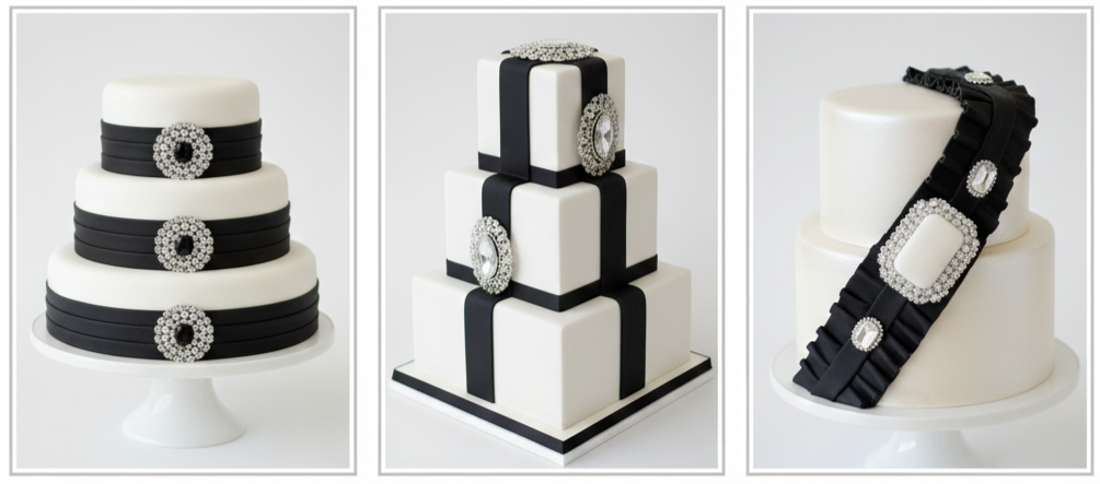
Ribbon And Brooch Finishes
Satin-style fondant ribbons and jewel-inspired cake brooches added texture and a vintage fashion vibe that looked stunning in photos.
Even when two cakes used the same colors, they rarely looked similar because designers had so many ways to play with texture. Some cakes looked delicate and lace-like, while others leaned bold and graphic. That variety is part of what made 2012 such a memorable year for black and white wedding cake design.
Different Styles That Ruled the Scene
In 2012, black and white cakes weren’t one-size-fits-all. Couples chose designs based on their venue, their theme, their personal style, and even their dress silhouette. These were the most popular cake styles that stood out that year: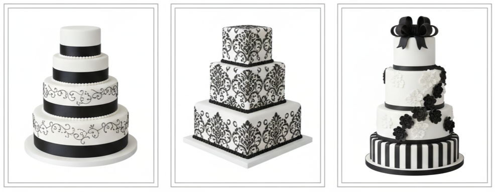
Classic And Tiered
Traditional multi-tier cakes stayed popular, usually featuring white fondant as the base with black ribbon trims, piping, or scrollwork. These designs looked formal and balanced, especially for ballroom receptions or traditional ceremonies.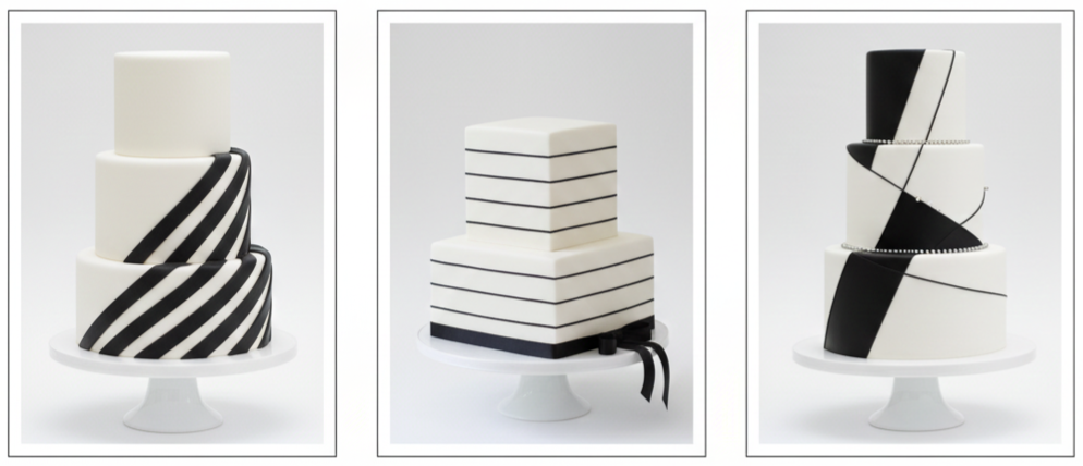
Sleek And Modern
Minimalist couples leaned into sharp edges, smooth fondant, and bold shapes. Designers used black accents in clean patterns like chevrons, stripes, or geometric panels, creating cakes that looked almost architectural.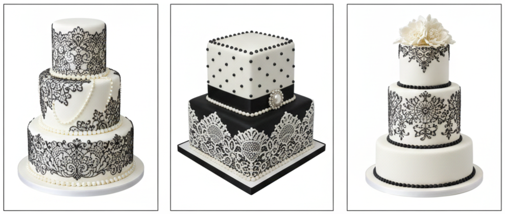
Vintage With Lace And Pearls
Vintage-inspired cakes focused on delicate piping, edible pearls, and lace-textured tiers. These cakes fit beautifully with lace gowns, classic bouquets, and romantic venue styling.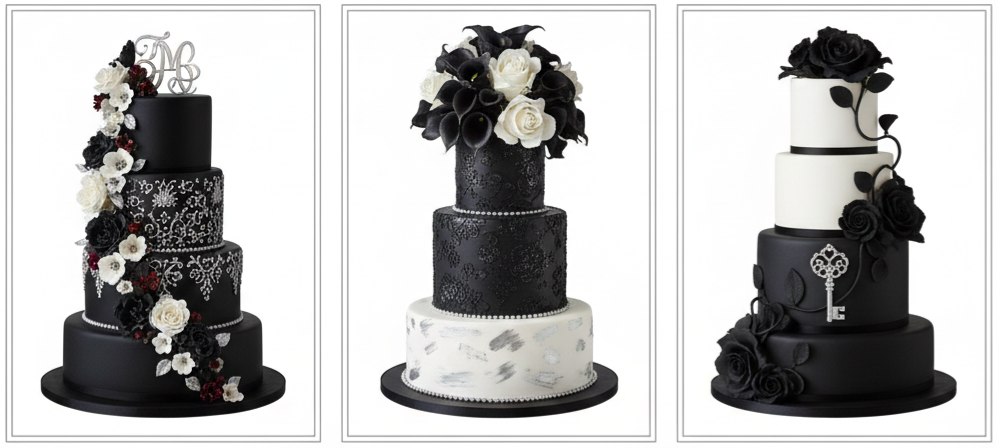
Gothic Romance Flair
Some couples chose deeper black fondant, dramatic floral toppers, silver detailing, and ornate designs that felt moody and bold. These cakes were perfect for evening weddings, candlelit receptions, or couples who wanted something striking and unconventional.
Each of these styles showed that black and white could feel soft, bold, classic, or modern depending on the details. That flexibility helped the trend last well beyond 2012.
Celebrity Weddings and Designer Influence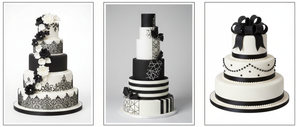
Celebrity style played a major role in shaping wedding trends in 2012. Even when couples didn’t follow celebrity weddings directly, high-profile events influenced what designers showcased at bridal expos and what couples requested in consultations. Black and white cakes became especially popular because they looked polished in professional wedding photos and fit the luxury aesthetic many celebrities leaned toward.
Top cake designers like Sylvia Weinstock and Ron Ben-Israel helped push monochrome cakes into the spotlight by presenting dramatic tiered designs that used contrast creatively. Their cakes often combined classic techniques with modern structure, inspiring bakers and couples to experiment with height, texture, and bold detailing. Wedding expos that year also featured towering black and white cake displays, from minimal modern styles to lace-heavy vintage designs, which helped make the look mainstream.
Even couples planning smaller weddings started asking for black and white cakes because the style felt elevated without requiring elaborate décor. The cake itself became the statement piece.
Personal Touches That Made Cakes Extra Special
Black and white cakes in 2012 stood out because they were easy to personalize without ruining the clean look. Couples found ways to bring personal meaning into the design while keeping everything refined. These were the most common custom touches that made cakes feel unique: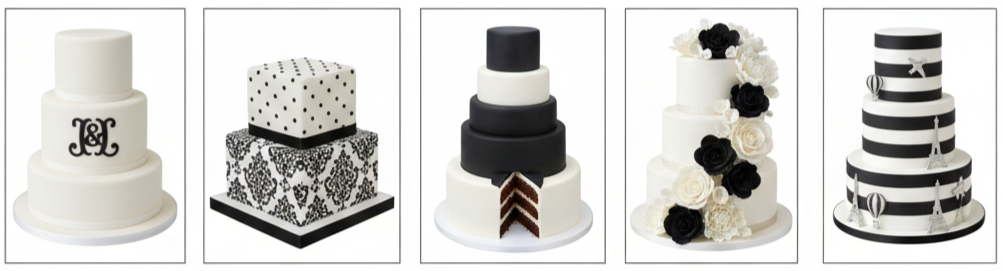
- Monograms And Initials: Couples often added a black monogram on a white tier, sometimes framed with scroll piping or a simple border for a clean, personal finish.
- Pattern Matching: Some couples requested patterns that matched their invitations, table linens, or dress lace. This created a cohesive visual theme across the entire wedding.
- Flavor Pairings With Contrast: Vanilla bean, dark chocolate, marble cake, and cookies-and-cream were popular because they matched the black-and-white theme from the inside out.
- Monochrome Sugar Flowers: Bakers used white roses with black centers, deep black calla lilies, or white peonies with dark accents to add contrast and elegance.
- Theme-Driven Details: Art deco weddings inspired angular patterns and metallic touches, while romantic weddings leaned into ruffles, lace textures, and floral designs.
These custom details helped couples feel like the cake reflected their story, not just a trend. A black and white cake could still feel personal, sentimental, and meaningful without needing bright colors or extra flair.
Things to Consider When Picking a Cake Like This
Choosing a black and white wedding cake in 2012 wasn’t just about picking a pretty design. Couples focused on how the cake worked with the space, the bridal style, and even the lighting. These were the most common decision points couples used: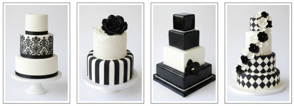
- Venue Style: Grand venues suited tall tiered cakes with bold scrollwork or dramatic contrast. Outdoor weddings and smaller venues usually worked better with softer lace textures and simpler silhouettes.
- Dress And Bridal Styling: Brides often matched cake details to their gown, especially lace piping, pearl accents, or elegant scroll patterns that echoed the fabric.
- Lighting And Photography: Black and white cakes photographed beautifully because contrast shows clearly in both natural light and dim reception settings. Designers paid close attention to detail placement so patterns stayed visible in photos.
- Balance Of Color: Bakers typically used white as the base and added black in controlled accents so the cake stayed elegant instead of overwhelming. When black fondant was used, designers added white florals or lighter patterns to keep the look balanced.
Black and white cakes also gave couples more freedom with décor. Since the cake already looked polished, the rest of the reception styling could be either simple or dramatic without clashing.
Why These Cakes Still Work Today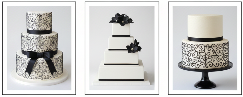
The best black and white wedding cakes from 2012 still hold up today because they were built on timeless design principles. They didn’t rely on trendy colors that fade quickly. Instead, they used contrast, texture, and balance, which always look stylish. Modern couples still choose black and white cakes because they work in every season and match almost every wedding theme.
Today’s bakers still pull inspiration from 2012 designs, especially lace-style piping, clean fondant tiers, and black accent work like ribbons or scroll patterns. Many couples now add modern touches like metallic finishes, textured buttercream, or simplified floral toppers, but the core appeal remains the same. Black and white cakes still communicate elegance immediately, whether the style is classic, modern, romantic, or bold.
These cakes also remain popular because they look high-end without needing excessive decoration. A clean monochrome cake with the right detailing still feels like a luxury centerpiece.
Conclusion
Black and white wedding cakes from 2012 weren’t just trendy, they changed what wedding cake design looked like moving forward. They showed that contrast could feel timeless, and that simple colors could still create bold impact. Whether the cake featured lace piping, damask patterns, sleek geometry, or dramatic florals, each design proved that black and white could carry a wedding’s visual style all on its own. Even years later, couples still look back at 2012 cakes because the designs feel refined, flexible, and unforgettable.
Key Takeaway: Black and white wedding cakes from 2012 became iconic because they blended timeless elegance with bold contrast, offered endless design options, and still inspire modern wedding cake trends today.
FAQs
What types of venues worked best for black and white cakes in 2012?
Ballrooms and formal venues worked best for tall tiered cakes with detailed scrollwork, while outdoor venues looked great with softer lace textures and simpler designs.
Were black and white cakes only for formal weddings?
Not at all. Black and white cakes worked for both formal and casual weddings because the details could be adjusted. Sleek styles suited modern weddings, while lace and florals fit softer themes.
How did bakers keep black accents from overpowering the cake?
Designers usually used white as the base and added black only through patterns, ribbons, or borders. When black fondant was used, they balanced it with white flowers or light detailing.
What kinds of flowers were popular on these cakes?
Sugar roses, peonies, orchids, and black-centered anemones were common. Some couples chose all-white flowers, while others used black blooms for contrast.
Are black and white cakes still trendy today?
Yes, black and white cakes remain popular, especially with modern updates like textured finishes, metallic accents, or simplified floral toppers. The classic contrast still feels stylish and timeless.