2016 Spring Wedding Color Ideas And Invitations Part 1
| Color Palette | Best Venue Style | Matching Invitation Style |
| Blush & Sage | Garden, Vineyard | Floral artwork, vellum wrap |
| Lavender & Gray | Barn, Rustic Estate | Minimal layout, lavender wax seal |
| Peach & Mint | Backyard, Beach | Watercolor, kraft paper wrap |
| Navy & Coral | Nautical, Rooftop | Striped design, bold fonts |
| Dusty Blue & Ivory | Chapel, Ballroom | Classic script, monogram crest |
Why Spring Weddings Set the Perfect Stage for Fresh Color Palettes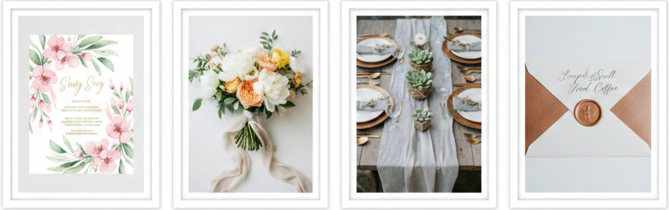
Spring weddings bring out the best in color. The season feels like a fresh start, filled with blooming flowers, longer days, and warm but comfortable weather. Outdoor venues like gardens, vineyards, and beachside spots shine in the spring, giving couples a naturally beautiful setting. With less need for over-the-top décor, the focus turns to color palettes, wardrobe choices, and matching invitation designs to bring the whole event together.
Top Wedding Color Trends for Spring 2016
Spring 2016 gave us some unforgettable color combinations. Whether you were drawn to subtle elegance or bold statements, there was something to fit every style. Here are the standout favorites that defined spring weddings during that year.
Blush and Sage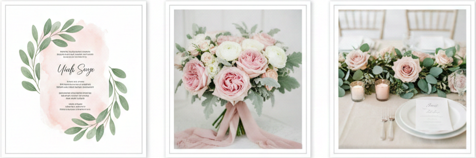
- Vibe: This combo was all about romance. Blush offered a soft, pretty pink tone, while sage added a touch of earthy calm.
- Where it works: It looked perfect in garden weddings or vineyard ceremonies.
- Details to try: Couples used blush roses, eucalyptus garlands, and ivory linens to tie the look together. Bridesmaids wore dresses in blush or sage, and groomsmen typically chose tan suits with sage accents.
- Matching flowers: Ranunculus, garden roses, and lamb’s ear fit perfectly with this look.
Lavender and Gray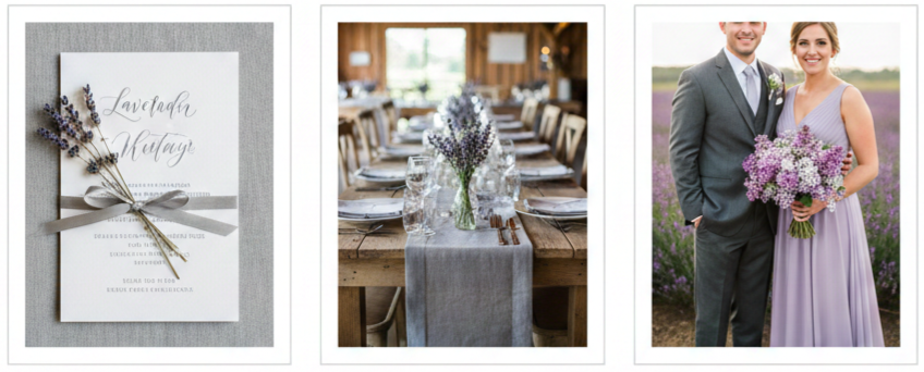
- Vibe: A little rustic, a little vintage, this combo felt elegant but relaxed.
- Where it works: Barns, open fields, or historic homes made perfect backdrops for these tones.
- Details to try: Table settings included gray linens with lavender napkins. Bridesmaids wore lavender dresses, and groomsmen balanced the look in charcoal suits.
- Matching flowers: Lilacs, lisianthus, and silver brunia blended right in with this color palette.
Peach and Mint
- Vibe: Bright, cheerful, and sweet, this pair gave weddings a lighthearted feel.
- Where it works: Great for backyard receptions, beachfront weddings, or any outdoor setup.
- Details to try: Peach lanterns, mint-painted jars, and ombré flower centerpieces were all popular. Bridesmaids wore soft peach gowns, and mint accessories pulled the look together.
- Matching flowers: Peonies, stock, and dusty miller were top floral picks for this theme.
Navy and Coral
- Vibe: Bold and energetic, this pairing delivered contrast in the best way.
- Where it works: Nautical-themed weddings, yachts, and rooftop venues welcomed these colors beautifully.
- Details to try: Navy linens, coral runners, striped napkins, and anchor-inspired accents gave weddings a fresh, clean look. Navy suits and coral bouquets were a favorite pairing for the bridal party.
- Matching flowers: Dahlias, roses, and hypericum berries made these weddings feel vibrant and cohesive.
Dusty Blue and Ivory
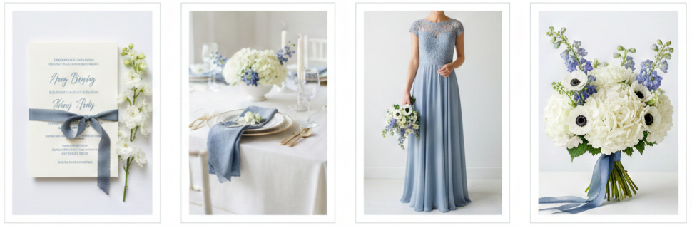
- Vibe: Elegant, serene, and timeless, this combination was made for a more traditional wedding setting.
- Where it works: Chapels, ballrooms, and formal venues were the ideal match.
- Details to try: Soft fabrics, ivory candles, and dusty blue accents throughout the décor kept the atmosphere calm and classic. Bridesmaids wore floor-length dusty blue gowns with touches of lace.
- Matching flowers: Delphinium, white hydrangeas, and anemones pulled everything together with grace.
Invitation Designs That Match These Color Palettes
Your wedding invitation sets the tone before guests ever arrive. In 2016, couples were all about keeping their invitations aligned with their color scheme to give guests a glimpse of what to expect. Each color combo had its own style when it came to stationery.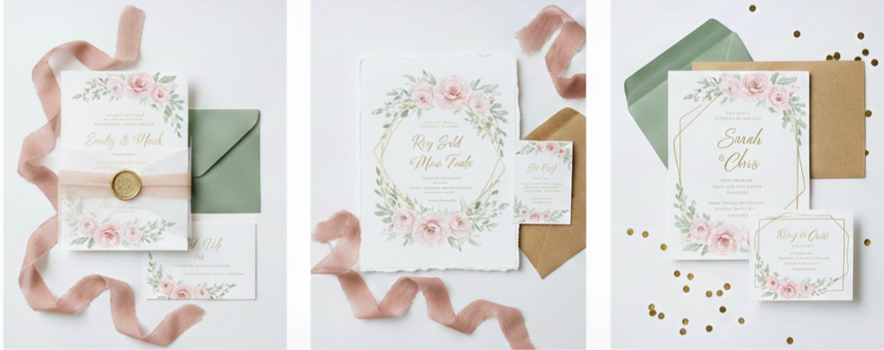
Blush and Sage
Think romantic floral illustrations with soft watercolor details. Deckled edges and vellum wraps added charm, while gold foil or scripted names made the invite feel personal.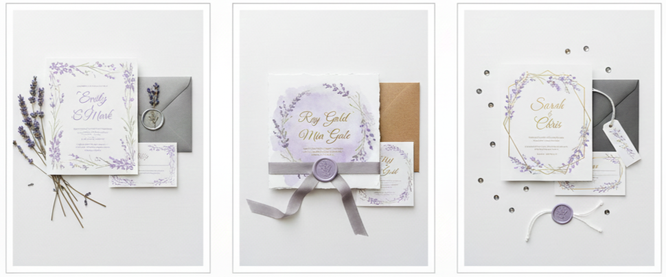
Lavender and Gray
Clean and minimalist was the way to go here. Matte paper with lavender ink and gray seals added a soft touch. Botanical borders and lavender wax seals were also popular.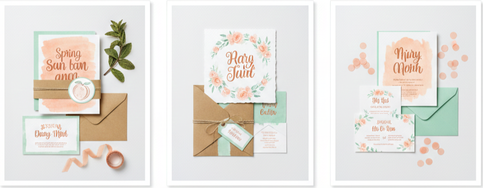
Peach and Mint
These invitations were playful and creative. You’d often see watercolor backgrounds in peach, fun fonts, and mint-colored paper layers or backing cards. Kraft paper wraps kept the look casual and cute.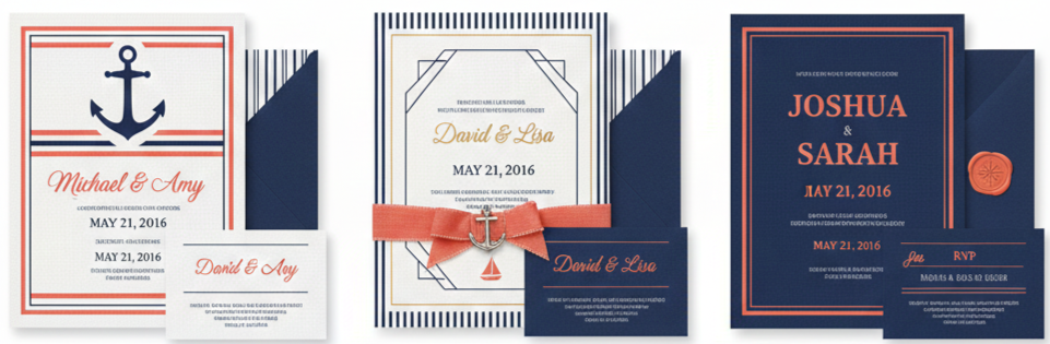
Navy and Coral
Invitations in this theme featured bold lines, strong typography, and sometimes nautical stripes or anchor logos. Linen-textured paper with coral foil accents made everything pop.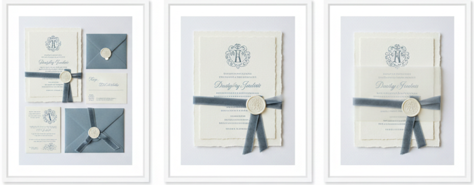
Dusty Blue and Ivory
These invites leaned into tradition. Expect classic fonts, monogrammed crests, and cotton or handmade paper. Dusty blue ribbons and ivory borders tied it all together.
How to Select the Right Colors and Invitations
Choosing colors and invitations is more than just picking what you like. There’s a bit of strategy behind what makes everything flow smoothly.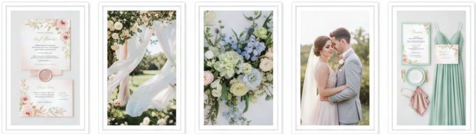
- Venue matters: If you’re getting married outdoors, soft and natural tones often look best. For more formal locations, darker or richer shades bring out the sophistication.
- Time of day helps guide your palette: Lighter hues work best for daytime weddings, while deeper shades bring drama to evening events.
- Work with the season’s flowers: Picking a palette based on what’s in bloom makes your florist’s job easier and usually saves money.
- Keep photography in mind: Natural lighting works wonders on soft tones like blush or mint. For indoor photos, stick with colors that won’t fade under artificial lighting.
- Create consistency: Once your colors are chosen, carry them through every part of the wedding—dresses, décor, signage, and especially your invitations. It keeps the look clean and intentional.
Conclusion
Spring weddings in 2016 were a beautiful blend of soft hues, bold contrasts, and fresh creativity. Color palettes like blush and sage, navy and coral, or dusty blue and ivory weren’t just about looking good—they created a feeling and story that carried through the whole day. The most memorable celebrations were the ones where every piece, from the first invitation to the final dance, felt thoughtfully tied together.
Key Takeaway: The secret to a visually cohesive spring 2016 wedding was consistency in color and detail. When your invitations match your flowers, your attire blends with your backdrop, and your décor fits your theme, everything feels natural—and unforgettable.
FAQs
What neutral colors go well with spring 2016 wedding palettes?
Soft neutrals like ivory, champagne, taupe, and light gray work well with most spring palettes. They add balance without stealing the spotlight from your main colors.
Can I combine more than two colors in my wedding palette?
Yes, many couples chose a base pair and added a third color—like gold, rose gold, or ivory—for added depth and style.
What fonts were trendy for spring wedding invitations in 2016?
Script calligraphy paired with serif fonts was a popular combo. It gave invitations a mix of elegance and modern flair.
How do I make sure my color palette stays consistent across everything?
Set your colors early and share them with all vendors. From florists to stationery designers, everyone will keep things in sync if they know what you’re working with.
Are bright colors like coral too intense for spring?
Not at all. Coral added energy to spring weddings. When paired with a grounding color like navy or gray, it looked bold without being overwhelming.
Leave a Reply