2016 Spring Wedding Color Ideas And Invitations Part 2
| Color Combo | Vibe | Best For |
| Mint & Copper | Fresh and modern | Outdoor or garden weddings |
| Lavender & Navy | Elegant and romantic | Evening or formal settings |
| Blush & Sage | Soft and timeless | Rustic or vineyard venues |
| Peach, Coral & Cream | Warm and cheerful | Barn or spring outdoor |
| Lilac & Dusty Blue | Dreamy and vintage | Romantic indoor/outdoor |
| Greenery Mixes | Natural and clean | Botanical or eco themes |
Bold Meets Soft: Striking Spring Color Combinations
Spring color palettes in 2016 took a creative leap. Instead of sticking with the usual pastels, many couples went for combos that mixed soft hues with bold accents for a more dynamic look.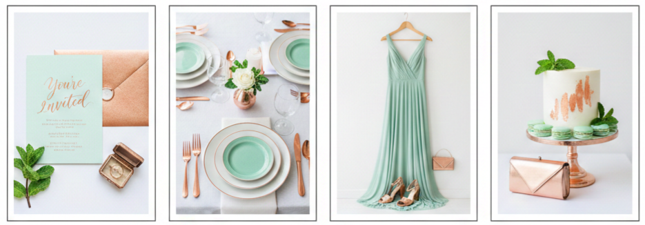
Mint and Copper
This combo brings together fresh minty tones with the warm, rich shine of copper. The result feels modern without being overdone. You could feature mint in your table settings or bridesmaid dresses, then layer in copper through foil-stamped invitations, cutlery, or vases.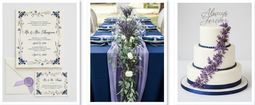
Lavender and Navy
Lavender gives off a delicate vibe, while navy adds depth. Together, they create a classic yet dreamy contrast. Imagine navy tablecloths with lavender centerpieces or ivory invitations with lavender borders and navy lettering.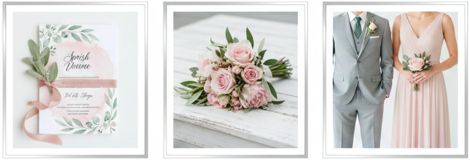
Blush and Sage
This pairing is soft and timeless. Blush offers a romantic touch, while sage introduces an earthy balance. Use these in wedding attire, floral arrangements, or watercolor-style invitations to tie everything together.
Garden-Inspired Palettes with a Natural Feel
Mother Nature always delivers when it comes to color inspiration. In 2016, couples took a cue from spring gardens and meadows to create fresh, nature-inspired palettes.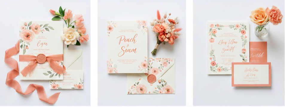
Peach, Coral, and Cream
This trio brings warmth and brightness without overwhelming. It’s perfect for outdoor or barn weddings. Coral can shine in bouquets, peach in bridesmaid dresses, and cream as the backdrop on invitations with floral illustrations.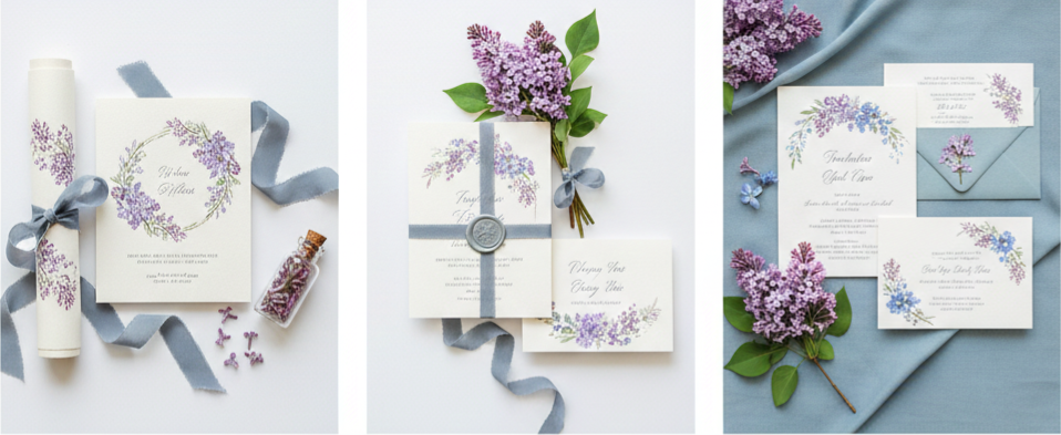
Lilac and Dusty Blue
This mix has a soft, vintage charm. Lilac blooms paired with dusty blue accents feel light and airy. You might see these colors show up in ribbons, table runners, or on paper goods with hand-drawn floral elements.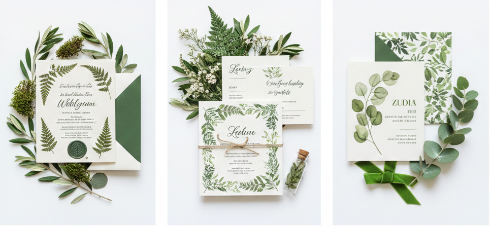
Greenery-Focused Mix
Multiple shades of green—like olive, moss, and eucalyptus—create a lush, grounded look. You can go full botanical with ferns, leaves, and even pressed greenery on your invites, keeping the vibe clean and fresh.
Metallic Accents for Spring Sophistication
Even though metallics are usually tied to colder seasons, spring weddings in 2016 saw an uptick in couples using them to elevate their look.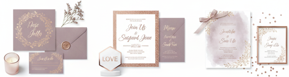
Rose Gold and Mauve
These two made a popular pair, offering soft shimmer with muted romance. You might find rose gold foil on mauve invitations, or rose gold decor sprinkled throughout the reception in candleholders or signage.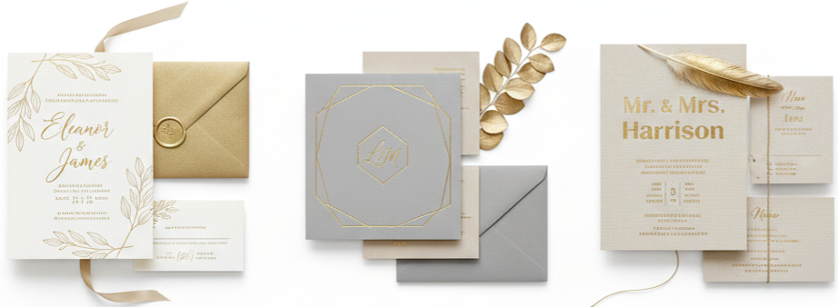
Gold Foil with Cool Neutrals
Gold and soft neutrals like ivory, dove gray, or beige created a classy, timeless look. Invitations printed in gold foil over clean backgrounds brought a polished finish without needing additional embellishments.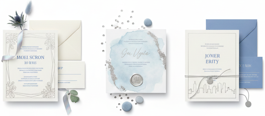
Silver and Blue Blends
Silver tones paired with pale blues or periwinkle created an airy and elegant setting. These worked well for couples who liked minimalist or modern styling—think silver-lined tableware or geometric stationery designs.
Invitation Styles That Reflect the Color Story
Weddings in 2016 placed more emphasis on telling a story through design—starting with the invitations. Color was just one part of that, but it helped shape the entire tone of the day.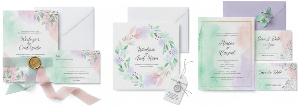
Watercolor Prints
These brought softness and artistic flair to any wedding style. Gentle washes of color on textured paper made each invitation feel like a mini painting. Common palettes included mint, blush, and lilac.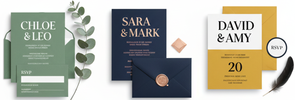
Minimalist Typography
Clean and modern, this style used crisp lines and simple fonts with bold color backgrounds. Sage green invites with white text or navy paper with rose gold font made strong impressions without clutter.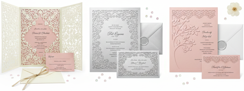
Laser-Cut Invitations
These were all about intricate detail. Inspired by lace and nature, laser-cut designs added dimension and elegance. Whether in ivory, blush, or metallic cardstock, they set a sophisticated tone.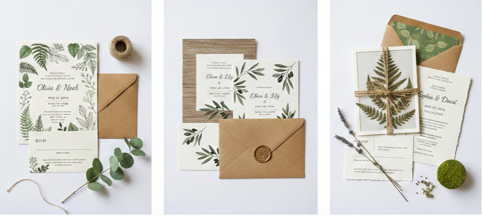
Botanical and Nature Motifs
Greenery-themed invites with leaf illustrations, kraft envelopes, or wood-textured prints connected back to the natural beauty of the season. These styles worked especially well with garden-themed or rustic weddings.
Customization Tips for Cohesive Invitations
Invitations don’t just announce your wedding—they preview your theme. The more consistent and thoughtful your details are, the more polished your wedding will feel.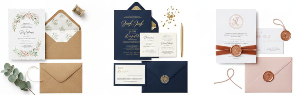
- Choosing the Right Paper: Rustic weddings often use handmade, recycled, or textured paper, while formal events might feature smooth, glossy finishes. Your paper choice gives guests an immediate sense of what to expect.
- Coordinating Envelopes and Inserts: Use colors that complement your main palette for the outer envelope and liners. Include RSVP cards and directions that match the invite design for a cohesive set.
- Monograms and Seals: Add a personal touch with custom crests, foil-stamped initials, or wax seals. These small extras elevate your stationery without going overboard.
- Tactile Elements like Ribbons or Bands: Whether it’s velvet ribbon, lace, or twine, these extras help bundle your invitation suite and reinforce your theme. Just make sure the color ties in with your overall palette.
Real Wedding Inspiration from 2016 Couples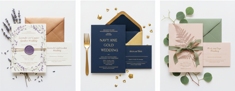
- Emily and Jake: Their lavender and copper garden wedding blended floral softness with bold accents. The tables were filled with lavender sprigs and copper decor. Invitations were detailed with copper foil and sealed with lavender wax.
- Sophie and Mark: They chose navy and gold for a ballroom wedding, pairing dark linens with golden chargers and centerpieces. Their invitations were navy with minimalist gold foil typography—clean, classy, and consistent with their venue.
- Aria and Leo: At their vineyard wedding, blush and sage set the tone. Their invitations included pressed fern patterns and blush-colored paper with sage ribbon ties. Everything from the ceremony decor to the table settings reflected their soft, natural palette.
Conclusion
Spring weddings in 2016 took bold steps forward, mixing unexpected colors, earthy elements, and elegant touches to create unforgettable events. From modern combos like mint and copper to nature-driven themes full of green and blush, couples found ways to make every detail speak for them. Invitations weren’t just an announcement—they were part of the story. With so many options in style, color, and texture, the smallest design choices made big impressions.
Key Takeaway: The best spring wedding palettes come together when your colors, textures, and invites all speak the same language. Let your style guide your choices, and keep every detail—from foil accents to floral hues—true to your vision.
FAQs
What’s the best way to use bold colors without overpowering a spring wedding?
Use bold shades as accents against softer backgrounds. Focus on details like invitation fonts, decor trim, or floral contrast.
Are laser-cut invitations too formal for casual weddings?
Not at all. Laser-cut invites come in many designs. Choose a floral or nature-inspired cutout to keep it casual and pretty.
How can I make botanical invites feel more upscale?
Choose thicker paper stock, use gold or copper accents, and go for elegant typography. The right combo brings a refined finish.
Can I mix four or more colors in my wedding palette?
Yes, but balance is key. Stick to two main colors and use others as secondary tones for depth and variety.
What should I focus on first: the venue or the invitation design?
Start with the venue. It usually determines the style and formality of your wedding, which helps shape your invitation design.
Leave a Reply