2016 Wedding Color Ideas
| Season | Color Palette | Best For |
| Spring | Blush, Lavender, Sage, Soft Blue | Garden, Floral, Outdoor |
| Summer | Coral, Turquoise, Peach, Lemon Yellow | Beach, Vineyard, Casual |
| Fall | Burgundy, Burnt Orange, Mustard, Forest | Rustic, Barn, Cozy Indoor |
| Winter | Navy, Silver, Plum, Icy Blue | Formal, Ballroom, Modern |
Pantone’s 2016 Colors of the Year: Rose Quartz and Serenity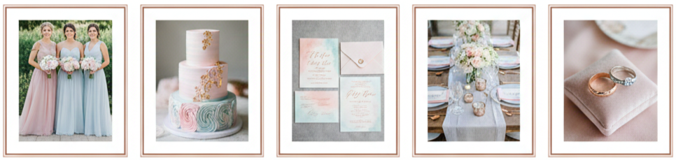
- Color choices: Pantone made headlines by selecting two Colors of the Year in 2016—Rose Quartz and Serenity. These soft, elegant tones set the tone for countless weddings throughout the year.
- Popular uses: Couples embraced them through pastel bridesmaid dresses, light-toned florals, watercolor invitations, and subtle décor details.
- Pairing tips: Rose Quartz worked well with ivory or champagne, while Serenity matched beautifully with silver and pale gray. Metallic accents like rose gold or copper added depth and gave the palette a modern edge.
Soft and Dreamy Pastels for Romantic Spring Weddings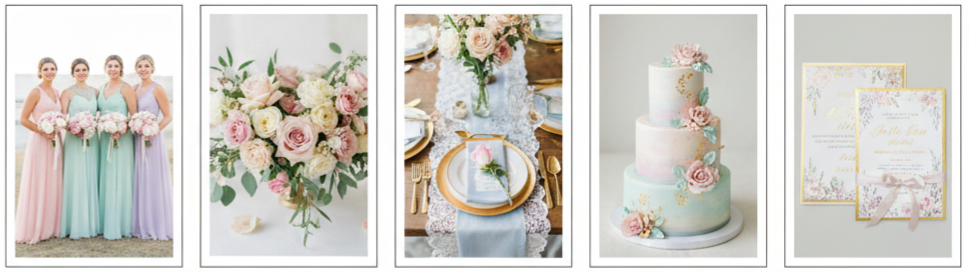
- Color palette: Pastels like blush pink, mint green, lavender, and baby blue took over spring weddings, offering a soft and whimsical aesthetic.
- Styling suggestions: Bridesmaids often wore mismatched pastel gowns, and florals leaned into garden-style arrangements using peonies, ranunculus, and soft roses.
- Design approach: To keep the look grounded, many couples layered these hues with white linens, delicate lace, and vintage tableware. Gold-rimmed glasses and flatware added a refined contrast.
Bold Jewel Tones for Dramatic Fall and Winter Themes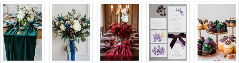
- Top colors: Emerald green, sapphire blue, burgundy, and amethyst were go-to jewel tones for cooler seasons, offering a bold and dramatic feel.
- Decor strategy: Velvet fabrics, candlelit tables, and deep floral arrangements with anemones or dahlias created a luxurious vibe perfect for indoor venues.
- Color pairings: These shades paired beautifully with gold, bronze, or copper, adding richness and warmth to late-season weddings.
Rustic Neutrals and Earthy Tones for Outdoor Ceremonies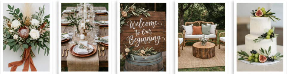
- Earth-tone palette: Neutrals like taupe, mocha, sand, and terracotta, along with soft greens such as sage and olive, were ideal for rustic or bohemian outdoor weddings.
- Floral design: Greenery-heavy arrangements with eucalyptus or dried florals created a relaxed, nature-inspired setting.
- Decor elements: Burlap runners, wooden signage, vintage furniture, and ceramic tableware helped complete the look while staying true to the natural color scheme.
Timeless Black and White With a Modern Twist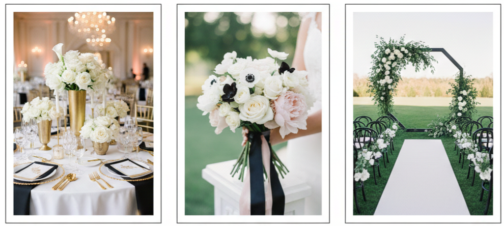
- Updated classic: Black and white remained a wedding favorite in 2016, but couples gave it a fresh twist by adding one or two accent colors.
- Popular combinations: Black and white paired with gold for glam weddings, with blush for a romantic feel, or with fresh greenery for a more modern touch.
- Design suggestions: From black-tie dress codes to minimal white floral arrangements with black ribbons, the palette delivered timeless elegance with a contemporary flair.
Beach-Inspired Corals and Ocean Blues for Summer Celebrations
- Vibrant palette: Coral and ocean-toned blues like aqua and turquoise captured the feel of summer, especially for beach and destination weddings.
- Style details: Bridesmaid dresses in coral or aqua looked vibrant against sandy backdrops, while groomsmen in khaki suits kept things casual yet sharp.
- Decor inspiration: Couples used tropical flowers, sea glass, shells, and driftwood in their décor to reinforce the beach-inspired vibe.
On-Trend Metallic Accents That Add Sparkle
- Popular metals: Rose gold, copper, silver, and gold were standout accents that brought glamour to any 2016 wedding color palette.
- Use in design: Couples incorporated metallics into flatware, sequin tablecloths, signage, and even cake décor.
- Best pairings: Rose gold worked well with blush and ivory; copper added contrast to greenery-heavy designs; silver offered a cool balance when used with navy or deep blue.
Unique Color Combinations to Stand Out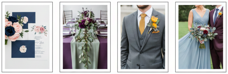
- Unexpected pairings: Many couples opted for fresh and bold combos that broke from traditional palettes, such as:
- Navy and blush
- Plum and sage
- Mustard and gray
- Dusty blue and maroon
- Design consistency: These unique palettes worked best when applied consistently across the wedding—think coordinated stationery, bouquet details, and wardrobe choices.
Seasonal Wedding Color Palette Guide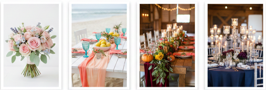
- Spring colors: Blush, lavender, sage, and soft blue worked well with floral-heavy weddings and outdoor garden venues.
- Summer colors: Coral, turquoise, lemon yellow, and peach added energy to beach, backyard, or vineyard ceremonies.
- Fall colors: Burgundy, burnt orange, mustard, and forest green created a warm, rustic atmosphere perfect for cozy venues or barn receptions.
- Winter colors: Navy, silver, deep plum, and icy blue offered elegance and contrast, especially when layered with candlelight and metallics.
Expert Tips for Choosing the Right Wedding Colors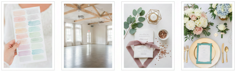
- Start with a favorite: Choose one color you naturally gravitate toward and build your palette around it.
- Consider your venue: Make sure your chosen colors won’t clash with existing walls, flooring, or furniture at your ceremony or reception space.
- Keep it balanced: Focus on two or three main colors and add neutrals or metallics for contrast.
- Repeat your colors: Use your palette throughout your invitations, table settings, bridal party attire, signage, and floral designs to keep the look cohesive.
Conclusion
Wedding color trends in 2016 offered something for every couple. Whether you leaned into the calm tones of Pantone’s Rose Quartz and Serenity, went bold with jewel tones, or kept things grounded with earthy neutrals, each palette told a story. The colors didn’t just decorate—they shaped the mood and elevated the experience, making every detail feel intentional and personal.
Key takeaway: The best 2016 wedding color palettes were all about creating a mood and telling a story—from start to finish—through thoughtful and consistent color choices.
FAQs
How do I pick a color palette if I don’t have a theme yet?
Begin with a color you like and build around it with complementary or neutral shades. Your color palette can guide your theme naturally as you plan.
What’s a good way to use multiple colors without it feeling chaotic?
Keep your palette to two or three main colors and use them consistently in attire, décor, and florals. Add neutrals or metallics to balance the look.
Can I mix pastel and bold colors together?
Yes, as long as you strike a balance. For example, soft blush paired with deep navy creates an elegant contrast when used thoughtfully throughout your design.
Were floral prints trendy for weddings in 2016?
Yes, floral prints appeared in bridesmaid dresses, linens, and accessories. They worked best when paired with solid tones that complemented the overall palette.
How do I incorporate metallics without going over the top?
Use metallics in small accents—think tableware, invitation details, cake embellishments, or bridal party accessories. A little shine goes a long way.
Leave a Reply