Fall Wedding Color Palettes
| Fall Color Palette | Overall Vibe |
| Burnt Orange & Sage Green | Warm, Rustic, Natural |
| Burgundy & Blush | Romantic, Timeless |
| Terracotta & Dusty Blue | Modern, Earthy |
| Emerald & Gold | Elegant, Luxurious |
| Mustard Yellow & Plum | Bold, Playful |
| Navy & Copper | Classic, Refined |
Why Fall Wedding Color Palettes Matter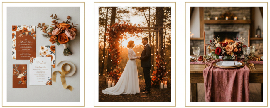
- Creates consistency: A defined color scheme helps all your details flow together, from invites to floral arrangements to attire.
- Enhances seasonal beauty: Fall colors naturally pair well with autumn foliage, sunset ceremonies, and candlelit receptions.
- Establishes tone: Whether you’re aiming for rustic, romantic, or modern, your palette sets the mood.
Picking your colors early helps guide your decisions as you plan the look and feel of your celebration.
Burnt Orange and Sage Green: A Rustic Favorite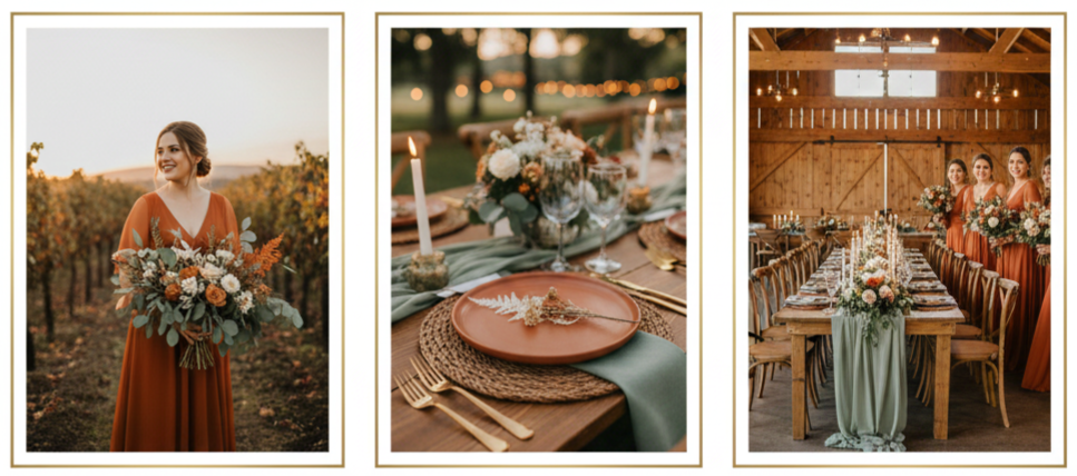
This combo is a fall favorite for good reason. Burnt orange mirrors those fiery leaves and cozy fall sunsets, while sage green brings in a calming, nature-inspired vibe. It works beautifully in outdoor and countryside settings—think barn weddings or vineyard receptions. Bridesmaids in burnt orange dresses, sage-toned greenery in bouquets, and natural wooden touches make everything feel earthy and well thought out.
You can tie in extras like terracotta accents and soft beige table settings to keep the whole aesthetic warm and grounded. The overall effect feels relaxed, welcoming, and unmistakably fall.
Burgundy and Blush: Romantic and Timeless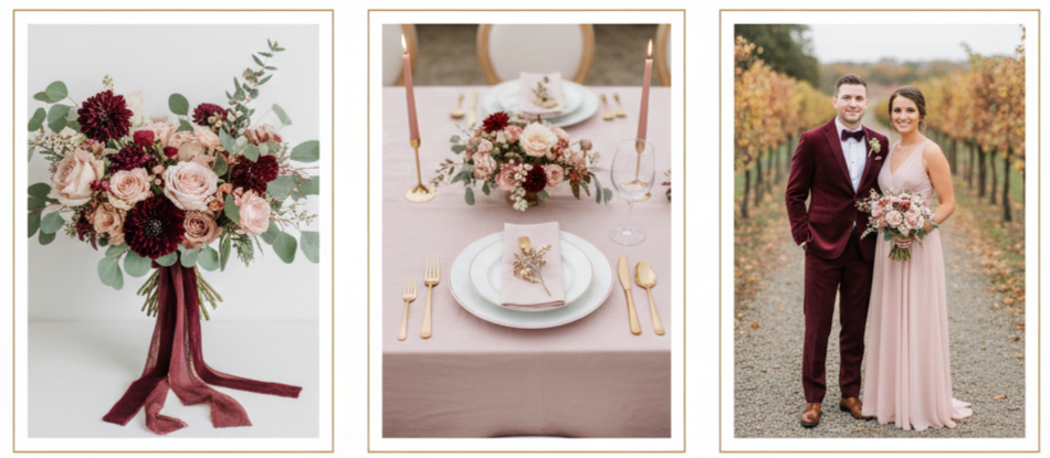
When you want elegance with a soft touch, burgundy and blush are a match made in wedding heaven. Burgundy adds richness and depth, while blush keeps things light and romantic. This palette is ideal for formal settings like churches, ballrooms, or vineyards.
Picture velvet burgundy suits or bridesmaid gowns, bouquets with roses in both hues, and candles casting a soft glow. Blush linens and touches of gold create a balance that feels both regal and approachable. Whether you’re hosting an afternoon ceremony or an evening affair, this color story fits right in.
Terracotta and Dusty Blue: Earthy Meets Cool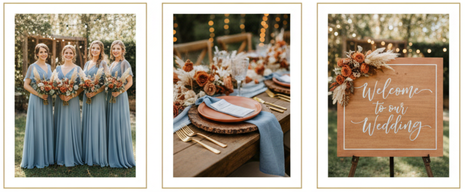
Terracotta and dusty blue make a surprising but stunning pair. Terracotta brings in that clay-like warmth that feels very grounded, while dusty blue softens the palette with a cooler, breezy tone. Together, they give off a stylish boho-modern vibe that’s great for desert, garden, or backyard weddings.
Dusty blue bridesmaid dresses look fresh and elegant, while terracotta florals, napkins, or signage bring in that seasonal warmth. Add pampas grass, rustic wood, and string lights, and you’ve got a well-balanced design that feels just right for fall without being overly traditional.
Emerald and Gold: Sophisticated and Luxe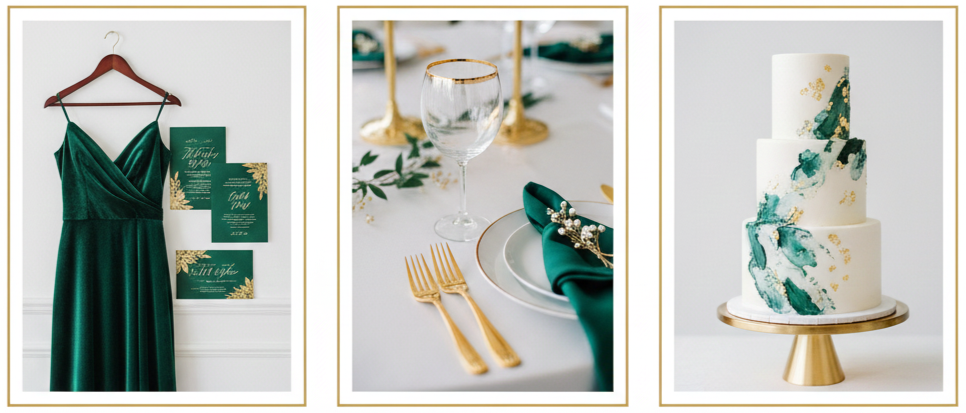
Emerald and gold offer a bold, upscale look. Emerald feels rich and dramatic—perfect for formal, evening weddings. Add gold into the mix and you get a warm glow that elevates every detail.
This palette thrives in grand venues, like historic estates, rooftops, or even art museums. Emerald velvet bridesmaid dresses, gold-rimmed glasses, and foiled stationery give your day a luxurious feel. You don’t need to overdo it—a few statement pieces go a long way in creating that upscale finish.
Mustard Yellow and Plum: Bold and Playful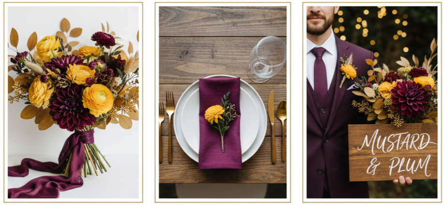
Mustard yellow and plum make a playful and punchy combo. Mustard adds a golden brightness that mirrors fall leaves, while plum gives your palette a moody depth. This is a great choice for couples who want to do something bold and a little off the beaten path.
Use plum as your anchor with napkins, suits, or signage, then sprinkle mustard in the florals or table accents. These colors look fantastic against natural wood, greenery, or neutral backdrops. Add some soft lighting, and the result is creative, cozy, and full of personality.
Navy and Copper: Classic With an Edge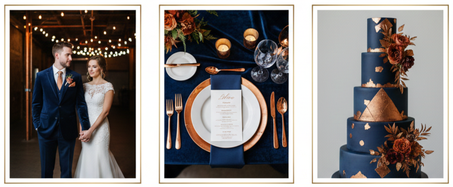
Navy and copper strike a balance between timeless and trendy. Navy brings the classic feel, while copper adds an eye-catching metallic warmth that feels modern but approachable.
This palette is ideal for evening weddings, industrial venues, or cozy lodge settings. Navy suits always look sharp, and when you pair them with copper candle holders, calligraphy, and tableware, you’ve got a wedding that feels polished yet unique. Throw in some navy velvet and warm lighting, and the vibe is instantly elevated.
Tips for Selecting the Right Palette
- Start with your venue: Look at the colors already in the space. Are there exposed beams, brick walls, or lush gardens? Use these natural elements to guide your choices.
- Think about the season: Autumn brings deeper, richer shades. Lean into the natural shift and avoid overly bright tones that might clash.
- Factor in your floral options: Check what’s in bloom during fall and build your colors around those florals for a natural, cohesive look.
- Balance with neutrals: Don’t feel like every element has to be bold. Neutrals like ivory, beige, and taupe help ground your palette.
- Stay consistent: Carry your colors through every detail—attire, signage, centerpieces, cake—to keep things cohesive and easy on the eyes.
Sources of Fall Wedding Color Inspiration
- Pinterest and Instagram: These platforms are packed with styled shoots and real weddings that showcase how color palettes play out in different settings.
- Local florists: Ask what’s seasonal and available. They often have ideas for palettes based on blooms you may not have considered.
- Home décor trends: Retailers often design collections around seasonal colors. Stores like West Elm or Anthropologie can give you creative ideas.
- Fashion runways: Fall fashion always introduces fresh takes on colors. Use those to guide your bridesmaid attire or accessories.
- Your personal style: Look around your home or closet. What colors do you naturally gravitate toward? Use that as a starting point for something authentic to you.
Conclusion
Picking your fall wedding color palette isn’t just about what looks good on paper. It’s about capturing the mood, the season, and your story—all in one seamless aesthetic. From deep burgundy and soft blush to bold mustard and plum, the right palette transforms your wedding into something truly memorable. Let your surroundings, your venue, and your own taste guide the way. Once your colors are locked in, the rest of the details fall into place naturally.
Key Takeaway: Your fall wedding palette should reflect your personality while complementing the season. Whether you lean into cozy earth tones or jewel-toned drama, a well-chosen palette brings your entire day together beautifully.
FAQs
What’s the best color for a fall wedding if I want something minimalist?
Neutrals like ivory, taupe, and grey work beautifully in fall when paired with one bold accent like terracotta or deep green. This keeps things clean while still embracing the season.
Can I use pastel colors for a fall wedding?
Yes, you can mix pastels with richer tones. Try blush with burgundy or dusty blue with burnt orange for a balanced look that still feels seasonal.
Are there any color palettes that work well across all fall months?
Burgundy with blush, emerald with gold, and terracotta with beige work from early September through November. These combos adapt well to the shifting foliage and lighting.
How do I make sure my color palette looks good in photos?
Use colors with contrast, and avoid choosing everything in the same tone. Talk to your photographer about lighting so the hues you choose show up true to life.
Can I mix more than three colors in my wedding palette?
Definitely. Just be sure the colors complement each other. Try sticking to three main shades and adding a couple of neutrals or metallics to balance it out.
Leave a Reply