Fall Wedding Color Schemes
| Wedding Style | Recommended Color Schemes |
| Rustic | Rust, Mustard, Sage Green |
| Classic | Burgundy, Blush, Navy |
| Modern | Mocha, Mauve, Slate Blue |
| Boho | Terracotta, Dusty Rose, Olive |
| Elegant | Black, Gold, Emerald |
| Outdoor | Olive Green, Burnt Orange, Cream |
Why Fall Wedding Color Schemes Stand Out
Fall weddings naturally feel warm, inviting, and visually rich, which is why color plays such a big role during this season. Autumn offers a built-in palette inspired by changing leaves, cozy textures, and softer light. Instead of relying on bright or pastel shades, fall color schemes lean into depth, contrast, and balance. These tones photograph beautifully, feel timeless, and work well across both indoor and outdoor venues.
Another reason fall color schemes stand out is their flexibility. They suit rustic barns, vineyards, modern lofts, and elegant ballrooms just as well. Couples also have more freedom to layer textures like velvet, wood, dried florals, and metallic accents, which instantly adds dimension to the overall look. Fall colors do not overpower the celebration; they enhance it in a way that feels natural and cohesive.
Classic Fall Wedding Color Schemes
Some color combinations continue to dominate fall weddings because they are reliable, elegant, and easy to style. These classic pairings work across décor, attire, florals, and stationery without feeling dated.
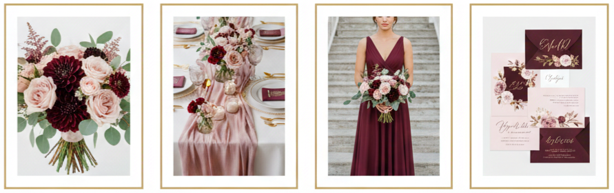
Burgundy and Blush
Burgundy brings richness and depth, while blush softens the overall look. This pairing works beautifully for romantic weddings, especially when burgundy appears in dresses or florals and blush shows up in table linens, stationery, or bouquets.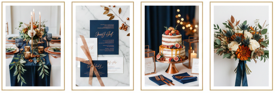
Navy and Copper
Navy provides a strong, polished base that feels formal without being stiff. Copper adds warmth and shine through accents like candle holders, chargers, signage, or flatware, making this combination ideal for evening receptions.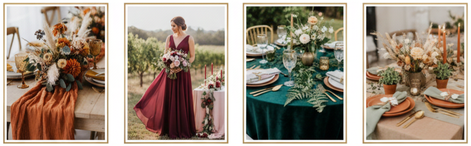
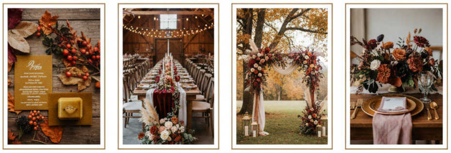
Rust and Mustard
Rust and mustard lean heavily into fall’s earthy side. Rust tones work well in textiles such as table runners or bridesmaid dresses, while mustard adds brightness through flowers, napkins, or small décor accents.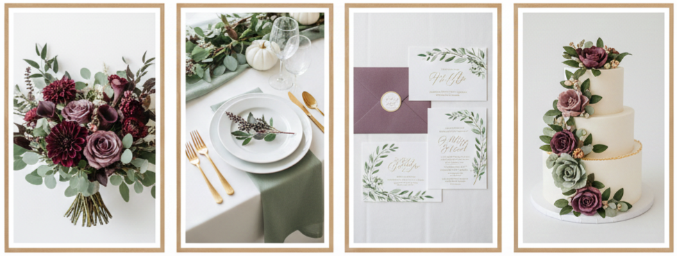
Plum and Sage Green
Plum introduces drama and elegance, while sage green balances it with softness. This color scheme is especially effective in floral-heavy designs where greenery plays a central role.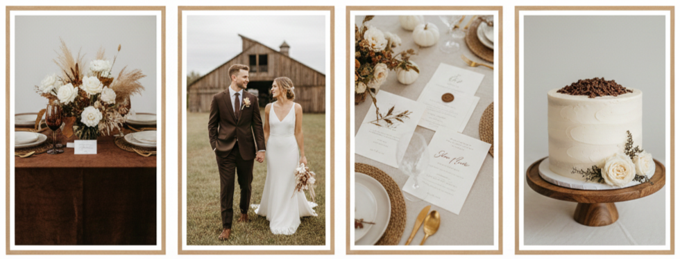
Chocolate and Cream
Chocolate offers grounding warmth, especially in wood elements or suits, while cream keeps the palette light and timeless. This combination works well for couples who want a cozy yet refined atmosphere.
Trendy Fall Color Palettes for Modern Couples
Modern fall weddings often feature unexpected color combinations that still feel rooted in the season. These palettes bring personality and style without straying too far from autumn’s natural influence.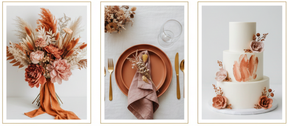
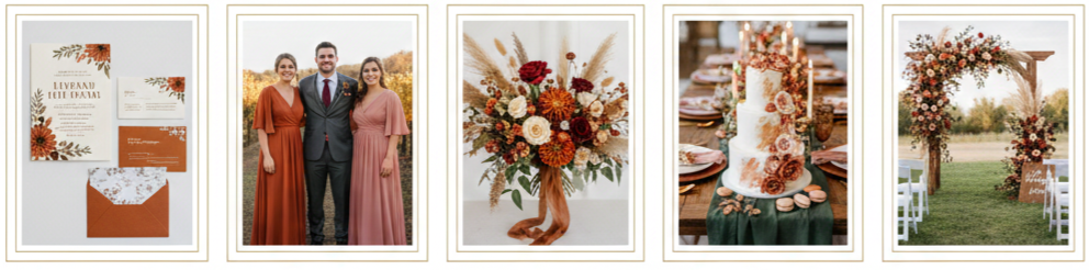
Terracotta and Dusty Rose
Terracotta adds warmth and structure, while dusty rose softens the look. This palette works well in boho, desert, or minimalist-inspired weddings where natural textures take center stage.
Olive Green and Burnt Orange
Olive green creates a calm, grounded base, while burnt orange adds energy and contrast. This pairing feels especially fitting for outdoor ceremonies and foliage-rich venues.
Mocha and Mauve
Mocha provides depth and neutrality, while mauve adds subtle color without overpowering the design. Together, they create a refined, modern look that works well with candlelight and soft fabrics.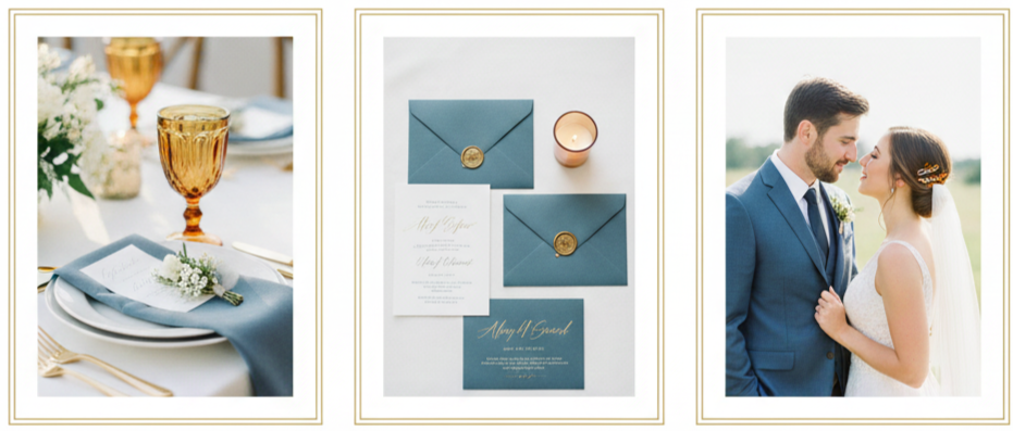
Amber and Slate Blue
Amber introduces warmth through lighting or glassware, while slate blue adds a cool contrast in linens, suits, or invitations. This combination feels unexpected yet balanced.
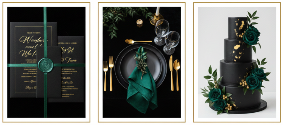
Black, Gold, and Emerald
Black sets a bold foundation, gold adds elegance through metallic accents, and emerald brings richness through florals or attire. This palette suits formal evening weddings and upscale venues.
Tips for Choosing Your Fall Wedding Colors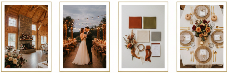
Selecting a fall wedding color scheme becomes much easier when you focus on a few practical considerations instead of trends alone. Your colors should complement your venue, reflect your personal style, and remain consistent throughout the celebration.
Start by observing your venue’s existing colors, materials, and lighting. A barn venue may already include warm wood tones, while a ballroom might feature neutral walls or bold carpeting. Your palette should enhance those elements rather than compete with them.
Think about how your colors will look in photos, especially under different lighting conditions. Fall weddings often transition from daylight to candlelit receptions, and certain shades shift depending on light.
Limit your palette to a manageable range. Two main colors with one or two supporting accents usually create the most cohesive look. Neutrals like cream, beige, or soft gray help balance deeper fall tones and prevent the design from feeling heavy.
How to Use Fall Wedding Colors in Every Detail
A successful fall wedding color scheme shows up consistently across the entire day, from the first impression to the final farewell. Each element should feel connected without appearing overly matched.
- Invitations and Stationery: Invitations introduce guests to your color scheme before the wedding day even begins. Use your palette through paper color, ink choice, envelope liners, or foil accents to set expectations early.
- Bridesmaid Dresses and Groom Attire: Bridesmaids do not need to wear identical shades. Mixing tones within the same color family adds depth and visual interest. Groomsmen can incorporate color through ties, pocket squares, or boutonnieres.
- Floral Arrangements: Seasonal blooms such as dahlias, roses, and mums pair well with fall greenery like eucalyptus or olive branches. Dried elements such as pampas grass or wheat enhance texture and reinforce the seasonal feel.
- Table Settings and Centerpieces: Linens, napkins, chargers, candles, and glassware all provide opportunities to showcase your palette. Layering colors through these elements creates a polished and intentional tablescape.
- Wedding Cake and Desserts: Cakes can reflect fall colors through floral accents, painted buttercream, or metallic detailing. Desserts like macarons or cookies also offer subtle ways to incorporate color.
- Ceremony Décor: Arches, aisle markers, signage, and programs should align with your chosen colors. Even small details, when coordinated, contribute to a cohesive overall look.
Mistakes to Avoid With Fall Color Schemes
- Even thoughtfully chosen color palettes can lose impact when common mistakes occur. Avoiding these missteps helps keep your wedding design polished and balanced.
- Using too many colors can overwhelm and distract. A simple, focused palette looks more intentional.
- Ignoring the venue’s existing design can lead to clashing visuals. Always consider flooring, wall colors, and permanent décor before finalizing your palette.
- Relying only on dark tones without lighter accents may make the space feel heavy, especially in indoor settings. Balance deeper colors with neutrals or metallics to maintain visual flow.
- Mixing conflicting textures can disrupt the aesthetic. Rustic materials and ultra-glam finishes should be blended thoughtfully to avoid visual inconsistency.
Not testing colors in different lighting can cause surprises. Always check swatches in natural and artificial light.
Conclusion
Fall wedding color schemes offer a unique opportunity to create a celebration that feels warm, stylish, and deeply personal. The season’s natural palette supports everything from classic combinations like burgundy and blush to modern pairings like terracotta and slate blue. When chosen thoughtfully, fall colors enhance the venue, complement the décor, and bring cohesion to every detail of the day.
Key Takeaway: Fall wedding color schemes work best when they balance richness with restraint. Choosing a focused palette, using it consistently, and letting seasonal textures do the rest creates a wedding design that feels effortless and memorable.
FAQs
Can cool tones still work for a fall wedding?
Cool tones like slate blue or gray work well when paired with warm accents such as amber, gold, or cream.
What fall colors photograph best?
Deep jewel tones, warm neutrals, and muted earth tones tend to photograph well in both daylight and evening lighting.
Should floral colors exactly match the wedding palette?
Florals should complement the palette rather than match it exactly. Slight variation adds depth and keeps arrangements looking natural.
How early should a color scheme be finalized?
Finalizing your color scheme early helps guide decisions for décor, attire, florals, and stationery, making planning smoother overall.
Is it okay to change colors between ceremony and reception?
Yes, subtle shifts using the same color family can work, especially when transitioning from day to evening, as long as the overall palette remains cohesive.
Leave a Reply