Fall Wedding Colors 2015
| Color Palette | Best For | Wedding Style | Venue Type |
| Marsala & Blush | Romantic tones | Vintage, Elegant | Ballroom, Estate |
| Navy & Gold | Bold elegance | Formal, Classic | Hotel, Cathedral |
| Plum & Sage | Earthy contrast | Rustic, Vineyard | Barn, Winery |
| Burnt Orange & Cranberry | Seasonal warmth | Cozy, Festive | Outdoor, Lodge |
| Dusty Blue & Copper | Modern charm | Minimal, Chic | Gallery, Loft |
The Charm of Autumn Weddings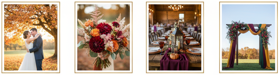
Fall weddings have a magic of their own. There’s something about the crisp air, changing leaves, and golden light that instantly sets a cozy, romantic vibe. That’s a big reason so many couples in 2015 picked autumn for their big day. With such a naturally beautiful backdrop, fall makes it easy to build a color palette that feels warm, intentional, and photo-ready without trying too hard.
Venues also play nicely with the season. Barns, vineyards, mountain lodges, estates, and indoor ballrooms all look better with deeper tones, soft neutrals, and a few metallic accents. We also get the practical perks of fall, like cooler temperatures and more comfortable outdoor ceremonies. When we combine those details with the right color palette, the entire wedding feels pulled together from the first invite to the final dance.
Top Fall Wedding Color Palettes of 2015
Fall 2015 color trends leaned into rich shades, balanced contrasts, and cozy warmth. These palettes worked because they matched the season’s natural tones and still felt stylish in formal venues.
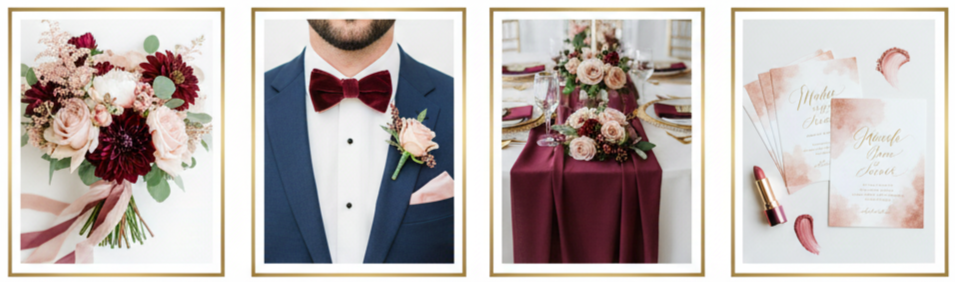
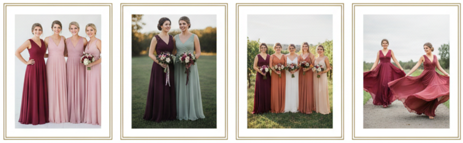
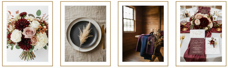
Marsala And Blush
Marsala was the standout shade of 2015, and it became a fall wedding favorite for a reason. It’s deep, romantic, and bold without feeling too loud. Blush softened the look and made the whole palette feel balanced. We saw marsala in bouquets, ties, table linens, and lipstick shades, while blush showed up in bridesmaid dresses, florals, and stationery accents. Together, they created a warm, romantic look that worked for vintage themes, classic venues, and modern styling.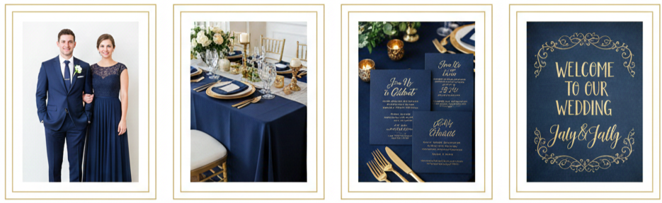
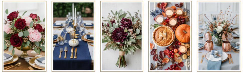
Navy And Gold
Navy brought structure and drama, while gold added warmth and polish. This pairing felt timeless in 2015, especially for evening weddings. Navy suits, dark bridesmaid dresses, and deep blue linens made the gold details pop, like candle holders, flatware, signage, and invitation foil. It fit formal ballrooms and modern venues equally well, which is why so many couples kept returning to it.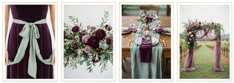
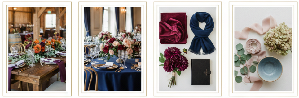
Plum And Sage
Plum added depth and mood, while sage kept everything grounded and natural. This combo worked beautifully for outdoor weddings, vineyard settings, and rustic themes. Plum showed up in florals, velvet ribbons, and bridesmaid attire, while sage appeared in greenery, table runners, and softer accent décor. The contrast felt earthy and romantic at the same time, which made it a strong fall choice in 2015.
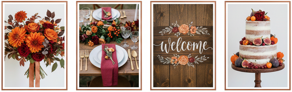
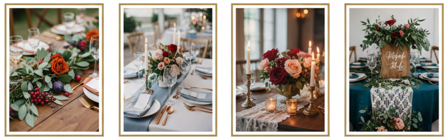
Burnt Orange And Cranberry
This palette captured fall in the most direct way. Burnt orange reflected the changing leaves, while cranberry added richness and a slightly festive feel. Couples used these colors in bold bouquets, seasonal centerpieces, napkins, signage, and even desserts. The overall vibe felt warm, inviting, and perfect for late fall celebrations where candlelight and warm wood tones played a big role.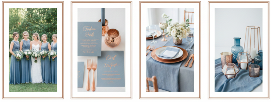
Dusty Blue And Copper
Dusty blue was a cooler twist on a fall palette, and copper warmed it up in a way that felt modern and unexpected. We saw dusty blue in dresses, invitations, and linens, while copper showed up in charger plates, candle holders, vases, and small décor details. This mix looked especially good with textured elements like hammered metal, velvet, and soft florals.
Choosing The Right Palette For Your Wedding Style
Choosing wedding colors is easier when we connect them to the vibe you want and the space you’re using. A rustic barn or vineyard naturally matches earthy tones like plum and sage or burnt orange and cranberry. A ballroom or estate wedding tends to look best with polished combos like navy and gold or marsala and blush.
We also want the colors to feel like you. A simple way to narrow it down is to think about the shades you already love in clothing, home décor, or even your favorite flowers. If you gravitate toward deeper tones, marsala, navy, or plum might feel right. If you love softer moods, blush, sage, and dusty blue can bring calm balance to a richer fall setting.
How To Incorporate Fall Wedding Colors
Once the palette is chosen, the goal is to carry it through the day in a way that feels consistent, not overwhelming. We can use the main colors in a few large moments and repeat them in smaller details so everything looks intentional.
Bridesmaid Dresses
Bridesmaids were one of the easiest ways couples showed off their color palette in 2015. Some weddings went with one consistent shade, while others mixed tones for a layered look. Marsala and blush worked well for alternating dresses, and plum with sage accents created a softer contrast. The mix-and-match approach also helped photos feel more dynamic without adding visual clutter.
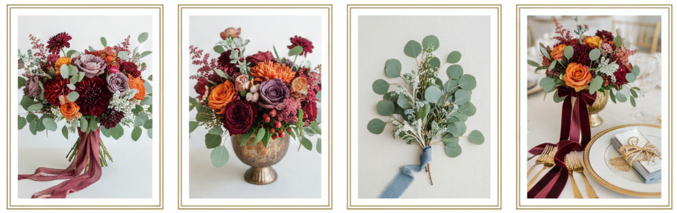
Floral Design
Florals brought fall palettes to life in 2015 because seasonal blooms naturally come in deeper tones. Dahlias, mums, garden roses, and ranunculus offered rich shades that matched marsala, cranberry, plum, and burnt orange easily. Greenery like eucalyptus and dusty miller paired well with sage and dusty blue tones. Couples also used ribbon, textured wrapping, and metallic vases to connect the bouquet and table florals to the full palette
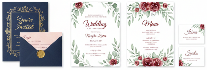
Stationery And Invitations
Invitations set expectations early, so couples in 2015 often used their palette here first. Navy paper with gold foil, blush accents paired with marsala typography, and watercolor designs featuring sage tones were all popular approaches. The best part was continuity. Couples carried the same colors into programs, menus, place cards, and signage, so guests saw the theme repeated naturally throughout the day.
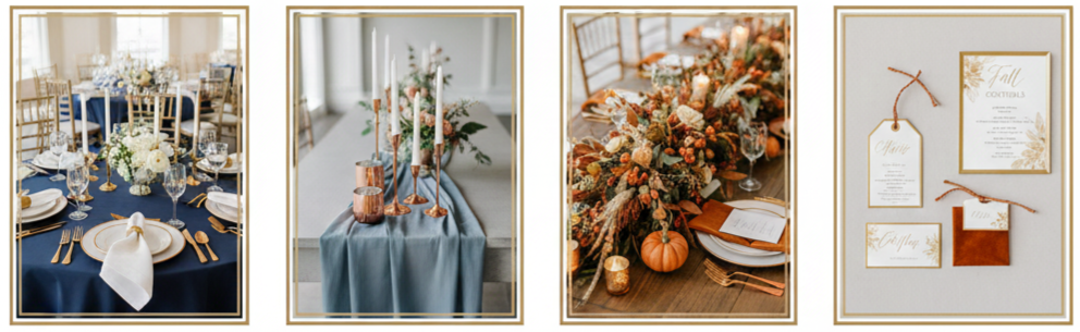
Reception Decor
Reception décor is where the palette becomes the atmosphere. Table linens, napkins, centerpieces, candles, and chargers all play a role. Navy linens with gold accents felt formal and clean. Dusty blue runners with copper candle holders felt modern and soft. Burnt orange details against wood tables made everything feel warm and seasonal. Couples also used small touches like escort cards, favor tags, and bar signage to keep the palette present without needing more big elements.
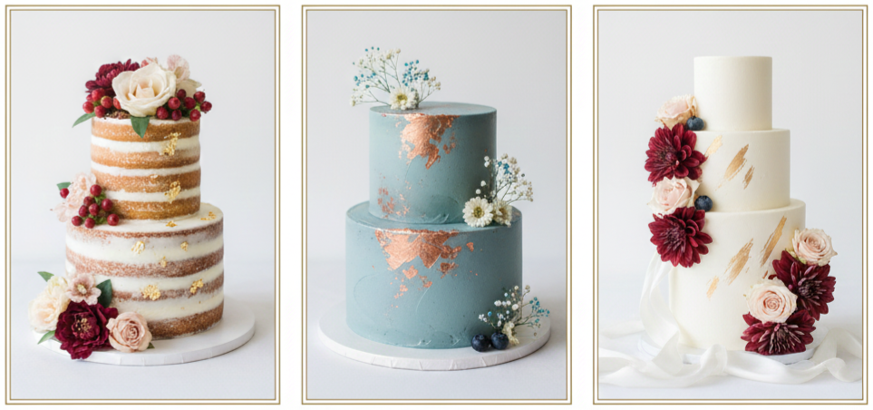
Wedding Cake Design
Cakes in 2015 were a major design moment. Naked and semi-naked cakes stayed popular, and couples used fresh florals, berries, and metallic leafing to pull in the wedding colors. Dusty blue icing with copper accents looked modern, while blush frosting with marsala flowers looked romantic. Even simple white cakes felt tied to the palette when decorated with flowers, ribbons, or metallic elements in the chosen colors.
Tips For Keeping Your Palette Cohesive
A fall palette can look stunning, and it can also get busy fast if we try to use too many shades at once. The best 2015 weddings kept things cohesive with structure and balance.
- Palette Size: Stick to two main shades and one or two accents. When we keep the palette tighter, every detail feels cleaner and more intentional.
- Neutral Support: Use neutrals like ivory, taupe, beige, or charcoal to create breathing room. Neutrals help deeper tones look richer instead of heavy.
- Lighting Check: Deep colors like navy, plum, and marsala can shift under indoor lighting. Testing fabric swatches and florals in the venue lighting helps prevent surprises.
- Consistent Repeats: Repeat your main colors in a few key places across the day, like stationery, ceremony décor, reception tables, and floral accents. Small repetition makes the whole event feel connected.
Matching Your Palette To The Theme
A theme becomes easier to execute when the colors naturally support it. Fall 2015 palettes worked well because each one could be tied to a clear vibe.
Rustic weddings leaned toward burnt orange, cranberry, sage, and plum because those tones matched wood textures, greenery, and outdoor settings. Modern weddings looked strong with dusty blue and copper or navy and gold, especially when paired with clean lines and minimal décor. Vintage romance leaned into marsala and blush with candlelight, lace textures, and softer florals. Boho styling paired jewel tones with layered greenery and textured details like macramé, wood signage, and free-form arrangements.
Why These Fall Wedding Colors Still Inspire
Even now, the fall wedding colors from 2015 still feel relevant because they weren’t trendy in a throwaway way. They were grounded in the season and built around tones that naturally work together. Marsala and blush still reads romantic. Navy and gold still looks elegant. Plum and sage still feels earthy. Burnt orange and cranberry still delivers that full autumn mood. Dusty blue and copper still feels modern while fitting fall textures.
These palettes also photograph beautifully. Deep tones create contrast, softer tones keep things light, and metallic accents catch light in a way that makes tablescapes and details look polished. When we choose colors that fit the environment and repeat them with intention, we get a wedding that feels timeless instead of dated.
Conclusion
Fall wedding colors in 2015 brought warmth, elegance, and bold personality into every part of the celebration. Couples used rich tones like marsala, plum, navy, and cranberry, then balanced them with blush, sage, dusty blue, and metallic accents. The best part is how flexible these palettes were. They fit rustic barns, vineyard views, and formal ballrooms while still feeling personal and memorable.
Key Takeaway: Fall wedding colors from 2015 stayed popular because they balanced cozy seasonal warmth with polished, photo-friendly contrast, making it easy to build a wedding look that feels timeless and intentional.
FAQs
What’s the best way to test a fall color palette before the big day?
We get the clearest answer by creating a mini set of real-world samples. Collect fabric swatches, ribbon options, and a few floral stems that match your palette. Place them together in the venue lighting and in natural daylight, then compare how the colors look in photos. This helps confirm the tones won’t shift unexpectedly, especially with deep shades like navy, plum, or marsala.
Can we use past fall color trends for a wedding happening now?
Yes, and it usually works in your favor. These palettes stayed popular because they’re built on timeless seasonal tones rather than short-lived trends. We can refresh the look with updated textures, like velvet, matte stationery, or modern metallic accents, while still using the same 2015-inspired color combinations.
Should our flowers match our wedding colors exactly?
Not always. Flowers look best when they complement the palette rather than trying to match it perfectly. We can treat florals as a blend of main colors, supporting tones, and greenery. For example, a marsala palette can still include neutral flowers, soft blush blooms, and natural greenery to keep the arrangement balanced and realistic.
Is it okay to mix metallics in a fall wedding design?
Yes, as long as we keep it intentional. Mixing copper and gold can add depth, especially in fall when warm metals fit the season. The simplest approach is choosing one metallic as the primary accent, then using the second metallic only in smaller details like candle holders, signage trim, or small décor pieces.
How can we include fall colors in the bridal look without changing the dress?
We can bring the palette into accessories and beauty details. Shoes, hair pieces, bouquet ribbon, and jewelry can reflect the wedding colors in subtle ways. Makeup is another option, like a marsala lip or copper-toned eyeshadow. These touches connect the bridal look to the palette while keeping the overall style classic.
Leave a Reply