Garden Wedding Invitations
| Item | When to Send |
| Save-the-Date Cards | 6–9 months before the wedding |
| Formal Invitations | 8–12 weeks before the wedding |
| RSVP Deadline | 4 weeks before the wedding |
| Order Invitations | 4–6 months before mailing date |
| Mail International Invites | 10–12 weeks before the wedding |
Why Garden Weddings Deserve Their Own Kind of Invitations
Garden weddings feel relaxed, romantic, and naturally beautiful, so the invitation needs to match that mood from the first glance. Your card sets expectations for everything your guests are about to experience, from the vibe of the venue to how formal the day feels. Since you’re celebrating outdoors, your design choices can lean into soft florals, airy color palettes, and nature-inspired details that feel right at home in a garden setting.
A garden invitation also does a practical job. Outdoor celebrations come with extra guest questions, like what shoes to wear on grass, what the weather plan is, and how to find the exact ceremony spot. When your invitation suite handles those details clearly, your guests feel prepared and excited, not confused.
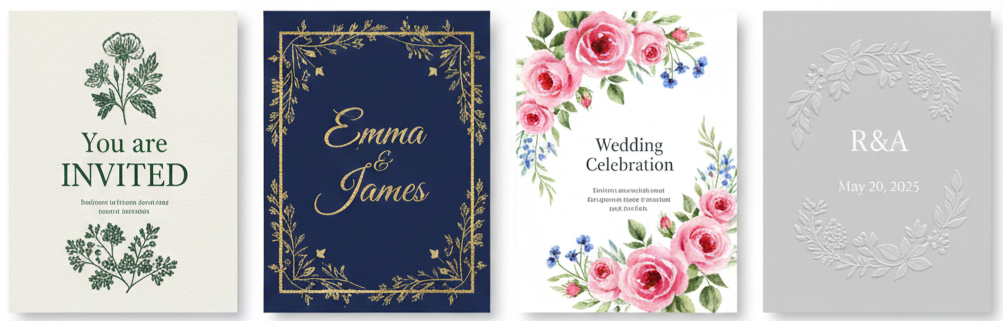
Top Garden Wedding Invitation Styles You’ll Love
Choosing a style gets easier when you start with the feeling you want your guests to have when they open the envelope. Some couples want something classic and romantic, while others want clean and modern with subtle greenery. Garden invitations work across a wide range of aesthetics, as long as they keep a natural, fresh look.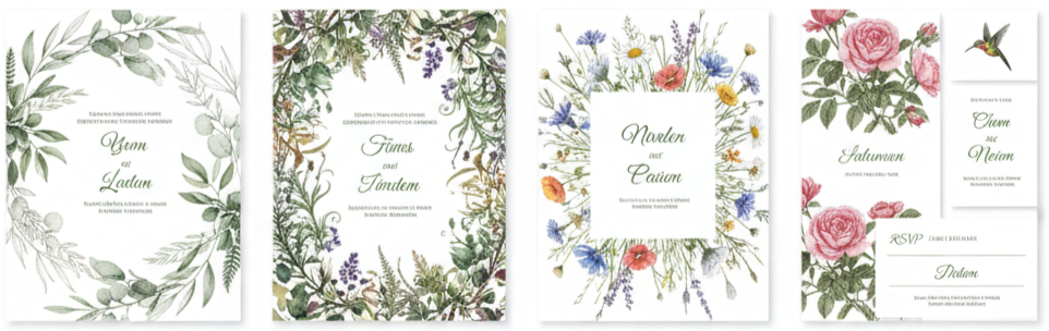
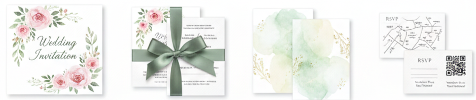
Botanical Illustrations
This style uses hand-drawn leaves, vines, ferns, herbs, or wildflowers to create a timeless look. It feels elegant without being too formal and works especially well for couples who want nature to be the main “theme” instead of heavy wedding motifs. 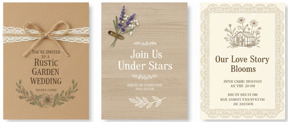
Rustic Charm
Rustic invitations lean into earthy textures and cozy details. Kraft paper, twine, lace accents, or subtle woodgrain backgrounds fit backyard ceremonies, greenhouse venues, and garden receptions with farmhouse décor.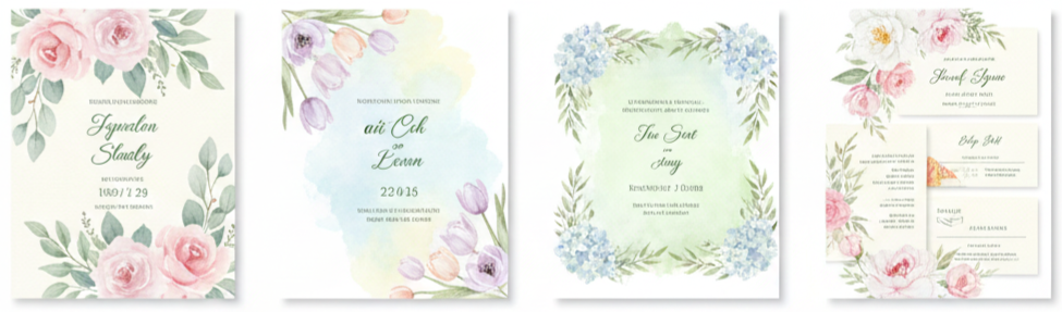
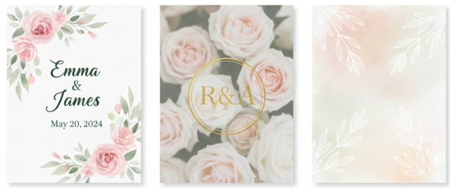
Watercolor Florals
Watercolor designs feel soft, romantic, and artistic. They’re great for spring and summer weddings, especially when you want pastel blooms and gentle greenery that look painted by hand.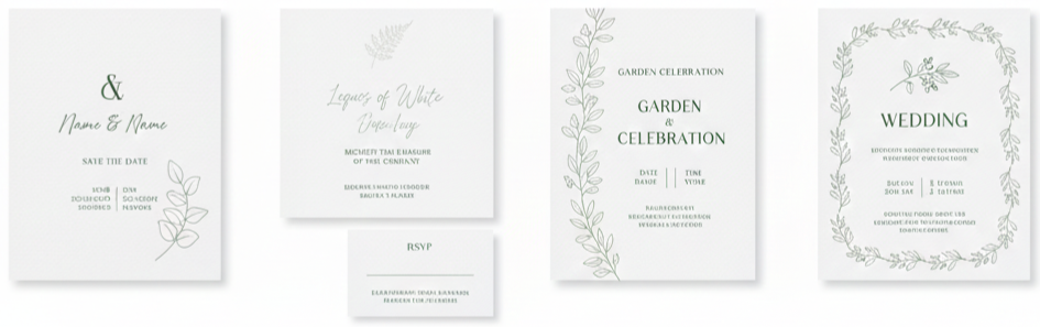
Minimalist Nature
If you like clean layouts, this style focuses on simple typography, lots of white space, and small botanical touches like a single sprig or leaf border. It looks modern, airy, and polished.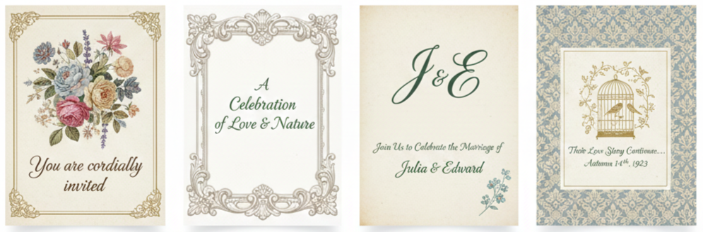
Vintage Garden
Vintage designs pull from antique botanical prints, classic frames, and traditional calligraphy. Faded tones, old-world patterns, and elegant scripts make the invitation feel timeless and refined.
How to Pick the Right Color Palette for Your Invitations
Color is where your garden invitation really starts to feel connected to your wedding. A good palette should complement the season, work with your florals, and stay easy to read. It’s tempting to use very light ink on light paper because it looks soft and dreamy, yet clarity matters more than aesthetics when guests are trying to read times, addresses, and RSVP instructions.
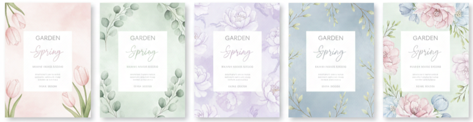
Spring Colors
Pastels like blush, sage, lilac, and soft blue feel fresh and romantic. These shades pair beautifully with tulips, peonies, and new greenery.
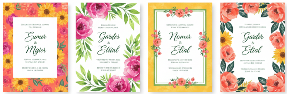
Summer Colors
Brighter tones like coral, sunflower yellow, fuchsia accents, and rich greens match bold blooms and sunny outdoor lighting.
Fall Colors
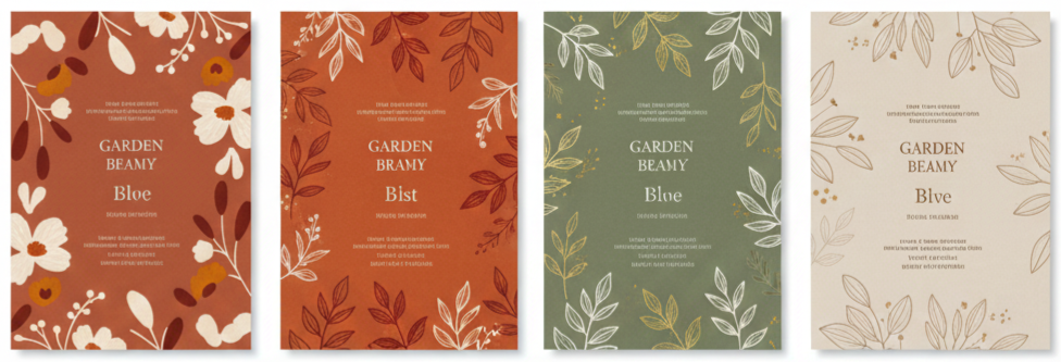
Earthy shades like terracotta, rust, olive, and warm neutrals pair well with changing leaves and late-season florals.
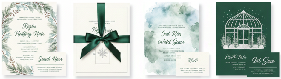
Winter Garden Colors
If your venue is a conservatory or greenhouse, cooler tones like ivory, silver, icy blue, and deep evergreen can feel elegant and seasonally appropriate.
Keep contrast in mind. Dark text on light backgrounds remains the easiest to read, especially for older guests. If you love pale ink, use it for decorative accents while keeping key details in a darker shade.
Garden-Themed Wording Ideas to Make Your Invites Stand Out
Your wording should feel like you, while also matching the setting. Garden weddings tend to lean romantic, warm, and welcoming, so you can use language that feels a little more personal than a traditional ballroom invitation. You can still keep it formal, yet a gentle nature-inspired line can make the whole suite feel more intentional.
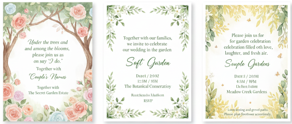
- Romantic Garden Line: “Under the trees and among the blooms, please join us as we say ‘I do.’”
- Soft Nature Line: “Together with our families, we invite you to celebrate our wedding in the garden.”
- Light And Sunny Line: “Please join us for a garden celebration filled with love, laughter, and fresh air.”
No matter what tone you choose, the important details should be clear and complete. Guests should instantly know the date, time, exact location, how to RSVP, and what to expect for attire. Outdoor venues also benefit from a short note about the setting, like lawn seating, gravel paths, or a ceremony in a meadow, so guests can plan shoes and layers without guessing.
Best Invitation Formats and Materials for a Garden Wedding
Your format and materials shape how the invitation feels in someone’s hands. Garden weddings pair beautifully with textured paper, natural finishes, and layered elements that feel organic. At the same time, you’ll want materials that hold up well during mailing and look clean when opened.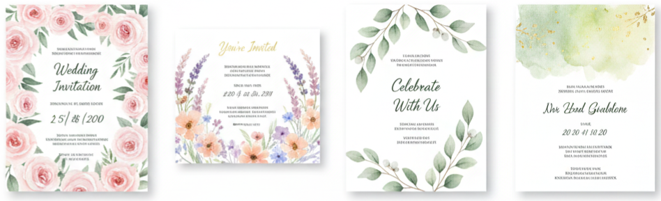
Traditional Flat Cards
Flat invitations feel classic and simple. They work for nearly any style, and they’re easy to mail. If your design includes florals or watercolor artwork, a flat card layout keeps the focus on the illustration.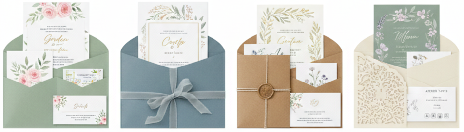
Pocket Or Folio Invitations
This format keeps everything organized in one place. It’s useful when you have multiple inserts like RSVP cards, weekend schedules, maps, and attire notes.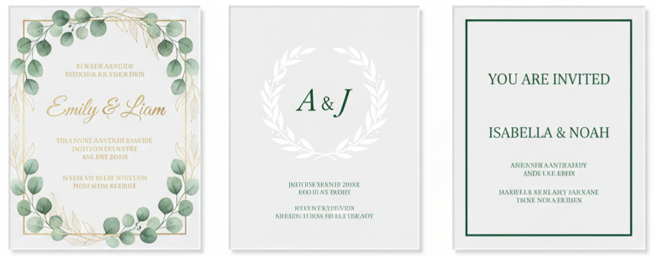
Acrylic Invitations
Acrylic invites feel modern and upscale. They’re also less likely to wrinkle or bend. They pair well with minimalist greenery, metallic ink, and clean typography.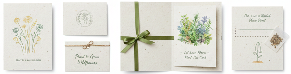
Seeded Paper
Seeded paper is made to be planted, so guests can grow wildflowers or herbs later. It’s a meaningful choice for couples who want an eco-friendly option that fits a garden theme naturally.
Vellum Overlays
Vellum adds a soft, romantic layer to your suite. You can print names, monograms, or delicate botanicals on vellum and place it over a floral card for a high-end look.
Materials should match your venue and vibe. A formal garden estate may look best with thick cotton paper and letterpress, while a casual backyard celebration might feel right with recycled stock and watercolor florals.
Printing Techniques That Take Your Invites to the Next Level
The printing method changes the entire look and feel of your invitation. Some techniques add texture you can feel, while others focus on shine or rich color. The best choice depends on your design style, your budget, and how dramatic you want the final result to feel.
- Letterpress: Letterpress presses text into thick paper, creating a deep, tactile impression. It looks especially elegant with botanical themes, classic typography, and vintage garden aesthetics.
- Foil Stamping: Foil adds shine and catches the light beautifully. Gold, rose gold, and copper work well for floral frames, leaf details, or formal text that needs a little sparkle.
- Digital Printing: Digital printing is affordable and great for watercolor art, detailed florals, and full-color designs. It’s the easiest option when you want lots of color variation without the cost of specialty presses.
- Embossing Or Debossing: Embossing raises details up from the paper, while debossing presses them in. Both add dimension and give your invitations a refined finish without needing metallic foil.
If you’re using layered materials like vellum or acrylic, do a test print first. It’s important to confirm the ink looks crisp and readable on the surface you choose.
Build a Matching Stationery Set for a Cohesive Look
A cohesive suite ties your wedding details together and makes the whole event feel thoughtfully planned. You don’t need a massive collection of paper goods, yet keeping your fonts, colors, and floral elements consistent creates a polished look from start to finish.
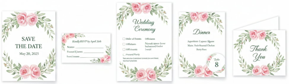
- Save-The-Dates: Save-the-dates set the tone early. Using the same garden motif or color palette helps guests recognize your wedding style right away.
- RSVP Cards: RSVP cards look best when they match your main invitation design. Keep the layout simple so guests can respond easily without confusion.
- Programs: Programs can echo your florals and typography while staying easy to read. For outdoor ceremonies, thicker paper helps them hold their shape.
- Menus And Table Cards: Coordinating menus and place cards make the reception décor feel intentional. A small floral detail or matching font can be enough to tie everything together.
- Thank-You Cards: Thank-you cards feel more meaningful when they reflect the same garden theme. They also become a nice keepsake after the event.
- Small extras can add a lot of charm. Wax seals, envelope liners, belly bands, and ribbon ties all work beautifully with garden themes, as long as they don’t make the invitation too bulky to mail.
Tips for Mailing Your Garden Wedding Invitations
Mailing is where beautiful invitations either arrive perfectly or get damaged in transit, so it’s worth handling with care. Planning your send-out timing also helps guests RSVP on time, book travel, and prepare for an outdoor venue.
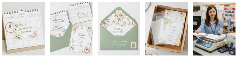
- Save-The-Dates Timing: Send save-the-dates around 6 to 8 months before the wedding, especially if guests need to travel.
- Invitation Timing: Send formal invitations about 8 to 10 weeks before the wedding so guests have time to RSVP and plan.
- Envelope Styling: Calligraphy, clean printed addresses, botanical liners, and matching stamps keep the garden look consistent from the outside in.
- Protection For Delicate Suites: Acrylic pieces, vellum layers, and thick paper benefit from protective sleeves. A structured mailer can also prevent bending.
- Postage Check: Heavier or oddly shaped suites often need extra postage. We recommend bringing a fully assembled invitation to the post office to confirm the correct stamp amount before you mail everything.
If your invitation has multiple layers or embellishments, mail one to yourself first. It’s the easiest way to see how it holds up and whether anything shifts during transit.
Conclusion
Garden wedding invitations should feel like the first chapter of your wedding story. When your design matches your venue, your palette complements the season, and your wording feels warm and clear, your guests instantly understand the vibe you’re creating. Whether you choose watercolor florals, botanical sketches, minimalist greenery, or a vintage-inspired suite, the right details make your invitation feel personal, polished, and ready for a beautiful outdoor celebration.
Key Takeaway: Garden wedding invitations look and feel their best when the design, colors, materials, and print style reflect the outdoor setting while keeping every detail clear and easy for guests to follow.
FAQs
How do we make garden wedding invitations feel personal without adding too many extras?
You can personalize the suite through small details that don’t add bulk, like a custom monogram, a short line about your venue, or a floral motif inspired by your bouquet. A single meaningful touch usually feels more intentional than layering multiple embellishments.
What’s the best way to share outdoor ceremony details without cluttering the invitation?
Use a separate details card or a small insert that covers outdoor notes like terrain, seating, and weather plans. Keeping those notes off the main invitation helps the primary card stay clean while still giving guests what they need.
How do we choose fonts that fit a garden theme and stay easy to read?
Pair one decorative font with one clean font. Use the decorative option for names or headings and the clean font for the date, time, and location. This keeps the invitation pretty and practical at the same time.
What invitation details matter most for guests attending a garden wedding for the first time?
Guests usually want clear timing, exact location directions, footwear guidance, and an easy RSVP method. A quick line about the outdoor setting also helps guests plan layers, sun protection, or a wrap for evening temperatures.
How do we keep a floral design from looking too busy on the main invitation?
Choose one focal area for florals, like a border or corner cluster, and leave breathing room around the text. A clean layout with controlled floral placement keeps the design elegant and prevents the details from getting lost.
Leave a Reply