Golden Wedding Theme
| Gold Finish | Best For | Avoid Using It For |
| Brushed Gold | Flatware, candleholders, chair accents, and modern signage frames | High-glare backdrops, glossy printed signs |
| Matte Gold | Signage hardware, minimalist décor, centerpiece bases, modern installations | Areas needing shine or sparkle for impact |
| Antique Gold | Vintage-inspired frames, ornate candleholders, classic venues, memory tables | Ultra-modern décor with sharp lines |
| Champagne Gold | Linens accents, soft romantic palettes, dessert display hardware, gentle glam | Very high-contrast palettes that need bold shine |
| Polished Gold | Chargers, statement arches, bold table accents, glam evening styling | Bright direct lighting zones that cause glare |
What A Golden Wedding Theme Means
A golden wedding theme uses gold as the main accent that ties the entire celebration together. We use it to create a warm, polished look that feels meaningful for milestone events like a 50th anniversary, vow renewal, or a formal wedding day. Gold also works in every season, so we can style it to feel light and airy in spring and summer, or rich and cozy in fall and winter.
- Style Directions: We can shape the theme into classic elegant, modern minimal, vintage opulence, or rustic gold, depending on the venue, the couple’s taste, and the overall mood we want guests to feel.
- Classic Elegant: We lean into refined gold touches, traditional florals, and formal table settings that feel timeless.
- Modern Minimal: We keep lines clean, décor simple, and gold accents subtle so everything looks fresh and intentional.
- Vintage Opulence: We layer textures and ornate details, using antique-inspired gold elements to create depth.
- Rustic Gold: We blend natural materials like wood, linen, and greenery with soft gold highlights for a relaxed look.
Choosing Your Gold Color Palette
A strong palette makes the golden wedding theme look cohesive instead of scattered. Gold changes depending on lighting, surrounding colors, and the finish we choose, so we get the best results when we pick a direction early and stay consistent from stationery to tablescapes.
- Timeless Pairings: White and gold feel crisp and formal, ivory and gold feel softer and romantic, and champagne and gold feel warm and understated while still looking elevated.
- Bold Combinations: Black and gold feel dramatic and glam, navy and gold feel deep and classic, and emerald and gold feel rich and celebratory, especially for evening events.
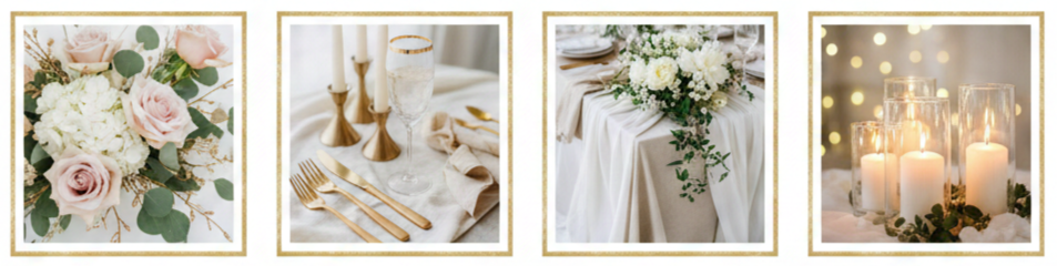
- Soft Options: Blush and gold feel gentle and flattering, dusty rose and gold feel muted and refined, and sage and gold feel fresh and natural, especially with brushed finishes.
- Keeping Gold Balanced: We usually choose one main gold finish, repeat it in just a few key places like table settings, signage, and lighting accents, then leave breathing room with neutrals, greenery, and soft florals so the metallic details feel intentional.
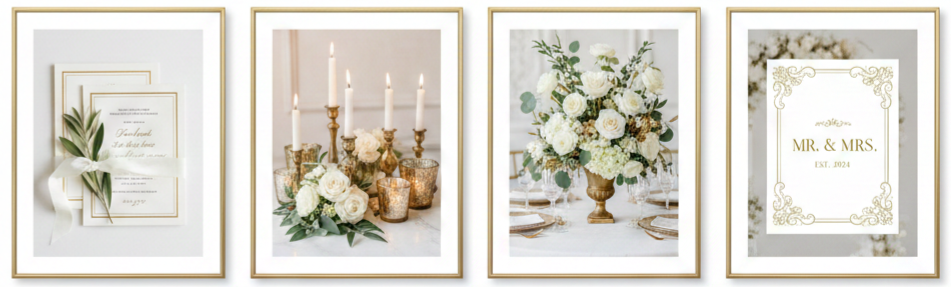
Invitations And Stationery Ideas
Invitations set expectations before guests arrive, so we use them to signal the tone of the golden wedding theme right away. When the paper quality, fonts, and gold accents match the rest of the décor style, everything feels more coordinated and premium.
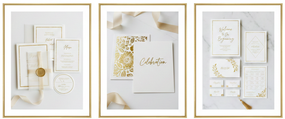
- Premium Print Options: Foil stamping adds a clean shine, embossing or debossing adds texture that feels upscale, and letterpress creates a crisp impression that looks polished when paired with minimal gold design.
- Day-Of Stationery: Matching ceremony programs, place cards, menus, welcome signs, and seating charts to the invitation suite creates a consistent look that guests notice, even when the details are subtle.
- Finishing Details: Vellum wraps with gold sticker seals, wax seals in champagne tones, envelopes with light gold patterns, and warm metallic calligraphy add structure without making the paper goods feel busy.
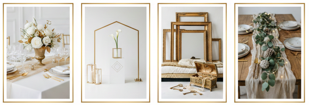
Ceremony Styling With A Golden Wedding Theme
The ceremony space is where we want gold to feel meaningful and elegant, not overwhelming. Gold works best here when it supports the structure of the setup, frames key areas like the altar, and adds warmth in the places guests naturally look.
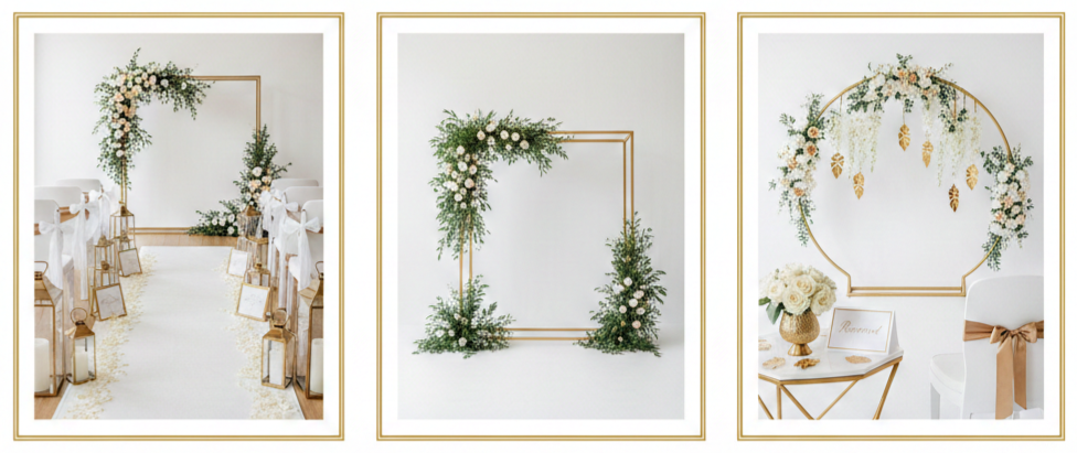
- Aisle Styling: Glass hurricanes with gold bases, lantern clusters at the aisle entrance, ivory petal pathways paired with gold-edged signage, and simple aisle markers with gold ribbon details keep the look clean and photogenic.
- Backdrop Ideas: A gold geometric arch with asymmetrical florals feels modern, a gold frame altar with greenery feels classic, a curved gold stand with hanging florals feels contemporary, and a minimal draped backdrop with gold tiebacks feels soft and formal
- Guest Area Touches: Reserved seating signs with thin gold borders, simple chair accents spaced out evenly, and a welcome table styled with cohesive floral and gold pieces keep the ceremony area tied to the overall theme.
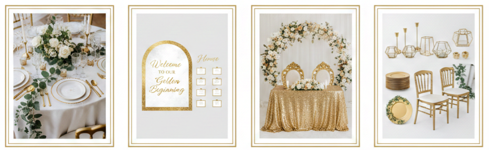
Reception Decor That Brings The Gold To Life
The reception is where the golden wedding theme becomes most immersive because guests spend the most time here. The goal is to repeat gold in a few high-impact areas so it looks deliberate rather than scattered across every surface.
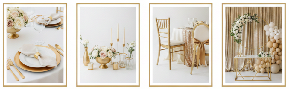
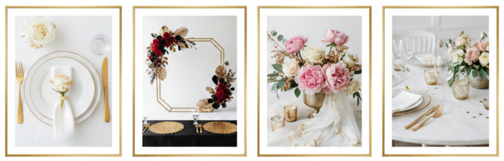
- Tablescape Essentials: Gold chargers paired with white plates create clean contrast, brushed gold flatware looks modern, glassware with thin gold rims feels subtle and upscale, and neutral napkins look finished when secured with gold rings or ribbon.
- Centerpiece Structure: Gold compotes with soft florals look classic, slim gold candleholders grouped in clusters add height without blocking views, gold-trimmed vases mixed with clear glass add dimension, and low arrangements with minimal gold accents keep tables conversational.
- Linen And Chair Styling: Ivory and champagne linens make gold feel warmer, sequin runners work best when used sparingly, gold chairs look bold and glamorous, and neutral chairs with small gold accents help keep the look balanced.
- Statement Decor: Hanging installations with gold hoops and florals create a focal point, sweetheart table backdrops with gold framing feel refined, balloon installations look polished in champagne and ivory tones, and metallic draping behind the dance floor adds a glam finish without clutter.
Golden Wedding Theme Lighting Tips
Lighting affects how gold looks more than almost anything else. Warm lighting makes gold glow and feel rich, while harsh white lighting can make it look flat or overly reflective, so we plan lighting as part of the design rather than a last-minute upgrade.
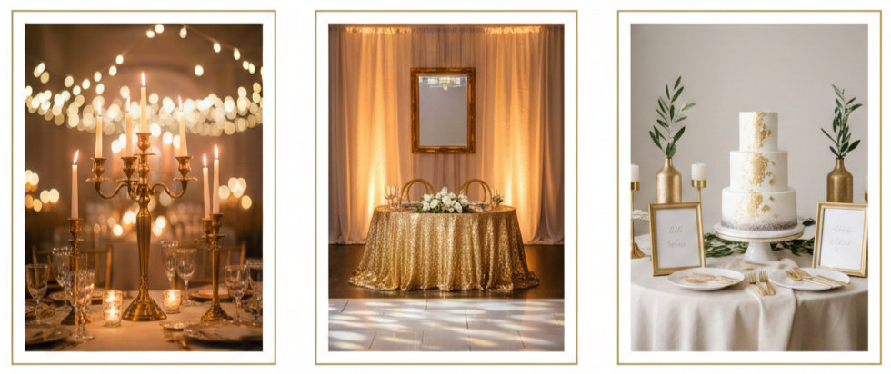
- Warm Lighting Ideas: Candlelight on tables and entry areas, string lights overhead for outdoor setups, warm uplighting that flatters metallic décor, and chandeliers or pendants that add a formal finish all make gold look softer and more expensive.
- Placement Strategy: We place gold accents where light naturally hits, like near the dance floor, behind the sweetheart table, along the bar front, and around the dessert display, then position signage carefully to avoid glare in photos.
- Photo-Friendly Choices: Mixing metallic pieces with linen, greenery, matte ceramics, and brushed finishes helps prevent harsh reflections and keeps the gold looking smooth in camera flashes.
Bridal And Groom Style With Gold Accents
Attire brings the theme into the most personal parts of the day, so we use gold accents in a way that feels natural rather than flashy. When jewelry, accessories, and small details match the gold finish used in décor, the whole event reads as coordinated.
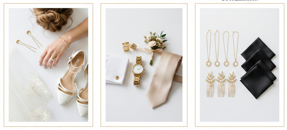
- Bridal Details: Gold jewelry that matches the décor finish, minimal gold hairpins or combs, subtle gold embroidery on a veil, and shoes with gold accents keep the look cohesive without overpowering the dress.
- Groom Styling: Gold cufflinks or tie clips, a classic gold-tone watch, boutonniere wraps with thin gold ribbon details, and tie colors like champagne, ivory, black, navy, or jewel tones keep everything aligned with the palette.
- Wedding Party Coordination: Matching bridesmaid jewelry in the same gold tone, coordinated hair accessories, and consistent pocket square styling keep the group photos looking polished and intentional.
Flowers That Pair Beautifully With Gold
Florals soften the metallic feel of gold and keep the theme from looking too sharp. We choose blooms and greenery that support warmth and texture, then balance volume so the arrangements feel lush without becoming heavy.
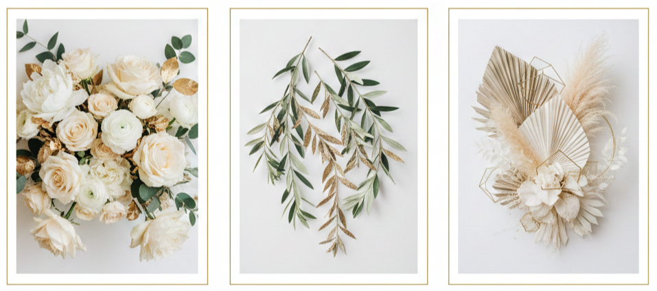
- Best Blooms: Cream roses create a classic look, white peonies add softness, orchids feel upscale, ranunculus adds delicate texture, and hydrangeas add volume that works well for ceremony and reception designs.
- Greenery Choices: Eucalyptus adds airy structure, Italian ruscus creates clean lines, and olive branches deliver a timeless look that pairs well with antique or champagne gold accents.
- Modern Textures: Dried palms add shape, pampas grass in champagne tones adds softness, and bleached foliage keeps the palette light and airy while still looking structured.
Cake, Dessert Table, And Drinks
Desserts and drinks give us another place to reinforce the golden wedding theme without overdecorating. Presentation matters here because these areas draw attention, create photo moments, and often become gathering points throughout the night.
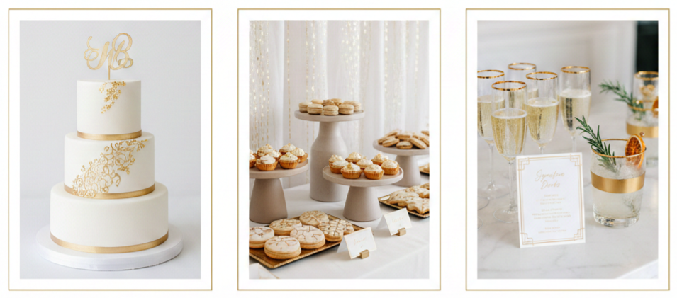
- Cake Styling: Painted gold accents look refined, minimal gold leaf adds luxury without clutter, metallic edging between tiers gives structure, and a monochrome cake with one gold topper can feel modern and elegant.
- Dessert Table Setup: Gold trays paired with neutral risers keep the setup balanced, clean labels with gold typography keep everything cohesive, and subtle shimmer backdrops look more refined than heavy glitter.
- Drink Details: Gold-rimmed flutes for champagne, a signature drink menu with gold accents, and simple garnishes that match the palette keep the bar presentation aligned with the overall theme.
Golden Wedding Theme Photo Moments
Photo moments keep the theme visible throughout the day and help the final gallery look cohesive. We plan spaces guests naturally gravitate toward, then keep the styling clean so it photographs well from different angles.
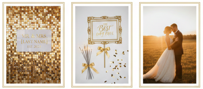
- Backdrop Options: A gold shimmer wall with clean signage feels modern, draped fabric with gold framing feels soft and formal, a floral wall with gold trim feels classic, and a brushed gold hoop backdrop with minimal florals fits modern venues.
- Classy Props: One statement sign with a gold border, sparklers for a refined send-off, and champagne-toned confetti used in controlled moments keep photos from looking cluttered.
- Timing: Late afternoon portraits outdoors and early evening portraits indoors tend to flatter gold the most because the light looks warmer and softer.
Party Favors And Guest Experience Details
Favors and guest experience details feel more elevated when they match the theme instead of feeling like random add-ons. When packaging, signage, and display areas align with the golden wedding theme, even simple items look premium.
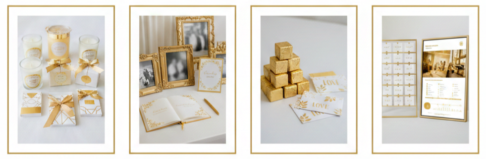
- Favor Ideas: Mini candles in neutral packaging with gold labels, chocolate boxes with gold foil, custom matchboxes designed to match stationery, and small photo keepsakes in gold-accent sleeves fit naturally into the theme.
- Experience Touches: A memory table with gold frames, a structured card display with gold accents, a guestbook station with matching signage, and a slideshow or anniversary timeline work especially well for milestone celebrations.
Budget-Friendly Golden Wedding Theme Ideas
A golden wedding theme can still look high-end on a realistic budget when we focus spending on the places guests notice most and simplify everything else. The key is using gold as a highlight, not a blanket covering every surface.
- High-Impact Spend Areas: Tablescapes, primary signage like a welcome sign and seating chart, and one focal backdrop such as a sweetheart table design or photo moment area create the strongest impression and show up in the most photos.
- Cost-Smart Choices: Renting chargers, chairs, and candleholders usually saves money while keeping the look polished, greenery can add volume without relying on expensive blooms everywhere, printed signage with gold accents can look refined without custom builds, and concentrating gold décor in key zones keeps the theme intentional.
Common Mistakes To Avoid
Small mistakes can make gold look mismatched or overly busy, so we keep the styling tight and consistent. Gold is easy to overuse, so restraint usually creates a more premium result.
- Too Many Finishes: Mixing yellow gold, rose gold, and brass evenly can look inconsistent, so sticking to one main finish strengthens the entire look.
- Too Much Shine: Overusing sequin fabrics, heavy glitter, and reflective décor creates visual noise, so balancing metallic accents with matte textures keeps the theme clean.
- Lighting Oversights: Harsh lighting makes gold look flat or overly reflective, so warm lighting and careful placement keep gold looking rich in photos and real life.
- Gold Everywhere: Gold works best as an accent, so focusing it in a few high-visibility areas keeps things elevated and avoids clutter.
Sample Styling Recipes For A Golden Wedding Theme
Styling recipes make decisions easier because they lock in palette, finish, and mood. Once we choose a recipe, it becomes much simpler to select florals, décor, stationery, and attire that all match.
Classic Elegant Recipe
Ivory, white, soft green, and gold paired with antique or brushed finishes, candle clusters, structured florals, and classic signage for a timeless, formal feel.
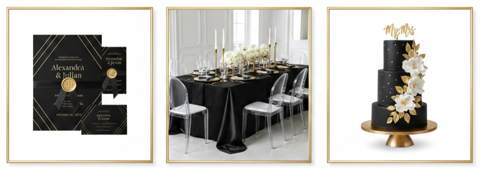
Modern Glam Recipe
Black, white, and gold with polished accents used in controlled spots, clean typography, geometric décor, and sleek tablescapes for a bold, upscale look.
Garden Luxe Recipe
Blush, champagne, greenery, and gold with champagne or brushed finishes, light linens, airy florals, and soft lighting for a romantic, refined mood.
Conclusion
A golden wedding theme looks most elevated when we treat it like a full design plan instead of adding gold touches randomly. Choosing one gold finish, sticking to a supporting palette, and repeating gold in a few high-visibility zones creates a cohesive look guests notice right away. Warm lighting, balanced textures, and matching stationery details pull everything together so the celebration feels polished and photographs beautifully.
Key Takeaway: We get the best golden wedding theme results when we choose one gold finish, repeat it in a few standout areas like tables, signage, and lighting, then balance the shine with neutrals, greenery, and warm light.
FAQs
How Do We Choose Between Brushed Gold And Polished Gold For A Golden Wedding Theme?
Brushed gold fits a softer, modern look with less glare in photos. Polished gold suits a formal, glam style with sharper shine, especially in evening lighting.
What Is The Best Way To Combine Gold With Other Metals Without Looking Mismatched?
Keeping gold as the main metal makes styling easier. Adding one secondary metal in small doses and repeating it in just a couple of places keeps the look cohesive.
Which Venue Styles Fit A Golden Wedding Theme Best?
Ballrooms, historic venues, modern industrial spaces, garden venues, and tented receptions all work well. Matching the gold finish and supporting colors to the venue lighting creates the cleanest result.
How Do We Keep A Golden Wedding Theme Looking Modern Instead Of Traditional?
Clean typography, minimal signage layouts, and structured décor lines push the style modern. Brushed or champagne gold finishes also feel more current, especially when balanced with neutral space and simple floral shapes.
What Are Unique Golden Wedding Theme Touches Guests Notice Right Away?
A strong welcome moment, a polished seating chart display, a cohesive tablescape, and one standout photo backdrop tend to grab attention immediately because guests naturally gather in those spaces.
Leave a Reply