Golden Wedding Invitations
| Gold Tone | Best Color Pairings | Style Vibe |
| Yellow Gold | White, Black, Navy, Emerald | Classic, Formal |
| Rose Gold | Blush, Nude, Warm Gray, Terracotta | Romantic, Modern |
| Antique Gold | Cream, Sage, Taupe, Dusty Blue | Vintage, Understated |
Why Golden Wedding Invitations Feel Elevated
Golden wedding invitations set a polished tone right away. Gold stands out on paper because it catches light, so even simple layouts look intentional and photo-ready. We also like gold because it fits almost any wedding mood. It works for ballroom formality, modern venues, outdoor celebrations, and evening receptions with darker styling. Gold stays flexible across palettes too, so we can pair it with crisp whites, warm neutrals, deep jewel tones, or soft pastels without forcing the design.

- Style Signal: Gold communicates refinement before guests read a single line.
- Visual Impact: Metallic finishes show dimension in hand and in photos.
- Theme Flexibility: Gold adapts to classic, modern, vintage, and glam settings.
- Easy Coordination: Gold pairs well with most color palettes and decor choices.
Types Of Golden Wedding Invitations That Photograph And Print Beautifully
Not every “gold” invitation looks the same. The final effect depends on the printing method, paper choice, and how the design uses space. We get the best results when we choose a gold finish that matches the wedding style and keeps the text easy to read.

Foil-Stamped Gold Invitations
Foil stamping presses metallic foil into paper, creating crisp shine that looks premium on names, monograms, and borders. This option works best when we keep the typography clean and give the foil room to stand out.

Gold-Embossed Or Debossed Details
Embossing raises the paper and debossing presses it down, adding texture guests feel immediately. Gold paired with these textures looks refined, especially for crests, monograms, and subtle patterns.

Letterpress With Gold Accents
Letterpress creates a soft indentation in thick paper, which feels classic and substantial. We can add gold foil accents to balance the matte letterpress look with metallic highlights that feel formal.

Digital Printing With Gold-Look Ink
Digital printing uses gold-toned ink that looks more like a gold color than true metallic foil. It still looks elevated when we use premium paper and a restrained layout, and it is practical when we want easier edits or faster turnaround.

Laser-Cut Gold-Layered Invitations
Laser-cut overlays and wraps add dimension and reveal gold backing through intricate patterns. This style suits ornate themes and statement invitations where we want dramatic presentation.

Gold Border, Edge-Foil, And Gilded Details
Thin gold borders, small corner motifs, and gilded edges can add luxury without heavy decoration. This approach works especially well for minimalist and modern formal designs.

Gold Glitter Accents
Glitter can look festive when we keep it controlled, like on liners, belly bands, or small accent areas. We get the best look when we balance glitter with matte paper and clean typography.
Choosing The Right Gold Tone: Yellow Gold, Rose Gold, Or Antique Gold
Gold tone changes the entire feel of the suite, so we choose it based on palette, venue lighting, and the mood we want guests to feel. A gold that looks perfect online can shift under warm indoor lights, so we also keep the paper and finish in mind.

Yellow Gold
Yellow gold looks classic, bold, and instantly formal. It pairs well with white, ivory, black, navy, emerald, burgundy, and deep green, and it feels especially right for traditional ceremonies and black-tie receptions.

Rose Gold
Rose gold feels softer and more romantic, with a modern edge. It pairs naturally with blush, nude, warm gray, ivory, dusty rose, and terracotta, and it gives warmth without feeling too heavy.
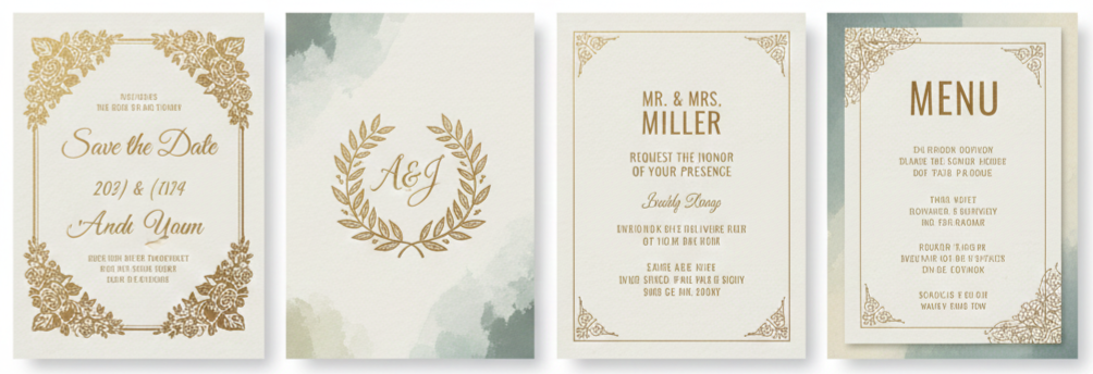
Antique Gold
Antique gold looks muted and heritage-inspired, which makes it perfect for vintage themes and textured paper. It pairs well with cream, sage, taupe, chocolate, dusty blue, and warm neutrals, and it feels understated while still elevated.
Paper And Print Choices That Make Gold Look Premium
Gold finishes look only as good as the foundation beneath them. Paper texture, thickness, and finish change how metallic elements reflect light and how the suite feels in hand. When we match paper to the print method, the entire invitation suite looks more intentional and polished.

- Cotton Paper: Cotton stock feels soft and substantial, making it ideal for letterpress, debossing, and foil stamping. It creates an heirloom feel that guests notice immediately when they hold the invitation.
- Smooth Matte Cardstock: Smooth matte cardstock provides a clean, modern base that makes gold foil pop. This option works especially well for minimalist layouts that rely on crisp typography and spacing.
- Linen Or Textured Stock: Textured paper adds warmth and depth, which suits antique gold palettes and vintage-style typography. It also helps traditional suites feel richer without adding more decoration.
- Vellum Layers: Vellum creates an airy, translucent layer that looks elegant as a wrap or overlay. Gold printing on vellum works best for monograms, light motifs, and soft layering that does not crowd the main invitation.
- Thickness And Weight: Heavier paper instantly feels more formal, even with a simple design. That weight signals quality before guests even read the details.
Golden Invitation Styles By Wedding Theme
Gold can look classic, modern, bold, or vintage depending on what we pair it with. When we match the invitation style to the wedding theme, the suite feels cohesive instead of generic.

Classic White And Gold
A white base with gold foil names and formal typography feels timeless. This style fits traditional venues, formal dress codes, and elegant ceremonies.
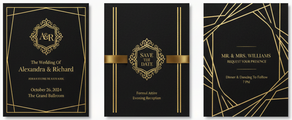
Black And Gold Formal Glamour
Black paired with gold foil creates dramatic contrast that suits evening weddings and candlelit receptions. A clean layout keeps the look bold without feeling overwhelming.
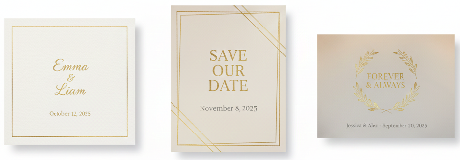
Neutral And Gold Minimalism
Ivory, beige, and warm gray with thin gold accents feel calm and modern. The key is restraint, so the invitation stays edited and refined.
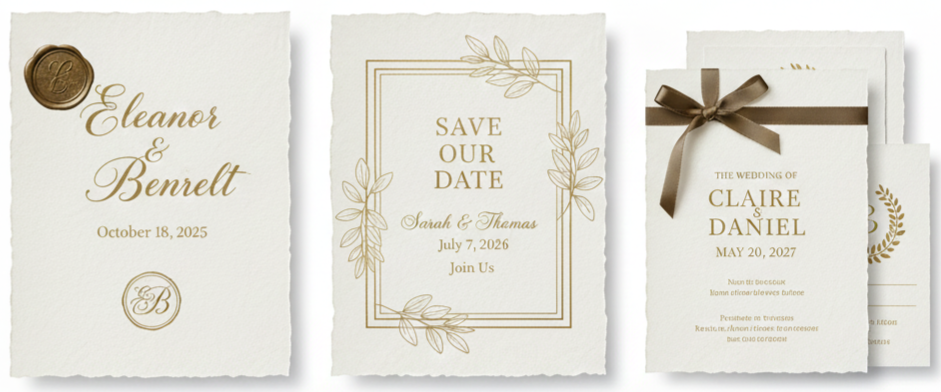
Vintage-Inspired Antique Gold
Antique gold on textured paper with scripts and monograms feels heritage-inspired. Wax seals and deckled edges can complement this style when we keep the layout structured.

Botanical Green With Gold Accents
Deep green and botanical elements with gold foil feel fresh and current while still formal. This combination works well for garden venues and natural palettes.
Custom Design Ideas That Make Gold Invitations Feel One-Of-One
Gold feels more memorable when we use it in details guests see up close. Personal touches also make the suite feel custom without requiring an overly complex design.

- Monograms And Crests In Gold: A monogram or crest instantly elevates the suite and creates a consistent visual thread across the invitation, RSVP card, details card, and envelope. A crest can also include subtle nods to the venue or theme without crowding the layout.
- Gold Envelope Liners: Liners create impact the moment guests open the envelope flap. Foil liners feel formal, printed gold patterns feel modern, and shimmer liners add warmth with a softer finish.
- Wax Seals With Metallic Highlights: Wax seals pair naturally with gold elements and add a premium finish to presentation. We can keep the seal color classic, like ivory or black, and tie in gold through metallic wax, gold cord, or a stamped emblem.
- Belly Bands And Wraps: Belly bands keep inserts organized and add a layered look that feels intentional. Vellum wraps with gold print, satin ribbons, and small gold tags all work when we keep the overall suite balanced.
- Edge Gilding: Gilded edges add quiet luxury that guests notice when they handle the invitation. This upgrade works especially well when the front design stays minimal and clean.
Wording That Works With Golden Wedding Invitations
Gold looks best when the text stays structured and easy to scan. We keep wording clean and organized so the metallic elements enhance the layout rather than compete with it.
- Invitation Essentials: The main invitation typically includes the host line, couple names, date, time, venue name, venue location, and a reception note when needed. We keep dress code notes short and place them where they do not compete with the names.
- RSVP Clarity: A separate RSVP card keeps the invitation face clean and helps guests respond quickly. We include a clear response deadline, the response method, and meal selections only when necessary.
- Details Without Overloading: A details card carries travel notes, parking guidance, schedule highlights, adults-only wording, and registry direction, usually through a wedding website. This keeps the main invitation visually calm while still giving guests practical information.
Golden Wedding Invitations For 50th Anniversary Celebrations
Gold also fits milestone celebrations, especially 50th anniversaries. The design can echo wedding-level elegance while shifting the content toward honoring the couple and making the event details easy to follow.

- Design Directions For Golden Anniversary Invitations: Formal anniversary invitations look great with cream stock, antique gold foil, and classic typography. A warm celebratory style can include subtle photo use or a gentle timeline motif paired with gold accents. A modern minimal style relies on white space, thin gold lines, and clean fonts for a fresh look.
- Anniversary Wording Elements: Anniversary invitations usually include the honoree names, celebration type, date, time, venue or home address, and RSVP details. Optional additions like dress code notes and memory-sharing prompts can add personality without clutter.
How We Keep The Full Invitation Suite Cohesive
A cohesive suite looks like a complete set rather than separate pieces. Consistency across typography, motifs, and envelope presentation makes the suite feel polished and intentional.

- Match Typography Across Pieces: We use one font pairing across the invitation, RSVP card, details card, and any additional inserts. Size and weight changes create hierarchy while keeping the overall look consistent.
- Repeat One Or Two Motifs: A thin gold border, monogram, small floral icon, or line pattern repeated across pieces ties the suite together without making it repetitive.
- Coordinate Envelope Presentation: Envelope color, liner choice, and addressing style should match the invitation mood. Gold ink addressing feels polished, hand calligraphy feels classic, and minimal printed fonts feel modern, and each works when aligned with the suite style.
- Use Inserts Strategically: We place extra details on separate cards so the main invitation stays clean. A reception card and details card keep information organized without overwhelming the invitation face.
Ordering Golden Wedding Invitations: Practical Decisions That Prevent Last-Minute Stress
Gold finishes can require extra production steps, so planning early helps maintain quality and avoids rushed design decisions. A simple, organized process also makes assembly and mailing much easier.
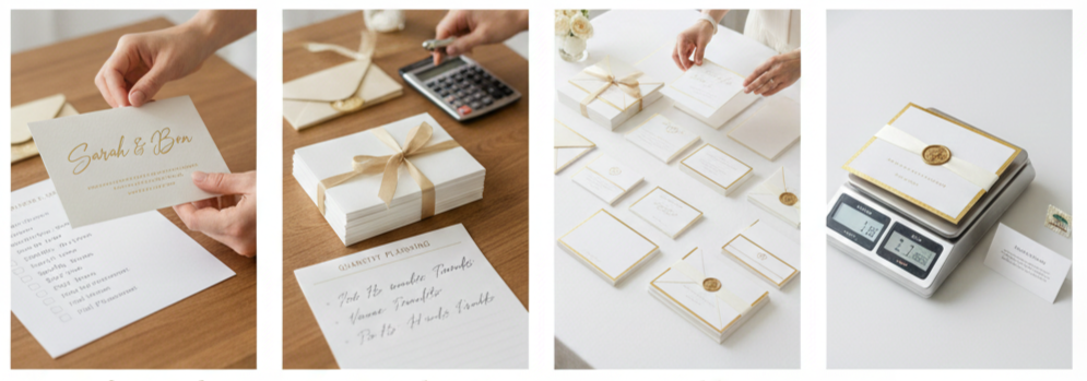
- Proofing And Sample Checks: Before approving, we verify spelling, formatting, spacing, date and time accuracy, venue details, RSVP deadlines, response methods, and website links. For foil and specialty finishes, we also confirm placement and margins so everything stays balanced.
- Quantity Planning: We count households rather than guests and add extras for keepsakes, photos, last-minute additions, and vendor needs like planners and photographers.
- Assembly Planning: We assemble one complete sample first, then keep every invitation consistent by stacking inserts in the same order and bundling them uniformly. A structured assembly approach keeps the suite neat and reduces mistakes.
- Postage Considerations: Thick paper, layered inserts, wax seals, and oversized envelopes can affect postage. We weigh a fully assembled sample and confirm postage before mailing to prevent returns and delays.
Where To Buy Golden Wedding Invitations
There are many places to buy golden wedding invitations, yet quality varies widely. We focus on print sharpness, paper options, and how clearly the vendor manages proofs and revisions.
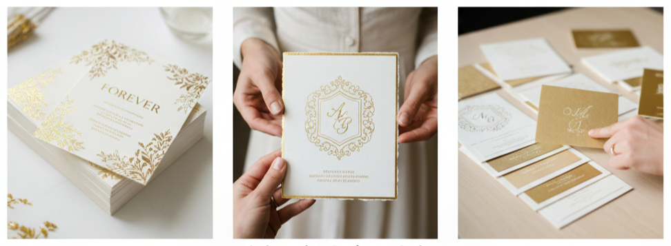
- Online Invitation Studios: Online studios offer streamlined ordering and consistent production, making them practical for templates and semi-custom suites. When we choose strong paper and keep the layout clean, these options still look premium.
- Independent Designers And Artisan Stationers: Custom designers create bespoke layouts, crests, and curated finishes, which works well when we want a signature look. This route also supports specialty papers and more tailored guidance.
- Local Stationery Shops: Local shops let us see paper samples in person, which helps when comparing gold tones under real lighting and matching them to the wedding palette.
- What We Evaluate Before Ordering: We look for sharp foil edges, premium paper choices, consistent color accuracy, a clear proofing process, finishing upgrades like liners and edge gilding, and straightforward revision and reprint policies.
Presentation Details That Make Guests Remember The Invitation
Presentation matters because the invitation experience starts with the envelope. When envelope color, addressing, and finishing details align with the suite, everything feels more cohesive and memorable.

- Envelope Color Choices: White and ivory feel clean and formal, black feels dramatic and evening-forward, deep green and navy feel rich and classic, and warm taupe or sand feels modern and understated. The best choice matches the gold tone and overall wedding mood.
- Addressing Styles: Hand calligraphy adds a traditional, elevated look, while printed calligraphy fonts feel polished and consistent. Minimal sans-serif addressing looks modern and clean, and it works especially well for minimalist suites.
- Finishing Touches That Stay Practical: Thin ribbons stay mail-friendly, belly bands keep inserts organized, and wax seals placed inside the envelope avoid postal issues. These finishing touches elevate presentation without adding bulk.
Conclusion
Golden wedding invitations bring a refined, intentional feel to the first moment guests connect with the celebration. When we choose the right gold tone, pair it with quality paper, and keep the layout structured, gold becomes a clean highlight that elevates the full suite without taking over the design. Consistency across the invitation, inserts, and envelope presentation pulls everything together so the suite looks polished in hand and photographs beautifully on the day.
Key Takeaway: Gold invitations look their best when we use gold as an accent, rely on premium paper, keep wording structured, and stay consistent across every piece from the invitation to the envelope.
FAQs
How Do We Choose Between Matte Gold And High-Shine Gold?
Matte gold feels softer and more understated, while high-shine gold feels more formal and dramatic. We match matte finishes with minimalist or vintage styling and use high-shine finishes for black-tie looks or evening-forward suites.
What Envelope Colors Pair Best With Gold Without Looking Too Loud?
Ivory, warm white, deep green, navy, and soft taupe pair well with gold while keeping the presentation refined. Black also works when we want bold contrast for a formal look.
Should We Use Gold On Every Insert Card Or Keep It Only On The Main Invitation?
A small gold accent across the suite keeps things cohesive, yet we usually keep gold lighter on inserts. A small motif, thin border, or header line often connects the pieces without overpowering the supporting details.
How Do We Prevent Gold Foil From Looking Too Busy In The Layout?
We limit gold to one or two focal areas, keep generous margins, and avoid stacking decorative elements around the couple’s names. Strong spacing and clear hierarchy keep the design elegant and readable.
What Small Upgrade Makes The Biggest Difference For A Gold Invitation Suite
Envelope liners and edge gilding add instant impact without changing the main invitation layout. They elevate presentation while keeping the invitation face clean and timeless.
Leave a Reply