Monthly Archives: October 2025
Yellow Wedding Color Ideas
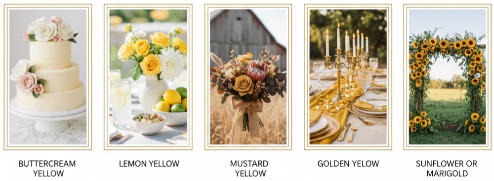
| Shade of Yellow | Best Season | Ideal Theme |
| Buttercream | Spring | Vintage, Romantic |
| Lemon Yellow | Summer | Playful, Garden |
| Mustard Yellow | Fall | Boho, Rustic |
| Golden Yellow | Winter | Elegant, Formal |
| Sunflower/Marigold | Summer/Fall | Outdoor, Natural |
Finding the Right Shade of Yellow
Yellow comes in many beautiful tones, and the one you pick sets the mood for your entire celebration.
- Buttercream Yellow: Soft and romantic, perfect for blending with blush or ivory in vintage or garden themes.
- Lemon Yellow: Bright and refreshing, ideal for spring and summer weddings full of sunshine.
- Mustard Yellow: Earthy and bold, best for rustic or boho settings, especially in fall.
- Golden Yellow: Rich and elegant, fitting for formal celebrations with metallic accents.
- Sunflower or Marigold: Cheerful and vibrant, great for outdoor weddings with lots of natural greenery.
Choosing the right shade means thinking about your wedding style and the feeling you want to create. Whether you’re going subtle or bold, there’s a shade of yellow that fits.
Color Combinations That Work With Yellow
Pairing yellow with the right colors can elevate your entire theme and bring everything together visually.
- Yellow and Gray: A balanced, modern look that keeps things simple and chic.
- Yellow and Navy: A bold and timeless pairing that pops beautifully in photos.
- Yellow and Blush: Romantic and gentle, great for soft, springtime palettes.
- Yellow and Green: Natural and earthy, especially with sage, olive, or eucalyptus tones.
- Yellow and White: Clean and fresh, perfect for a sunny beach or outdoor setting.
Use yellow either as the main accent or as part of a broader palette. This keeps your wedding design feeling coordinated without overwhelming the eye.
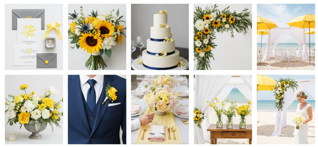
Bringing Yellow Into Wedding Attire
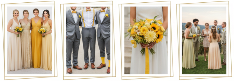
There are plenty of stylish ways to work yellow into your wedding look.
- Bridesmaid Dresses: Yellow looks amazing on all skin tones, especially when you mix shades like buttercream and gold for a layered effect.
- Groomsmen Accessories: Add a dash of yellow through ties, suspenders, socks, or boutonnieres to keep things fun but still elegant.
- Bridal Details: Yellow flowers in the bouquet, a sash, hair accessories, or even yellow heels can tie the theme together without being too bold.
- Guest Outfit Coordination: Suggest color palettes like soft green, beige, or pink in your invites if you’d like your guests to blend naturally with your color theme.
Mixing yellow in the wardrobe adds warmth and charm while still keeping everything cohesive.
Yellow Wedding Decor That Stands Out
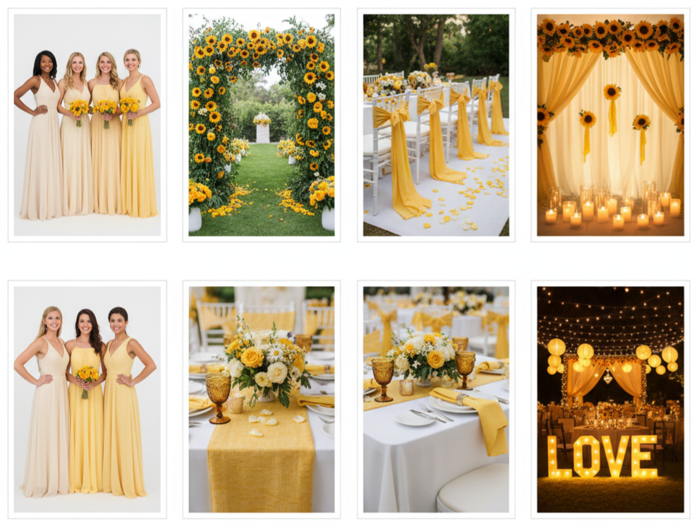
Yellow shines in every corner of your ceremony and reception space when used thoughtfully.
- Ceremony Setup: Use yellow blooms in your arch or arbor. Line the aisle with scattered petals or floral arrangements that include sunflowers or marigolds.
- Seating Details: Add yellow chair sashes or ribbons to bring soft touches of color to guest seating.
- Reception Tables: Keep linens neutral, like ivory or gray, and use yellow in napkins, runners, or glassware for accents.
- Statement Pieces: Hang yellow lanterns, set up a citrus-inspired centerpiece, or decorate a photo backdrop with sunflowers or draped fabric.
- Lighting Choice: Use warm string lights or candlelight to make yellow tones glow. Avoid blue-toned bulbs that can clash with or dull your yellow decor.
The trick is using yellow in layers—small touches throughout rather than large blocks of color.
Yellow Wedding Flowers You’ll Love
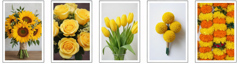
Flowers are where yellow naturally belongs, and there’s a wide variety to choose from.
- Sunflowers: Bold and rustic, perfect for barn weddings or outdoor celebrations.
- Yellow Roses: Timeless and elegant, great for both classic and modern themes.
- Tulips: Simple and fresh, especially suited for spring.
- Billy Balls (Craspedia): Fun, round, and modern, they add texture to bouquets and boutonnieres.
- Marigolds: Bright and festive, especially popular in Indian and Latin celebrations.
Mix yellow flowers with white blooms, greenery, or even lavender to build balance in arrangements. Whether it’s bouquets, centerpieces, or ceremony decor, florals are one of the easiest ways to bring in yellow beautifully.
Yellow Wedding Ideas for Every Season
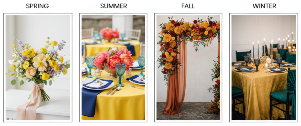
Yellow adjusts well to the seasons—you just need to tweak the tones and pairings.
- Spring: Lemon yellow with lilac, peach, or blush feels light and floral.
- Summer: Bright citrus tones with navy, coral, or turquoise look bold and fun.
- Fall: Mustard or marigold with terracotta, burgundy, or emerald adds warmth.
- Winter: Golden yellow with black, emerald, or deep gray creates contrast and elegance.
Let the season inspire your floral choices, materials, and how yellow is layered across the venue and fashion. Seasonal light also impacts how yellow shows up in photos, so plan accordingly.
Yellow Wedding Cakes and Sweet Treats
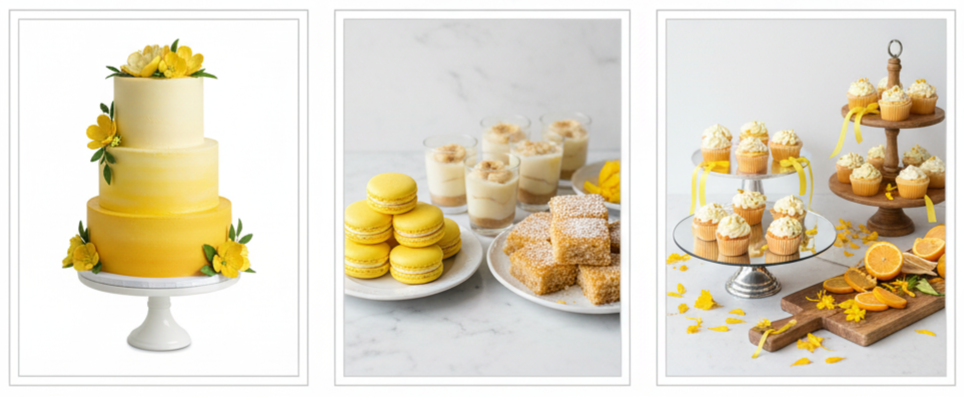
Desserts offer a playful way to tie yellow into your celebration.
- Cake Style: Try an ombre yellow design or one decorated with real or sugar yellow flowers. Lemon-flavored layers are a fun, flavorful tie-in.
- Sweet Table: Add yellow treats like lemon bars, yellow macarons, or banana pudding in mini cups.
- Presentation Ideas: Use tiered trays, wooden boards, or mirrored stands. Accent with citrus slices, marigold petals, or gold foils.
With yellow desserts, you not only match your theme—you give your guests something to admire and enjoy.
Yellow Stationery That Makes a Statement
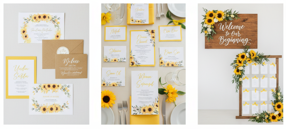
Your invitations and signage can set the tone right from the start.
- Invites: Use yellow elements like a floral border, watercolor background, or envelope liners. Kraft paper and yellow ink feel rustic, while white and gold bring polish.
- Menus and Place Cards: Include yellow accents through calligraphy, floral illustrations, or colored cardstock.
- Welcome Signs and Seating Charts: Use yellow paint or floral embellishments to carry the theme throughout.
Make sure the design balances color with readability—bold yellow on white paper may be hard to see, so adjust the font or background accordingly.
Creative Ways to Add Yellow to the Fun Stuff
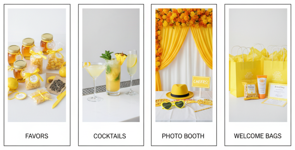
The small details leave a big impression and help guests remember your wedding long after it’s over.
- Favors: Try honey jars, beeswax candles, lemon drops, or sunflower seed packets. Wrap them in yellow ribbon or personalize them with yellow tags.
- Cocktails: Offer signature drinks like lemon martinis, pineapple mojitos, or sparkling limoncellos.
- Photo Booth: Create a backdrop with marigold flowers or draped yellow fabric. Add props like yellow hats, sunglasses, and signs.
- Welcome Bags: Include yellow snacks, small gifts, sunscreen, and a printed weekend itinerary. Use yellow tissue paper or bags to keep the theme going.
Little yellow touches spread throughout the day create a cohesive look without overdoing it.
Conclusion
Yellow brings life, joy, and energy to a wedding like no other color. Whether you lean into it fully or use it as an accent, the right shade of yellow can add just the right mix of cheer and elegance. From attire to decor, florals to desserts, every part of your wedding can benefit from a thoughtful yellow detail. When planned with balance and intention, a yellow wedding theme doesn’t just look good—it feels good from start to finish.
Key takeaway: Yellow works in every season and every wedding style. It’s versatile, memorable, and full of personality. When used smartly, it transforms your wedding into a warm, happy celebration that guests won’t forget.
FAQs
Can yellow be used as the main wedding color without being overwhelming?
Yes, you can make yellow the star of your wedding. The key is pairing it with muted tones like gray, beige, or white to keep everything feeling fresh and not too bright.
What type of lighting works best for yellow-themed decor?
Warm lighting, like string lights or golden-hued bulbs, enhances yellow tones. Avoid harsh white or cool-toned lighting, which can dull the effect.
How do I use yellow in a formal or black-tie wedding?
Stick to deeper tones like mustard or golden yellow. Combine them with rich textures like velvet, and accent with black, gold, or navy for an elegant, upscale look.
Are there budget-friendly ways to add yellow to wedding decor?
Absolutely. Use lemons, sunflowers, or yellow candles. DIY paper decor, ribbons, or spray-painted accents are also great low-cost ways to add color.
Is yellow suitable for multicultural or cultural weddings?
Definitely. Yellow is often symbolic in Indian, African, and Latin cultures. It’s a meaningful color of joy and prosperity, making it a thoughtful choice for many types of celebrations.
Winter Weddding Colors
| Main Color | Accent Color | Mood | Best For |
| Icy Blue | Silver | Elegant | Snowy venues, modern |
| Emerald | Gold | Luxurious | Formal halls, glam themes |
| Cranberry | Cream | Romantic | Rustic barns, vintage |
| Navy | Burgundy | Dramatic | Evening weddings |
| Sage Green | Champagne | Soft & Minimal | Outdoor or boho themes |
| Plum | Blush | Moody Romantic | Loft or indoor venues |
| Burnt Orange | Deep Teal | Bold & Creative | Late fall to winter mix |
| Rust | Mauve | Earthy | Barns, vintage setups |
| Black | Forest Green | Bold & Refined | Industrial spaces |
| Amethyst | Ice Blue | Whimsical | Winter wonderland theme |
Why Color Choice Matters in a Winter Wedding
Choosing your winter wedding colors goes far beyond aesthetics. The shades you pick set the vibe for the day and help tie everything together—from your flowers and invites to your reception décor and photography. Winter gives you a naturally stunning backdrop, so your palette should complement the season’s charm. Whether you’re going traditional or thinking outside the box, your colors make a major visual impact.
Classic Winter Wedding Color Palettes That Never Go Out of Style
- Icy Blue and Silver: This duo captures winter’s frosty elegance. Icy blue gives off that fresh, snow-dusted feel, while silver adds sparkle and refinement. Use these shades in your bridesmaid dresses, table accents, or metallic centerpieces to pull the whole look together.
- Emerald and Gold: Want something rich and timeless? Emerald green and gold deliver. Emerald brings in nature-inspired depth, while gold adds festive glow and luxury. This palette looks amazing in velvet textures, gold chargers, and jewel-toned florals.
- Cranberry and Cream: Romantic and cozy, cranberry and cream work beautifully for rustic or vintage-inspired weddings. Cranberry brings warmth and passion, while cream softens everything with an elegant touch. Incorporate these colors in bouquets, signage, or even your cake details.
- Navy and Burgundy: This combination is perfect for moody, candlelit venues. Navy adds classic sophistication, and burgundy deepens the drama. You’ll love how well these colors photograph—especially at evening receptions filled with candlelight.
Modern Winter Wedding Colors for Today’s Couples
- Sage Green and Champagne: Soft, earthy, and slightly glam, sage green with champagne makes for a subtle yet stylish winter wedding combo. Sage gives you that natural, organic tone, while champagne adds a little glow without going over the top.
- Dusty Rose and Slate Gray: If you’re into minimalism with a romantic edge, this is your pairing. Dusty rose keeps things sweet and soft, while slate gray adds a clean, modern finish. It’s perfect for urban venues or chic, contemporary wedding décor.
- Plum and Blush: Plum is rich and bold. Blush is soft and romantic. Together, they create a balanced look that feels modern but still warm. Use this pairing in florals, bridesmaid dresses, or your tablescape for a color story that stands out.
- Black and Forest Green: For a bold, sophisticated look, go with black and forest green. Forest tones bring in earthy vibes, and black adds depth and contrast. Add gold or ivory to soften it, and you’ve got a stunning winter palette that feels both grounded and glamorous.
Unique and Unexpected Winter Wedding Color Combos
- Burnt Orange and Deep Teal: Want something creative that still feels cozy? Burnt orange brings in warmth, while deep teal adds a cool, punchy contrast. This palette works great for late fall or early winter weddings and looks incredible in textured fabrics like velvet.
- Rust and Mauve: These colors bring in vintage charm with a romantic twist. Rust is warm and grounded, and mauve is soft and dusty—together they make your floral designs and décor feel intentional and unique without being loud.
- Amethyst and Ice Blue: If you’re dreaming of a whimsical winter vibe, this duo delivers. Amethyst gives you that mystical pop, and ice blue keeps everything anchored in winter elegance. Great for winter wonderland weddings or anything with a touch of fantasy.
- Mustard and Maroon: This bold pair is ideal for couples who want something different but still seasonal. Mustard brings retro warmth, while maroon offers structure and richness. It’s especially great for creative floral design and statement bridal party looks.
Creative Ways to Use Your Color Palette
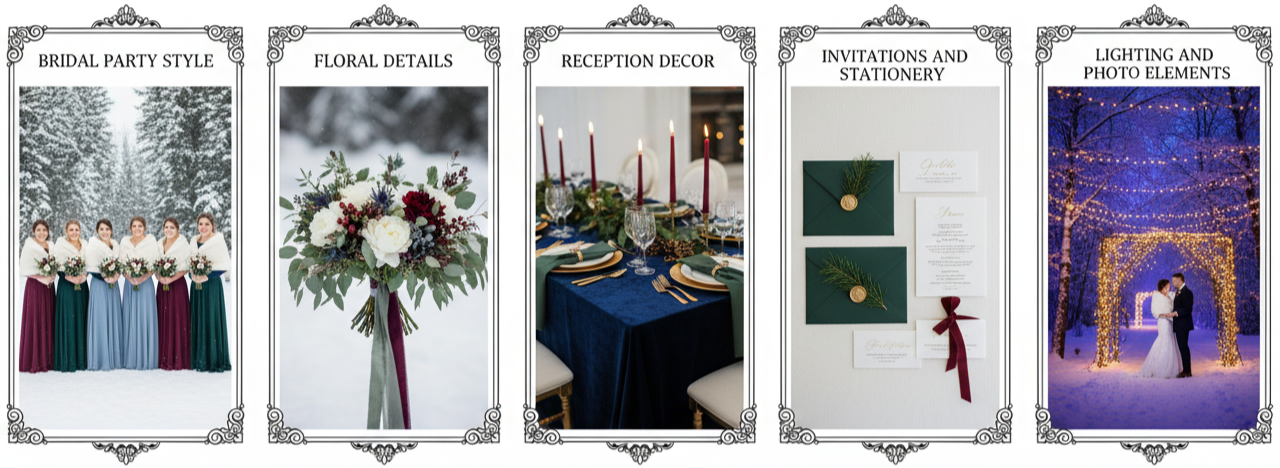
- Bridal Party Style: Incorporate your palette in bridesmaid dresses, ties, shoes, or accessories. Mix-and-match tones for a layered effect, or go uniform for a bold, clean look. Even small pops like boutonnieres or shawls help pull the palette through.
- Floral Details: Choose in-season blooms that match or complement your chosen shades. Add greenery like eucalyptus or pine, mix in berries or thistles, and use ribbon in your palette colors to finish bouquets or boutonnieres.
- Reception Decor: Layer your colors across table linens, candles, napkins, and menus. Try velvet table runners, colored glassware, or metallic accents that echo your theme. Even the chair covers or charger plates can contribute to the color story.
- Invitations and Stationery: Set the tone early with colored envelopes, matching fonts, and details like wax seals or metallic foil. Use the same design style across your menus, programs, place cards, and signage to keep things cohesive.
- Lighting and Photo Elements: Add color through lighting like uplights, fairy lights, or candles. Talk to your photographer about using backgrounds and flat lays that highlight your palette and show off your style throughout your photos.
How to Pick Your Winter Wedding Colors
- Start with your venue: Look at the walls, floors, lighting, and general style. You’ll want colors that work with the space—not against it.
- Think about the season: What does your wedding date look like outside? Snowy mountains? City skyline? Bare trees? Your palette can reflect and enhance those visuals.
- Decide on your vibe: Romantic? Moody? Glamorous? Your colors should match how you want the day to feel.
- Use mood boards: Pull together photos, fabric swatches, floral examples, and décor ideas to see how everything works together before committing.
- Stick with 2–4 shades: Stick to one or two main colors with a few accent tones. It keeps your look clean and makes decorating decisions easier.
Conclusion
Winter weddings are a magical chance to create something truly special, and your color palette sets the tone. Whether you want cozy and romantic or bold and dramatic, the right colors make your celebration feel personal. Let your style, venue, and the season guide your choices. When everything comes together, your wedding will feel beautifully and unmistakably like you.
Key Takeaway: Your winter wedding colors are more than just shades—they’re the heartbeat of your design. Use them to create a vibe that reflects your vision and transforms your space into something unforgettable.
FAQs
What color themes work best for a New Year’s Eve winter wedding?
Go for festive and bold combos like black, gold, and silver. Add deep jewel tones like emerald or navy for added richness and a celebration-ready vibe.
How do I avoid my winter wedding looking too much like a holiday party?
Skip the classic red-and-green combo and go for more sophisticated or muted tones. Think blush and gray, emerald and gold, or cranberry and cream to give your wedding its own identity.
Can I use bright colors in a winter wedding?
Yes, just pair them with deeper or neutral tones to keep it seasonally balanced. Coral with navy or turquoise with charcoal can work beautifully.
What are some good color combinations for an all-white winter wedding?
Mix white with soft tones like pale blush, silver, or champagne. Add in crystal or clear acrylic details for a snowy, elevated look that’s still minimalist.
How can I transition fall wedding colors into winter?
Blend warm tones like rust or burnt orange with cooler ones like deep green or navy. Add texture through velvet, fur, or candlelight to bring in that winter feel.
Summer Wedding Colors
| Color Combination | Mood/Style |
| Blush Pink & Sage Green | Soft, Romantic |
| Navy Blue & Coral | Bold, Nautical |
| Lavender & Grey | Calm, Elegant |
| Terracotta & Dusty Rose | Earthy, Boho |
| Butter Yellow & Sky Blue | Cheerful, Playful |
| Mint Green & Peach | Fresh, Youthful |
| Fuchsia & Orange | Vibrant, Tropical |
| Turquoise & Yellow | Energetic, Beachy |
| Red, Pink & Purple | Dramatic, Luxurious |
| Ivory & Sand | Neutral, Coastal |
| White & Eucalyptus | Clean, Minimal |
| Beige & Dusty Blue | Cool, Refined |
Why Your Wedding Colors Matter in Summer
- The setting: Your venue—whether it’s a garden, beach, rooftop, or ballroom—sets the stage. Your colors should naturally fit the surroundings and elevate the overall feel.
- The lighting: Summer offers long days and golden sunsets. Colors that pop in natural light or transition beautifully into evening ambiance make a big difference.
- The photos: Everything from floral choices to guest attire and décor affects how your wedding photographs. Cohesive colors keep your pictures looking polished.
- The mood: Bright, fresh hues bring energy. Soft tones create romance. The colors you choose help create the emotion your wedding radiates.
Classic Summer Wedding Color Combinations
- Blush pink and sage green: This is a go-to for garden weddings. Blush adds romance, while sage green introduces an organic touch. These tones blend seamlessly with outdoor flowers, vintage themes, and soft lighting.
- Navy blue and coral: This duo works beautifully for coastal or nautical-themed weddings. Navy grounds the palette with elegance, and coral brings lively contrast. Use these in everything from bouquets to groomsmen’s ties.
- Lavender and grey: For a serene, modern tone, lavender softens the look while grey adds a hint of sophistication. It works especially well for twilight ceremonies and vineyard settings.
Trendy and Modern Color Palettes
- Terracotta and dusty rose: These tones bring an earthy, boho vibe. Terracotta adds richness, and dusty rose keeps things soft. They’re perfect for rustic, outdoor, or desert weddings that embrace natural elements.
- Butter yellow and sky blue: Playful and breezy, this cheerful combo reflects a sunny, open-air celebration. These shades are great for backyard weddings or garden receptions.
- Mint green and peach: This fresh, pastel mix adds a youthful and modern feel. Peach flowers with mint accents make for a clean, romantic look that still feels vibrant.
Bold and Bright Summer Wedding Colors
- Fuchsia and orange: These high-energy hues are perfect for tropical or destination weddings. Use them in your bouquet, centerpieces, or even bridesmaid accessories for a bold statement.
- Turquoise and yellow: If you’re planning a fun, summer celebration with beachy vibes, this combo brings just the right punch. Turquoise keeps things cool, while yellow brightens up your whole space.
- Red, pink, and purple: These rich, saturated colors work well in more formal venues. Layer them in your florals, lighting, and décor to make the space feel bold, romantic, and unforgettable.
Neutral and Minimalist Summer Color Schemes
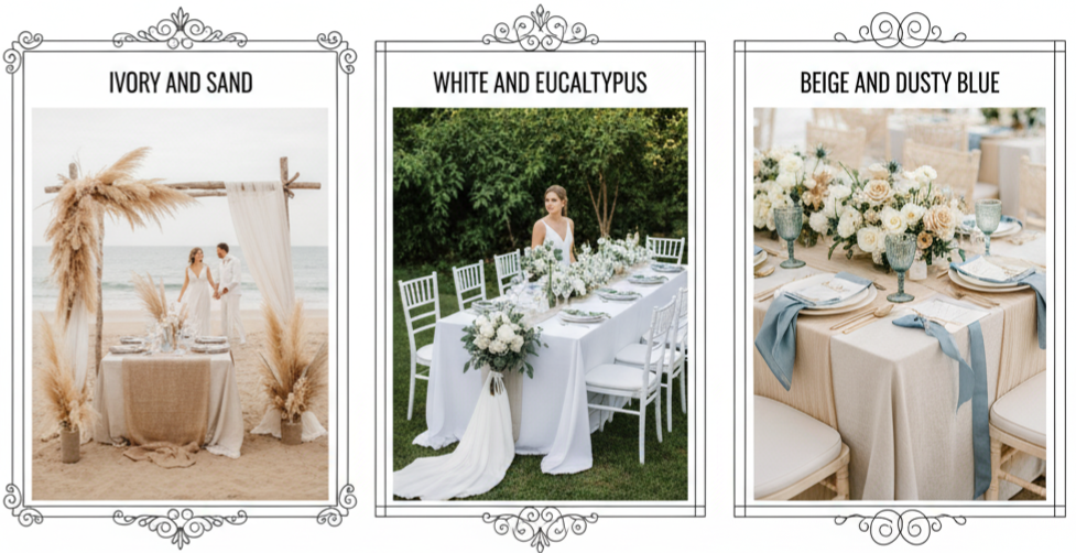
- Ivory and sand: This combo offers a natural elegance that works especially well on the beach. It blends effortlessly with your surroundings and creates a calming tone.
- White and eucalyptus: A minimalist’s dream. Clean white palettes paired with lush greenery like eucalyptus look sleek and fresh, especially in open garden settings.
- Beige and dusty blue: These soft shades complement each other beautifully. Beige provides warmth, and dusty blue brings a subtle coolness, giving you balance across your theme.
How to Pick the Right Summer Wedding Colors
- Start with your venue: The location should guide your palette. If your venue is bright and airy, lighter tones will feel cohesive. If it’s darker or has rich wood tones, deeper hues will pop better.
- Consider the time of day: Morning weddings work well with light pastels, while evening ceremonies give you more room for moodier tones or metallics.
- Think about florals: Always check which flowers are in season. It’s easier and more budget-friendly to build your palette around blooms that will be readily available.
- Match attire and theme: Choose colors that work well for bridal party outfits and fit your overall wedding style—boho, formal, rustic, or modern.
- Keep it personal: Your colors should reflect who you are as a couple. Pick tones that make you feel good and that connect with your story.
Key takeaway: The best summer wedding colors are the ones that look great in your chosen space, match your schedule, and express your personal style.
Ways to Use Your Wedding Colors Without Overdoing It
- Invitations and paper goods: Start by using your color palette in save-the-dates, menus, and programs. It gives guests an early taste of your theme.
- Bridal party attire: Coordinating bridesmaid dresses and groomsmen accessories with your main colors pulls everything together visually—especially in photos.
- Florals and centerpieces: Bring your palette into bouquets, table florals, aisle decorations, and arches. It ties the ceremony and reception together.
- Reception décor: Use your colors in table linens, napkins, chair accents, candles, and signage. These small touches add up.
- Lighting and ambiance: Colored lights or lanterns, especially at night, add drama and warmth to your event.
- Wedding cake and desserts: Think colored florals, custom icing, or cake toppers that match your theme.
Common Mistakes to Avoid When Picking Colors
- Using too many colors: Sticking to two to three main shades keeps everything looking clean and intentional. More than that can feel chaotic.
- Clashing with the venue: Always bring swatches to your venue if possible. You don’t want your palette to compete with existing walls or furniture.
- Choosing trends over taste: Just because a color combo is trending doesn’t mean it’s right for your style or venue. Go with what feels true to you.
- Ignoring practicality: Some shades show sweat or wrinkles more easily—something to think about when planning for heat and outdoor settings.
- Forgetting flower availability: Make sure your palette aligns with blooms that are actually in season. Custom colors might cost more or not be an option at all.
Conclusion
Summer weddings give you so much room to play with color. Whether you’re going bold and bright, soft and romantic, or modern and minimal, there’s a perfect palette that fits your vision. Your colors shape your entire celebration—from the ceremony setting to the final dance. They influence your flowers, your fashion choices, and the overall atmosphere. Taking the time to pick the right ones means your day will feel cohesive, personal, and beautiful from start to finish.
Key takeaway: Choose wedding colors that reflect your relationship, fit your venue, and work well with the time of day. It’s not about chasing trends—it’s about creating a celebration that feels just like you.
FAQs
What are some good color combinations for a beach wedding in summer?
Soft, natural tones like aqua and white, coral and tan, or sky blue with sandy beige all work great for a beach backdrop.
Is it okay to use dark tones for a summer wedding?
Yes, deeper colors like navy, burgundy, or emerald can be paired with neutrals or light metallics to create contrast and keep things season-appropriate.
How can I make sure my wedding colors are consistent across every detail?
Choose 2–3 main colors and use them throughout your invites, flowers, linens, and bridal party outfits for a cohesive look.
Do my bridesmaids need to wear dresses in my exact wedding colors?
Not necessarily. You can use complementary tones or varying shades within your palette. The key is to keep everything feeling coordinated and intentional.
Can I use neon colors for my wedding if I love bold shades?
You can, as long as you balance them with softer elements. Neon works well in accents like signage, decor, or accessories—just don’t overdo it.
Stephanie Williams Photography
| Session Type | What’s Included |
| Wedding | Full-day coverage, engagement session, album options |
| Engagement/Couples | Location planning, 1-hour shoot, online gallery |
| Family & Maternity | 45–60 min session, natural posing, digital images |
| Branding/Editorial | Creative direction, multiple looks, hi-res files |
| Destination | Travel coverage, location scouting, full session planning |
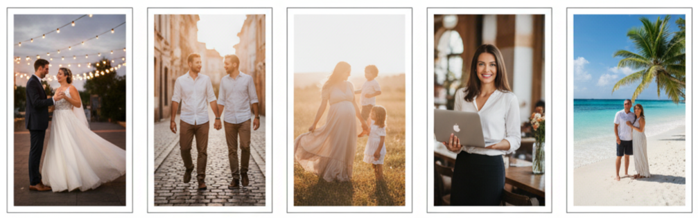
Meet Stephanie Williams
Stephanie Williams is a photographer who captures emotion, connection, and artistry in every image. With over ten years of experience, she’s turned her creative passion into a thriving career. Stephanie isn’t just a photographer—she’s a storyteller who uses her camera to preserve life’s most meaningful moments in a natural and artistic way.
Her journey began with a deep love for fine art and design, which continues to influence her photography today. She blends creativity with precision, delivering images that are as genuine as they are stunning. Her work has appeared in leading publications like Style Me Pretty, Brides, and Magnolia Rouge. Every photo reflects her commitment to quality, detail, and timeless beauty.
Signature Style and Approach
Stephanie’s photography style feels organic, elegant, and full of life. She’s known for her natural light, soft color palettes, and effortless compositions that highlight emotion. Rather than staging every shot, Stephanie focuses on real moments—those candid smiles, gentle gestures, and quiet details that make each session unforgettable.
She uses a mix of guided posing and spontaneous direction, helping clients feel comfortable while keeping every frame genuine. Her balance of artistry and authenticity gives her photos that signature glow people instantly recognize.
Services Tailored to Your Story
Every client has a unique story, and Stephanie builds each session around that. Whether it’s a wedding, engagement, or brand shoot, she offers personalized experiences with attention to both creative vision and client comfort.
- Wedding Photography: Stephanie approaches weddings with care and creativity. From getting ready in the morning to dancing under the stars, she captures every part of the day. Couples can expect coverage that includes full-day documentation, detailed shots of décor, candid emotional moments, and elegant portraits. She also offers destination wedding options for couples celebrating abroad.
- Engagement and Couples Sessions: For couples, these sessions are about connection. Stephanie encourages natural interactions, choosing meaningful locations that reflect the relationship’s story. The result is a gallery that feels personal, full of laughter, love, and light.
- Family and Maternity Photography: Families grow quickly, and Stephanie’s there to capture each stage. She keeps things relaxed so kids feel comfortable, making every photo feel real and natural. Her maternity sessions highlight the beauty of what’s to come, preserving those sweet moments before your family grows.
- Editorial and Branding Photography: For business owners, creatives, and professionals, Stephanie provides high-quality branding sessions. These shoots are crafted to represent your vision and help elevate your online and media presence. From product photos to lifestyle portraits, she focuses on capturing images that communicate confidence and authenticity.
- Destination and Travel Photography: Stephanie is available for travel sessions anywhere in the world. She’s photographed couples on European streets, tropical islands, and mountain peaks. Wherever your story takes you, she ensures your experience feels easy, professional, and inspiring.
What It’s Like Working With Stephanie
From start to finish, working with Stephanie Williams Photography feels effortless. She makes every part of the experience enjoyable, structured, and focused on you.
- Pre-Session Planning: Before any session, Stephanie schedules a consultation to understand your goals and creative ideas. You’ll discuss locations, timing, wardrobe, and overall style. This step ensures everything aligns with your vision before the shoot begins.
- Day of the Shoot: On the day of the session, Stephanie creates a calm and positive environment. She gives easy direction, making sure you feel confident while keeping things relaxed. Whether it’s a wedding or a family session, she balances structure and spontaneity so each moment feels natural.
- Editing and Delivery: After the shoot, Stephanie carefully selects and edits each photo by hand. She enhances lighting, color tones, and fine details while keeping everything true to her signature style. Clients receive a private online gallery with downloadable high-resolution images and options for albums or prints.
Steps for Booking a Session
- Reach Out: Fill out the inquiry form on Stephanie’s website or send a direct email with your session details.
- Consultation: Schedule a short chat to discuss your needs, creative direction, and availability.
- Secure Your Date: Once everything’s set, you’ll lock in your session by signing a contract and paying a deposit.
- Plan the Details: Stephanie will help with wardrobe guidance, timeline planning, and location suggestions.
- Enjoy the Shoot: Relax, have fun, and trust Stephanie to create stunning photos that reflect your story.
Portfolio Highlights
Stephanie’s portfolio is a beautiful mix of love stories, editorial shoots, and lifestyle portraits. Her imagery combines cinematic light, thoughtful composition, and emotion that jumps off the page.
Her work has been featured in major outlets including:
- Style Me Pretty – Recognized for timeless wedding photography.
- Brides Magazine – Featured for creative editorial coverage.
- Magnolia Rouge – Highlighting her romantic aesthetic.
- Once Wed and The Knot – Celebrating her artistry in modern wedding photography.
From coastal elopements and vineyard ceremonies to brand shoots for luxury clients, her work consistently captures beauty and depth in every frame.
Booking and Contact Information
Booking a session with Stephanie is easy and personal. Whether you’re planning a wedding, celebrating an engagement, or updating your brand imagery, she’ll tailor everything to fit your vision.
- How to Book: Reach out through her website’s contact form or send an email directly. You can also follow her on Instagram to view her latest projects and announcements. Stephanie offers complimentary consultations for new clients to discuss ideas and availability.
- Availability: Weddings and destination shoots should be booked several months in advance, typically 2–6 months, to secure your preferred date. Portrait and branding sessions can be scheduled more flexibly, often on weekdays.
- Delivery Options: After your shoot, you’ll receive a private gallery where you can download, share, and order your favorite prints. Professional photo albums and framed options are also available for those who want tangible keepsakes.
Conclusion
Stephanie Williams Photography is more than just professional photography—it’s an experience built around trust, creativity, and storytelling. Every photo session is designed to bring out the best version of your story, whether it’s the joy of a wedding, the anticipation of a new baby, or the excitement of a growing business. Stephanie’s calm approach and artistic eye ensure you get images that feel as good as they look.
Key Takeaway: Stephanie Williams Photography combines emotion, artistry, and detail to create timeless imagery. Every session—whether personal or professional—is guided by care, precision, and passion, ensuring photos that capture life beautifully and honestly.
FAQs
Does Stephanie offer mini sessions throughout the year?
Yes, she occasionally offers limited mini sessions, especially during spring, fall, or holiday seasons. These are perfect for quick updates or family portraits and tend to fill up fast.
Can I bring pets to my shoot?
Absolutely. Pets are welcome and often make photos even more special. Stephanie just asks that you mention it beforehand so she can prepare accordingly.
Do I need to sign a contract before booking?
Yes, all bookings require a signed agreement and a small deposit to secure your date. This step helps confirm both parties’ commitment to the session.
What happens if the weather doesn’t cooperate?
In case of rain or bad weather, Stephanie will reschedule your session for another date. She keeps a few backup days available, especially for outdoor shoots.
Can Stephanie recommend makeup artists or stylists?
Yes, she has a trusted network of professionals who can assist with makeup, hair, and wardrobe styling to make sure you feel confident before your session.
Spring Wedding Colors
| Main Color | Accent Color | Theme/Vibe |
| Blush | Sage Green | Romantic & Timeless |
| Lavender | Grey | Calm & Elegant |
| Peach | Mint | Fresh & Cheerful |
| Terracotta | Dusty Rose | Modern & Warm |
| Butter Yellow | Sky Blue | Bright & Playful |
| Lilac | Emerald Green | Bold & Elegant |
| Coral | Teal | Vibrant & Tropical |
| Mauve | Mustard | Retro & Artistic |
| Periwinkle | Gold | Dreamy & Luxurious |
Why Spring Is Ideal for Colorful Weddings
Spring weddings have their own charm. Everything is in bloom, the weather feels just right, and there’s an undeniable sense of freshness in the air. It’s a time when nature brings out its best colors, making it the perfect season to play with bright and beautiful palettes. Whether you’re hosting an outdoor garden event or an indoor ceremony with floral accents, spring offers endless opportunities for creativity. The natural lighting during this season also enhances photos, helping every color pop beautifully.
Classic Spring Wedding Color Palettes That Never Fail
- Blush and Sage Green: This pairing is timeless and effortlessly romantic. Blush adds a gentle warmth, while sage green brings a soft, natural balance. Together, they create a peaceful, elegant look perfect for floral arrangements, bridesmaid dresses, and table settings.
- Lavender and Grey: If you’re going for a calm and refined vibe, lavender and grey make a perfect match. Lavender captures the essence of spring blooms, and grey complements it with a sleek, modern touch. It’s an ideal combination for couples who prefer something simple yet classy.
- Peach and Mint: Peach and mint bring a fresh, cheerful energy to a wedding. Peach gives off playful charm, while mint adds a cooling balance. From wedding invitations to bridesmaid dresses, this color combo radiates springtime joy without overwhelming the space.
Trendy Spring Wedding Colors for Modern Celebrations
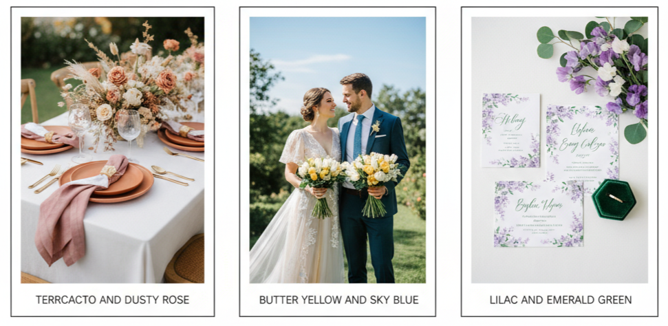
- Terracotta and Dusty Rose: Earthy, warm, and modern, this duo has become a favorite for contemporary weddings. Terracotta brings depth, while dusty rose softens the look with romantic undertones. It’s a beautiful balance of bold and gentle—perfect for table designs, floral accents, or bridesmaid attire.
- Butter Yellow and Sky Blue: This cheerful combination embodies the essence of spring. Butter yellow symbolizes happiness and light, while sky blue adds calm and clarity. It’s a perfect choice for outdoor weddings with sunshine-filled settings, especially when paired with white florals and green details.
- Lilac and Emerald Green: For those who want something elegant and eye-catching, lilac and emerald green strike the perfect balance. Lilac keeps the springtime feel light, while emerald green introduces depth and richness. This combination works beautifully across attire, decorations, and stationery.
Key Takeaway: Spring wedding colors offer endless creative options. Whether you love soft and classic tones or bold and modern shades, the season gives you the flexibility to express your style beautifully.
Unique Spring Wedding Color Ideas for Non-Traditional Couples
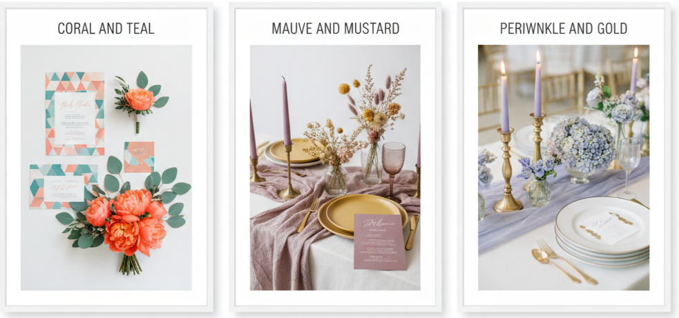
- Coral and Teal: Vibrant and tropical, coral and teal make an unforgettable pair. Coral brings life and energy, while teal keeps things cool and elegant. This color combo suits coastal or destination weddings and looks incredible in florals, signage, or table settings.
- Mauve and Mustard: If you’re looking for something artsy and vintage-inspired, mauve and mustard are the way to go. Mauve adds a touch of romance, while mustard delivers a bold, retro twist. The contrast between these tones creates a stylish and memorable setup.
- Periwinkle and Gold: Periwinkle brings a dreamy, whimsical touch, while gold introduces a luxurious edge. This combo feels soft yet sophisticated, making it ideal for evening spring weddings. Gold candle holders, periwinkle flowers, and subtle metallic touches can elevate any celebration.
Tips for Choosing the Right Spring Color Palette
Choosing the right palette involves more than picking pretty colors. It’s about creating harmony across your wedding theme and setting.
- Match the Venue: The space where you’re getting married plays a big role. Garden settings work beautifully with greens and pastels, while industrial or urban venues can handle bold, modern tones.
- Consider the Theme: Think about your wedding’s personality. Romantic weddings fit pastel tones, while boho themes work best with earthy or muted shades.
- Factor in the Flowers: Your floral choices may guide your palette. Seasonal blooms like tulips and peonies can determine your color range and availability.
- Coordinate the Attire: Your colors should complement both your gown and the bridal party’s outfits. Keeping consistency across details creates a polished look.
- Use Color Swatches: Before finalizing, test combinations with fabric swatches or digital palettes to see how they come together visually.
How to Incorporate Spring Wedding Colors Throughout Your Event
Once you’ve picked your dream palette, it’s time to bring it to life in your wedding details. The secret is to weave the colors throughout every element without overdoing it.
- Invitations and Stationery: Set the tone early by weaving your color palette into save-the-dates, menus, and programs. It gives guests a first glimpse of your wedding style.
- Bridal Party Attire: Your bridal party is one of the best places to showcase your colors. Try blending different tones from your palette across dresses or accessories. Groomsmen can match through ties, pocket squares, or boutonnieres that complement the main colors.
- Ceremony Decor: Use your colors in subtle details like altar flowers, aisle petals, and welcome signage. Even chair sashes and drapery can add a coordinated touch to your ceremony setup.
- Reception Styling: Bring your color story into the reception with table linens, centerpieces, candles, and even lighting. Small touches—like colored napkins or floral arrangements—can create a cohesive, inviting atmosphere that ties everything together.
- Cakes and Desserts: Desserts are another great place to show off your chosen hues. From cake icing to floral cake toppers and colorful macarons, desserts offer a fun way to incorporate your palette while adding visual appeal to your reception.
Conclusion
Spring weddings give couples the freedom to get creative with color. From soft blush tones to bold emerald greens, every combination tells a different story. The right palette will tie your whole event together, from decor to attire and everything in between. Whether you stick to timeless classics or explore modern, vibrant shades, the beauty of spring provides the perfect backdrop for your vision to shine.
Key Takeaway: Spring is all about possibilities. Choose colors that reflect your personal style, complement your venue, and make your celebration feel fresh, cohesive, and uniquely yours.
FAQs
What color flowers work best for spring weddings?
Spring flowers like tulips, peonies, ranunculus, and daffodils are perfect choices. They come in a variety of shades, making it easy to coordinate with any palette.
Can I mix multiple color palettes for a spring wedding?
Yes, mixing palettes works well as long as the tones complement each other. The key is to stay within a consistent theme—either warm, cool, or pastel—for a balanced look.
Are metallics okay to use in a spring wedding color scheme?
Definitely! Metallics like gold, silver, or rose gold make excellent accent colors. They add sophistication and pair beautifully with most spring hues.
Should I consider the time of day when picking my wedding colors?
Yes. Morning or midday weddings look great with lighter, softer colors, while evening weddings suit deeper tones that glow under lighting.
Is it okay to choose non-seasonal colors for a spring wedding?
Of course. Your wedding colors should reflect your personality. You can incorporate darker or non-traditional hues like navy or burgundy and still keep it spring-appropriate with lighter accents.
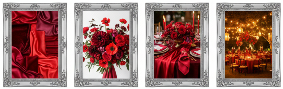
Red Wedding Color Ideas
| Color Combination | Best Season | Style Vibe |
| Red + White | Winter/Summer | Classic, Clean |
| Red + Blush | Spring | Soft, Romantic |
| Red + Gold | Fall/Winter | Glamorous, Formal |
| Burgundy + Dusty Rose | Fall/Winter | Warm, Vintage |
| Red + Black | Year-Round | Bold, Modern |
| Red + Emerald Green | Winter | Festive, Natural |
| Terracotta + Brick Red | Fall/Summer | Earthy, Boho |
| Red + Navy/Midnight Blue | Fall/Winter | Elegant, Refined |
| Monochromatic Reds | Winter | Dramatic, Luxe |
| Neutral + Red Accents | Year-Round | Minimal, Stylish |
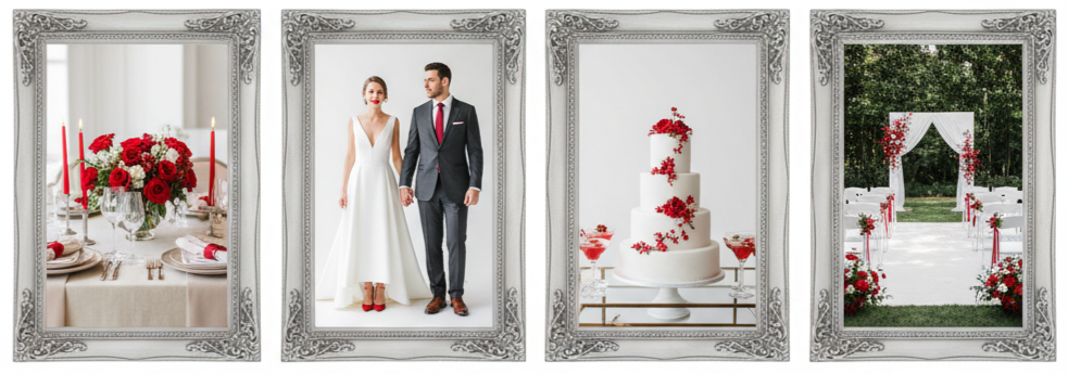
Classic Red and White
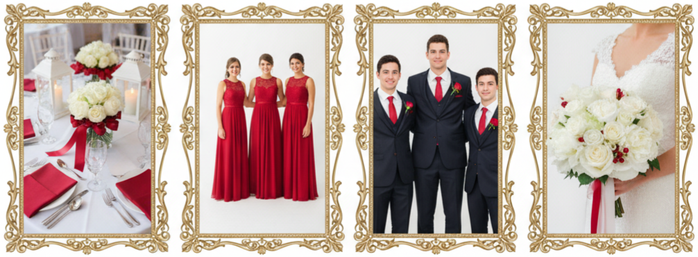
A red and white palette is a timeless choice for weddings. Red brings passion, while white balances it with purity and simplicity. This mix fits almost any wedding theme—traditional or modern—and works beautifully in both summer and winter settings.
- Décor Ideas: Combine white roses with red ribbons, use white table linens paired with red napkins, and add red candles inside white lanterns for a clean yet romantic look.
- Attire Tips: Bridesmaids can wear red dresses, while groomsmen match with red ties or boutonnieres. The bride can carry a bouquet of white flowers with a hint of red.
- Best Season: This pairing shines in bright summer venues or cozy winter settings with snowy backdrops.
Romantic Red and Blush
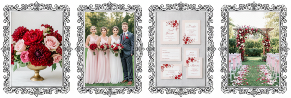
When you want a color scheme that feels soft but still striking, red and blush are your best bet. The blush tones add warmth and tenderness to the boldness of red, creating a graceful and dreamy feel perfect for romantic weddings.
- Floral Inspiration: Blend red dahlias, peonies, and blush roses in your arrangements for texture and contrast.
- Bridal Party Look: Blush gowns with red bouquets look charming and elegant.
- Design Details: Use blush-colored stationery with red lettering to keep the romantic aesthetic consistent.
- Best Setting: This palette suits garden weddings or outdoor spring ceremonies where natural light enhances the colors.
Red and Gold Glam
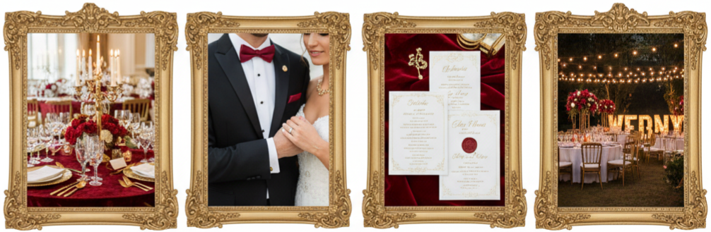
Red and gold together bring instant luxury. This combination exudes royalty and sophistication, making it ideal for formal or evening weddings.
- Décor Touches: Think red velvet runners, gold-rimmed plates, and tall gold candle holders.
- Wedding Attire: Brides can wear subtle gold jewelry, while grooms accessorize with gold cufflinks and a red tie.
- Finishing Details: Add gold foil touches on invitations and signage for an extra-glam feel.
- Perfect Timing: Red and gold work beautifully for fall or festive holiday weddings.
Burgundy and Dusty Rose
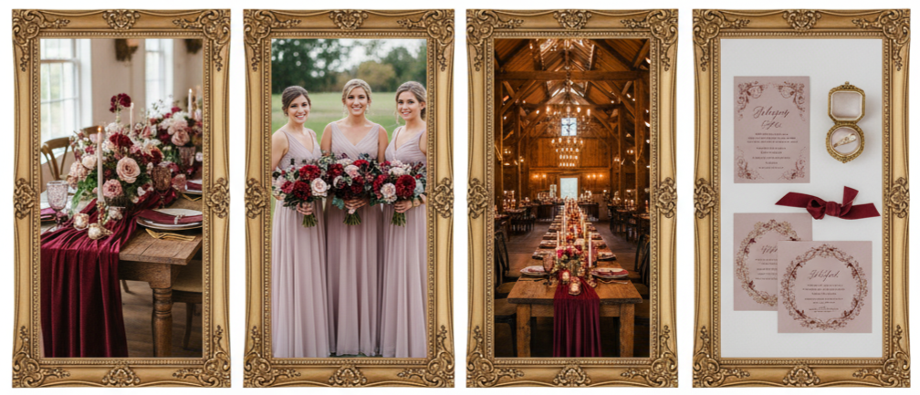
If you love rich and cozy tones, burgundy and dusty rose are perfect. They bring warmth and romance with a slightly vintage touch, making them ideal for autumn or winter weddings.
- Design Tips: Use burgundy tablecloths or velvet accents paired with dusty rose floral arrangements.
- Bridal Styling: Dress bridesmaids in dusty rose gowns and pair them with burgundy bouquets.
- Venue Match: This palette looks great in rustic barns, vineyards, or candlelit indoor venues.
- Bonus Tip: Add hints of antique gold to tie everything together.
Red and Black Modern Drama
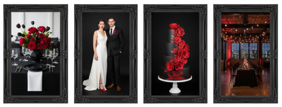
For couples who want something bold and unconventional, red and black make a dramatic statement. This color combo creates a sleek and edgy atmosphere, perfect for urban weddings or modern venues.
- Décor Style: Use black table settings and linens, accented by red roses or tulips.
- Attire Choices: Brides might wear red shoes or lipstick, while grooms look sharp in black suits with red accessories.
- Cake Idea: A black cake decorated with red sugar flowers looks artistic and eye-catching.
- Ideal Setting: Choose a city loft, industrial warehouse, or nighttime reception for the best effect.
Red and Emerald Green
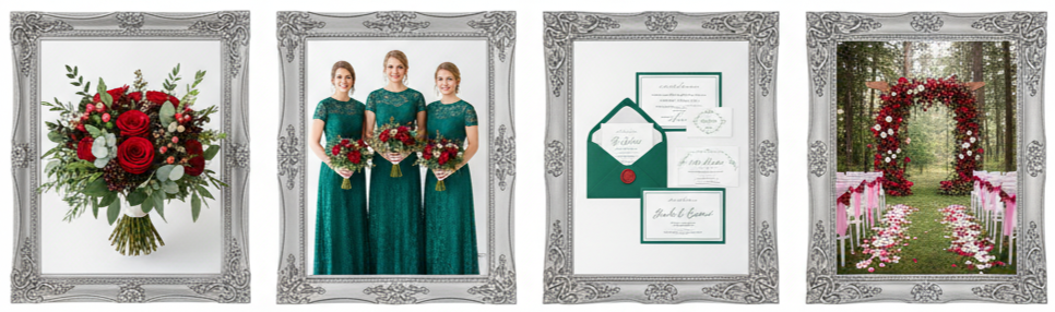
Red and emerald green blend perfectly for a rich and natural look. This combination works well for holiday weddings, botanical settings, or woodland-themed events.
- Floral Elements: Mix red roses with green foliage like eucalyptus and ferns for lush arrangements.
- Bridesmaid Outfits: Emerald dresses paired with red bouquets create a striking contrast.
- Stationery Idea: Use emerald borders and red wax seals for a festive touch.
- Season Fit: This color combo feels magical during winter or in venues surrounded by greenery.
Terracotta and Brick Red Boho Style
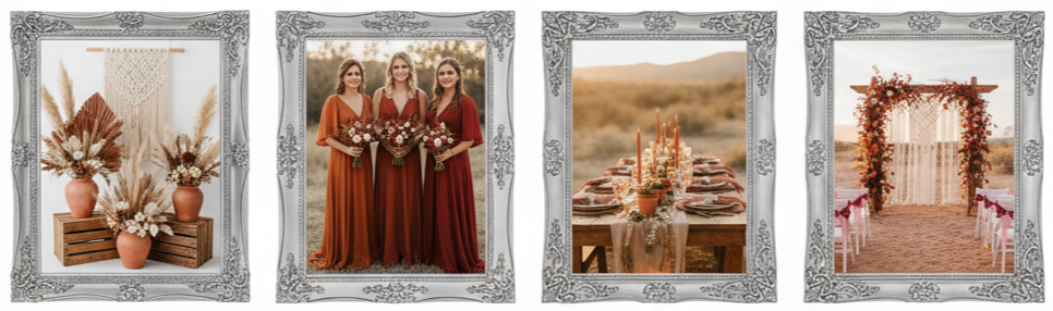
Terracotta and brick red offer a warm, earthy palette that’s perfect for boho or rustic weddings. These colors bring comfort and personality, especially for outdoor or desert-inspired celebrations.
- Decorations: Use terracotta pots with dried florals, macramé backdrops, and wooden accents.
- Fashion Choices: Bridesmaids can wear dresses in varying shades of rust, sienna, and brick.
- Ambiance: This color mix creates a natural and grounded atmosphere with a stylish edge.
- Best Venue: Works beautifully in open-air locations, barn venues, or sandy landscapes.
Red with Navy or Midnight Blue
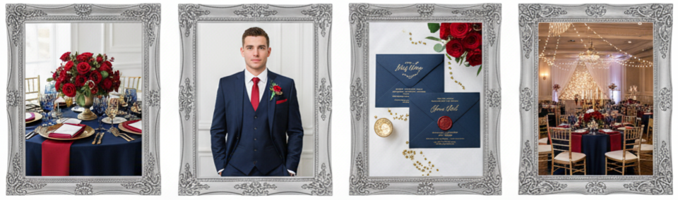
Pairing red with navy or midnight blue gives a classy, timeless appearance. This combination suits both nautical and elegant evening weddings.
- Styling Ideas: Navy tablecloths with red floral centerpieces look stunning, or reverse the scheme with red napkins on blue dinnerware.
- Attire Notes: Navy suits for the groom with red ties or pocket squares keep the look sophisticated.
- Décor Accent: Add gold or silver metallic details to elevate the design.
- Where It Works: Great for coastal, formal, or ballroom-style venues.
Monochromatic Red Palette
A monochromatic red theme feels bold and artistic. Using multiple shades of red adds visual interest while keeping everything cohesive.
- Color Play: Combine ruby, wine, scarlet, and cherry tones across your décor.
- Design Elements: Mix fabrics and textures—like silk, velvet, and satin—for a layered look.
- Floral Mix: Incorporate dark red dahlias, bright poppies, and roses in varying shades.
- Pro Tip: Use soft lighting to highlight each tone and create depth.
Neutral Base with Red Accents
If you want something subtle yet stylish, start with neutral colors and add hints of red for contrast. This approach gives you a clean, modern aesthetic while keeping the color pop intentional.
- Design Idea: Use cream or taupe as your main palette, then add red through bouquets, ribbons, or candles.
- Fashion Details: Brides might wear red heels or lipstick, while grooms add a red tie for a minimal pop.
- Décor Simplicity: A white cake with red floral details or red cocktails at the bar tie the look together.
- Why It Works: This balance suits minimalist, contemporary, or intimate weddings perfectly.
Conclusion
Red is one of the most adaptable wedding colors out there. Whether you love the timeless charm of red and white, the romance of blush tones, or the sophistication of gold and emerald, red easily complements any theme or season. It’s warm, passionate, and instantly draws attention in the best way possible.
Key Takeaway: Red wedding color ideas work because red adapts to any style. You can tone it down with neutrals or amp it up with bold shades. Find the balance that fits your personality, and you’ll have a wedding palette that feels elegant, memorable, and uniquely yours.
FAQs
Is red too bold for a casual or backyard wedding?
Not at all. Pair red with soft neutrals like beige or blush, and use it in smaller touches like flowers, table napkins, or invitations to keep things balanced.
Can red be used for daytime weddings?
Yes. Lighter shades such as cherry or coral make red suitable for daytime events while keeping the atmosphere cheerful and vibrant.
What colors should I avoid pairing with red?
Avoid combining red with overly bright or neon colors since they can clash. Stick to earthy or muted tones for a polished look.
How do I make red work for a beach wedding?
Try softer reds like terracotta or coral with sandy neutrals and greenery. They’ll blend naturally with the coastal surroundings.
Should my bridal party wear the same shade of red?
Not necessarily. Mixing shades like wine, ruby, and rose can create depth and visual interest without losing cohesion.
Purple Wedding Color Ideas
| Season | Purple Shade | Pairing Colors | Wedding Vibe |
| Spring | Lavender, Lilac | Blush, Mint | Soft, Romantic |
| Summer | Orchid, Lilac | Sage, Ivory | Bright, Fresh |
| Fall | Plum, Mauve | Burnt Orange, Gold | Warm, Rustic |
| Winter | Eggplant, Plum | Silver, Slate Gray | Elegant, Moody |
Choosing the Right Shade of Purple
Purple offers endless possibilities for setting the mood of your wedding. Whether you’re dreaming of something soft and romantic or bold and dramatic, there’s a shade that fits your vision perfectly. From pastel tones to rich jewel hues, purple easily complements any venue or season.
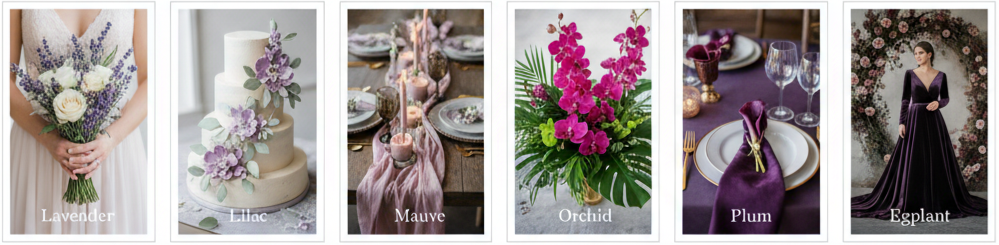
- Lavender: This soft shade is perfect for spring garden weddings. It feels fresh, romantic, and naturally elegant.
- Lilac: A lovely, feminine tone that adds sweetness to your color palette, especially in floral arrangements.
- Mauve: A blend of gray and purple that brings a vintage and sophisticated feel to your celebration.
- Orchid: Bright and tropical, ideal for beach weddings or outdoor summer events.
- Plum: Deep and rich, great for formal evening weddings that call for a luxurious touch.
- Eggplant: A dark, dramatic tone that works beautifully in winter or black-tie weddings.
To balance these tones, consider pairing deep purples with lighter neutrals or metallic accents like silver, champagne, or gold. The combination creates a cohesive look that transitions smoothly from ceremony to reception.
Playing with Purple Wedding Color Combos
Purple’s a flexible color that works with tons of styles. Whether you’re going for modern glam or a natural vibe, the right mix can level up your whole wedding look.
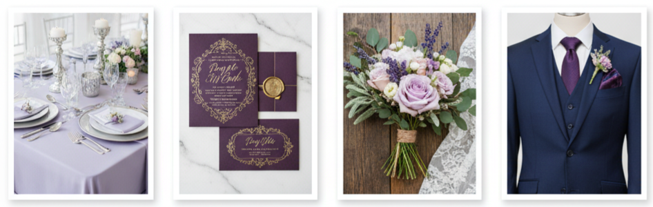
- Purple and Silver: This pairing feels sleek and modern. Soft lilac paired with silver accents like candle holders or metallic tableware creates a refined look.
- Purple and Gold: A luxurious combination that exudes regal charm. Plum and gold bring richness, especially when used for table linens or invitations.
- Purple and Green: Fresh and organic, perfect for garden or boho weddings. Think lavender flowers mixed with eucalyptus or sage greenery.
- Purple and Pink: Romantic and soft, especially suited for spring or early summer weddings. Lilac and blush create an airy and sweet combination.
- Purple and Navy: Bold and elegant, perfect for evening receptions or formal events. Deep purple florals with navy suits add depth and contrast.
By experimenting with these color pairings, you can bring warmth, vibrancy, or sophistication to your celebration.
Styling Bridesmaids in Purple Dresses
Bridesmaid dresses are a simple yet stunning way to weave purple into your wedding day. The beauty of this color is how flattering it looks on different skin tones. You can either choose one consistent shade or go for a gradient look using multiple purple hues.
Mixing lavender, mauve, and plum dresses can create a gorgeous ombré effect that looks great in photos. For summer weddings, lighter fabrics like chiffon or satin add movement and flow, while velvet or silk bring richness for fall or winter celebrations. Metallic or nude heels and delicate jewelry complete the look without overpowering it.
Gorgeous Purple Wedding Flowers to Consider
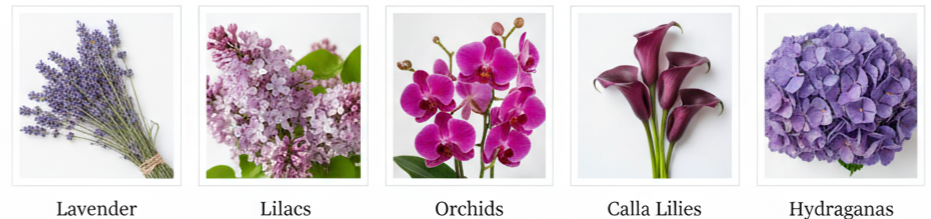
Flowers are a great way to show off your color palette, and purple blooms bring elegance, warmth, and depth to your wedding style.
- Lavender: Adds fragrance and rustic charm to outdoor or countryside weddings.
- Lilacs: Perfect for spring ceremonies, known for their delicate appearance and subtle scent.
- Orchids: Elegant and modern, ideal for upscale or tropical venues.
- Calla Lilies: Sophisticated and sleek, great for black-tie or winter weddings.
- Hydrangeas: Voluminous and romantic, perfect for bouquets and table centerpieces.
To balance your floral arrangements, combine different purple tones with greenery or neutral blooms like cream roses or white tulips. A mix of textures and shades makes your arrangements more eye-catching and cohesive.
Decorating with Purple Details
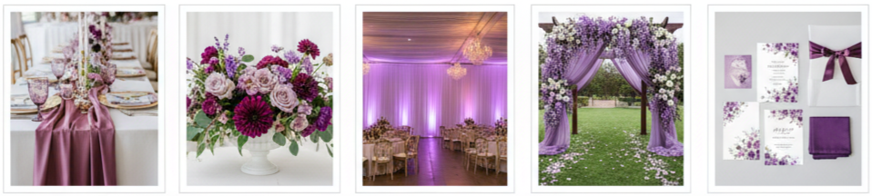
When it comes to wedding décor, purple is both timeless and versatile. It works beautifully across different styles—modern, rustic, vintage, or glamorous.
You can add touches of purple through fabrics like drapes or table runners, floral centerpieces, or lighting. Lavender or lilac uplighting gives your reception a soft glow, while plum-colored candles and glassware create an intimate feel. Small touches like menus, napkins, and chair ribbons in coordinating shades keep your theme consistent without overwhelming the space.
For outdoor ceremonies, consider adding lavender petals to the aisle or draping purple fabrics on your arch. These subtle details help tie the entire event together seamlessly.
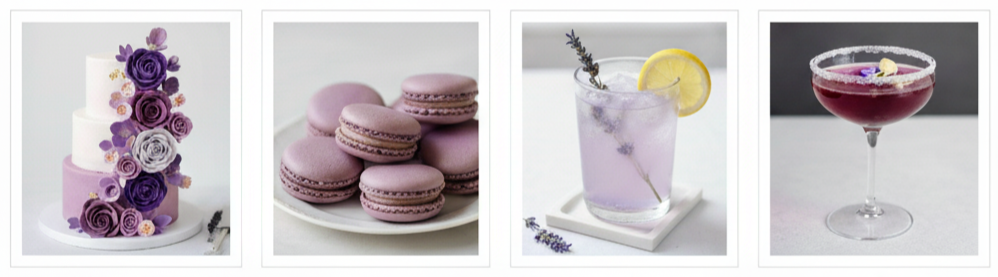
Wedding Cakes and Desserts in Purple Tones
Your wedding cake is a statement piece, and purple tones make it even more memorable. You can opt for a fully purple cake, a two-toned ombre design, or white frosting with purple floral accents. Metallic touches like gold leaf or edible glitter add a sophisticated twist.
If you’re planning a dessert table, carry the theme through your treats. Purple macarons, violet cupcakes, and lavender-infused cookies not only look beautiful but also taste incredible. You can even include lavender lemonade or purple cocktails for a creative beverage option.
How Grooms and Groomsmen Can Wear Purple
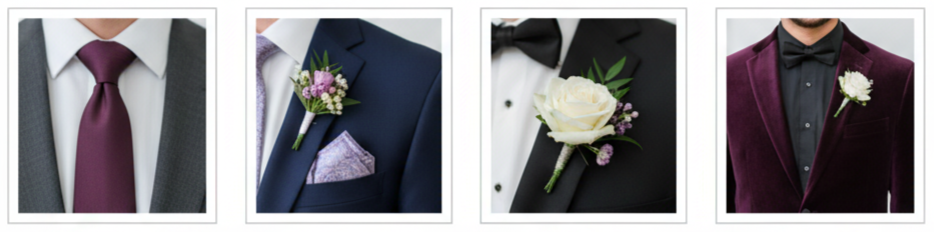
Purple isn’t just for the bridal party—it’s a stylish choice for the groom and groomsmen too. You don’t have to go all out with a purple suit to make a statement. A few thoughtful accents go a long way.
Purple ties, pocket squares, and boutonnières add just the right touch of color. Deep plum or eggplant accessories pair well with navy, black, or gray suits. For a bolder choice, a velvet purple jacket can make a dramatic and elegant impression, especially for evening or winter weddings. Matching these accents with the bridal bouquet or bridesmaid dresses creates a well-coordinated look.
Best Seasonal Purple Wedding Themes
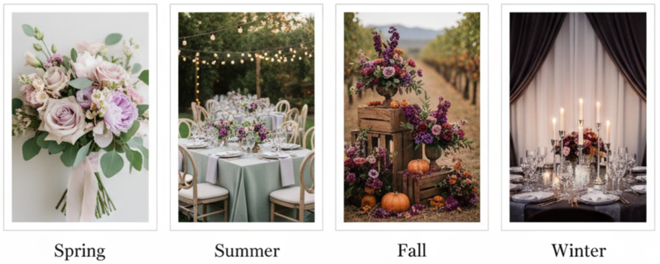
Each season offers a new opportunity to reimagine purple in a fresh and fitting way. By adjusting tones and complementary colors, you can make purple work beautifully year-round.
- Spring: Light and airy shades like lavender and blush capture the freshness of blooming flowers.
- Summer: Lilac and sage bring brightness to outdoor or garden weddings.
- Fall: Deep plum and burnt orange create a cozy, rich palette that suits rustic or vineyard venues.
- Winter: Eggplant and icy silver add depth and glamour, especially for indoor or candle-lit ceremonies.
Choosing shades that match the season ties everything together and complements your venue and the natural setting around you.
Unique Purple Touches You’ll Love
The best weddings are all about personal details, and purple gives you plenty of creative ways to add charm and character. You can carry your color scheme through every element of the day, from invitations to farewell décor.
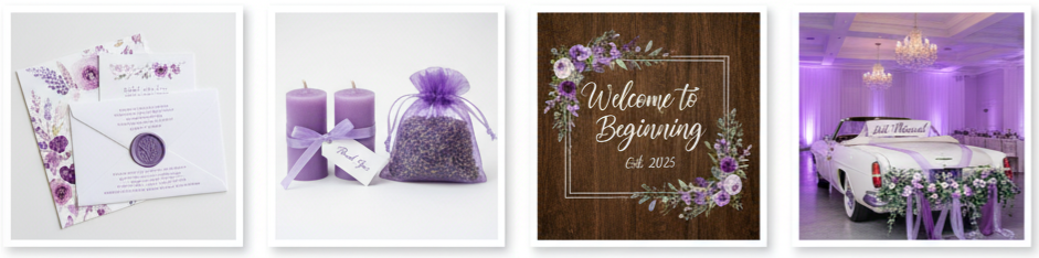
- Invitations: Try watercolor designs in lilac or plum, or seal your envelopes with purple wax stamps for an elegant finish.
- Wedding Favors: Lavender sachets, purple-wrapped candles, or violet-colored candies make thoughtful keepsakes.
- Signage: Welcome signs, menus, and seating charts with purple lettering add consistency to your décor.
- Lighting: Soft purple uplighting enhances the romantic mood, especially during dinner and dancing.
- Transportation: Add ribbons or floral garlands in purple hues to your getaway car for a cohesive touch.
Small touches like these create a lasting impression and tie your entire theme together in a subtle yet beautiful way.
Conclusion
Purple brings a sense of luxury, romance, and creativity to any wedding theme. Whether you prefer pastel lilac for a dreamy outdoor setting or deep plum for a sophisticated ballroom celebration, purple adapts effortlessly to your vision. It’s a color that symbolizes both elegance and individuality, giving you the freedom to design a wedding that feels uniquely yours.
Key Takeaway: Purple is a timeless wedding color that blends seamlessly into any season or style. By experimenting with tones, pairing complementary colors, and weaving purple into your décor, florals, and fashion, you’ll create a cohesive and unforgettable atmosphere that reflects your personal story.
FAQs
What are some creative ways to use purple in wedding invitations?
Incorporate watercolor designs, lavender ink, or purple wax seals. You can also tie your invitations with purple ribbons or include dried lavender for a natural scent.
Can purple be used in a beach wedding theme?
Yes. Shades like orchid and lilac work beautifully with beach tones. Pair them with ivory, coral, or turquoise for a bright, breezy vibe.
Is purple appropriate for a small backyard wedding?
Absolutely. Lighter shades like mauve and lavender complement outdoor settings and pair nicely with natural greenery and wooden décor.
What kinds of lighting work best with purple décor?
Soft violet or lavender uplighting sets a romantic tone. Candlelight and fairy lights can also enhance the warm, elegant atmosphere.
How do I match purple accents with floral arrangements that aren’t purple?
Add purple ribbons to bouquets, use tinted vases for centerpieces, or mix in a few purple blooms to tie the look together without overwhelming your other flowers.
Pink Wedding Color Ideas
| Season | Primary Pink Shade | Complementary Colors | Best Wedding Style |
| Spring | Blush Pink | Sage Green, Cream | Garden or Outdoor |
| Summer | Coral Pink | Teal, Gold | Beach or Tropical |
| Fall | Dusty Rose | Burgundy, Burnt Orange | Rustic or Boho |
| Winter | Rose Gold | Silver, Ivory | Glamorous or Classic |
Why Pink Is a Timeless Wedding Color
Pink has always been one of the most popular wedding colors, and for good reason. It symbolizes love, warmth, and happiness while offering endless versatility. Whether you want something subtle like blush or something more vibrant like fuchsia, pink fits every theme and setting. It blends effortlessly with neutrals, jewel tones, and metallics, making it perfect for any season or wedding style—from a garden celebration to a glamorous ballroom affair.
Popular Pink Wedding Color Combinations
- Blush Pink and Sage Green: This pairing feels fresh and romantic, ideal for outdoor or spring weddings. Blush adds softness, while sage brings an earthy balance. Use them in floral arrangements, table linens, and bridesmaid dresses for a cohesive look.
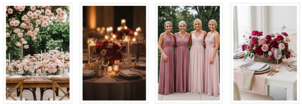
- Dusty Rose and Navy: This combination gives your wedding a refined and elegant edge. Dusty rose offers muted charm, while navy provides depth. Think velvet accents, navy suits, and rose-toned bouquets—it’s a blend that works beautifully for formal settings.
- Pink and Gold: Perfect for those who want luxury and shine, pink and gold together create an upscale feel. Incorporate gold flatware, metallic decor, and pink florals to add sophistication. This combo works especially well for evening receptions or elegant indoor venues.
- Pink and Gray: If you prefer something modern and understated, pink and gray make a sleek pair. The neutral tones of gray tone down pink’s brightness, giving your event a sophisticated feel. It’s great for minimalist themes and city venues.
Pink Wedding Color Ideas by Season
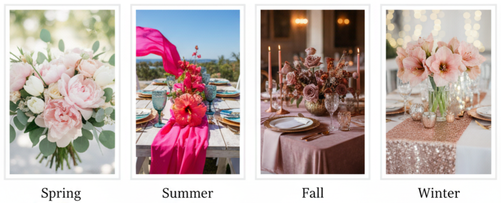
- Spring Weddings: Spring is the season of new beginnings, and soft pinks shine brightest here. Light blush, baby pink, and pastel combinations look stunning among blooming flowers. Use fresh florals like peonies, cherry blossoms, and tulips paired with natural greenery to enhance the soft tones.
- Summer Weddings: Summer calls for vibrant and playful pinks. Shades like coral and hot pink bring energy and excitement. Add tropical flowers like hibiscus and pair with teal or gold accents. Flowing fabrics and outdoor venues work beautifully for this bright palette.
- Fall Weddings: Deeper pinks like mauve and dusty rose feel right at home in autumn. Combine them with earthy hues like burnt orange, deep red, or copper. Add dried florals, pampas grass, and velvet textures for warmth and richness.
- Winter Weddings: Winter weddings are magical with rose gold, blush, or berry tones. Pair pink with silver or ivory for a crisp, romantic aesthetic. Think sparkling lights, elegant florals like amaryllis, and satin fabrics for a cozy yet glamorous finish.
Using Pink in Key Wedding Details
- Bridesmaid Dresses: Pink bridesmaid dresses are a classic choice. You can mix shades for a pretty gradient or stick to one tone for a clean look. Chiffon works well in warm weather, while velvet or satin adds richness in cooler seasons.
- Bouquets and Florals: Pink flowers are a natural choice. Roses, ranunculus, and peonies bring texture and romance. Mix different shades of pink with greenery for balance. For a striking look, add small pops of white or deep red.
- Ceremony and Reception Décor: Pink decor sets the tone from the aisle to the tables. Think soft drapes, floral installs, pink glassware, and a glow from candles or fairy lights for that dreamy vibe.
- Cake and Desserts: A pink cake is both stylish and delicious. Try ombre layers or gold foil detailing. Add edible flowers or pink macarons for a coordinated dessert table. You can even match the cake flavor—strawberry or raspberry—for a sweet touch.
- Wedding Stationery: Invitations set the tone for your wedding day. Use blush or dusty pink stationery with gold or silver calligraphy. Add watercolor floral prints or wax seals for detail. Carry this theme across menus, programs, and signage for a polished finish.
How to Pick the Perfect Shade of Pink
Choosing the right pink shade depends on your wedding’s setting and mood.
- Venue Setting: Outdoor venues like gardens pair well with soft pinks, while grand ballrooms handle bolder tones like magenta.
- Lighting: Natural light enhances lighter pinks, while dim or candlelit venues suit deeper shades like rose or mauve.
- Bridal Party Coordination: Choose tones that flatter different skin tones. Dusty rose and blush are versatile favorites.
- Seasonal Match: Align your pink tones with the time of year—pastels for spring, rich pinks for fall and winter.
- Neutral Balancing: Combine pink with neutrals like ivory, beige, or gray to prevent the palette from feeling too overpowering.
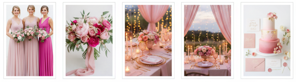
Real Wedding Ideas Using Pink
- Garden Wedding: One couple went for a blush and greenery theme featuring cascading floral arches, pink petals on the aisle, and string lights overhead. The look was soft, natural, and full of romance.
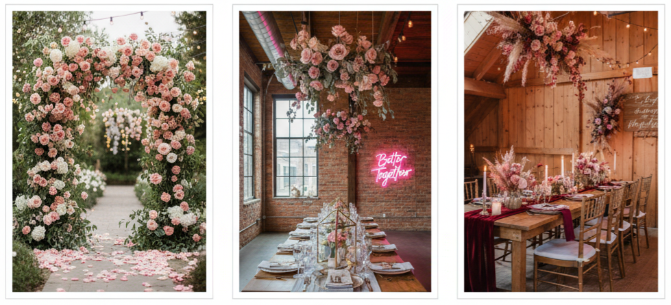
- Modern Loft Wedding: Another pair chose dusty pink and gray in an industrial space. They decorated with suspended flowers, geometric centerpieces, and a custom neon pink sign that read “Better Together.”
- Rustic Barn Wedding: A fall wedding featured pink and burgundy decor, with dried flowers, wood signage, and rose-tinted lighting. The combination created a warm, inviting setting perfect for the season.
Each of these weddings shows how pink can adapt to different atmospheres, creating distinct yet equally stunning looks.
Conclusion
Pink weddings never go out of style because they’re so adaptable. You can go subtle or bold, elegant or playful—pink fits it all. Whether your venue is outdoors, rustic, or ultra-modern, there’s a pink palette that will make it shine. Pair it thoughtfully with other tones and use it across your decor, attire, and florals for a cohesive and beautiful result.
Key Takeaway: Pink fits any season, theme, or style. From blush to bold fuchsia, it brings warmth, romance, and a touch of elegance that makes your day feel truly yours.
FAQs
What are some unexpected color pairings that work well with pink?
Pair pink with mustard yellow, black, or teal for a modern, standout look. These combinations make your wedding feel fresh and unique.
How can I make a pink wedding feel more modern?
Stick with clean lines and geometric shapes for a modern feel. Use pink as a subtle accent to keep things sleek and fresh.
Can pink work in a beach wedding theme?
Yes! Go with coral or tropical pinks paired with sandy neutrals, seafoam green, or turquoise for a coastal, breezy style.
What pink flowers are available all year?
Roses, carnations, and gerberas are easy to find year-round. You can also ask your florist about dyed blooms to match your exact pink tone.
Is pink suitable for a gender-neutral wedding?
Definitely. Combine pink with gray, navy, or beige to balance the look. It’s all about how you style it—pink is for everyone.
Pastel Wedding Color Ideas
| Color Combination | Style or Mood |
| Blush Pink & Sage Green | Romantic and Natural |
| Lavender & Dusty Blue | Calm and Elegant |
| Peach & Mint | Fresh and Playful |
| Pale Yellow & Gray | Modern and Minimal |
| Soft Coral & Sky Blue | Airy and Coastal |
Why Pastel Colors Are a Perfect Choice for Weddings
Pastel colors have a way of making weddings feel soft, elegant, and effortlessly romantic. They create a dreamy setting that works beautifully for both traditional and modern ceremonies. Whether you’re saying your vows in a blooming garden, a chic indoor venue, or by the ocean, pastel shades blend seamlessly into any environment. Their versatility makes them a favorite choice for couples who want their big day to look graceful without being overly dramatic. Plus, they pair wonderfully with neutrals and metallics, giving you endless ways to style your celebration.
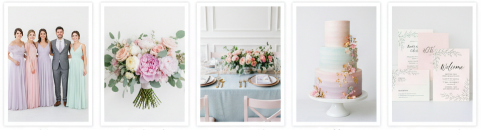
Most Beautiful Pastel Color Combinations for Weddings
- Blush Pink and Sage Green: This romantic combo blends warmth and earthiness perfectly. Blush pink adds sweetness, while sage green gives balance and calm. Together, they work beautifully in floral arrangements, bridesmaid dresses, or table décor for outdoor or garden weddings.
- Lavender and Dusty Blue: If you love calm, cool tones, this pairing brings soft sophistication. Lavender adds whimsy, and dusty blue adds depth, making them perfect for spring and early summer weddings. They look especially lovely in table linens or bridal bouquets.
- Peach and Mint: This fun and fresh combo brings cheer to any event. Peach adds warmth while mint introduces a crisp, refreshing feel. It’s perfect for daytime weddings or outdoor venues filled with sunshine and greenery.
- Pale Yellow and Gray: For a modern and minimal look, this combination hits the mark. Pale yellow brings brightness, while gray tones it down for an elegant balance. It’s great for industrial venues or couples who prefer simple, sleek styling.
- Soft Coral and Sky Blue: These colors evoke a beachy, relaxed mood. Soft coral adds a hint of vibrancy, while sky blue keeps things airy and serene. This combination works well for seaside weddings and destination celebrations.
Seasonal Pastel Palettes for Every Wedding Style
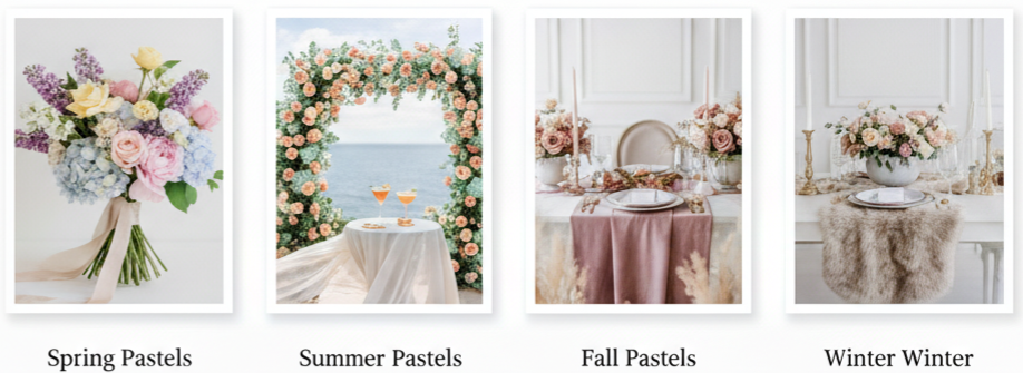
Each season has its own color story, and pastels fit into them effortlessly. Here’s how to choose pastel tones that align with your wedding season.
- Spring Pastels: Spring weddings pair perfectly with colors like lilac, butter yellow, baby pink, and pale blue. These tones reflect blooming flowers and the feeling of renewal. They look stunning in floral arrangements, table linens, or bridesmaid dresses.
- Summer Pastels: In summer, go for brighter shades like mint, peach, and blush. These colors stand out beautifully under natural sunlight. They’re ideal for outdoor celebrations and look incredible in flowing fabrics, floral arches, or signature cocktails.
- Fall Pastels: Fall doesn’t have to mean dark tones. Soft hues like mauve, sage, and dusty rose bring an elegant twist to autumn weddings. Combine these with warm textures like velvet or dried florals for a cozy seasonal touch.
- Winter Pastels: Cool colors like icy blue, frosted lavender, and pale silver give off a wintry, romantic charm. Paired with candlelight, faux fur, or shimmering details, they create a magical and cozy wedding atmosphere.
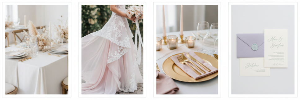
Incorporating Pastel Colors Across Wedding Elements
Bringing your chosen pastel palette into every part of your wedding makes everything feel connected and intentional.
- Bridal Party Attire: Pastel dresses always make for timeless bridesmaid looks. You can mix and match shades or keep them uniform. For the groomsmen, pastel ties, socks, or pocket squares add a touch of color without stealing attention.
- Florals and Bouquets: Flowers are one of the easiest ways to show off your color palette. Choose blooms like peonies, roses, lisianthus, or ranunculus in pastel tones. Pair them with soft greenery such as eucalyptus for balance.
- Reception Tables and Décor: Think of your reception tables as the centerpiece of your theme. Pastel linens, delicate tableware, and soft floral centerpieces pull everything together. Add candles or colored glassware for extra charm.
- Wedding Cake Design: Pastel cakes always make a statement. From ombre frosting to pressed flower designs, these colors make your cake look as beautiful as it tastes. Adding subtle metallic details gives it an elegant finish.
- Stationery and Signage: Pastel invitations, menus, and signs create a cohesive look from the very beginning. Use soft backgrounds, elegant fonts, and delicate designs to complement your wedding’s overall tone.
How to Use and Balance Pastel Colors Effectively
Balancing pastels is all about creating harmony. It’s easy for them to look washed out, so knowing how to anchor them makes a big difference.
- Use Neutral Anchors: Colors like white, ivory, or beige create a clean base that lets your pastels stand out naturally.
- Add Texture: Incorporate materials like silk, lace, or linen to create depth and interest. Textures help bring dimension to your décor and attire.
- Include Metallic Accents: Touches of gold, silver, or rose gold add a modern and refined look. They also help break up the softness of pastels.
- Limit the Number of Colors: Stick to a palette of three or four shades. Too many can make the overall design feel busy instead of balanced.
Key Takeaway: To make your pastel color palette shine, pair soft hues with texture and neutrals for structure. That way, your wedding looks cohesive, elegant, and visually engaging from start to finish.
Tips for Choosing Your Ideal Pastel Palette
Picking your wedding colors is personal, and your pastel palette should feel like an extension of your story.
- Match the Setting: Your venue’s existing tones—like the color of walls, natural surroundings, or furniture—should complement your palette, not compete with it.
- Think About the Season: Bright pastels work best in spring and summer, while muted versions fit beautifully into fall and winter celebrations.
- Consider Lighting: Pastels look different in various lighting. Test samples under both natural and indoor lights to see how they photograph.
- Add Meaning: Let personal memories inspire your palette. Maybe you love lavender because of a favorite vacation or mint green because it reminds you of home. Those small details make your colors feel more special.
Conclusion
Pastel wedding color ideas bring an effortless blend of beauty and romance to any celebration. Whether you choose classic blush and sage, playful peach and mint, or elegant lavender and blue, pastels give your day a soft and stylish finish. They work for every season, theme, and setting, adding charm without feeling overdone. By using a balance of color, texture, and thoughtful details, you can create a cohesive wedding that feels timeless and completely yours.
Key Takeaway: Pastel palettes create weddings that feel warm, romantic, and refined. By mixing soft tones with neutrals and personal touches, your celebration will feel perfectly tailored to your love story.
FAQs
What pastel shades are best for beach weddings?
Soft coral, sky blue, seafoam green, and sand beige are perfect for beach weddings. They mirror the ocean and sky, creating a calm, natural vibe.
Can pastels work in an evening wedding setting?
Definitely. Choose muted tones like dusty mauve or pale silver, then layer in candles or metallic accents for a warm and elegant glow during nighttime celebrations.
How can I keep my pastel theme from looking too childish?
Focus on refined décor and sleek design elements. Use structured floral arrangements, clean fonts, and neutral accents to create an elegant balance.
Are pastels suitable for modern or industrial wedding venues?
Yes, they work beautifully. Pair soft tones like blush or gray with metal details or exposed brick to achieve a stunning modern contrast.
What flowers are best for pastel-themed weddings?
Peonies, garden roses, lisianthus, and ranunculus are ideal for pastel arrangements. They come in a range of soft tones and bring texture, fullness, and natural elegance to bouquets and décor.
Orange Wedding Color Ideas
| Season | Orange Shade | Complementary Colors | Wedding Style |
| Spring | Soft Orange | Blush Pink, Mint Green | Romantic Garden |
| Summer | Bright Orange | Turquoise, Gold | Tropical Beach |
| Autumn | Burnt Orange | Burgundy, Olive Green | Rustic Outdoor |
| Winter | Deep Orange | Navy, Champagne | Elegant Indoor |
Why Orange Works So Well for Weddings
Orange brings warmth, boldness, and creativity into wedding design. It’s a color that naturally attracts attention without overpowering the mood. Whether you’re going for a casual garden setting or a formal venue, orange can match the tone. From soft peach to deep burnt rust, this color gives you plenty of room to play.
It also shines in photographs. It reflects light beautifully and makes floral arrangements, tablescapes, and clothing details stand out in every frame.
Matching Orange With the Seasons
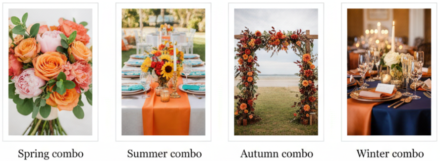
Orange isn’t limited to one time of year—it works year-round when paired properly.
- Spring combo: Soft orange, blush pink, and mint green create a fresh and romantic atmosphere.
- Summer combo: Bright orange, turquoise, sunflower yellow, and gold deliver a fun, tropical energy.
- Autumn combo: Burnt orange, burgundy, olive green, and brown bring in a cozy, rustic feel.
- Winter combo: Deep orange, navy blue, champagne, and ivory result in an elegant and warm look.
Color Combos That Bring Orange to Life
Mixing orange with the right colors makes it feel fresh and intentional, not overwhelming.
- Orange and terracotta: Perfect for boho or desert-themed weddings.
- Orange and pink: Looks like a sunset, ideal for vibrant summer ceremonies.
- Orange and greenery: Clean, organic, and suitable for garden or outdoor venues.
- Orange and neutrals: Cream, ivory, or beige help tone down orange for a modern style.
- Orange and blue: They’re color wheel opposites that create a perfect, eye-catching balance.
Fresh Décor Ideas That Use Orange Right
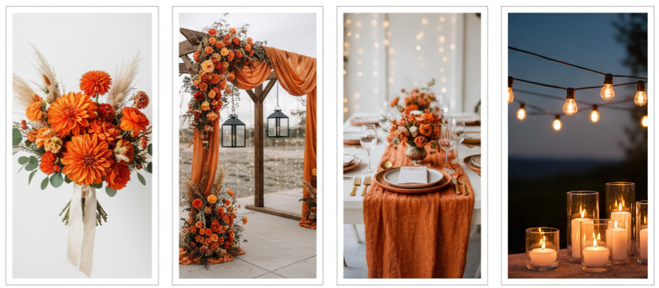
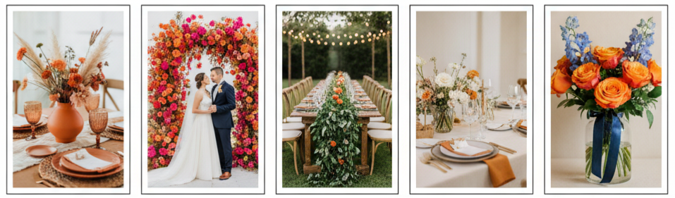
There are so many creative ways to weave orange into your décor.
- Florals: Dahlias, marigolds, ranunculus, and tulips offer natural orange tones. Pair them with dried grass or foliage for texture.
- Ceremony backdrop: Use orange fabric, flowers, or ribbons on an arch. Add hanging lanterns or string lights for a warm glow.
- Tables: Incorporate orange napkins, table runners, or chargers. Mix in brass, wood, or glass accents for balance.
- Lighting: Amber bulbs or Edison string lights bring in a cozy ambiance.
- Signage: Invitations and place cards can feature orange watercolor or calligraphy for subtle cohesion.
Bridesmaid Dresses That Nail the Orange Look
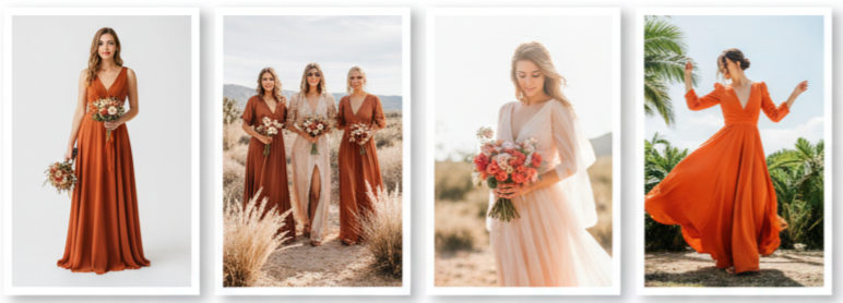
Orange works on a wide range of skin tones and wedding styles, making it a strong choice for bridesmaid dresses.
- Burnt orange: A deep, fall-friendly tone that adds warmth.
- Rust or copper: Ideal for bohemian weddings and outdoor ceremonies.
- Peach or coral: Lighter, playful options for spring and summer.
- Tangerine: Bold and retro, perfect for tropical or themed weddings.
Mix-and-match dresses in different orange shades give a modern, effortless look. You can tie the dresses together with matching bouquets or accessories for visual harmony.
Adding Orange to the Groom’s Style
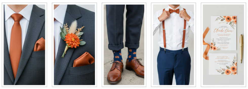
You don’t need a full orange suit to make a statement. Small touches go a long way.
- Ties and bow ties: Rust or tangerine options can liven up a neutral suit.
- Pocket squares: Patterns or florals in orange shades add flair.
- Boutonnières: Orange florals or dried accents look sharp on lapels.
- Suspenders and socks: For groomsmen, fun orange details can match the bridal party without feeling forced.
Pairing orange accents with navy or charcoal suits keeps things polished and balanced.
Wedding Cakes and Treats With an Orange Twist
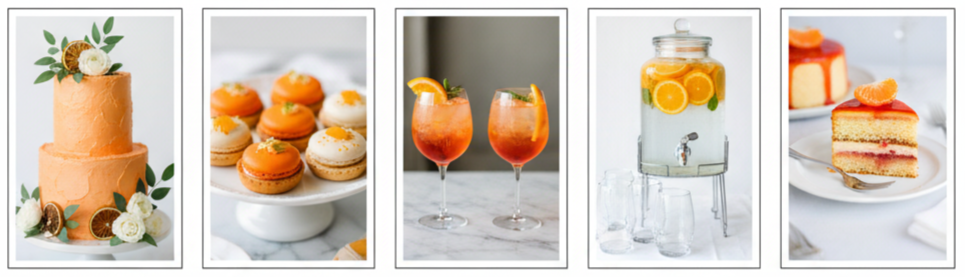
Desserts and drinks are fun places to explore the orange theme.
- Cake designs: Try orange buttercream, marbled fondant, or dried orange garnishes.
- Flavors: Orange creamsicle, mandarin sponge, or blood orange glaze add flavor and uniqueness.
- Dessert table: Include macarons, citrus tarts, and candied orange peels.
- Drinks: Offer cocktails like Aperol Spritz, orange margaritas, or orange-champagne mixes.
- Water stations: Use fresh orange slices and mint for an elegant, refreshing display.
These little additions help carry your theme from start to finish—visually and tastefully.
Creative Orange Wedding Stationery Ideas
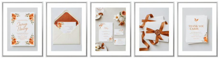
From invitations to thank-you notes, stationery lets orange shine without stealing the spotlight.
- Invitations: Use watercolor backgrounds, orange typography, or floral borders.
- Envelopes: Try orange or terracotta liners for a stylish reveal.
- Menus and cards: Add orange ink splashes or simple floral touches.
- Wax seals and ribbons: Finish invitations with burnt orange or copper tones for texture.
The stationery sets the mood, so even small doses of orange go a long way in making things feel personal and cohesive.
Guest Favors That Carry the Orange Theme
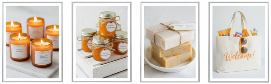
When your guests leave with something memorable, it makes your wedding even more special.
- Candles: Orange blossom or citrus-scented candles look great and smell even better.
- Jam jars: Mini marmalades make sweet, homemade favors.
- Handmade soaps: Orange and vanilla scented soaps are classy and useful.
- Welcome bags: Fill them with orange-hued gum, citrus snacks, or even sunglasses.
Every detail doesn’t need to scream orange—but keeping the color theme present adds charm and intention.
How to Keep Orange from Taking Over
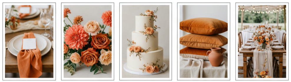
Orange is bold, so keeping it balanced is key.
- Stick to accents: Use orange in small doses—florals, napkins, ties—rather than in every element.
- Layer shades: Mix coral, burnt orange, and peach tones for depth and contrast.
- Use neutral bases: Ivory, beige, and gray help tone down the orange without losing its warmth.
- Try texture: Use different finishes like velvet, linen, or matte materials to soften the look.
A little planning goes a long way. The right touches will keep orange exciting, not overwhelming.
Conclusion
Orange is one of the most flexible and expressive wedding colors out there. Whether you’re going for something laid-back and rustic or bold and modern, it adapts to your vision. With the right combinations, orange adds warmth, creativity, and a pop of personality to everything from your flowers and outfits to your invites and desserts. It fits every season and offers endless options for customization.
Key takeaway: Orange weddings don’t just stand out visually—they bring personality, fun, and energy to every moment of your day.
FAQs
Can orange work for a black-tie wedding?
Yes, go for deeper shades like rust or burnt orange, and use them as accents. Pair with navy or champagne to keep it formal and balanced.
What are budget-friendly ways to use orange?
DIY dried orange garlands, affordable seasonal flowers, or thrifted orange linens are low-cost ways to add color without overspending.
Does orange work with modern wedding styles?
Absolutely. Stick to minimalist designs, clean lines, and pair orange with neutral colors or sleek metallics for a modern edge.
Is orange too bold for intimate weddings?
Not at all. When used with restraint, orange brings a cozy and welcoming feeling—perfect for smaller gatherings.
Can I use orange in a greenery-heavy wedding?
Yes, orange pops beautifully against natural greenery and enhances an outdoor setting without clashing.