Uncategorized
Green Theme Wedding
| Wedding Detail | Greener Swap |
| Fresh-Cut Centerpieces: | Potted Plants Or Herbs |
| Floral Foam Arrangements: | Chicken Wire Or Floral Frogs |
| Disposable Plates & Cups: | Rental Dishware Or Compostables |
| Single-Use Napkins: | Cloth Napkins (Rented Or Reused) |
| Printed Menus At Every Seat: | One Shared Menu Sign Per Table |
| Plastic Favor Bags: | Reusable Fabric Bags Or No Packaging |
| Balloon Decor: | Greenery Installations Or Fabric Banners |
| Standard Confetti: | Dried Petals Or Biodegradable Confetti |
| New Decor Purchases: | Rented Or Thrifted Pieces |
| Throwaway Aisle Markers: | Potted Greenery (Reused Later) |
Why Go for a Green Theme Wedding?
A green theme wedding brings nature right into your celebration. It’s stylish, calming, and sends a clear message that you care about the planet. On top of that, green stands for balance, renewal, and new beginnings—perfect for the start of your life together.
This theme doesn’t just look good—it feels good too. It lets you create a beautiful, meaningful event that reflects your values without sacrificing any of the fun or elegance.
Picking the Right Green Color Palette
There are endless ways to make green work for your wedding. You can keep it soft and dreamy or go bold and dramatic. The key is picking the shades that suit your style and season.
Romantic tones
Sage green brings a soft, gentle touch to your wedding style.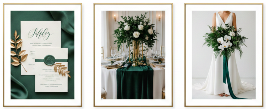
Elegant options
Emerald green adds drama and richness to formal settings.
Rustic picks
Olive and moss greens are ideal for outdoor or woodland themes.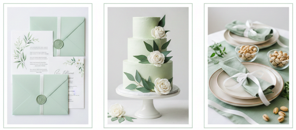
Spring colors
Mint and pistachio feel light, fun, and perfect for springtime.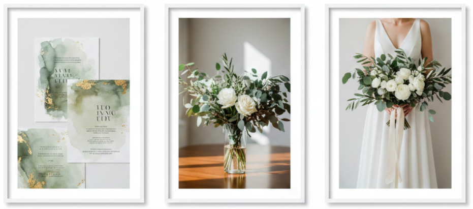
Modern twist
Eucalyptus tones offer a clean and sophisticated look.
To make the palette pop, you can pair green with blush, cream, gold, copper, or ivory. These accent shades help tie everything together and keep the vibe elegant and fresh.
Incorporating Green into Wedding Attire
Wedding fashion is a great place to show off your green theme without going overboard. From head to toe, there are so many creative and subtle ways to add green.
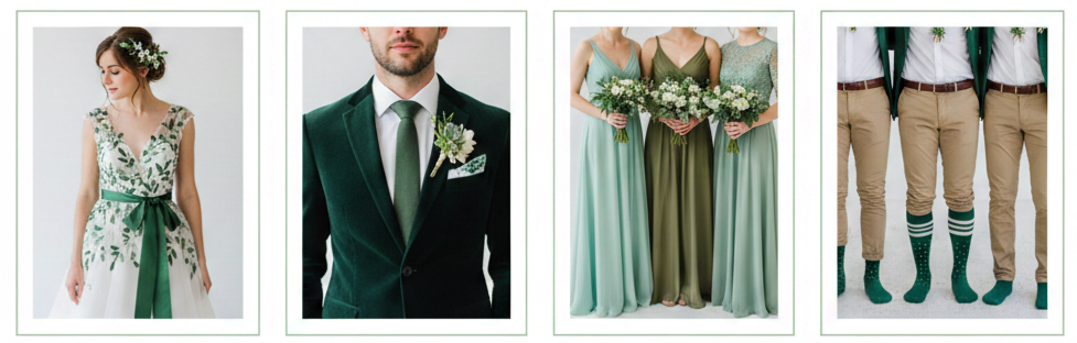
- Brides: Try a dress with green embroidery, a sash, or accessories like shoes or hairpieces. You could even go all in with a gown in a soft shade of green.
- Grooms: A dark green suit or velvet blazer looks bold and stylish. If you prefer subtle, a green tie or pocket square does the trick.
- Bridesmaids: Mismatched green dresses in different textures like chiffon or satin look fantastic together while giving each person a unique feel.
- Groomsmen: Coordinating green bowties, boutonnieres, or even socks can help tie in the theme.
For a sustainable twist, go with rented outfits, thrifted styles, or clothing made from eco-friendly fabrics. These choices add meaning and reduce waste.
Decor That Feels Alive and Fresh
Your decor sets the stage, and a green theme gives you a chance to really work with nature. You can go for a wild, organic vibe or something clean and modern—either way, it’ll feel fresh and memorable.
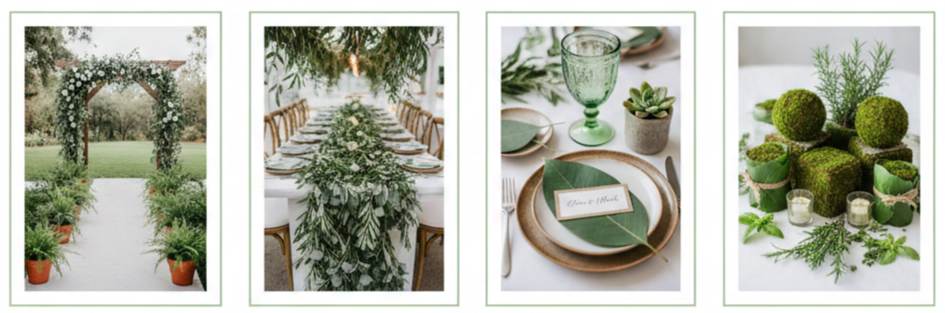
- Ceremony ideas: Line the aisle with potted plants or ferns. Use a wooden arch draped with greenery for a simple but striking altar.
- Reception touches: Hang garlands overhead or across tables. Use moss-covered elements, fresh herbs, or leaf-wrapped candles to bring everything together.
For the tables, skip the fabric runners and go for greenery like eucalyptus instead. Name cards can be tucked into little pots or even clipped to leaves. Green-tinted glasses and earthy ceramics give everything a polished and cohesive feel.
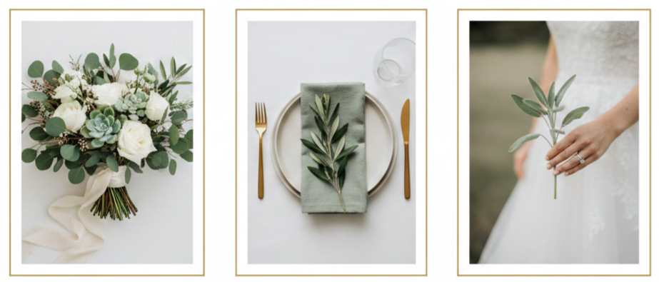
Floral and Botanical Touches That Wow
Green weddings don’t need to be packed with flowers. In fact, focusing on foliage makes the whole event feel lush and intentional.
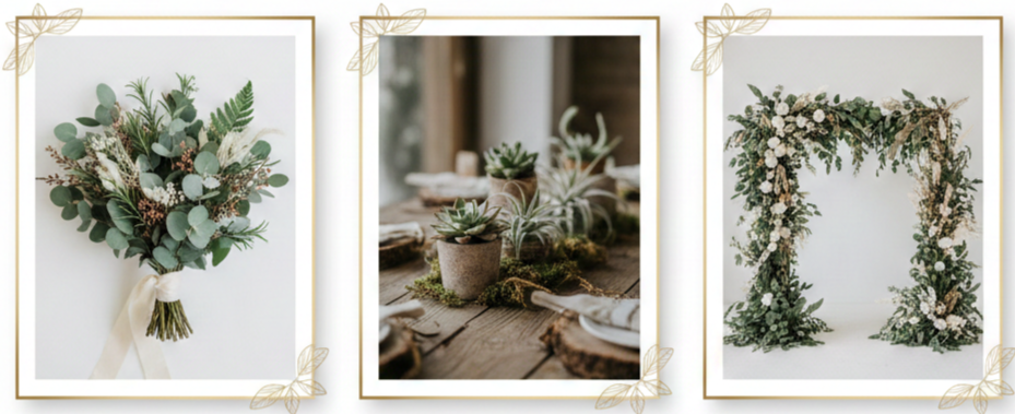
- Go-to greens: Use eucalyptus, ferns, ruscus, dusty miller, or herbs like rosemary and sage.
- Creative choices: Try succulents, air plants, or moss for something different. They last longer and can double as decor and favors.
- Long-lasting options: Dried florals or silk greenery are great if you want to avoid waste and keep some pieces after the wedding.
For an eco-friendly touch, choose seasonal plants and work with local growers. Not only will your greenery look fresher, but you’ll also be supporting small businesses and cutting down on transportation emissions.
Choosing an Eco-Conscious Venue and Vendors
Choosing the right venue and vendors helps keep everything aligned with your green theme from start to finish. Focus on places that already have natural beauty so you can use less decor.
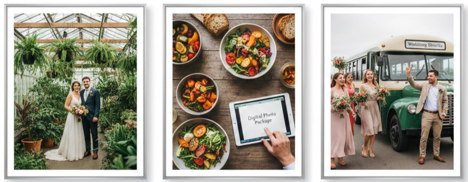
- Venues to consider: Greenhouses, botanical gardens, vineyards, and outdoor estates. These places provide built-in charm and reduce the need for extras.
- Smart vendor picks: Look for caterers who use organic or locally sourced food. Ask photographers if they offer digital-only packages to cut back on paper. Work with planners who are familiar with eco-friendly weddings.
Encourage guests to carpool or arrange shuttle services to reduce transportation emissions. Even a small change in travel can make a big impact.
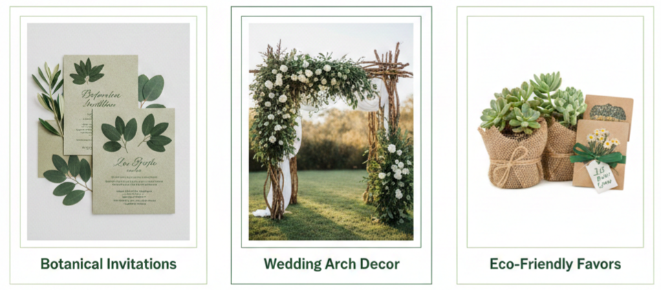
Green-Friendly Favors and Paper Products
Your guests will remember the little things, so why not make your favors and paper products count?
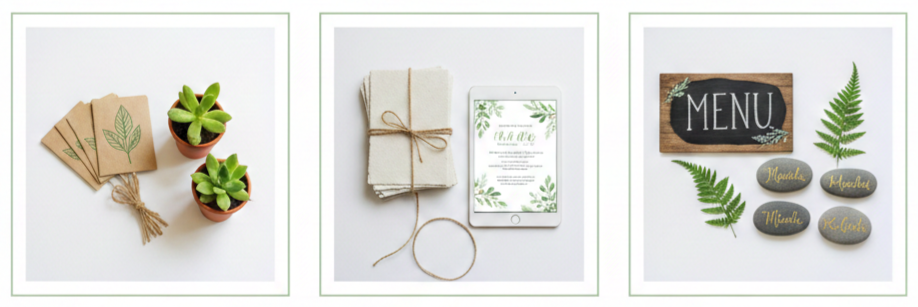
- Eco-friendly favors: Give out seed packets, mini potted plants, beeswax candles, or reusable items like cloth bags or metal straws.
- Sustainable stationery: Go digital for save-the-dates and RSVPs. If you prefer printed, use recycled paper or seed paper that guests can plant.
Instead of printed menus at every place setting, use a few large chalkboards or wooden signs. Escort cards can be swapped for natural elements like stones or pressed leaves with names written on them.
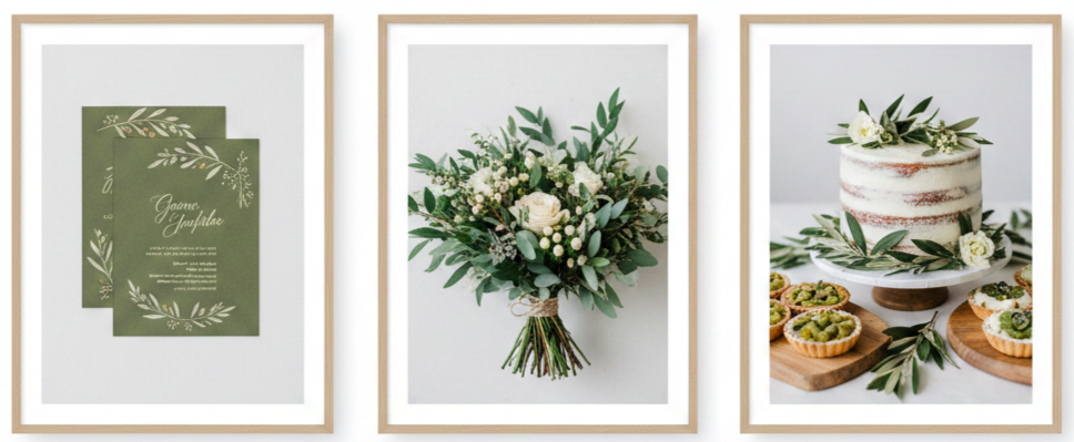
Green-Inspired Cakes and Menus
Your menu and cake are great ways to carry the green theme right through the reception. And yes, they can look just as good as they taste.
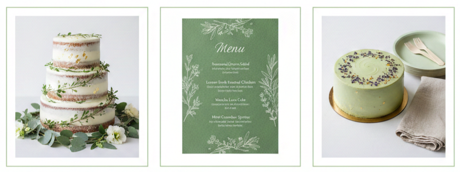
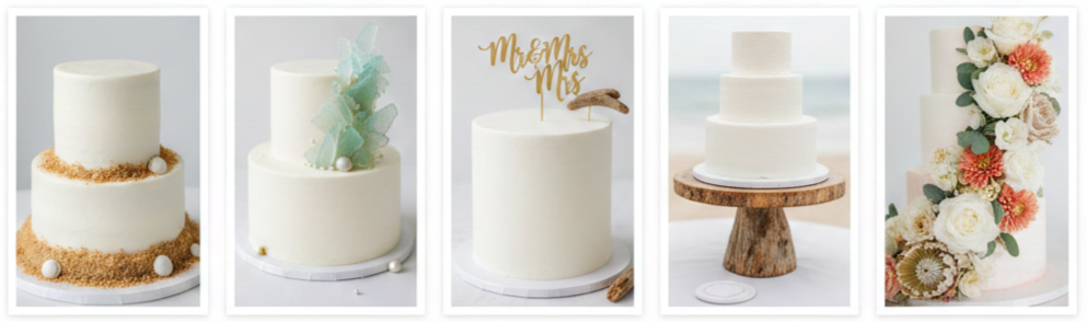
- Cake ideas: Go for white or green icing with touches of greenery or gold leaf. Naked cakes wrapped in vines or decorated with herbs look fresh and modern.
- Flavor ideas: Think matcha, lavender, lemon basil, or even mint. These natural flavors feel right at home in a green-themed wedding.
- Menu tips: Use seasonal, locally sourced ingredients. Offer plant-based meals or sides. Serve up drinks from local wineries or breweries.
Don’t forget about the serving pieces. Go with compostable plates, reusable dishes, or vintage rentals to avoid waste.
Conclusion
A green theme wedding is the perfect way to combine beauty with purpose. Whether you’re dreaming of a forest celebration or a chic botanical setup, this theme lets you keep things elegant while making eco-conscious choices.
You don’t have to change everything to make a big difference. Even small details—like choosing potted plants instead of cut flowers or switching to digital invites—can have a lasting impact.
Key takeaway: A green theme wedding blends natural beauty with thoughtful choices, giving you a celebration that’s both stunning and sustainable.
FAQs
What are some affordable ways to pull off a green wedding theme?
Choose a naturally beautiful venue, rent decor, use seasonal greenery, and go digital for your invitations to keep costs down.
Can I have a green wedding indoors?
Yes, you can transform any indoor space using potted plants, greenery garlands, natural textures, and plenty of lighting for an earthy vibe.
Is it okay to mix multiple shades of green?
Absolutely, combining various shades like sage, olive, and emerald adds depth and makes your theme more visually interesting.
What kind of music fits a green-themed wedding?
Acoustic, folk, or instrumental music works best because it complements the calming and natural vibe of a green wedding.
Do I have to plan everything myself to keep it eco-friendly?
No, there are plenty of wedding planners who specialize in sustainable weddings and can help with every detail.
Great Ideas Of Beach Wedding Cakes
| What You’re Deciding | Best Pick For The Beach | Quick Note |
| Frosting/Finish | Ganache Or Fondant | Holds shape better in heat/humidity |
| Style | Textured Coastal Finish | Hides minor weather changes |
| Flavors | Citrus Or Coconut | Feels light in warm weather |
| Fillings | Ganache Or Thick Preserves | Stays firm outdoors |
| Decor | Sugar Florals + Low Toppers | Less wind risk than delicate pieces |
| Setup | Shade + Cover Until Cutting | Reduces sun, sand, and wind damage |
What Makes A Beach Wedding Cake Different?
- Heat Changes Everything: Beach weather warms cakes faster than most people expect. Direct sun softens frosting, blurs piped edges, and increases the chance that tiers shift, especially on taller builds. We get the best results when the cake stays in shade and arrives closer to serving time so it spends less time fighting the temperature.
- Humidity Affects Texture And Structure: Humidity can turn frosting sticky, soften cake layers, and loosen decorations, especially when fillings carry extra moisture. We keep beach cakes stable by choosing finishes that tolerate humidity and fillings that hold their shape instead of spreading under pressure.
- Wind Makes Details Risky: A breeze can knock lightweight toppers out of place, lift loose petals, and tug at delicate decorations. We stick with low-profile decor, secure toppers, and placements that reduce exposure to open wind so the cake stays photo-ready longer.
- Sand And Salt Air Add Extra Challenges: Sand drifts onto frosting faster than anyone wants, and salt air can dull heavy shine finishes like certain metallic effects. We reduce problems by keeping the cake covered until close to the cake moment and choosing textures that still look intentional outdoors.
Best Frosting And Finish Options For The Beach
Fondant For A Smooth, Polished Look
Fondant holds clean lines and structured shapes better than softer frostings, which makes it a strong option for outdoor setups. Heat can still soften fondant, especially on darker colors, so lighter tones like ivory, white, champagne, and soft sea-glass shades stay safer for beach conditions and keep the finish looking crisp.
Buttercream With Heat-Smart Adjustments
Buttercream fits beach weddings beautifully when the design stays practical and the cake does not sit out too long. We lean into simple layouts, skip heavy piping, and choose textured finishes that still look elegant even when warmth softens the surface slightly. A chilled hold until close to display time makes buttercream far more reliable outdoors.
Ganache For Strength And Clean Lines
Ganache gives a firm, smooth surface that tends to handle warm air better than standard buttercream. It supports clean edges and modern minimalist designs while avoiding the fully fondant feel. For couples who want sleek style with more outdoor stability, ganache usually brings the strongest balance.
Textured Coastal Finishes That Look Better With Movement
A beach setting naturally matches organic finishes, and texture also hides small weather changes better than ultra-smooth frosting. Palette-knife waves, soft stucco textures, gentle ripples, and horizontal lines photograph beautifully and stay forgiving if the surface changes slightly during the event.
Fresh Flowers Vs Sugar Flowers
Sugar flowers stay consistent and avoid wilting in humidity. Fresh flowers can still look amazing when we choose hardy blooms, keep stems food-safe, and place flowers shortly before display time. When the cake must sit outside longer, sugar florals usually hold the look more reliably.
Beach-Perfect Cake Flavors Your Guests Will Love
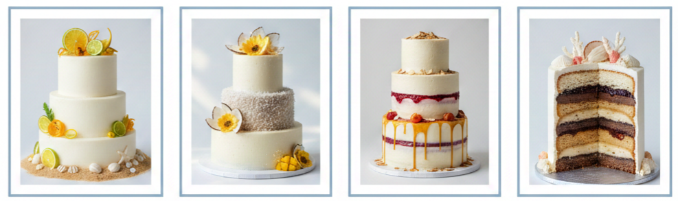
- Citrus And Bright Classics: Citrus flavors are perfect for a beach wedding, with options like lemon cake, orange-zest vanilla, or key lime. Curds are firm and balanced for clean slices and stable tiers.
- Tropical Flavors Without Being Too Sweet: Tropical flavor profiles work best when they stay light rather than heavy. Coconut cake with coconut buttercream, pineapple accents paired with vanilla, and mango or passion fruit notes in a stable filling can feel fun without tasting overly sugary. Since fruit adds moisture, we keep fruit layers thicker and more structured for outdoor plans.
- Vanilla, Almond, And Light Spice With Coastal Pairings: Classic flavors still shine at the beach, and they feel elevated with small upgrades. Vanilla bean with raspberry preserves, almond cake with a thin apricot layer, and light spiced vanilla with caramel ganache all bring a wedding feel while also holding their structure well outdoors.
- Fillings That Hold Up Outdoors: Beach cakes do best with fillings that resist softening in warm air. Ganache, thick fruit preserves, firm curds, and buttercream-based fillings usually stay reliable when the cake spends time outside. Airy whipped fillings soften faster, so we reserve them for indoor venues or very short outdoor cake moments.
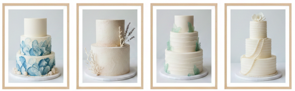
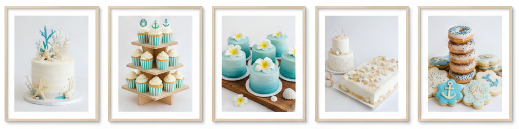
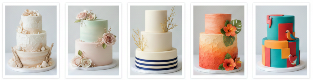
Stunning Beach Wedding Cake Design Ideas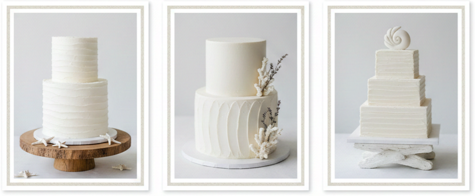
Minimalist White With Coastal Texture
A white cake with subtle texture looks timeless against ocean blues and sandy neutrals. Gentle wave patterns, palette-knife sweeps, soft horizontal ridges, and matte finishes keep the look elegant without feeling busy. This style pairs well with a simple topper or a small floral cluster that will not compete with the scenery.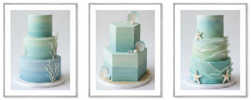
Ocean Ombré With Soft Sea Tones
Ombré designs photograph beautifully at the beach because they mirror the shoreline gradient. Pale blues, seafoam greens, and muted aqua shades keep the look refined. For humid days, we choose smoother blending and avoid heavy paint-style finishes that can smudge or dull.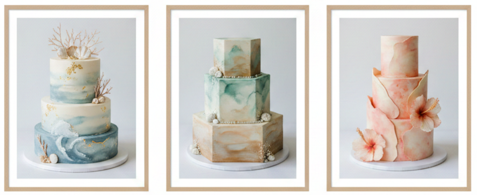
Watercolor Coastal Cakes
Watercolor effects feel romantic and artistic, especially in palettes like dusty blue and ivory, sea-glass green and sand, or blush and pale coral for sunset weddings. Humidity can affect smudging, so we keep these finishes protected until close to display time.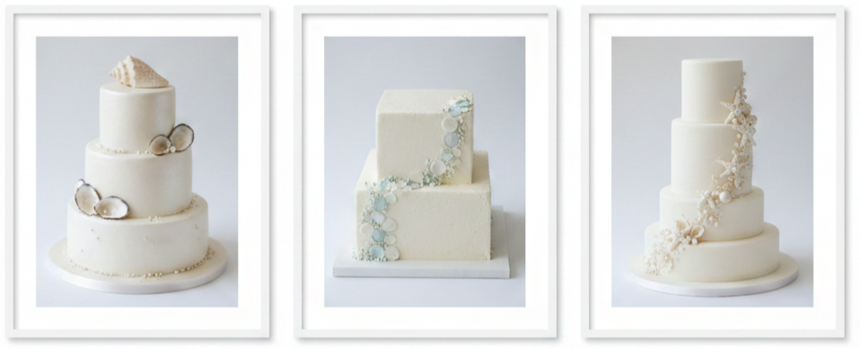
Pearl And Shell-Inspired Elegance
Shell details look elevated most when used sparingly. Small sugar shells at the base, delicate pearl accents, or a single shell motif per tier can create a beach feel without turning the cake into a novelty.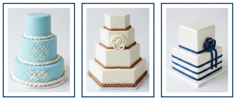
Nautical Rope And Knot Detailing
Rope borders and knot-inspired piping give a coastal vibe without relying on literal beach icons. A neat rope border around a tier base or clean stripe work can look polished and classic, and these details stay more secure when built on a firm frosting base.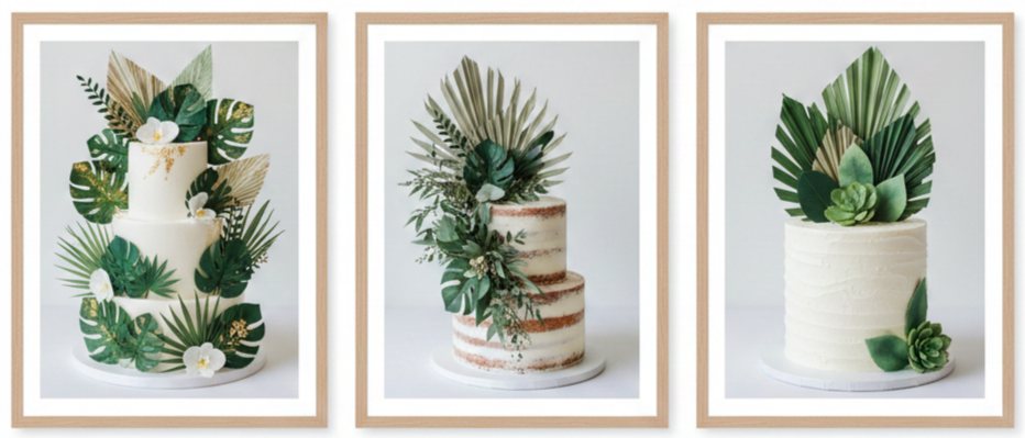
Palm Leaves And Tropical Greenery
Greenery looks fresh in bright beach light and adds a modern touch. Palm-inspired sugar shapes or safe decorative greenery accents can create a bold look without needing fragile structures.
Beach-Themed Decorations That Look Elevated
- Edible Sand That Looks Real: An edible sand effect looks surprisingly realistic with the right ingredients. Fine cookie crumbs, toasted coconut, brown sugar blends, or crushed vanilla wafers can give a sandy finish, especially when dusted lightly at the base to keep the look tasteful and clean.
- Sea-Glass Inspired Accents: Sea-glass colors look best in small touches. Translucent candy pieces, pale aqua sugar shards, and lightly tinted accents can add coastal charm while still looking wedding-appropriate. Keeping the shades soft helps the design stay refined.
- Toppers That Stay Put In Wind: Wind-friendly toppers tend to be low-profile, heavier, and secured with sturdy picks. Acrylic toppers and solid wood toppers usually hold better than lightweight paper designs when the breeze picks up.
- Cake Stands That Match The Setting: Outdoor stability starts at the base. Wide stands, non-slip pads, and sturdy tables reduce wobble, especially on uneven ground. Natural wood stands look great at the beach, and a sealed cake board keeps the cake safely separated from raw surfaces.
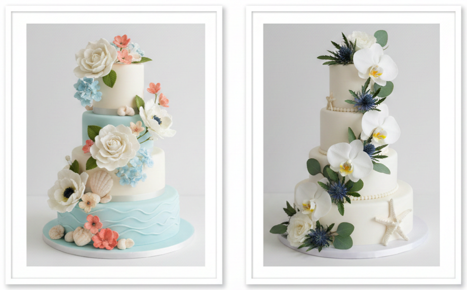
- Fresh Florals With A Coastal Color Plan: Coastal florals look cohesive when the palette matches the environment. Whites, creams, sandy beige accents, soft blush, coral, and muted greens photograph beautifully, and intentional placements like a cascade or cluster resist wind better than scattered petals.
Creative Alternatives To A Traditional Tiered Cake
- A Single-Tier Statement Cake: A single-tier cake can still feel dramatic when the design has one strong focal point like texture, florals, or a soft ombré finish. For larger guest counts, a sheet cake prepared off-site or a dessert table keeps servings easy without adding outdoor risk.
- Cupcake Towers With Coastal Styling: Cupcakes work well for beach receptions when the display stays sheltered. Coordinated wrappers, simple toppers, and a clean tiered stand keep the presentation wedding-ready while also making serving quick.
- Mini Cakes For Guests Or Tables: Mini cakes give a boutique look and reduce the pressure of one large cake sitting outdoors. They also photograph well when styled consistently across tables.
- Sheet Cake Back-Up With A Display Cake: This combination keeps the cake moment polished while making serving practical. A small display cake handles photos and cutting, and guests get served from a sheet cake stored in a cooler, safer spot.
- Donuts, Macarons, And Cookie Stacks: These desserts can fit a beach theme and usually handle warmth better than soft-frosted tiered cakes. Covered displays still matter to protect them from sun, wind, and sand.
Color Palettes That Match The Ocean Backdrop
- White And Sandy Neutrals: White and sandy tones feel timeless at the beach and work with almost any decor plan. A textured white finish with soft beige accents fits naturally into coastal photos.
- Seafoam And Soft Blush: Seafoam adds a coastal note, and blush keeps the look romantic. This palette works especially well for spring and early summer weddings with softer light.
- Navy, Ivory, And Gold Accents: Navy creates strong contrast in bright outdoor settings. Since dark colors absorb heat, we use navy in smaller details like thin bands or lettering, then balance it with ivory and light gold accents.
- Sunset Tones: Coral, peach, and warm pink shades match late afternoon and sunset celebrations beautifully. This palette pairs exceptionally well with tropical florals and softly textured frosting.
- Bright Tropical Colors: Bold palettes can feel festive when they stay controlled. Teal, hibiscus, and mango tones work best when the design keeps clean lines and limits the number of colors used at once.
Practical Tips To Keep A Beach Wedding Cake Looking Perfect
- Choose Shade First, Then Choose Design: Shade reduces melting risk, protects color, and keeps the surface cleaner. Even partial shade can noticeably improve stability and appearance.
- Time The Setup Close To Serving: Less outdoor exposure usually means a cleaner finish and easier slicing. We plan delivery and setup as close to cake cutting as possible so the cake stays fresh for photos and serving.
- Use Strong Internal Supports: Tiered cakes need strong structure, especially after travel and on uneven ground. Central dowels, sturdy boards under each tier, and a strong base board reduce shifting and keep the cake level.
- Select A Sheltered Display Spot: We avoid wide-open wind-facing locations. Spots near a wall, inside a tent, or behind a windbreak protect the cake from wind and sand and keep decorations in place.
- Keep The Cake Covered Until The Moment It’s Needed: A cake cover helps block sand and sea air. Keeping the cake covered until the main photo and serving moment keeps it looking cleaner and more polished.
- Build A Simple Cake Emergency Kit: A small kit can handle quick fixes. A small spatula smooths edges, clean cloths manage touch-ups, extra flowers or backup decor fill gaps, gloves keep handling clean, and toothpicks or small skewers secure loose pieces.
How To Work With Your Baker For A Beach Wedding Cake
- Share The Real Timeline And Location Conditions: Bakers plan best when they have the whole picture. We share ceremony time, reception time, cake cutting time, travel distance, and what the venue provides in shade, tenting, and refrigeration.
- Ask About Outdoor Stability Options: A stable plan starts with the finish and design. We confirm which frosting, fillings, and decor will handle the weather, and we decide whether the cake should stay indoors until close to serving.
- Confirm Delivery And Setup Responsibilities: Beach locations can be tricky to access. We confirm parking rules, permit requirements, walking distance to the setup area, delivery time windows, and who is responsible for moving the cake after setup.
- Discuss A Backup Serving Plan: A backup serving plan makes everything easier. A sheet cake stored in the coolest available location keeps servings smooth, while the display cake stays focused on photos and presentation.
Budget-Friendly Beach Wedding Cake Ideas
- Keep The Design Clean And Let The Setting Do The Work: A simple textured cake can look more expensive than a crowded design because it feels intentional. One strong feature like waves, a soft ombré, or a floral accent usually looks more polished than combining multiple styles.
- Reduce Tier Count And Increase Servings Separately: A smaller display cake plus a sheet cake for servings keeps costs down and improves outdoor stability. Guests still receive cake, and the display stays manageable.
- Use Fresh Greenery For Visual Impact: A small greenery arrangement can look modern and elevated without intricate sugar work. Secure placement and food-safe prep keep it practical outdoors.
- Choose Seasonal Elements: Seasonal flowers and flavors usually taste better, look fresher, and cost less. Seasonal choices also tend to match coastal palettes naturally.
Conclusion
Beach wedding cakes turn out best when the design matches real outdoor conditions instead of only looking good in a studio photo. Textured white cakes, soft ocean ombrés, and minimalist greenery styles usually look stunning by the shoreline and stay stable with the right planning. Shade, smart timing, secure decor, and reliable frosting choices keep the cake photo-ready and easy to serve from the first look to the last slice.
Key Takeaway: A beach wedding cake looks and performs its best when the finish stays stable, the structure stays supported, decorations stay wind-secure, and outdoor exposure stays short.
FAQs
What Is The Best Cake Size For A Smaller Beach Wedding Of 30–50 Guests?
We usually recommend a single-tier or small two-tier display cake paired with a kitchen sheet cake for extra servings. This setup keeps the display easier to manage outdoors and still gives a polished cake-cutting moment for photos.
How Do We Keep A Cake Table Stable On Sand?
A sturdy table with a wide base matters most, and level support under the legs, such as flat boards or stable platforms, keeps the surface from shifting. Non-slip pads under the cake stand also help, and narrower pedestal stands tend to wobble more outdoors.
Are Metallic Finishes Safe And Practical For Beach Cakes?
Metallic accents work well in small details like thin bands or lettering. Heavy metallic coverage can dull in humid salt air, so subtle metallic touches typically look cleaner and stay more consistent in photos.
What Cake Decorations Work Best For A Windy Ceremony-To-Reception Transition?
Heavier toppers, low-profile floral accents, and secured sugar elements hold up best. Lightweight paper toppers, loose petals, and tall fragile pieces are more likely to shift when the breeze picks up.
What Is A Smart Serving Plan When The Reception Space Has Limited Refrigeration?
We keep the display cake smaller and bring it out close to cake cutting, then serve guests from a separate cake stored in the coolest available location. This keeps texture consistent and reduces weather-related issues.
Golden Wedding Ring
| Karat | Color Depth | Scratch Resistance | Daily Wear Fit | Notes |
| 10K | Lighter | High | Strong | More alloy metals |
| 14K | Rich | High | Best Balance | Most common choice |
| 18K | Deeper | Medium | Good | Shows wear sooner |
| 22K | Very Rich | Lower | Limited | Softer, dents easier |
What A Golden Wedding Ring Symbolizes
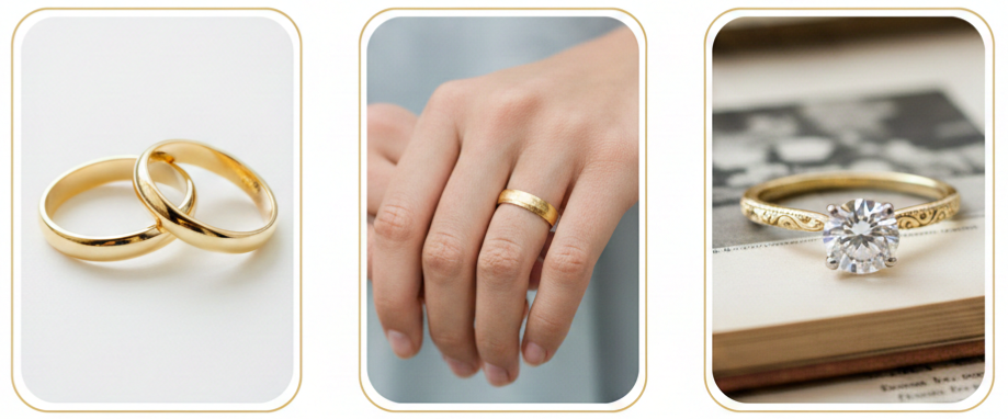
A golden wedding ring keeps its place for practical reasons and personal ones. Gold has a long history as a sign of commitment, and it still works for modern life because it fits into everyday routines without looking out of place. The color reads warm and familiar, and the metal has enough flexibility to suit many styles, from a simple polished band to a ring with texture, engraving, or stones. When we choose a golden wedding ring, we usually want something that stays meaningful, looks refined in photos, and still feels right years later when it becomes part of daily life.
Types Of Gold Used In Wedding Rings
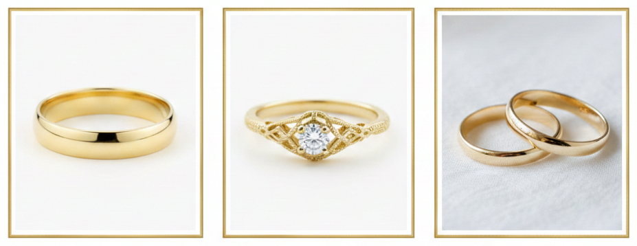
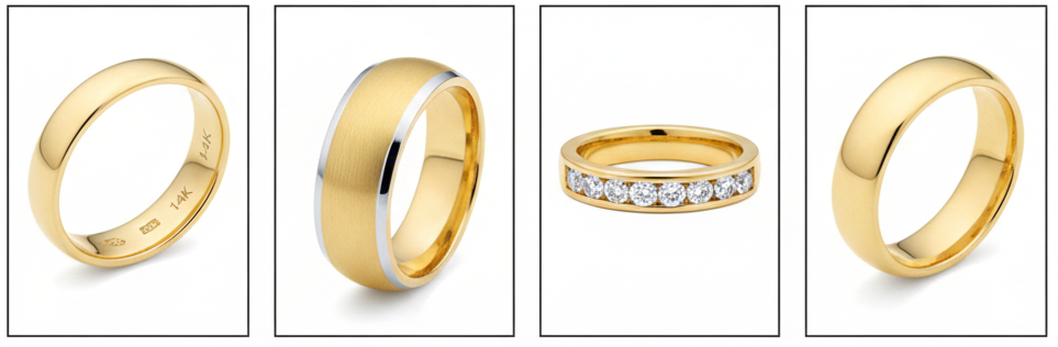
Yellow Gold
Yellow gold is the classic look most people imagine when they picture a wedding band. It carries a rich, warm tone that stays consistent over time because it does not rely on surface plating to maintain its color. Many couples choose yellow gold when they want a traditional appearance that pairs well with vintage-inspired designs or a timeless, minimalist band.
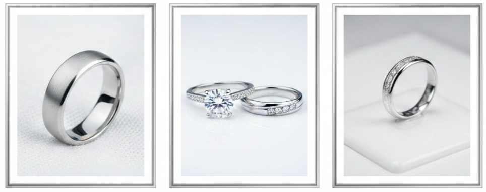
White Gold
White gold has a cooler, brighter appearance that fits modern styling and pairs nicely with diamonds and platinum-toned jewelry. Many white gold rings use rhodium plating to create a crisp white finish. Over time, that plating can wear down through daily contact, which may reveal a slightly warmer tone underneath. Re-plating is common and restores the bright surface when the color shift becomes noticeable.
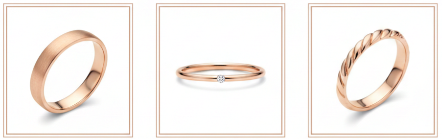
Rose Gold
Rose gold has a soft blush tone created by mixing gold with copper. It can look subtle or more pronounced depending on the karat and finish. Rose gold has a distinctive warmth that stands out without feeling flashy, which makes it popular for couples who want something slightly different while still keeping a classic metal choice.
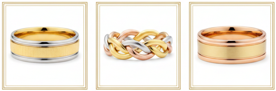
Two-Tone And Tri-Tone Gold
Mixed-tone rings combine two or three gold colors in one band, such as yellow and white, or yellow, white, and rose together. This style adds contrast and detail and also makes it easier to match the ring with different jewelry colors. Two-tone and tri-tone bands work well for people who wear both gold and silver accessories and want a ring that blends with everything.
Gold Purity Explained (10K, 14K, 18K, 22K)
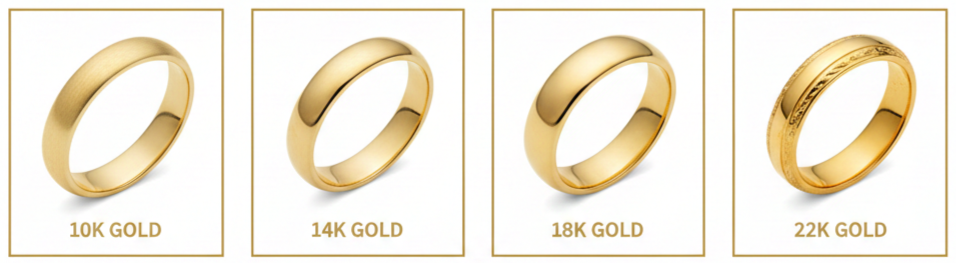
- What Karat Means: Karat measures how much pure gold is in the ring. Pure gold at 24K is usually too soft for a daily wedding band, so most rings use gold mixed with other metals. Those added metals improve durability while also influencing the final color and how the ring wears over time.
- 10K Gold: 10K gold has a lower percentage of pure gold and a higher percentage of alloy metals, which often makes it more resistant to scratches and dents. It is a practical fit for very active routines or jobs that involve frequent hand use. The tradeoff is a lighter gold tone compared with higher karats.
- 14K Gold: 14K gold is one of the most common choices because it balances durability and a rich gold appearance. It handles daily wear well, holds its shape, and keeps a strong gold tone without being overly soft. Many people see 14K as the “everyday sweet spot” for wedding rings.
- 18K Gold: 18K gold has more pure gold, which typically creates a deeper, richer color, especially in yellow gold. It can feel more premium in tone and weight. Since it is softer than 14K, it may show surface wear sooner depending on work, hobbies, and how frequently the ring contacts hard surfaces.
- 22K Gold: 22K gold has a very high gold content and a bold, saturated gold color. It is often chosen for cultural or traditional reasons where that deep tone matters. Because it is softer, the design structure and daily wear habits become more important, especially for long-term everyday wear.
Popular Golden Wedding Ring Styles
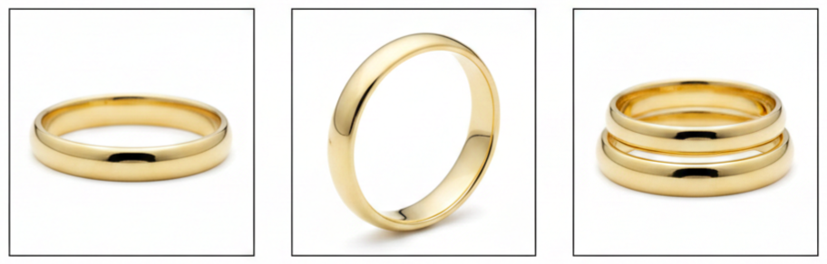
Classic Plain Band
A plain gold band stays popular because it never looks dated. With this style, craftsmanship matters because the ring relies on clean proportions, smooth edges, and consistent finishing. A well-made plain band feels comfortable, looks balanced from every angle, and pairs easily with other jewelry.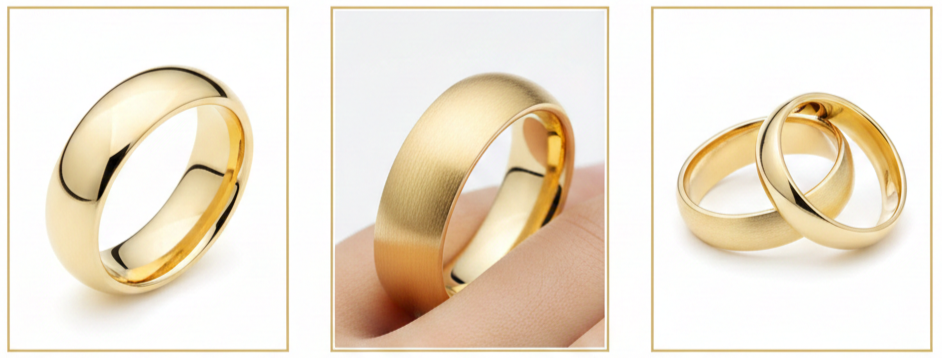
Comfort-Fit Bands
Comfort-fit rings have a rounded interior that feels smoother against the finger. Many people like how comfort-fit styles slide on and off more easily and feel less restrictive during hand movement. This can be especially noticeable on wider bands where a flat interior may feel tighter.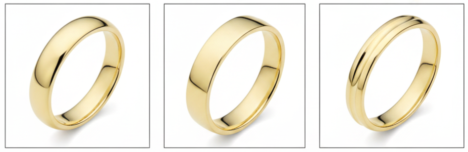
Domed, Flat, And Knife-Edge Profiles
A domed ring has a rounded outer surface that reflects light softly and reads traditional. A flat profile looks modern with clean, straight lines. A knife-edge profile includes a subtle raised ridge down the center that adds structure and definition without needing stones or heavy engraving.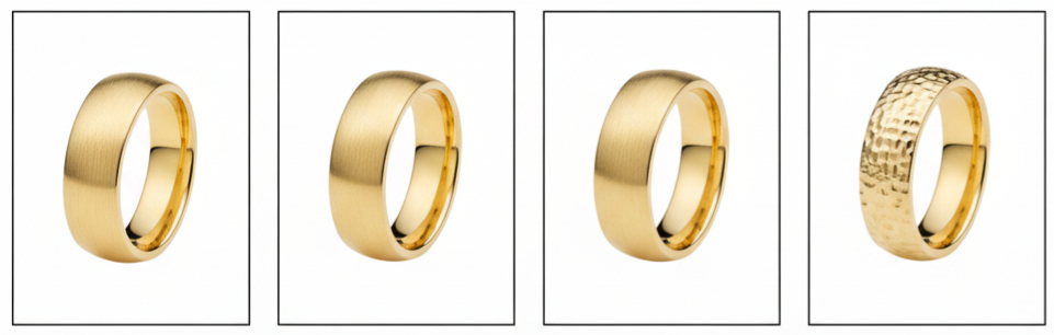
Textured And Matte Finishes
Finishes shape how the ring looks under light and how visible everyday wear becomes. A high-polish finish looks bright and reflective, though light scratches can show sooner. Brushed and satin finishes create a softer sheen and usually disguise small marks better. Matte finishes look low-shine and modern, though they may develop shine in high-contact areas. Hammered finishes add irregular texture and character, and many people like how that texture naturally hides everyday scuffs.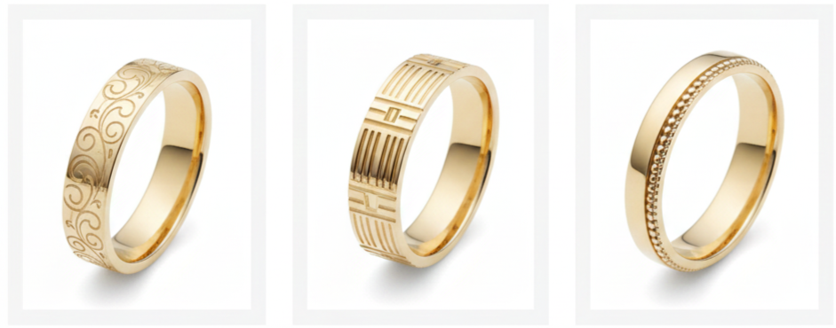
Engraved And Patterned Bands
Engraving adds detail through repeating patterns, geometric lines, or decorative edges like milgrain. These designs can feel vintage-inspired or clean and modern depending on the pattern style. Patterned bands keep the ring visually interesting without relying on stones.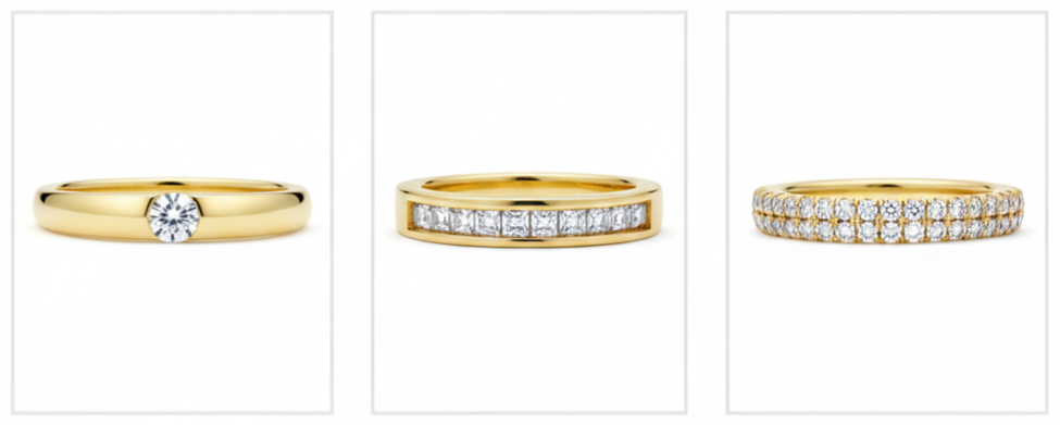
Diamond Or Gem Accents
Stone accents range from subtle to bold. A single accent stone adds a small point of sparkle. Channel-set stones sit flush within a channel for a smoother silhouette. Pavé details add multiple small stones along the surface for more shine. With any stone option, secure setting work matters because daily wear includes contact, friction, and movement that can loosen stones over time.
Choosing The Right Width And Thickness
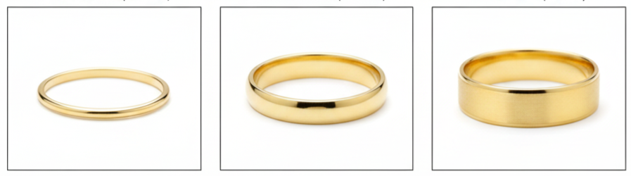
- Ring Width: Narrow bands around 2mm to 4mm feel subtle and lightweight, and they pair easily with an engagement ring. Medium bands around 5mm to 7mm feel balanced and noticeable without looking bulky. Wide bands around 8mm and up create a bold look and allow more space for patterns, textures, and design details.
- Ring Thickness: Thickness affects durability and how “solid” the ring feels. A very thin ring may be more likely to warp over time, while an overly thick ring can feel heavy and less comfortable for all-day wear. Many people choose a thickness that feels sturdy, sits comfortably, and supports the ring’s long-term shape.
Matching Rings As A Couple
Some couples like matching sets, while others prefer rings that share a similar vibe without being identical. Both approaches work well when the choices feel intentional. Matching sets usually focus on the same gold color, the same finish, or the same profile shape. Complementary sets keep a shared element, like the same gold tone with different widths, or similar edge details that look connected while still fitting each person’s style.
Comfort, Fit, And Sizing Tips
- How A Ring Should Feel: A properly fitted ring slides over the knuckle with slight resistance and then sits securely at the base of the finger. It should not pinch, leave deep impressions, or rotate constantly throughout the day.
- Sizing Considerations: Finger size can change with temperature, hydration, and daily activity. Hands may swell in heat or after exercise and may shrink in cold weather. Many jewelers recommend measuring when hands feel normal, not immediately after heavy activity or cold exposure.
- Comfort-Fit Vs Standard-Fit: Comfort-fit rings can feel slightly roomier because of the rounded interior. Even when the size number matches, the sensation can differ from a standard-fit ring. Trying both styles helps confirm which interior feels better during movement and long wear.
- Resizing Practicalities: Many gold rings can be resized, especially plain bands. Resizing can be more limited with patterns, eternity-style stone layouts, or multi-tone designs. It helps to confirm resizing eligibility before purchase, especially when choosing a detailed style.
Customization Ideas That Keep The Ring Personal
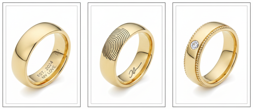
- Inside Engraving: Inside engravings add meaning without changing the ring’s exterior. Many people choose initials, dates, short phrases, or coordinates. This option keeps the ring’s style clean while making it personal.
- Handwriting Or Fingerprint Details: Handwriting engraving can turn a signature or note into a wearable detail. Fingerprint designs add a private, subtle feature that feels unique without looking overly decorative.
- Hidden Stones And Design Touches: A hidden stone inside the band adds meaning without changing the visible style. Edge details like milgrain, beveling, or rounded corners can also shift the ring’s look and comfort while still keeping a simple overall appearance.
How To Budget For A Golden Wedding Ring
Budgeting becomes easier when we focus on the choices that change the final price most. Karat impacts cost, and higher karat gold usually costs more. Ring weight also matters because wider and thicker bands contain more gold. Design complexity adds labor cost, especially with engraved patterns, custom textures, or mixed-metal construction. Stones add cost based on type, size, and setting style. Brand and craftsmanship can also influence pricing, especially when warranties and service plans are included. A practical budget usually prioritizes comfort and solid construction first, then adds design details like finish, engraving, or stones based on preference.
Where To Buy A Golden Wedding Ring
A local jeweler usually offers in-person sizing, finish comparisons, and direct input on comfort details like width, edge shape, and interior fit. Many also provide long-term services like resizing, refinishing, inspections, and repairs. Online stores often provide larger selections and convenient browsing, though the best experiences include clear specifications, close-up images, and straightforward sizing guidance. In either case, it is smart to confirm the ring’s karat, gold color, width, thickness, interior style, resizing eligibility, return policy, and warranty coverage before purchase.
What To Look For In Quality And Craftsmanship
- Hallmarks And Stamps: Gold rings usually include stamps like 10K, 14K, 18K, or 22K, and some include a maker’s mark. These markings support transparency about the metal content and help confirm what the ring is made of.
- Finish Consistency: A well-made ring looks even in finish and feels smooth along the edges. Transitions between surfaces, such as polished-to-brushed sections, should look intentional and clean rather than uneven. A ring should also feel comfortable against the skin and not catch on clothing.
- Stone-Setting Security: Rings with stones should show secure, symmetrical setting work. Prongs should feel smooth and properly finished, and stones should sit straight without looseness. Channel settings should keep stones aligned and protected without gaps where shifting could begin.
- Structural Integrity: The ring should feel solid for its size. Hollow or overly light construction may feel less durable over time. A well-built band holds its shape and stays comfortable during everyday wear.
Caring For A Golden Wedding Ring
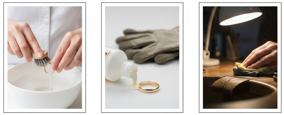
- At-Home Cleaning: Mild soap and lukewarm water work well for most gold rings. A brief soak followed by a soft brush helps remove residue, then a thorough rinse and gentle drying keeps the finish clear. This method suits plain bands and many stone-set rings, though delicate settings benefit from gentle pressure and careful handling.
- Avoiding Common Damage Sources: Harsh chemicals can dull finishes and may affect settings over time. Abrasive surfaces increase scratching, especially on polished finishes. Heavy impact can dent softer gold alloys, which is more noticeable as karat increases.
- Professional Maintenance: Periodic inspections confirm settings remain secure and the band stays structurally sound. Polishing refreshes shine, and refinishing restores brushed or matte textures when they naturally smooth out from wear.
Common Mistakes To Avoid
A few common missteps can turn a ring that looks great into one that feels frustrating. Choosing a ring based on looks alone can lead to comfort issues, especially with wide bands or sharper profiles. Picking a karat level that does not match daily routines can cause faster wear than expected. Skipping sizing checks and ignoring policies on resizing, returns, and warranty coverage can limit options later. Neglecting routine maintenance can also lead to avoidable problems, especially with white gold plating or stone settings that benefit from periodic inspections.
Conclusion
A golden wedding ring stays a favorite because it blends tradition with real-world wearability. When we pick a gold color that matches personal style, choose a karat that fits daily routines, and select a width and profile that stay comfortable for long wear, the ring becomes an easy part of everyday life. Strong craftsmanship checks and clear purchase policies protect that choice, and routine cleaning and occasional professional service keep the ring looking and feeling right over time.
Key Takeaway: A golden wedding ring feels right long-term when the gold color, karat, width, and profile match real daily wear, and when the ring is supported by solid craftsmanship checks and consistent care.
FAQs
How do we choose a Wedding Ring Finish That Keeps Its Look Longer?
Brushed, satin, and hammered finishes usually disguise light scratches better than high polish. A polished finish still works well for daily wear, especially since professional polishing can restore shine when the surface starts showing contact marks.
What Details Should We Confirm When Ordering A Golden Wedding Ring Online?
We usually confirm the karat, width, thickness, interior style, resizing eligibility, return terms, and warranty coverage. Clear specifications and strong policies matter more online because we rely on measurements rather than in-person comparisons.
How Do We Know Whether A Wider Band Will Feel Comfortable All Day?
Wider bands place more metal against the finger, so interior shape matters. Comfort-fit interiors usually feel better for wider widths, and trying a similar width in person makes daily comfort easier to predict.
What Is The Most Reliable Way To Protect Stone Accents In A Gold Wedding Ring?
Secure settings matter most, and routine inspections help keep stones tight. Removing the ring during heavy work or rough activities also reduces impact and abrasion that can loosen settings over time.
What Signs Tell Us It Is Time To Have A Golden Wedding Ring Serviced?
We usually look for visible dents, a finish change that looks uneven, snagging on fabric, fit changes that cause frequent spinning, or any looseness in stone settings. Any shift in comfort or security is a good reason to schedule a professional check.
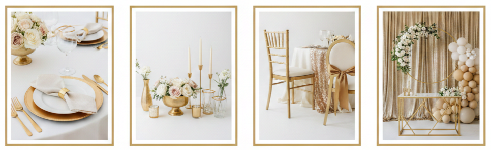
Golden Wedding Theme
| Gold Finish | Best For | Avoid Using It For |
| Brushed Gold | Flatware, candleholders, chair accents, and modern signage frames | High-glare backdrops, glossy printed signs |
| Matte Gold | Signage hardware, minimalist décor, centerpiece bases, modern installations | Areas needing shine or sparkle for impact |
| Antique Gold | Vintage-inspired frames, ornate candleholders, classic venues, memory tables | Ultra-modern décor with sharp lines |
| Champagne Gold | Linens accents, soft romantic palettes, dessert display hardware, gentle glam | Very high-contrast palettes that need bold shine |
| Polished Gold | Chargers, statement arches, bold table accents, glam evening styling | Bright direct lighting zones that cause glare |
What A Golden Wedding Theme Means
A golden wedding theme uses gold as the main accent that ties the entire celebration together. We use it to create a warm, polished look that feels meaningful for milestone events like a 50th anniversary, vow renewal, or a formal wedding day. Gold also works in every season, so we can style it to feel light and airy in spring and summer, or rich and cozy in fall and winter.
- Style Directions: We can shape the theme into classic elegant, modern minimal, vintage opulence, or rustic gold, depending on the venue, the couple’s taste, and the overall mood we want guests to feel.
- Classic Elegant: We lean into refined gold touches, traditional florals, and formal table settings that feel timeless.
- Modern Minimal: We keep lines clean, décor simple, and gold accents subtle so everything looks fresh and intentional.
- Vintage Opulence: We layer textures and ornate details, using antique-inspired gold elements to create depth.
- Rustic Gold: We blend natural materials like wood, linen, and greenery with soft gold highlights for a relaxed look.
Choosing Your Gold Color Palette
A strong palette makes the golden wedding theme look cohesive instead of scattered. Gold changes depending on lighting, surrounding colors, and the finish we choose, so we get the best results when we pick a direction early and stay consistent from stationery to tablescapes.
- Timeless Pairings: White and gold feel crisp and formal, ivory and gold feel softer and romantic, and champagne and gold feel warm and understated while still looking elevated.
- Bold Combinations: Black and gold feel dramatic and glam, navy and gold feel deep and classic, and emerald and gold feel rich and celebratory, especially for evening events.
- Soft Options: Blush and gold feel gentle and flattering, dusty rose and gold feel muted and refined, and sage and gold feel fresh and natural, especially with brushed finishes.
- Keeping Gold Balanced: We usually choose one main gold finish, repeat it in just a few key places like table settings, signage, and lighting accents, then leave breathing room with neutrals, greenery, and soft florals so the metallic details feel intentional.
Invitations And Stationery Ideas
Invitations set expectations before guests arrive, so we use them to signal the tone of the golden wedding theme right away. When the paper quality, fonts, and gold accents match the rest of the décor style, everything feels more coordinated and premium.
- Premium Print Options: Foil stamping adds a clean shine, embossing or debossing adds texture that feels upscale, and letterpress creates a crisp impression that looks polished when paired with minimal gold design.
- Day-Of Stationery: Matching ceremony programs, place cards, menus, welcome signs, and seating charts to the invitation suite creates a consistent look that guests notice, even when the details are subtle.
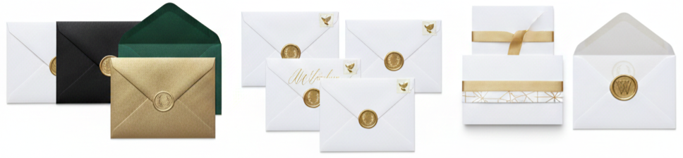
- Finishing Details: Vellum wraps with gold sticker seals, wax seals in champagne tones, envelopes with light gold patterns, and warm metallic calligraphy add structure without making the paper goods feel busy.
Ceremony Styling With A Golden Wedding Theme
The ceremony space is where we want gold to feel meaningful and elegant, not overwhelming. Gold works best here when it supports the structure of the setup, frames key areas like the altar, and adds warmth in the places guests naturally look.
- Aisle Styling: Glass hurricanes with gold bases, lantern clusters at the aisle entrance, ivory petal pathways paired with gold-edged signage, and simple aisle markers with gold ribbon details keep the look clean and photogenic.
- Backdrop Ideas: A gold geometric arch with asymmetrical florals feels modern, a gold frame altar with greenery feels classic, a curved gold stand with hanging florals feels contemporary, and a minimal draped backdrop with gold tiebacks feels soft and formal
- Guest Area Touches: Reserved seating signs with thin gold borders, simple chair accents spaced out evenly, and a welcome table styled with cohesive floral and gold pieces keep the ceremony area tied to the overall theme.
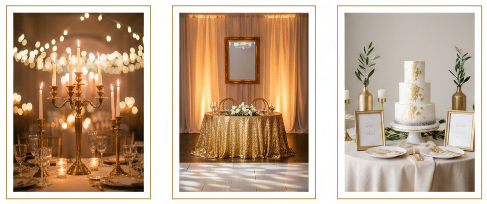
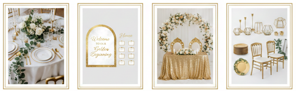
Reception Decor That Brings The Gold To Life
The reception is where the golden wedding theme becomes most immersive because guests spend the most time here. The goal is to repeat gold in a few high-impact areas so it looks deliberate rather than scattered across every surface.
- Tablescape Essentials: Gold chargers paired with white plates create clean contrast, brushed gold flatware looks modern, glassware with thin gold rims feels subtle and upscale, and neutral napkins look finished when secured with gold rings or ribbon.
- Centerpiece Structure: Gold compotes with soft florals look classic, slim gold candleholders grouped in clusters add height without blocking views, gold-trimmed vases mixed with clear glass add dimension, and low arrangements with minimal gold accents keep tables conversational.
- Linen And Chair Styling: Ivory and champagne linens make gold feel warmer, sequin runners work best when used sparingly, gold chairs look bold and glamorous, and neutral chairs with small gold accents help keep the look balanced.
- Statement Decor: Hanging installations with gold hoops and florals create a focal point, sweetheart table backdrops with gold framing feel refined, balloon installations look polished in champagne and ivory tones, and metallic draping behind the dance floor adds a glam finish without clutter.
Golden Wedding Theme Lighting Tips
Lighting affects how gold looks more than almost anything else. Warm lighting makes gold glow and feel rich, while harsh white lighting can make it look flat or overly reflective, so we plan lighting as part of the design rather than a last-minute upgrade.
- Warm Lighting Ideas: Candlelight on tables and entry areas, string lights overhead for outdoor setups, warm uplighting that flatters metallic décor, and chandeliers or pendants that add a formal finish all make gold look softer and more expensive.
- Placement Strategy: We place gold accents where light naturally hits, like near the dance floor, behind the sweetheart table, along the bar front, and around the dessert display, then position signage carefully to avoid glare in photos.
- Photo-Friendly Choices: Mixing metallic pieces with linen, greenery, matte ceramics, and brushed finishes helps prevent harsh reflections and keeps the gold looking smooth in camera flashes.
Bridal And Groom Style With Gold Accents
Attire brings the theme into the most personal parts of the day, so we use gold accents in a way that feels natural rather than flashy. When jewelry, accessories, and small details match the gold finish used in décor, the whole event reads as coordinated.
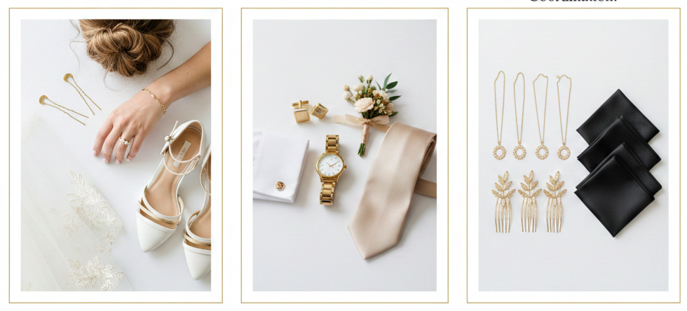
- Bridal Details: Gold jewelry that matches the décor finish, minimal gold hairpins or combs, subtle gold embroidery on a veil, and shoes with gold accents keep the look cohesive without overpowering the dress.
- Groom Styling: Gold cufflinks or tie clips, a classic gold-tone watch, boutonniere wraps with thin gold ribbon details, and tie colors like champagne, ivory, black, navy, or jewel tones keep everything aligned with the palette.
- Wedding Party Coordination: Matching bridesmaid jewelry in the same gold tone, coordinated hair accessories, and consistent pocket square styling keep the group photos looking polished and intentional.
Flowers That Pair Beautifully With Gold
Florals soften the metallic feel of gold and keep the theme from looking too sharp. We choose blooms and greenery that support warmth and texture, then balance volume so the arrangements feel lush without becoming heavy.
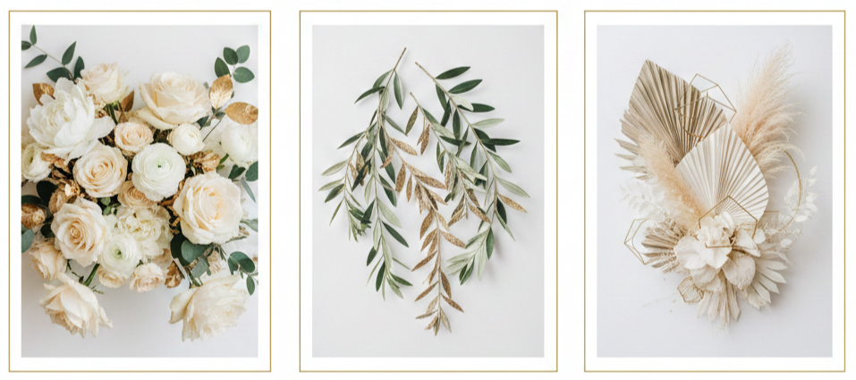
- Best Blooms: Cream roses create a classic look, white peonies add softness, orchids feel upscale, ranunculus adds delicate texture, and hydrangeas add volume that works well for ceremony and reception designs.
- Greenery Choices: Eucalyptus adds airy structure, Italian ruscus creates clean lines, and olive branches deliver a timeless look that pairs well with antique or champagne gold accents.
- Modern Textures: Dried palms add shape, pampas grass in champagne tones adds softness, and bleached foliage keeps the palette light and airy while still looking structured.
Cake, Dessert Table, And Drinks
Desserts and drinks give us another place to reinforce the golden wedding theme without overdecorating. Presentation matters here because these areas draw attention, create photo moments, and often become gathering points throughout the night.
- Cake Styling: Painted gold accents look refined, minimal gold leaf adds luxury without clutter, metallic edging between tiers gives structure, and a monochrome cake with one gold topper can feel modern and elegant.
- Dessert Table Setup: Gold trays paired with neutral risers keep the setup balanced, clean labels with gold typography keep everything cohesive, and subtle shimmer backdrops look more refined than heavy glitter.
- Drink Details: Gold-rimmed flutes for champagne, a signature drink menu with gold accents, and simple garnishes that match the palette keep the bar presentation aligned with the overall theme.
Golden Wedding Theme Photo Moments
Photo moments keep the theme visible throughout the day and help the final gallery look cohesive. We plan spaces guests naturally gravitate toward, then keep the styling clean so it photographs well from different angles.
- Backdrop Options: A gold shimmer wall with clean signage feels modern, draped fabric with gold framing feels soft and formal, a floral wall with gold trim feels classic, and a brushed gold hoop backdrop with minimal florals fits modern venues.
- Classy Props: One statement sign with a gold border, sparklers for a refined send-off, and champagne-toned confetti used in controlled moments keep photos from looking cluttered.
- Timing: Late afternoon portraits outdoors and early evening portraits indoors tend to flatter gold the most because the light looks warmer and softer.
Party Favors And Guest Experience Details
Favors and guest experience details feel more elevated when they match the theme instead of feeling like random add-ons. When packaging, signage, and display areas align with the golden wedding theme, even simple items look premium.
- Favor Ideas: Mini candles in neutral packaging with gold labels, chocolate boxes with gold foil, custom matchboxes designed to match stationery, and small photo keepsakes in gold-accent sleeves fit naturally into the theme.
- Experience Touches: A memory table with gold frames, a structured card display with gold accents, a guestbook station with matching signage, and a slideshow or anniversary timeline work especially well for milestone celebrations.
Budget-Friendly Golden Wedding Theme Ideas
A golden wedding theme can still look high-end on a realistic budget when we focus spending on the places guests notice most and simplify everything else. The key is using gold as a highlight, not a blanket covering every surface.
- High-Impact Spend Areas: Tablescapes, primary signage like a welcome sign and seating chart, and one focal backdrop such as a sweetheart table design or photo moment area create the strongest impression and show up in the most photos.
- Cost-Smart Choices: Renting chargers, chairs, and candleholders usually saves money while keeping the look polished, greenery can add volume without relying on expensive blooms everywhere, printed signage with gold accents can look refined without custom builds, and concentrating gold décor in key zones keeps the theme intentional.
Common Mistakes To Avoid
Small mistakes can make gold look mismatched or overly busy, so we keep the styling tight and consistent. Gold is easy to overuse, so restraint usually creates a more premium result.
- Too Many Finishes: Mixing yellow gold, rose gold, and brass evenly can look inconsistent, so sticking to one main finish strengthens the entire look.
- Too Much Shine: Overusing sequin fabrics, heavy glitter, and reflective décor creates visual noise, so balancing metallic accents with matte textures keeps the theme clean.
- Lighting Oversights: Harsh lighting makes gold look flat or overly reflective, so warm lighting and careful placement keep gold looking rich in photos and real life.
- Gold Everywhere: Gold works best as an accent, so focusing it in a few high-visibility areas keeps things elevated and avoids clutter.
Sample Styling Recipes For A Golden Wedding Theme
Styling recipes make decisions easier because they lock in palette, finish, and mood. Once we choose a recipe, it becomes much simpler to select florals, décor, stationery, and attire that all match.
Classic Elegant Recipe
Ivory, white, soft green, and gold paired with antique or brushed finishes, candle clusters, structured florals, and classic signage for a timeless, formal feel.
Modern Glam Recipe
Black, white, and gold with polished accents used in controlled spots, clean typography, geometric décor, and sleek tablescapes for a bold, upscale look.
Garden Luxe Recipe
Blush, champagne, greenery, and gold with champagne or brushed finishes, light linens, airy florals, and soft lighting for a romantic, refined mood.
Conclusion
A golden wedding theme looks most elevated when we treat it like a full design plan instead of adding gold touches randomly. Choosing one gold finish, sticking to a supporting palette, and repeating gold in a few high-visibility zones creates a cohesive look guests notice right away. Warm lighting, balanced textures, and matching stationery details pull everything together so the celebration feels polished and photographs beautifully.
Key Takeaway: We get the best golden wedding theme results when we choose one gold finish, repeat it in a few standout areas like tables, signage, and lighting, then balance the shine with neutrals, greenery, and warm light.
FAQs
How Do We Choose Between Brushed Gold And Polished Gold For A Golden Wedding Theme?
Brushed gold fits a softer, modern look with less glare in photos. Polished gold suits a formal, glam style with sharper shine, especially in evening lighting.
What Is The Best Way To Combine Gold With Other Metals Without Looking Mismatched?
Keeping gold as the main metal makes styling easier. Adding one secondary metal in small doses and repeating it in just a couple of places keeps the look cohesive.
Which Venue Styles Fit A Golden Wedding Theme Best?
Ballrooms, historic venues, modern industrial spaces, garden venues, and tented receptions all work well. Matching the gold finish and supporting colors to the venue lighting creates the cleanest result.
How Do We Keep A Golden Wedding Theme Looking Modern Instead Of Traditional?
Clean typography, minimal signage layouts, and structured décor lines push the style modern. Brushed or champagne gold finishes also feel more current, especially when balanced with neutral space and simple floral shapes.
What Are Unique Golden Wedding Theme Touches Guests Notice Right Away?
A strong welcome moment, a polished seating chart display, a cohesive tablescape, and one standout photo backdrop tend to grab attention immediately because guests naturally gather in those spaces.
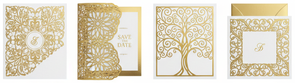
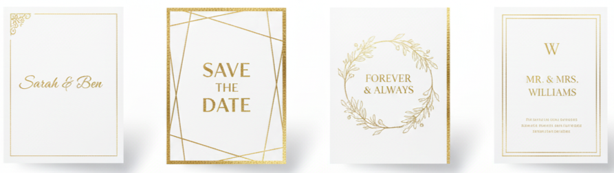
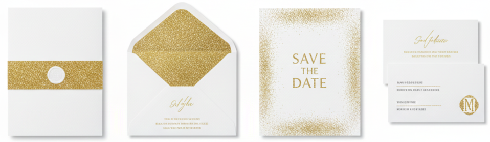
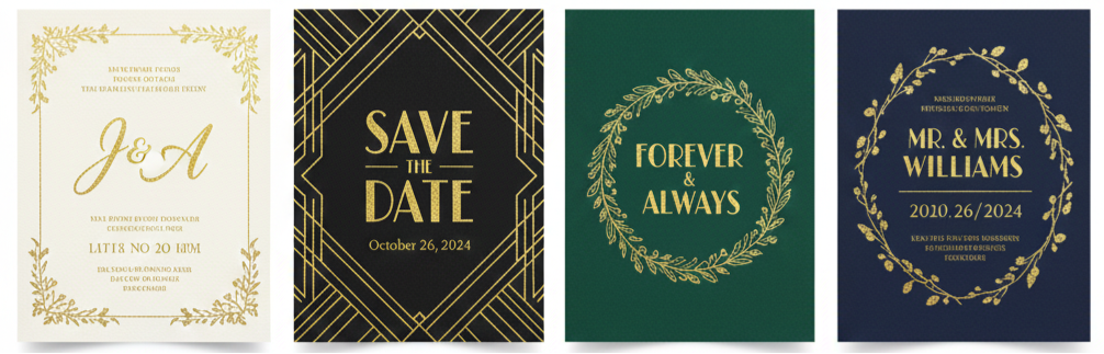
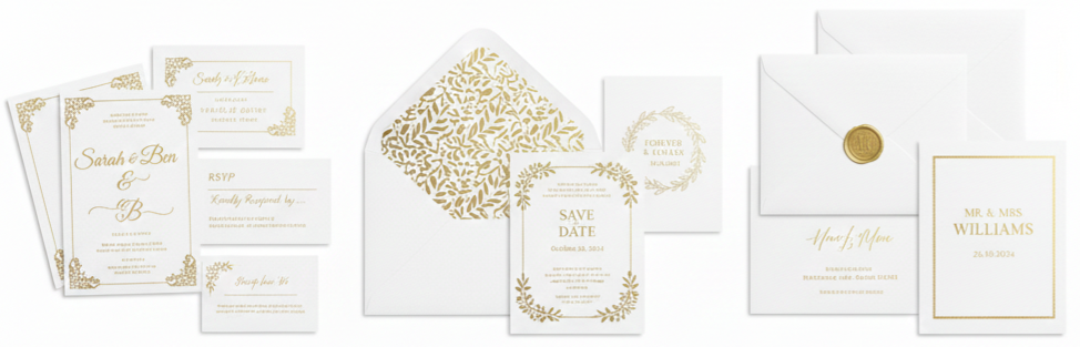
Golden Wedding Invitations
| Gold Tone | Best Color Pairings | Style Vibe |
| Yellow Gold | White, Black, Navy, Emerald | Classic, Formal |
| Rose Gold | Blush, Nude, Warm Gray, Terracotta | Romantic, Modern |
| Antique Gold | Cream, Sage, Taupe, Dusty Blue | Vintage, Understated |
Why Golden Wedding Invitations Feel Elevated
Golden wedding invitations set a polished tone right away. Gold stands out on paper because it catches light, so even simple layouts look intentional and photo-ready. We also like gold because it fits almost any wedding mood. It works for ballroom formality, modern venues, outdoor celebrations, and evening receptions with darker styling. Gold stays flexible across palettes too, so we can pair it with crisp whites, warm neutrals, deep jewel tones, or soft pastels without forcing the design.
- Style Signal: Gold communicates refinement before guests read a single line.
- Visual Impact: Metallic finishes show dimension in hand and in photos.
- Theme Flexibility: Gold adapts to classic, modern, vintage, and glam settings.
- Easy Coordination: Gold pairs well with most color palettes and decor choices.
Types Of Golden Wedding Invitations That Photograph And Print Beautifully
Not every “gold” invitation looks the same. The final effect depends on the printing method, paper choice, and how the design uses space. We get the best results when we choose a gold finish that matches the wedding style and keeps the text easy to read.
Foil-Stamped Gold Invitations
Foil stamping presses metallic foil into paper, creating crisp shine that looks premium on names, monograms, and borders. This option works best when we keep the typography clean and give the foil room to stand out.
Gold-Embossed Or Debossed Details
Embossing raises the paper and debossing presses it down, adding texture guests feel immediately. Gold paired with these textures looks refined, especially for crests, monograms, and subtle patterns.
Letterpress With Gold Accents
Letterpress creates a soft indentation in thick paper, which feels classic and substantial. We can add gold foil accents to balance the matte letterpress look with metallic highlights that feel formal.
Digital Printing With Gold-Look Ink
Digital printing uses gold-toned ink that looks more like a gold color than true metallic foil. It still looks elevated when we use premium paper and a restrained layout, and it is practical when we want easier edits or faster turnaround.
Laser-Cut Gold-Layered Invitations
Laser-cut overlays and wraps add dimension and reveal gold backing through intricate patterns. This style suits ornate themes and statement invitations where we want dramatic presentation.
Gold Border, Edge-Foil, And Gilded Details
Thin gold borders, small corner motifs, and gilded edges can add luxury without heavy decoration. This approach works especially well for minimalist and modern formal designs.
Gold Glitter Accents
Glitter can look festive when we keep it controlled, like on liners, belly bands, or small accent areas. We get the best look when we balance glitter with matte paper and clean typography.
Choosing The Right Gold Tone: Yellow Gold, Rose Gold, Or Antique Gold
Gold tone changes the entire feel of the suite, so we choose it based on palette, venue lighting, and the mood we want guests to feel. A gold that looks perfect online can shift under warm indoor lights, so we also keep the paper and finish in mind.
Yellow Gold
Yellow gold looks classic, bold, and instantly formal. It pairs well with white, ivory, black, navy, emerald, burgundy, and deep green, and it feels especially right for traditional ceremonies and black-tie receptions.
Rose Gold
Rose gold feels softer and more romantic, with a modern edge. It pairs naturally with blush, nude, warm gray, ivory, dusty rose, and terracotta, and it gives warmth without feeling too heavy.
Antique Gold
Antique gold looks muted and heritage-inspired, which makes it perfect for vintage themes and textured paper. It pairs well with cream, sage, taupe, chocolate, dusty blue, and warm neutrals, and it feels understated while still elevated.
Paper And Print Choices That Make Gold Look Premium
Gold finishes look only as good as the foundation beneath them. Paper texture, thickness, and finish change how metallic elements reflect light and how the suite feels in hand. When we match paper to the print method, the entire invitation suite looks more intentional and polished.

- Cotton Paper: Cotton stock feels soft and substantial, making it ideal for letterpress, debossing, and foil stamping. It creates an heirloom feel that guests notice immediately when they hold the invitation.
- Smooth Matte Cardstock: Smooth matte cardstock provides a clean, modern base that makes gold foil pop. This option works especially well for minimalist layouts that rely on crisp typography and spacing.
- Linen Or Textured Stock: Textured paper adds warmth and depth, which suits antique gold palettes and vintage-style typography. It also helps traditional suites feel richer without adding more decoration.
- Vellum Layers: Vellum creates an airy, translucent layer that looks elegant as a wrap or overlay. Gold printing on vellum works best for monograms, light motifs, and soft layering that does not crowd the main invitation.
- Thickness And Weight: Heavier paper instantly feels more formal, even with a simple design. That weight signals quality before guests even read the details.
Golden Invitation Styles By Wedding Theme
Gold can look classic, modern, bold, or vintage depending on what we pair it with. When we match the invitation style to the wedding theme, the suite feels cohesive instead of generic.
Classic White And Gold
A white base with gold foil names and formal typography feels timeless. This style fits traditional venues, formal dress codes, and elegant ceremonies.
Black And Gold Formal Glamour
Black paired with gold foil creates dramatic contrast that suits evening weddings and candlelit receptions. A clean layout keeps the look bold without feeling overwhelming.
Neutral And Gold Minimalism
Ivory, beige, and warm gray with thin gold accents feel calm and modern. The key is restraint, so the invitation stays edited and refined.
Vintage-Inspired Antique Gold
Antique gold on textured paper with scripts and monograms feels heritage-inspired. Wax seals and deckled edges can complement this style when we keep the layout structured.
Botanical Green With Gold Accents
Deep green and botanical elements with gold foil feel fresh and current while still formal. This combination works well for garden venues and natural palettes.
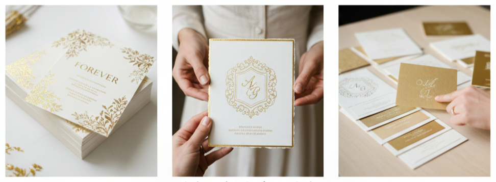
Custom Design Ideas That Make Gold Invitations Feel One-Of-One
Gold feels more memorable when we use it in details guests see up close. Personal touches also make the suite feel custom without requiring an overly complex design.
- Monograms And Crests In Gold: A monogram or crest instantly elevates the suite and creates a consistent visual thread across the invitation, RSVP card, details card, and envelope. A crest can also include subtle nods to the venue or theme without crowding the layout.
- Gold Envelope Liners: Liners create impact the moment guests open the envelope flap. Foil liners feel formal, printed gold patterns feel modern, and shimmer liners add warmth with a softer finish.
- Wax Seals With Metallic Highlights: Wax seals pair naturally with gold elements and add a premium finish to presentation. We can keep the seal color classic, like ivory or black, and tie in gold through metallic wax, gold cord, or a stamped emblem.
- Belly Bands And Wraps: Belly bands keep inserts organized and add a layered look that feels intentional. Vellum wraps with gold print, satin ribbons, and small gold tags all work when we keep the overall suite balanced.
- Edge Gilding: Gilded edges add quiet luxury that guests notice when they handle the invitation. This upgrade works especially well when the front design stays minimal and clean.
Wording That Works With Golden Wedding Invitations
Gold looks best when the text stays structured and easy to scan. We keep wording clean and organized so the metallic elements enhance the layout rather than compete with it.
- Invitation Essentials: The main invitation typically includes the host line, couple names, date, time, venue name, venue location, and a reception note when needed. We keep dress code notes short and place them where they do not compete with the names.
- RSVP Clarity: A separate RSVP card keeps the invitation face clean and helps guests respond quickly. We include a clear response deadline, the response method, and meal selections only when necessary.
- Details Without Overloading: A details card carries travel notes, parking guidance, schedule highlights, adults-only wording, and registry direction, usually through a wedding website. This keeps the main invitation visually calm while still giving guests practical information.
Golden Wedding Invitations For 50th Anniversary Celebrations
Gold also fits milestone celebrations, especially 50th anniversaries. The design can echo wedding-level elegance while shifting the content toward honoring the couple and making the event details easy to follow.
- Design Directions For Golden Anniversary Invitations: Formal anniversary invitations look great with cream stock, antique gold foil, and classic typography. A warm celebratory style can include subtle photo use or a gentle timeline motif paired with gold accents. A modern minimal style relies on white space, thin gold lines, and clean fonts for a fresh look.
- Anniversary Wording Elements: Anniversary invitations usually include the honoree names, celebration type, date, time, venue or home address, and RSVP details. Optional additions like dress code notes and memory-sharing prompts can add personality without clutter.
How We Keep The Full Invitation Suite Cohesive
A cohesive suite looks like a complete set rather than separate pieces. Consistency across typography, motifs, and envelope presentation makes the suite feel polished and intentional.
- Match Typography Across Pieces: We use one font pairing across the invitation, RSVP card, details card, and any additional inserts. Size and weight changes create hierarchy while keeping the overall look consistent.
- Repeat One Or Two Motifs: A thin gold border, monogram, small floral icon, or line pattern repeated across pieces ties the suite together without making it repetitive.
- Coordinate Envelope Presentation: Envelope color, liner choice, and addressing style should match the invitation mood. Gold ink addressing feels polished, hand calligraphy feels classic, and minimal printed fonts feel modern, and each works when aligned with the suite style.
- Use Inserts Strategically: We place extra details on separate cards so the main invitation stays clean. A reception card and details card keep information organized without overwhelming the invitation face.
Ordering Golden Wedding Invitations: Practical Decisions That Prevent Last-Minute Stress
Gold finishes can require extra production steps, so planning early helps maintain quality and avoids rushed design decisions. A simple, organized process also makes assembly and mailing much easier.
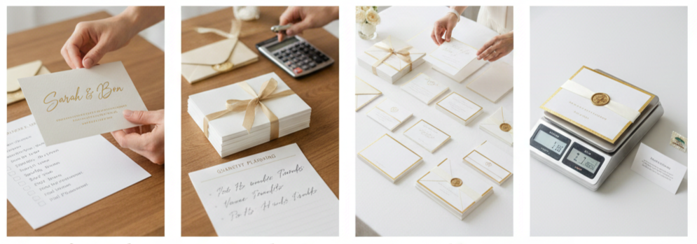
- Proofing And Sample Checks: Before approving, we verify spelling, formatting, spacing, date and time accuracy, venue details, RSVP deadlines, response methods, and website links. For foil and specialty finishes, we also confirm placement and margins so everything stays balanced.
- Quantity Planning: We count households rather than guests and add extras for keepsakes, photos, last-minute additions, and vendor needs like planners and photographers.
- Assembly Planning: We assemble one complete sample first, then keep every invitation consistent by stacking inserts in the same order and bundling them uniformly. A structured assembly approach keeps the suite neat and reduces mistakes.
- Postage Considerations: Thick paper, layered inserts, wax seals, and oversized envelopes can affect postage. We weigh a fully assembled sample and confirm postage before mailing to prevent returns and delays.
Where To Buy Golden Wedding Invitations
There are many places to buy golden wedding invitations, yet quality varies widely. We focus on print sharpness, paper options, and how clearly the vendor manages proofs and revisions.
- Online Invitation Studios: Online studios offer streamlined ordering and consistent production, making them practical for templates and semi-custom suites. When we choose strong paper and keep the layout clean, these options still look premium.
- Independent Designers And Artisan Stationers: Custom designers create bespoke layouts, crests, and curated finishes, which works well when we want a signature look. This route also supports specialty papers and more tailored guidance.
- Local Stationery Shops: Local shops let us see paper samples in person, which helps when comparing gold tones under real lighting and matching them to the wedding palette.
- What We Evaluate Before Ordering: We look for sharp foil edges, premium paper choices, consistent color accuracy, a clear proofing process, finishing upgrades like liners and edge gilding, and straightforward revision and reprint policies.
Presentation Details That Make Guests Remember The Invitation
Presentation matters because the invitation experience starts with the envelope. When envelope color, addressing, and finishing details align with the suite, everything feels more cohesive and memorable.
- Envelope Color Choices: White and ivory feel clean and formal, black feels dramatic and evening-forward, deep green and navy feel rich and classic, and warm taupe or sand feels modern and understated. The best choice matches the gold tone and overall wedding mood.
- Addressing Styles: Hand calligraphy adds a traditional, elevated look, while printed calligraphy fonts feel polished and consistent. Minimal sans-serif addressing looks modern and clean, and it works especially well for minimalist suites.
- Finishing Touches That Stay Practical: Thin ribbons stay mail-friendly, belly bands keep inserts organized, and wax seals placed inside the envelope avoid postal issues. These finishing touches elevate presentation without adding bulk.
Conclusion
Golden wedding invitations bring a refined, intentional feel to the first moment guests connect with the celebration. When we choose the right gold tone, pair it with quality paper, and keep the layout structured, gold becomes a clean highlight that elevates the full suite without taking over the design. Consistency across the invitation, inserts, and envelope presentation pulls everything together so the suite looks polished in hand and photographs beautifully on the day.
Key Takeaway: Gold invitations look their best when we use gold as an accent, rely on premium paper, keep wording structured, and stay consistent across every piece from the invitation to the envelope.
FAQs
How Do We Choose Between Matte Gold And High-Shine Gold?
Matte gold feels softer and more understated, while high-shine gold feels more formal and dramatic. We match matte finishes with minimalist or vintage styling and use high-shine finishes for black-tie looks or evening-forward suites.
What Envelope Colors Pair Best With Gold Without Looking Too Loud?
Ivory, warm white, deep green, navy, and soft taupe pair well with gold while keeping the presentation refined. Black also works when we want bold contrast for a formal look.
Should We Use Gold On Every Insert Card Or Keep It Only On The Main Invitation?
A small gold accent across the suite keeps things cohesive, yet we usually keep gold lighter on inserts. A small motif, thin border, or header line often connects the pieces without overpowering the supporting details.
How Do We Prevent Gold Foil From Looking Too Busy In The Layout?
We limit gold to one or two focal areas, keep generous margins, and avoid stacking decorative elements around the couple’s names. Strong spacing and clear hierarchy keep the design elegant and readable.
What Small Upgrade Makes The Biggest Difference For A Gold Invitation Suite
Envelope liners and edge gilding add instant impact without changing the main invitation layout. They elevate presentation while keeping the invitation face clean and timeless.
Golden Wedding Cake
| Guest Count | Recommended Cake Setup |
| 10–20 | 1 Tier (6–8″) |
| 20–35 | 1 Tier (8–10″) |
| 35–55 | 2 Tiers (6″+8″) |
| 55–75 | 2 Tiers (8″+10″) |
| 75–100 | 3 Tiers (6″+8″+10″) |
| 100–130 | 3 Tiers (8″+10″+12″) |
| 130–160 | 4 Tiers (6″+8″+10″+12″) |
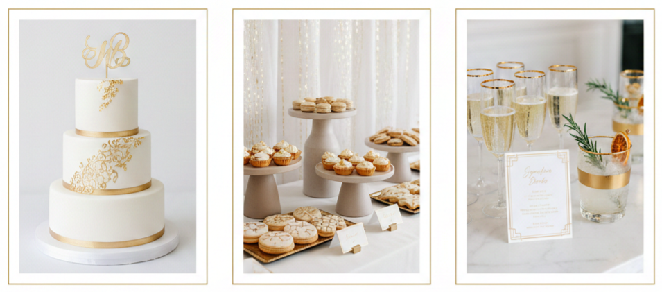
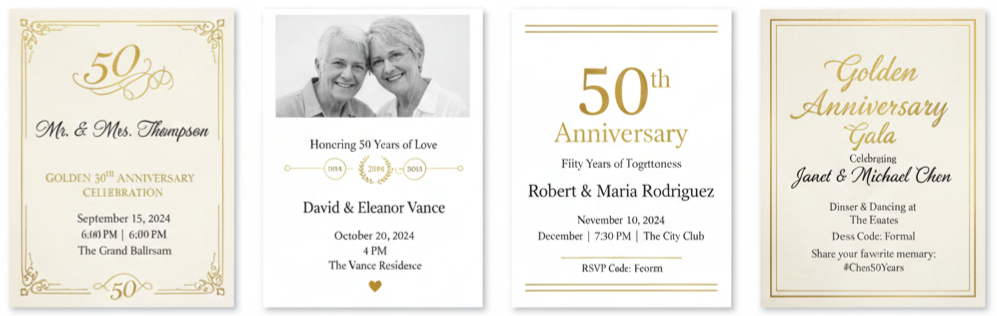
What Is a Golden Wedding Cake?
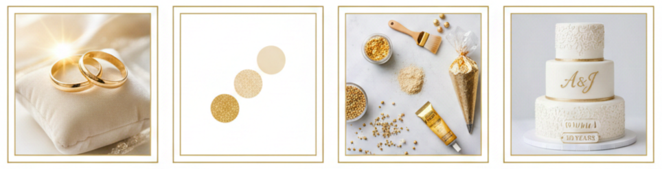
A golden wedding cake sits at the center of a 50th wedding anniversary celebration, also known as a Golden Anniversary. We usually think of it as more than dessert because it represents longevity, shared memories, and a life built together. The “golden” theme shows up through edible metallic finishes, thoughtful details, and a design that feels elevated without feeling stiff.
Many couples choose a look that blends gold with soft neutrals like ivory, white, and champagne. Those shades photograph well, work with nearly any venue, and feel timeless. We also see personal details added more than ever, such as initials, a wedding date, or a short message that reflects the couple’s story. When the cake matches the tone of the event, it turns into a centerpiece that feels meaningful, not just decorative.
- Golden Anniversary Meaning: Gold symbolizes prosperity, warmth, and a lasting bond, which fits a 50-year milestone perfectly. A cake built around this theme instantly communicates what the celebration honors.
- Common Color Pairings: Gold looks most natural when balanced with ivory, white, champagne, or soft blush tones. These combinations keep the design elegant and avoid an overly bright metallic look.
- Ways Gold Appears On Cakes: Bakers use edible gold leaf, gold dust, metallic paint, gold drips, gold piping, and gold-toned sprinkles or pearls. Each option creates a different level of shine, from subtle shimmer to full luxury.
- Personalization Options: Couples frequently add monograms, names, the wedding date, or a “50 Years” message. Personalized elements make the cake feel like it belongs to the couple, not just the theme.
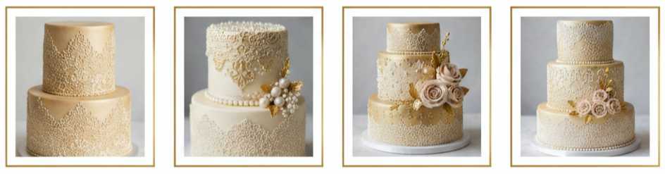
Popular Golden Wedding Cake Designs
Golden wedding cakes come in many styles, so we usually start by matching the design to the celebration itself. A formal banquet might call for a tall tiered cake with detailed piping, while a relaxed family gathering might suit a smaller cake with a clean finish and a few gold accents. The goal is to create a cake that looks intentional and fits the couple’s personality.
Classic tiered designs still lead the pack because they carry a sense of tradition and ceremony. Modern minimalist designs have also become popular because they feel fresh and polished without heavy decoration. Vintage-inspired cakes work beautifully for couples who love timeless details, such as lace textures and pearl accents. And when the celebration focuses on family history, photo-integrated cakes add a sentimental touch that guests genuinely enjoy.
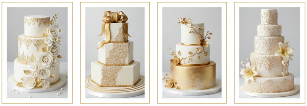
Classic Tiered Elegance
These cakes typically feature multiple tiers, smooth fondant or buttercream, and gold detailing along edges or patterns. Sugar flowers, delicate piping, and pearl accents give the cake a formal, celebratory look.
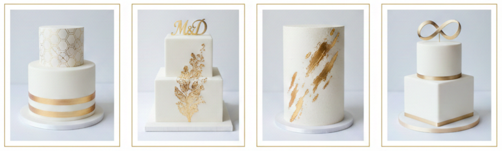
Modern Minimalist Style
Clean lines, smooth finishes, and a simple gold stripe or geometric pattern create a sleek statement. A single-tier or two-tier cake can still look high-end with brushed gold strokes or a metallic monogram.
Vintage-Inspired Details
Antique gold tones, lace-style piping, edible pearls, and soft floral touches create a nostalgic feel. This design style fits couples who appreciate classic romance and heirloom-inspired décor.
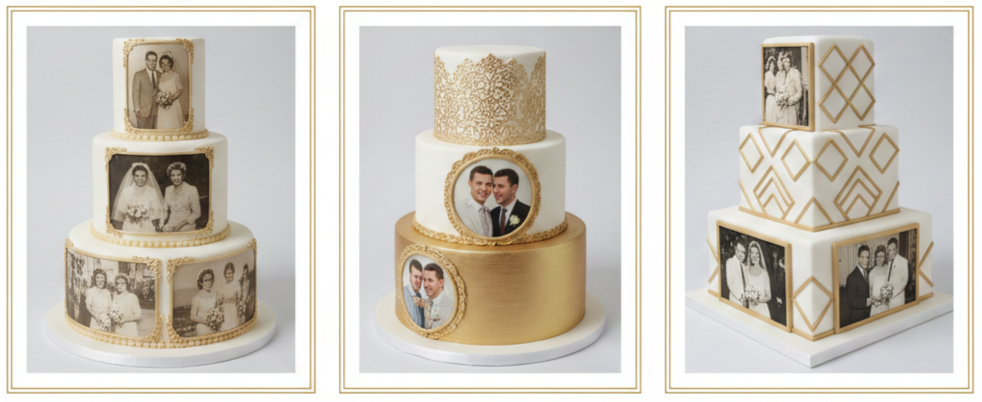
Photo-Integrated Designs
Edible photos or printed panels can show wedding-day images or snapshots from different decades. These cakes turn into conversation starters and make the display feel personal and story-driven.
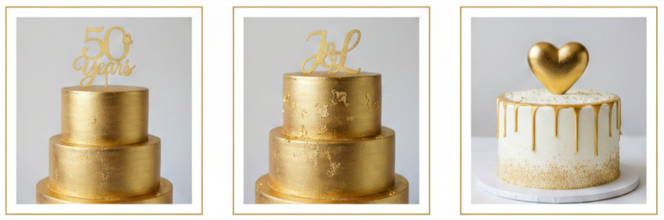
Topper Choices That Fit The Theme
Popular toppers include “50 Years,” the couple’s initials, or a simple gold heart. A topper works best when it matches the cake’s style, not when it competes with it.
Flavor Combinations That Stand Out
A golden wedding cake needs to taste as good as it looks. We usually recommend flavors that feel classic and crowd-friendly, then elevate them with a filling or frosting that adds personality. A good cake should slice cleanly, stay moist, and still taste great after sitting out during the celebration. Flavor also plays a big role in how guests remember the cake, especially at an anniversary where many guests will talk about the details afterward.
Some couples prefer traditional flavors that remind them of wedding cakes from decades ago, like vanilla, almond, or red velvet. Others choose celebration-forward flavors like champagne paired with fruit. Rich options like dark chocolate and caramel work well for evening events and formal receptions. For larger cakes, multiple tiers make it easy to offer more than one flavor without making the cake feel mismatched.
- Vanilla Bean With Raspberry Compote: A classic vanilla base tastes familiar and comforting, while raspberry adds brightness and a little tang. This pairing works well for all ages and feels elegant without being heavy.
- Almond Cake With Amaretto Buttercream: Almond brings a warm, slightly nutty flavor, and amaretto frosting adds a smooth, refined finish. This option feels mature and pairs nicely with coffee and tea.
- Champagne Cake With Strawberry Filling: Champagne flavor fits a milestone celebration and keeps the cake light. Strawberry filling adds sweetness and color, which makes slices look festive on the plate.
- Dark Chocolate With Salted Caramel: Chocolate adds richness and caramel adds sweetness with balance. This pairing works well for guests who prefer bold flavors over lighter fruit-forward options.
- Red Velvet With Cream Cheese Frosting: Red velvet gives a classic look and a smooth cocoa flavor, and cream cheese frosting adds a tangy contrast. This option feels timeless and remains popular across generations.
Choosing the Right Baker or Cake Designer
A golden wedding cake usually involves more design detail than a casual birthday cake, so choosing the right baker matters. We typically focus on two things: consistent flavor and strong design execution. Gold finishes can look stunning when done well, yet they can also look uneven when rushed or done with the wrong materials. A cake designer with experience in metallic finishes and anniversary-style details will deliver a cleaner, more polished result.
We also recommend planning earlier than people expect, especially when the celebration falls during busy seasons. Tastings help lock in flavors, and design consultations help avoid misunderstandings about color, size, and decoration. A reliable baker will talk through venue conditions, delivery timing, setup needs, and how the cake will hold up based on weather and event length. This planning reduces last-minute stress and keeps the celebration smooth.
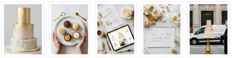
- Portfolio Review: We look for clean lines, smooth finishes, and balanced design work in the baker’s previous cakes. A strong portfolio shows consistency across multiple styles, not just one.
- Tasting Appointment: Sampling flavors helps confirm texture, sweetness level, and filling combinations. A tasting also shows how well the baker handles classic flavors versus specialty options.
- Design Consultation: A clear conversation about themes, colors, flowers, toppers, and personalization prevents surprises. Many bakers also sketch or provide inspiration boards to align expectations.
- Timeline Planning: High-demand bakers book months in advance, especially for detailed tiered cakes. Early planning also leaves room for changes, such as guest count adjustments.
- Delivery And Setup Details: We always confirm delivery fees, setup timing, and whether the baker provides a stand. A clear plan protects the cake’s appearance and reduces event-day problems.
Decorating Ideas Beyond the Cake
A cake looks even better when the table around it feels intentional. We usually treat the cake display like a mini feature area at the event because guests naturally gather there for photos, conversation, and the cake-cutting moment. Small details around the cake can make a simple design feel more luxurious, while a well-designed cake can look even more impressive with the right backdrop.
The easiest way to build a cohesive cake table is to coordinate metals, florals, and lighting. Gold works best when it looks layered, not scattered. That means using a few gold elements with purpose, such as a stand, candle holders, or frames, rather than adding gold to everything. We also recommend using personal items, like framed photos from the couple’s wedding day, to connect the display to the anniversary story.
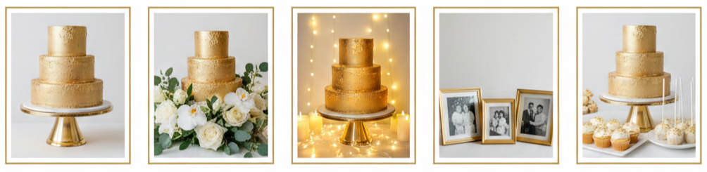
- Cake Stand And Base Styling: A gold-toned or neutral stand adds height and instantly frames the cake. A simple base looks best when it matches the cake’s finish and does not distract from the design.
- Floral Surround And Greenery: White roses, orchids, hydrangeas, or soft seasonal blooms work well with gold details. Greenery adds texture and keeps the display from looking too formal or stiff.
- Lighting For Photos: Soft warm lighting, candles, or fairy lights create a flattering glow. Good lighting improves photos and makes metallic details look richer instead of harsh.
- Family Photo Touches: Framed photos from different decades help guests connect with the couple’s journey. A small photo arrangement near the cake turns the area into a meaningful tribute.
- Matching Dessert Add-Ons: Cookies, cupcakes, or cake pops with gold sprinkles can reinforce the theme. These extras also support serving needs when the guest list is large.
Tips for a Memorable Cake Cutting Moment
The cake cutting is one of the easiest moments to make special without adding complexity. We usually focus on timing, lighting, and a few meaningful touches. When the cake is placed in a good spot and the moment has a little structure, guests naturally gather and the photos turn out better. The best cake-cutting moments feel personal and relaxed, not staged.
Music creates atmosphere quickly, so many couples choose their wedding song or a favorite track that has been part of their relationship. Engraved utensils add a small keepsake element. Involving family members can also make the moment feel generational, especially when grandchildren participate in simple roles like handing plates or standing beside the couple for photos.
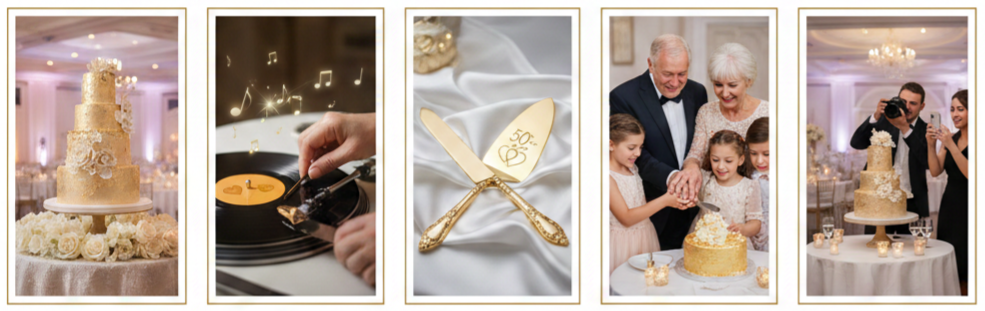
- Best Placement For The Cake: A well-lit, central area makes the cake easy to see and easy to photograph. This setup also creates a natural gathering space without crowding.
- Music Choice That Adds Meaning: A wedding song, a favorite love song, or a family-selected track sets the tone. Music helps the moment feel intentional without requiring a formal announcement.
- Keepsake Serving Set: An engraved knife and server set adds a personal detail and works as a lasting memento. Many couples keep it as part of an anniversary tradition.
- Family Involvement: Grandchildren or close family members can join the couple for the cut and for photos. This creates a warm moment that reflects the full family story behind 50 years together.
- Photo Planning: Assign one person to capture the moment from multiple angles. This prevents missed shots and ensures the couple has a complete set of memories.
Budget Considerations for a Golden Wedding Cake
Golden wedding cake pricing depends on size, design complexity, ingredients, and local market rates. We typically see costs increase when the cake includes multiple tiers, handcrafted sugar flowers, detailed piping, or real edible gold leaf. Delivery and setup may also add to the total. A clear quote keeps budgeting realistic and prevents last-minute compromises that affect the final look.
A smart approach is to decide where the “wow factor” should live. Some couples invest in a showpiece design feature, like gold leaf accents or a dramatic topper, then keep the rest of the cake simpler. Others choose a smaller cake for cutting and supplement with additional desserts for serving. Both approaches can look beautiful and keep costs aligned with the event’s priorities.
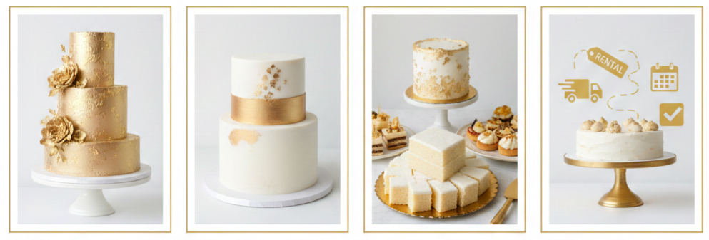
- Typical Price Range Drivers: Tier count, serving size, and decoration detail influence cost the most. Specialty fillings and premium finishes also affect pricing.
- Ways To Keep The Look Without Overspending: Choosing one standout feature can deliver a luxury vibe without a luxury budget. A clean base design with strategic gold accents often looks more refined than an overly busy cake.
- Serving Strategy That Reduces Cost: A smaller display cake paired with sheet cake slices or a dessert table can support large guest counts. This method preserves the centerpiece effect while managing serving costs.
- Extra Fees To Confirm: Delivery, setup, stand rental, and last-minute changes can increase the total. Confirm these details early to avoid surprises.
Conclusion
A golden wedding cake brings beauty and meaning to a 50th anniversary celebration, and the best choice reflects the couple’s style, story, and the tone of the event. We see the strongest results when the design feels intentional, the flavors match the guest experience, and the cake display supports photos and gathering. Whether the celebration calls for a classic tiered centerpiece, a sleek modern cake, a vintage-inspired look, or a photo-integrated tribute, the right cake turns a milestone into a shared moment everyone remembers.
Key Takeaway: A golden wedding cake works best when it balances elegance with personal meaning, pairing a well-chosen gold design with flavors guests will genuinely enjoy. Thoughtful planning around the baker, display area, and cake-cutting moment turns the cake into a centerpiece that honors 50 years with clarity and style.
FAQs
Can we use fresh flowers instead of sugar ones on the cake?
Yes, fresh flowers work beautifully on a golden wedding cake, especially when the blooms match the event décor. We recommend choosing pesticide-free, non-toxic flowers and having the baker or florist place them using food-safe methods.
Do we need a full cake if we’re also serving a dessert table?
No, a full-sized cake is not required when a dessert table is part of the plan. Many celebrations use a smaller cake for the ceremonial cut, then serve guests additional sweets or pre-portioned cake slices prepared separately.
What should we write on the golden wedding cake?
Popular wording includes the couple’s names, “50 Years Together,” the wedding date, or a short phrase with personal meaning. We suggest keeping the message short so it looks clean and readable in photos.
Is gold cake décor safe to eat?
Edible gold leaf, edible gold dust, and food-safe metallic paints are safe when labeled for consumption. We always confirm that the baker uses certified edible products rather than decorative-only materials.
How do we keep the cake fresh if the event is outdoors?
Heat and humidity can affect frosting, so we usually keep the cake indoors or in shade until cutting time. Fondant finishes typically handle warmth better than soft buttercream, and a baker can recommend the best structure for outdoor conditions.
Golden Wedding Dress
| Silhouette | Best Wedding Theme | Ideal Venue Type |
| Ballgown | Glamorous, Royal | Ballroom, Historic Estate |
| A-Line | Classic, Romantic | Garden, Church |
| Mermaid | Modern, Evening | Hotel, Rooftop |
| Sheath/Column | Minimalist, Chic | Beach, Courthouse |
| Tea-Length/Midi | Casual, Retro | Backyard, City Hall |
The Symbolism Behind a Golden Wedding Dress
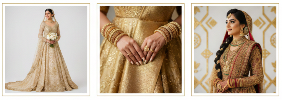
- What Gold Communicates: A golden wedding dress feels like a statement without trying too hard. Gold has long been tied to royalty, celebration, and lasting value, so it naturally fits a wedding day where everything feels bigger than normal life. Brides who pick gold usually want a look that feels confident, warm, and unforgettable, while still staying elegant.
- Why Brides Choose It: Gold gives you more storytelling than traditional white. It can represent prosperity, strength, and a “new chapter” energy that feels personal instead of automatic. Some brides choose it because it matches their taste and personality. Others choose it because gold is meaningful in their culture, where it may symbolize blessings, joy, and good fortune.
- Cultural Connection: In many South Asian, Middle Eastern, and African wedding traditions, gold is not unusual at all. It can be a classic bridal choice, especially when paired with embroidery, ornate jewelry, and ceremonial details. For brides blending traditions, gold can also bridge modern styling with cultural heritage in a way that feels natural.
Flattering Styles and Silhouettes in Gold
Ballgown Drama
A ballgown in gold leans into that royal feeling. The fitted bodice and full skirt turn the glow of gold into a true spotlight moment, especially in formal venues like ballrooms, historic buildings, and grand event spaces. This silhouette also photographs beautifully because gold catches light across the entire skirt.
A-Line Versatility
A-line dresses are popular for a reason. They flatter many body shapes, feel comfortable for movement, and create a soft, elegant flow that works well with gold tones. Gold in an A-line can look classic, modern, or romantic depending on the fabric and detailing.
Mermaid Glam
Mermaid silhouettes look striking in gold because the shape already brings attention. The fitted structure and dramatic flare can make metallic or embroidered gold feel bold and sleek, which works well for evening ceremonies or modern venues with dramatic lighting.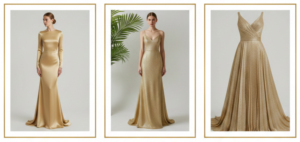
Sheath Or Column Simplicity
A sheath or column golden wedding dress keeps the focus on the fabric and finish. When the cut is clean, gold becomes the main feature, which is perfect for brides who love minimal styling with maximum impact. This is also a great option for destination weddings because it can be easier to pack and move in.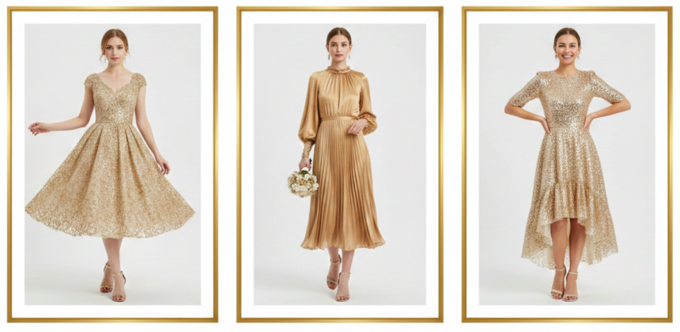
Tea-Length And Midi Charm
Shorter golden wedding dresses are playful, stylish, and surprisingly timeless. Tea-length and midi cuts work well for courthouse ceremonies, smaller receptions, or brides who want a second look for the party. Gold keeps the look bridal, even when the hemline feels more relaxed.
Golden Tones and Fabric Options That Enhance the Look
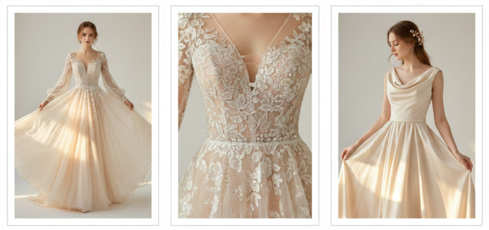
Champagne Gold Softness
Champagne gold is a gentle blend of ivory and gold. It’s perfect when you want a glow instead of a full metallic shine. This shade looks especially flattering in natural light and works well in romantic themes like garden weddings and airy indoor venues.
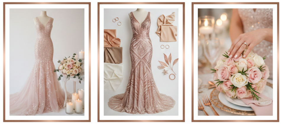
Rose Gold Warmth
Rose gold adds a pink undertone that feels modern and romantic. It pairs beautifully with blush florals, warm neutrals, and soft candlelight. Brides who want a trendy look without going too loud often land on rose gold.

Antique Gold Vintage Depth
Antique gold feels richer and moodier, with a more muted finish. It’s a great match for vintage themes, historic venues, and old-Hollywood styling. It also looks stunning in textured fabrics like brocade or gowns with ornate embroidery.
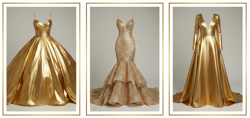
Bright Metallic Gold Bold Shine
Bright metallic gold is the statement-maker. It catches light quickly and looks incredible at night under warm lighting. Brides who choose this shade usually keep styling cleaner, because the dress already does a lot visually.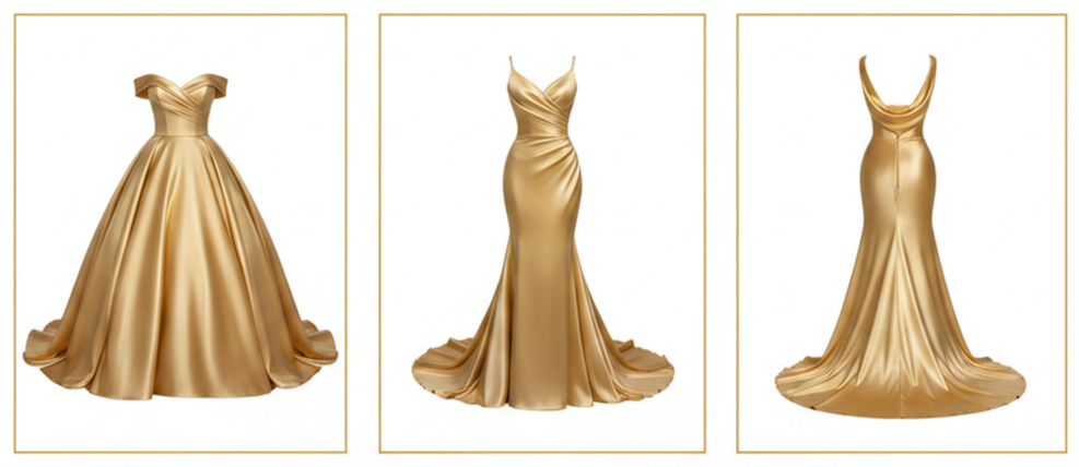
Satin Shine
Satin in gold looks smooth, glossy, and luxurious. It works best when you want the gown to look polished and elevated, especially in structured silhouettes like ballgowns and fit-and-flare designs.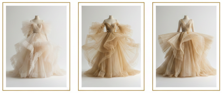
Tulle And Organza Movement
Tulle and organza soften gold and add that floaty, layered feel. These fabrics are great when you want the dress to look airy, romantic, or a little dreamy. They also help gold feel lighter in daytime weddings.
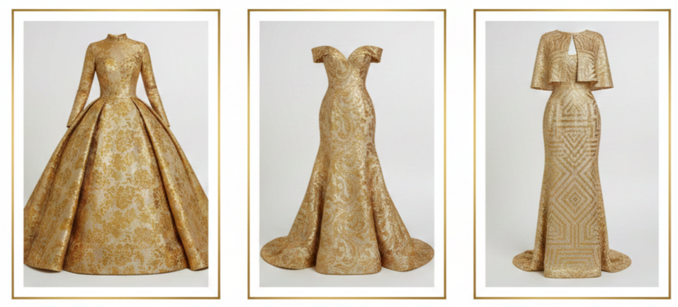
Brocade Texture
Brocade adds weight, texture, and a regal finish. A brocade gold gown can look historic and high-end at the same time, making it ideal for formal venues, cathedral weddings, or vintage-inspired celebrations.
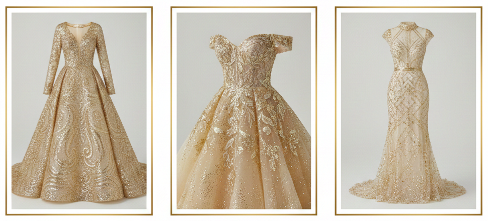
Sequins And Metallic Embroidery Sparkle
Sequins and metallic embroidery add dimension and shine. You can go all-out with a full-sequin look or keep it refined with embroidered bodice details, patterned shimmer, or delicate gold threadwork across sleeves and skirts.
How to Accessorize a Golden Wedding Dress With Grace
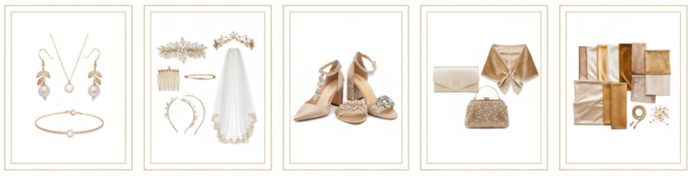
- Jewelry Balance: Gold dresses don’t call for heavy jewelry. A pair of earrings, a delicate bracelet, or a single meaningful necklace usually does the trick. Warm tones like yellow or rose gold work best, and pearls or champagne-colored stones add a touch of elegance without stealing the spotlight.
- Hairpieces And Veils: A golden gown pairs well with subtle sparkle in the hair. A crystal comb, a simple headband, a delicate crown, or a vine-style piece can fit beautifully. Veils look best when they stay light and sheer, and a veil with subtle gold embroidery can tie everything together in a way that feels intentional.
- Shoes That Match The Mood: Nude, champagne, or metallic gold heels are the easiest choices. For brides who want a personal touch, velvet shoes, gemstone accents, or a subtle pattern can add personality without stealing attention. Comfort matters too, especially when you’ll be on your feet for hours.
- Clutch And Wrap Options: A satin clutch, a beaded mini bag, or a structured neutral purse keeps the look polished. For cooler weather, wraps can look amazing with gold, especially in velvet, faux fur, or soft shawl fabrics in neutral tones that match the gown’s warmth.
- Color Coordination Tip: Gold already looks rich, so accessories work best when they feel coordinated, not crowded. Keeping the palette warm and cohesive usually creates the most elegant result.
Ideal Venues and Wedding Themes for a Golden Dress
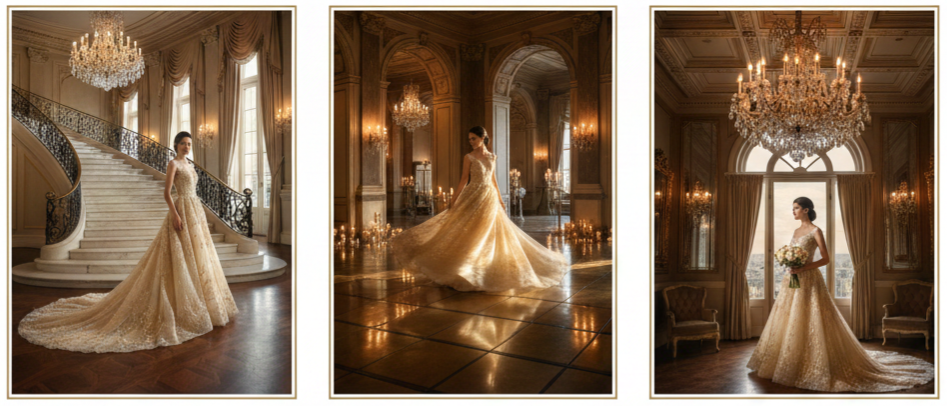
Ballroom And Luxury Venues
Gold naturally fits formal spaces with chandeliers, polished floors, dramatic staircases, and warm lighting. A golden wedding dress looks right at home in a venue that already feels elevated.
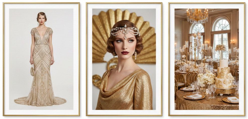
Vintage And Art Deco Weddings
Antique gold tones pair beautifully with vintage styling, old-Hollywood hair, and glamorous decor. The dress can become the centerpiece of the whole theme, especially when paired with classic silhouettes and rich textures.
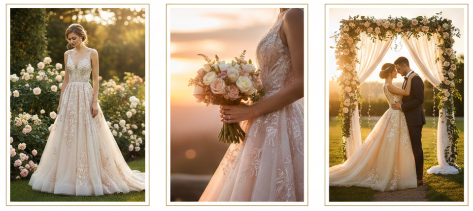
Garden And Outdoor Ceremonies
Champagne and rose gold are especially flattering outdoors. Natural light brings out softness in the shade and keeps the look romantic instead of overpowering. Gold also looks stunning against greenery, florals, and sunset skies.
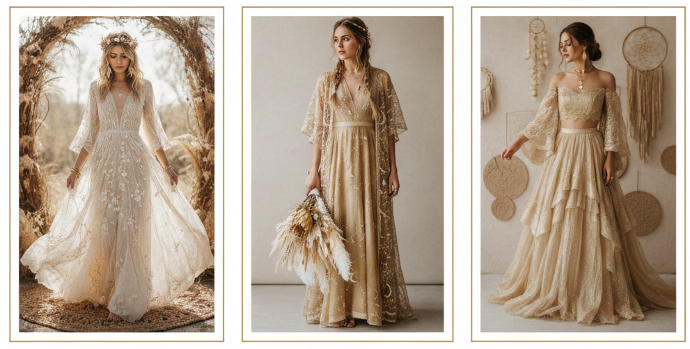
Bohemian Luxe Styling:
Gold can still work in a relaxed theme when you choose lighter fabrics, softer shades, and natural textures. The look becomes more “glowy and effortless” instead of “formal and dramatic,” especially when paired with simple accessories and earthy decor.
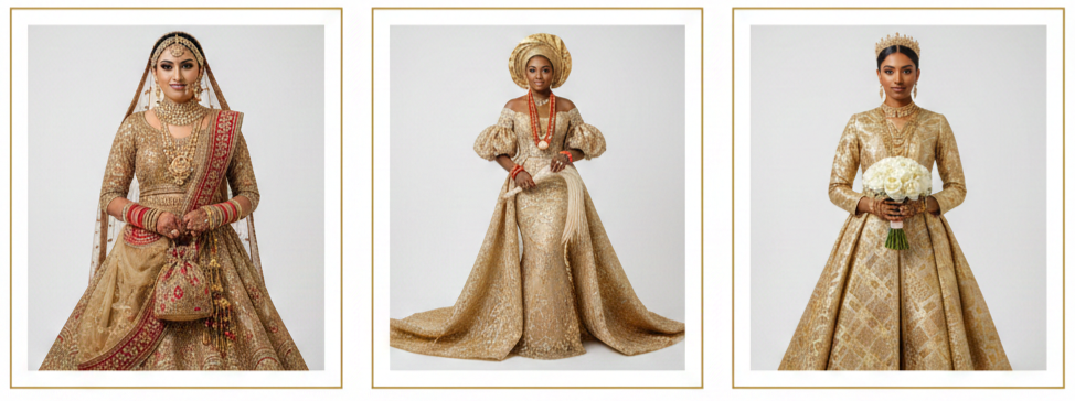
Cultural Celebrations
Gold is already a bridal classic in many cultures. It pairs naturally with ceremonial jewelry, embroidered textiles, and traditional styling. Brides who want to honor tradition while staying modern often find that gold makes the blend feel seamless.
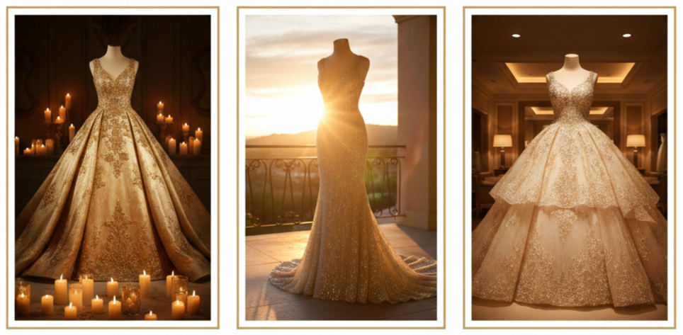
Lighting Considerations
Gold looks best under warm light. Candlelight, golden hour sunlight, and warm indoor lighting bring out depth and glow, while harsh cool lighting can flatten the color.
Inspiration From Real Brides Who Wore Gold
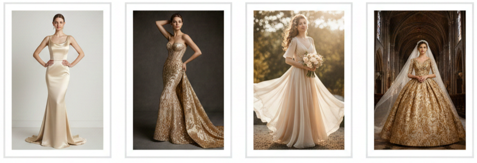
- Minimal And Modern Looks: Some brides choose a sleek gold sheath dress in satin or crepe and keep everything else simple. The result feels confident and clean, with gold acting like a natural spotlight without extra drama.
- Full Glam Moments: Other brides go for a sequin mermaid gown, an embroidered bodice, or a dramatic train that turns the aisle into a runway. These looks usually shine the most in evening ceremonies or reception spaces with warm, dim lighting.
Outdoor Romance: Brides wearing champagne or rose gold often lean into soft styling, like loose waves, floral accessories, and airy fabrics. Gold in sunlight can look soft and luminous rather than flashy, which is why it works so well in outdoor ceremonies. - Grand Traditional Settings: Antique gold ballgowns or brocade gowns look stunning in cathedrals and historic venues. Paired with structured silhouettes, veils, and elegant styling, the dress can feel timeless, not trendy.
Where to Find or Customize a Golden Wedding Dress
- Designer Collections: Some mainstream bridal designers include gold gowns in their seasonal collections, especially in champagne tones or dresses with gold detailing. These can be easier to find in boutiques that carry color-forward bridal lines.
- Couture And Custom Options: Couture designers and custom studios can create a golden gown that matches your exact shade, silhouette, and level of embellishment. Custom is especially helpful when you want a very specific gold tone, a unique fabric, or personalized details like sleeves, neckline shape, or embroidery patterns.
- Cultural Bridal Boutiques: South Asian and Middle Eastern bridal shops frequently offer gold options as a standard choice. These gowns may include intricate beadwork, ornate embroidery, and richly layered fabrics that feel ceremonial and luxurious.
- Online Made-To-Order Sellers: Online shops can offer more variety in shade and style, especially for brides seeking non-traditional dresses. Many made-to-order listings allow sizing adjustments and custom touches, which can be useful when you want something specific.
- Local Designers And Tailors: Working with a local designer gives you hands-on collaboration. You can try on mockups, adjust fit, and fine-tune the final look. This is a great route when you want something that feels one-of-one.
- Smart Shopping Step: Always ask for a fabric swatch and look at it in natural light. Gold can shift dramatically depending on lighting, and what looks soft in a boutique can look brighter outdoors.
Conclusion
A golden wedding dress is a style choice that feels personal, confident, and unforgettable. It works across silhouettes, themes, and cultures, which makes it surprisingly versatile. Whether you want a soft champagne glow for a daytime ceremony or a bold metallic statement for an evening celebration, gold gives you a bridal look that feels intentional and full of presence.
Key Takeaway: A golden wedding dress blends symbolism and style in a way that feels bold without feeling forced. When we match the right gold tone with the right fabric, silhouette, and accessories, the result looks polished, memorable, and completely bridal.
FAQs
Can I wear a golden wedding dress to a destination wedding?
Yes, and it can look amazing in travel settings. We suggest lightweight fabrics and softer tones like champagne or rose gold for warm climates, because they photograph beautifully in natural light.
How do I coordinate bridesmaids’ dresses with a gold gown?
Neutral tones like beige, champagne, blush, and soft gray usually pair well with gold. For a richer look, deep jewel tones can work too, especially in fall or evening weddings.
Will a golden wedding dress clash with floral arrangements?
Gold is easy to match with florals when the palette stays warm and balanced. Cream, blush, burgundy, dusty rose, and deep green usually complement gold without making the bouquet feel too busy.
Are golden dresses only for formal weddings?
Not at all. A simpler cut in a softer gold tone can fit casual weddings, elopements, courthouse ceremonies, and outdoor celebrations while still looking special and bridal.
What makeup works best with a golden gown?
Warm-toned makeup tends to match gold best. Bronze, copper, peach, and soft gold highlights can complement the gown, and you can keep it natural or add a bold lip depending on your overall vibe.
Gold Wedding Invitations
| Style | Best For | Look & Feel |
| Foil-Stamped | Formal, classic weddings | Sleek, shiny, polished |
| Laser-Cut | Elegant, ornate themes | Detailed, delicate |
| Minimalist Accents | Modern, clean designs | Simple, refined |
| Vintage/Baroque | Dramatic, royal themes | Bold, ornate, rich |
Why Gold Feels So Special
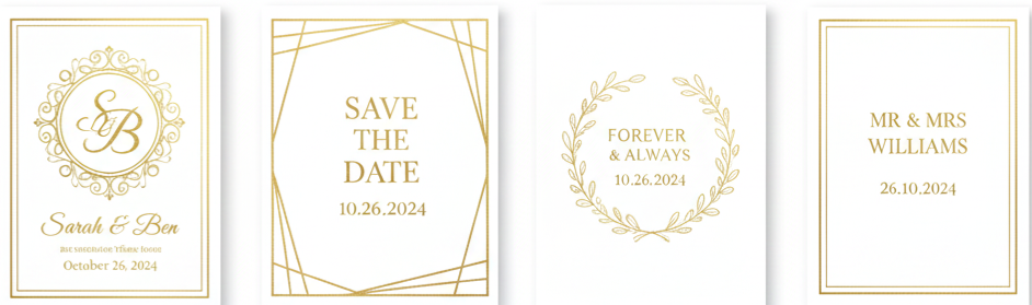
Gold adds instant warmth, charm, and elegance to wedding invitations. It’s a color that has always symbolized love, wealth, and celebration—making it the perfect choice for setting the tone of your big day. Whether you’re planning a grand ballroom wedding or something more low-key, gold invites can match your style without feeling over the top. It’s timeless, versatile, and always looks refined.
Different Styles of Gold Invitations
Gold invitations come in all kinds of designs. Whether you’re into detailed patterns or sleek simplicity, there’s a gold invitation that fits your theme perfectly.
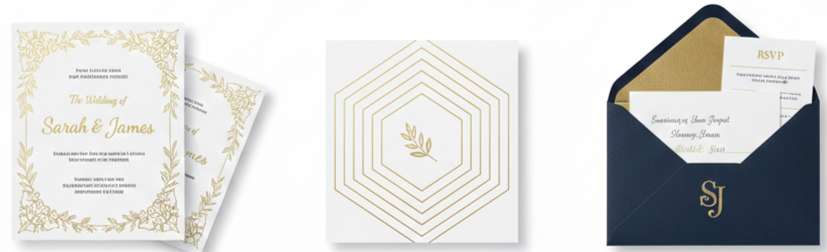
Classic foil-stamped invitations
These use a metallic foil that’s heat-pressed onto the paper, giving your text or border a beautiful shine. It’s elegant, formal, and eye-catching.
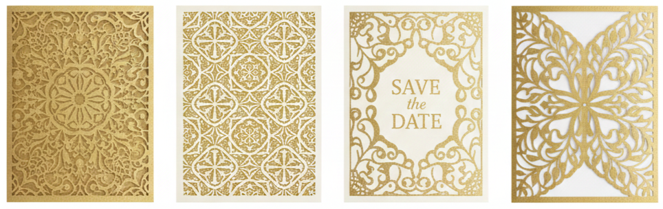
Laser-cut designs
These feature detailed, lace-like patterns cut into the card. Add a gold layer behind or use gold as the main material, and the result is something truly striking.
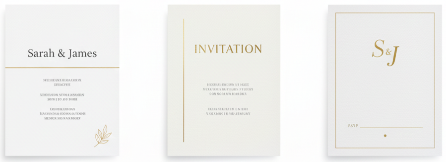
Minimalist designs with gold accents
If you love clean lines and modern vibes, a minimal card with just a touch of gold—like a thin line or a name in foil—keeps things classy without being too much.
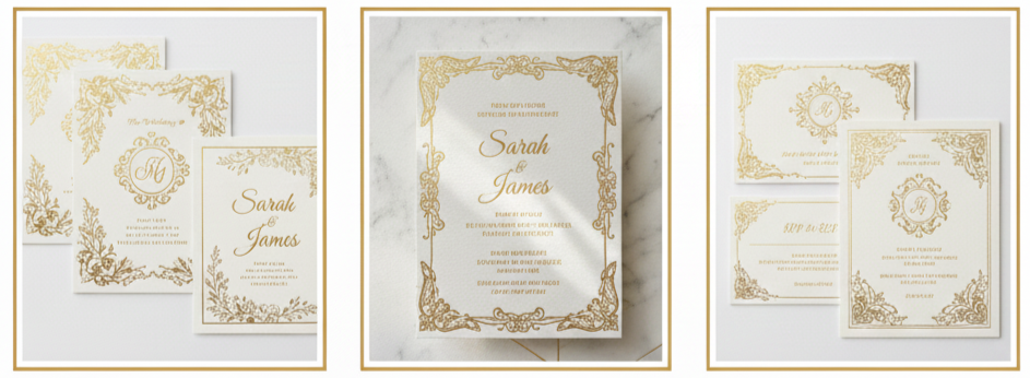
Vintage and baroque styles
These use rich designs, fancy fonts, and bold gold elements. They’re perfect if you’re going for a royal, dramatic, or old-world theme.
What Paper and Materials Work Best
The material you choose changes everything about how gold looks and feels. The right base can either make gold pop or help it blend smoothly into the design.
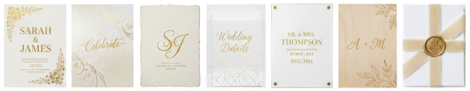
- Matte cardstock: This flat finish gives gold foil a bold contrast, making the shine stand out even more.
- Shimmer or pearlescent paper: These have a soft glow that works beautifully with gold, giving your invitation a delicate sparkle.
- Handmade paper: With its rough texture, it gives off a rustic and organic feel. Gold foil on top adds a luxe twist.
- Vellum overlays: Vellum is translucent and can be layered over another card. You can print gold text on it or let it reveal a gold background underneath.
- Acrylic invitations: These are ultra-modern. Printed gold on clear acrylic looks clean, bold, and sophisticated.
- Wood veneer cards: If you’re leaning toward rustic charm, gold engraved on wood gives an earthy yet upscale look.
- Fabric details: Velvet wraps, silk ribbons, or linen bands with gold seals add another layer of texture and elegance.
Color Combos That Work With Gold
Gold is a flexible accent that works with many color palettes. It adds elegance, drama, or warmth, depending on what you pair it with.
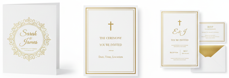
White and gold
Clean, formal, and forever in style. Works well for classic or religious ceremonies.
Black and gold
Bold and luxurious. Ideal for glamorous evening events or winter weddings.
Blush and gold
Soft and romantic. This combo is popular for spring and summer weddings.
Navy and gold
Refined and timeless. A great fit for fall weddings or events with a formal tone.
Emerald, burgundy, or dusty blue
These shades make gold stand out while still fitting beautifully into seasonal or themed weddings.
How to Personalize Your Gold Invitations
Personal touches make your invitation suite feel like it was made just for you. From fonts to layout to accessories, every detail adds meaning.
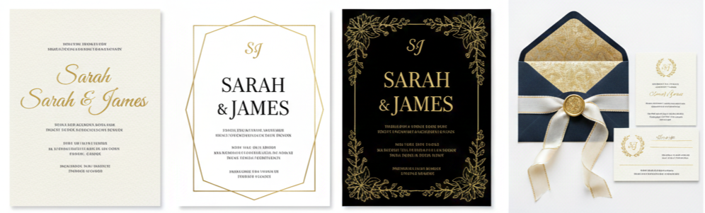
- Typography choices: Script fonts feel romantic and flowy, while serif fonts give a more structured, formal tone. Make sure your gold text stays readable by keeping enough contrast with the background.
- Layout and spacing: Let gold breathe. Too much text or too many gold elements can feel crowded. A clean layout gives your design room to shine.
- Personal details: Add your initials, a custom crest, or a small drawing in gold foil. These elements make your invitations more memorable.
- Finishing touches: Think gold wax seals, satin ribbons with gold edging, or envelope liners with metallic patterns. These extras add texture and elevate the overall feel.
Printed or Digital—Which One’s Better?
There’s no right or wrong here—it just depends on what matters most to you. Gold designs can work beautifully in both formats.
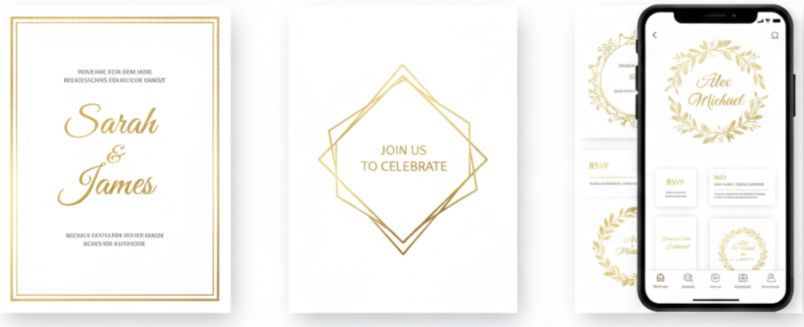
- Printed invitations: These give you the real deal—foil you can touch, textured paper, and something your guests can hold onto. They’re especially great if you’re going all out for your big day or want a keepsake.
- Digital invitations: These are convenient, budget-friendly, and eco-conscious. Designers use tricks like shadowing and gradients to mimic the look of real gold. While it won’t actually shine, it still looks classy on screen.
Key takeaway: If you want something physical and luxe, go with printed gold invitations. If you’re looking for speed and simplicity, digital designs offer a polished look without the wait.
Planning for Costs and Keeping It Affordable
Gold details do cost more, but there are easy ways to make smart choices without sacrificing style. Some features are worth the splurge, while others can be simplified.
- Foil stamping and embossing: These are premium options because they require special machines and materials. They add the most visual impact but cost more.
- Paper quality: Premium papers like cotton, handmade, or deckled-edge stock raise the price per card.
- Custom art or calligraphy: Hiring a designer or calligrapher to create original artwork or write out addresses adds to the overall budget.
- Extras like wax seals or belly bands: These elements are beautiful but can raise your per-invite cost quickly.
To cut back:
- Stick to flat printing with metallic ink instead of real foil.
- Use gold only on key details—like your names or a border.
- Choose standard sizes to avoid extra shipping or printing fees.
- Use downloadable templates or semi-custom options to get a unique look without the full custom price tag.
Where to Find Gold Wedding Invitations
You’ve got options when it comes to sourcing your dream invitations. It really depends on how hands-on you want to be and how personalized you want your suite to feel.
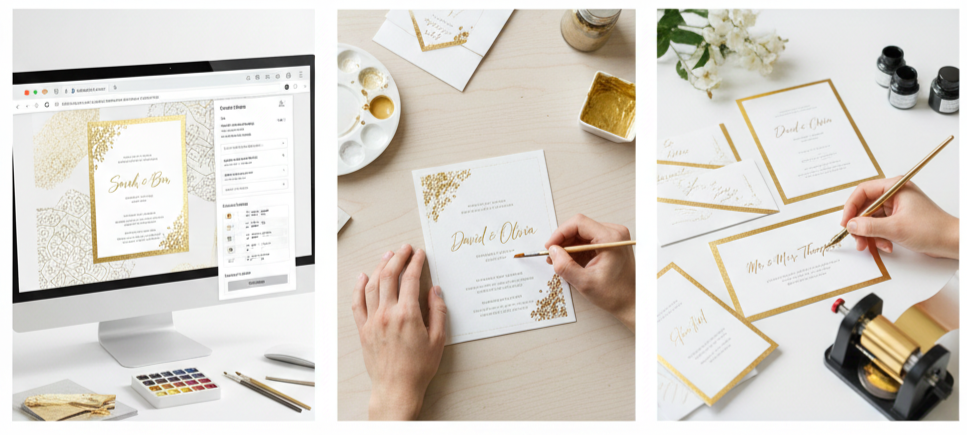
- Online platforms: Sites like Etsy, Minted, and Zola offer hundreds of ready-made or customizable gold invitations. You can choose a template and tweak colors, fonts, and layouts until they match your vision.
- Custom stationers: If you want something completely one-of-a-kind, work with a local or boutique stationery designer. They’ll help you bring a fully personalized design to life with gold elements that match your story and theme.
- Print shops and calligraphers: Local printers often have gold foil or metallic ink options. You can also hire a calligrapher for hand-written elements or illustrations to add that artisanal touch.
Conclusion
Gold wedding invitations make a lasting first impression. They bring out the style, mood, and excitement of your big day before your guests even arrive. Whether you’re leaning toward classic foil, intricate patterns, or a modern minimalist look, there’s a gold design that fits your theme. By choosing the right paper, playing with color pairings, and adding personal touches, you can craft invitations that feel both luxurious and completely you.
Key takeaway: Gold wedding invitations combine timeless beauty with versatile design options. With smart planning and thoughtful details, they become more than just announcements—they become a piece of your love story.
FAQs
Can gold invitations work for a casual or outdoor wedding?
Absolutely. Just go for a simple design and pair gold with soft tones or natural elements to keep things relaxed but stylish.
How long does it take to have gold foil invitations made?
Custom gold foil invitations usually take 3–4 weeks for production, not including shipping. It’s best to order early and leave time for proofing.
Are there environmentally friendly options for gold wedding invitations?
Yes. Many printers offer recycled paper, eco-friendly inks, or digital options that still look great with gold designs.
Can I combine gold with other metallics like silver or rose gold?
Definitely. Just use one as your main color and the others as accents to avoid a cluttered look.
How should I style gold invitations in flat lay photos?
Use soft backdrops, neutral props, or floral elements to let the gold stand out. Natural lighting helps capture the shine.
Gold Wedding Inspirations
| Color Combination | Vibe Created | Best For |
| Gold + White + Ivory | Classic & Elegant | Formal venues, traditional setups |
| Rose Gold + Blush | Soft & Romantic | Spring weddings, garden venues |
| Gold + Emerald | Bold & Rich | Winter weddings, evening events |
| Matte Gold + Dusty Blue | Calm & Refined | Outdoor or minimalist weddings |
| Gold + Black + Cream | Modern & Dramatic | City venues, editorial style |
The Allure Of Gold In Wedding Themes
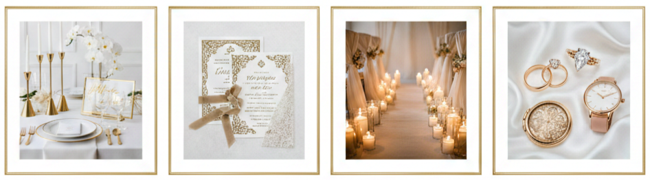
Gold fits almost any wedding style because it brings warmth and polish without locking us into one look. A modern glam setup feels sharper when gold sits next to clean lines, structured florals, and sleek signage. A vintage luxe vibe feels richer when we use antique-style gold finishes, ornate frames, and layered textures like lace and velvet. A romantic classic theme feels softer when gold shows up through candlelight, delicate details, and flowing fabrics that keep everything looking graceful.
Gold also gives us options in tone, which makes planning easier once we pick a direction. Yellow gold reads traditional and bright. Champagne gold feels refined and neutral. Antique gold leans warm and nostalgic. Rose gold adds a soft, modern glow. The most important part is staying consistent with the finish we choose so our décor, stationery, and accessories look like they belong together in photos and in person.
Gold Color Palette Ideas That Actually Work
Gold looks best when it supports other shades instead of trying to carry the whole color scheme. When we pair gold with the right base tones, the entire wedding feels cohesive, and the metal accents look intentional instead of random.
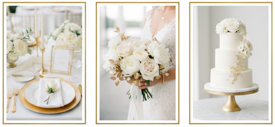
Gold, White, And Ivory
This pairing stays clean, classic, and formal without feeling heavy. White and ivory act as a bright foundation through linens, florals, and attire, while gold adds a finished look through frames, flatware, chargers, candleholders, and signage.
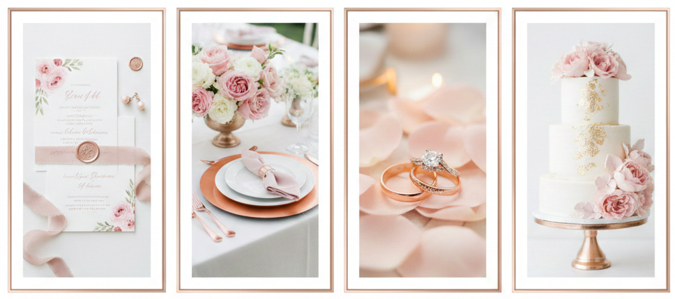
Rose Gold And Blush
This combination feels soft and romantic, and it photographs beautifully in warm light. Rose gold details in stationery, jewelry, and décor pair naturally with blush florals and neutral linens for a gentle glow that still feels elevated.
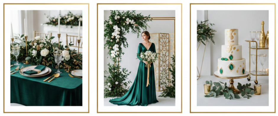
Gold And Emerald
Emerald gives gold a deeper, richer backdrop, which makes it ideal for evening events, winter weddings, or formal venues. Emerald dresses, linens, or greenery look striking next to gold candleholders, bar details, and statement arrangements.
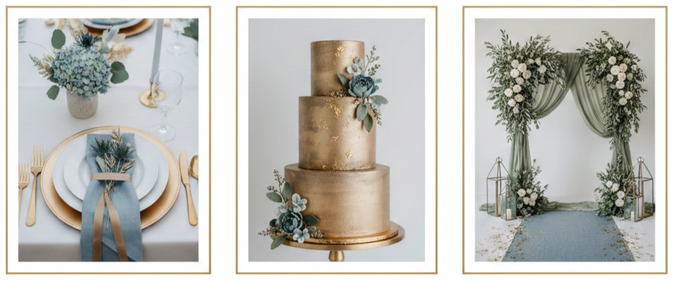
Matte Gold With Dusty Blue Or Sage
Matte finishes keep gold from looking too shiny, which works well in outdoor spaces and airy venues. Dusty blue adds calm contrast, while sage keeps the palette organic and relaxed.
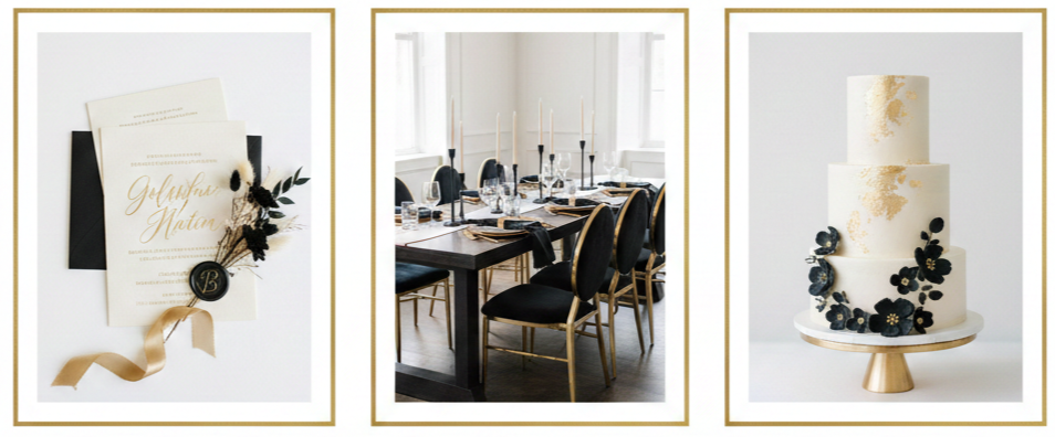
Gold With Black And Cream
Black adds structure, cream keeps things warm, and gold brings the shine. This palette feels modern and editorial, especially when we use black in signage, chairs, or typography and keep gold as a repeated accent across key areas.
A simple way to keep gold from taking over is to commit to one gold tone and repeat it in a few high-visibility spots. That repetition makes the palette feel planned, and it keeps the room from looking overly reflective.
Gold Wedding Decor Ideas That Tie It All Together
Gold décor works best when we choose a few anchor moments and build around them. That approach keeps everything polished while avoiding a cluttered look. We can let gold frame the space, then let florals, fabric, and lighting do the heavy lifting.
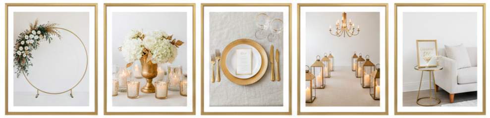
- Ceremony Backdrops That Shine: A gold arch instantly sets the tone, whether we choose a circular shape, a clean rectangular frame, or a canopy style for a softer look. Floral placement matters here, so we can keep gold visible by using asymmetrical arrangements or corner clusters instead of covering the structure completely.
- Centerpieces That Feel Intentional: Gold can hold a centerpiece together through compotes, raised stands, or mixed-height candleholders. Grouped candles add warmth, and gold bases give the table a finished look even when florals stay simple.
- Tables That Look Elevated: Gold chargers, gold-rimmed glassware, and matching flatware make each place setting feel complete. When we want a softer vibe, brushed or champagne gold pairs well with textured linens that reduce glare and keep the look warm.
- Lighting That Makes Gold Glow: Candlelight brings out gold’s warmth and makes the whole room feel inviting. Warm bulbs, lantern paths, and chandelier-style fixtures keep gold looking rich instead of harsh.
- Lounge And Bar Details That Get Noticed: Guests naturally gather around the bar and lounge areas, so gold accents here go a long way. Gold side tables, framed mirrors, gold-trimmed signage, and gold-rimmed glassware carry the theme beyond the tables without adding clutter.
We can keep everything cohesive by repeating the same gold finish across ceremony structures, table pieces, and signage stands. Even when individual items come from different vendors, the consistent tone makes the design feel unified.
Bridal Fashion With A Touch Of Gold
Gold can show up in fashion in a way that feels personal and polished, not costume-like. The easiest approach is to choose one or two gold elements that stand out, then keep the rest simple so the overall look stays balanced.
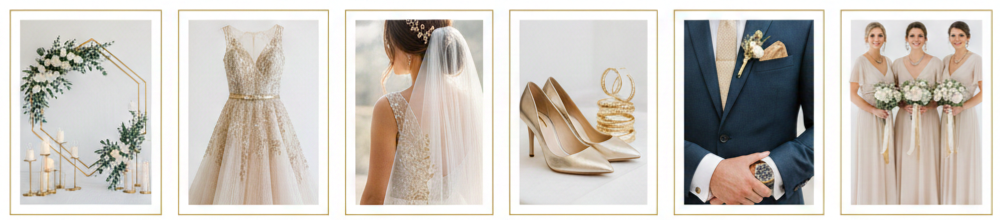
- Wedding Gowns With Subtle Gold: Gold-thread embroidery, delicate beading, and champagne underlayers create warmth without overpowering the dress. A removable gold-toned belt or sash adds definition while still keeping the overall look bridal.
- Veils And Hair Details: Gold edging or embroidered motifs on a veil look refined in close-up photos. Gold pins, barrettes, or leaf-inspired hairpieces add a hint of shine without competing with the dress.
- Shoes And Jewelry That Photograph Well: Gold heels or sandals pop in detail shots and feel timeless. Jewelry works best when we pick a focus piece, like statement earrings or a bracelet, and keep other pieces minimal so nothing feels busy.
- Groom And Groomsmen Accents: Gold cufflinks, tie bars, and watches add a classic finish to formalwear. A small gold touch in a boutonnière wrap or pocket detail can tie everything into the overall theme.
- Bridesmaids With A Gold Glow: Muted gold or champagne dresses can look stunning when fabrics stay soft and not overly reflective. Neutral dresses paired with coordinated gold accessories offer a cleaner option while still keeping the theme consistent.
Gold fashion details look especially cohesive when they match the gold tone used in décor and stationery. That small consistency makes the entire wedding feel curated.
Gold-Inspired Invitations And Stationery
Stationery sets expectations before anyone arrives, so gold details here make the theme feel intentional from the start. We can keep the look clean and premium by matching the gold finish across invitations, signage, and table paper
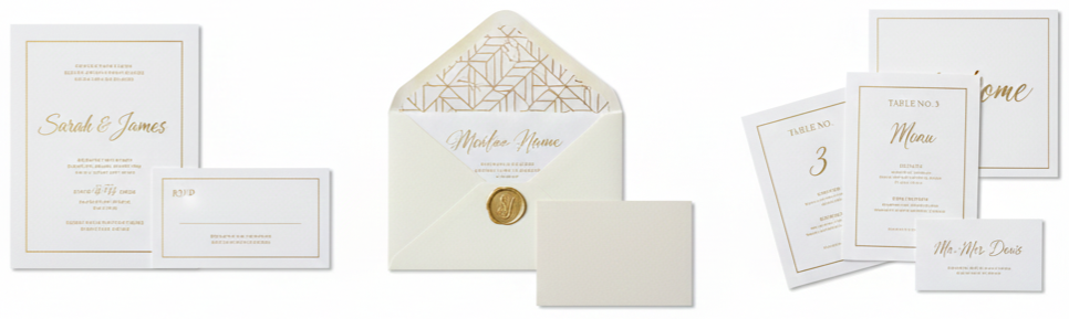
- Foil-Stamped Invitations With Clean Type: Gold foil catches light and adds a formal, polished feel. Clean modern fonts create a sleek look, while classic serif fonts lean more traditional, and both styles work as long as the layout stays uncluttered.
- Gold Calligraphy And Envelope Details: Gold ink calligraphy feels personal and luxe, especially when paired with neutral envelopes. Envelope liners, wax seals, and small monograms can carry the theme without making the suite feel heavy.
- Day-Of Paper That Matches: Place cards, menus, table numbers, and welcome signs look best when they share the same typography and gold tone used in the invitation suite. That consistency makes the day feel visually seamless from entry to reception.
Even small paper details have a big impact because guests interact with them directly. Matching finishes and fonts helps the wedding feel thoughtfully designed.
Gold Wedding Cakes And Desserts
Desserts are one of the most photographed details of the day, so gold accents here can feel like a fun, high-impact upgrade without requiring a full gold décor takeover.
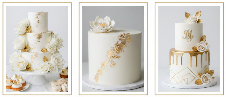
- Edible Gold Leaf That Looks Premium: Gold leaf adds texture and shine without looking overly glossy. It works well on fondant or smooth buttercream and looks especially elegant when placed asymmetrically or used to highlight floral placements.
- Metallic Details That Stay Tasteful: Gold drip effects, gold-painted sugar flowers, thin gold linework, and monogram details create a modern finish. A little negative space makes these designs look intentional rather than crowded.
- Dessert Tables That Double As Décor: Gold trays, risers, and label frames help the dessert table feel styled instead of simply set up. Warm lighting around the table and desserts that match the palette keep the look cohesive.
A good rule is to let gold accent the desserts rather than coat everything. That approach keeps the design elevated and easy to photograph.
Golden Moments For Photos And Keepsakes
Gold details pay off when we plan how they’ll appear in lighting and in the backgrounds guests see most. We can also carry the theme beyond the day through keepsakes that feel meaningful instead of disposable.
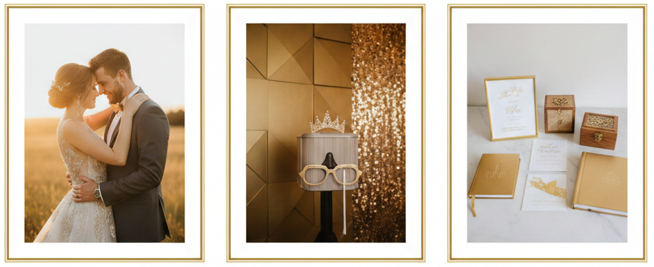
- Golden Hour Portrait Planning: Golden hour light adds warmth that makes gold look rich and flattering. Building time for couple portraits, wedding party photos, and detail shots during this window can elevate the entire photo set.
- Photo Booth Backdrops With Gold Texture: Matte gold panels, softly lit sequined walls, or gold frames with fabric drape create a backdrop that looks festive without harsh reflection. Simple props keep the photos modern and clean.
- Keepsakes That Preserve The Theme: Gold-embossed vow books, framed invitation suites, memory boxes, and gold-edged albums hold up well over time and feel like natural extensions of the day rather than leftover décor.
Gold in keepsakes works best when it feels subtle and classic, so it still looks good years later.
Budget-Friendly Gold Wedding Touches
Gold can look expensive without costing a fortune, as long as we focus on what guests notice most and keep the finish consistent. Concentrating gold where it matters gives the wedding a premium look while keeping spending under control.
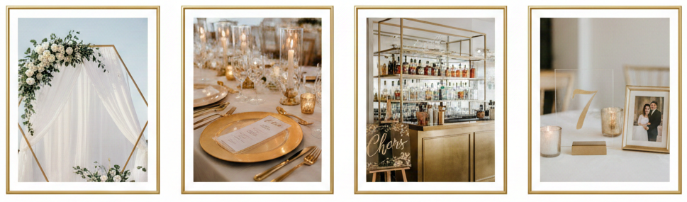
- High-Impact Zones Worth Prioritizing: Ceremony backdrops, reception tables, the bar area, and entry signage are the spots guests remember. A few polished gold moments in these zones can carry the entire theme.
- Rentals That Keep Finishes Consistent: Renting gold arches, candleholders, chargers, and lounge pieces often looks better than mixing random store-bought items. Rentals also make it easier to match tones across the room.
- Affordable Gold Details That Photograph Well: Acrylic signage with gold lettering, simple gold candleholders, consistent gold frames, and warm-toned candles can look high-end when the styling stays cohesive.
- DIY Gold That Still Looks Clean: DIY works best for small décor pieces like table numbers, signage stands, and frames. Thin, even coats of paint, proper drying time, and finish consistency keep DIY items from looking rough or uneven.
When we keep gold limited to a few strong features and repeat the same finish, the overall design reads intentional and polished, even on a tighter budget.
Conclusion
Gold wedding inspirations give us a flexible way to create a wedding that feels warm, elegant, and visually consistent. Gold works across styles because it can act as a subtle accent or a bold statement, depending on how we use it. When we commit to a single gold tone, repeat it across a few key areas like the ceremony backdrop, tablescapes, stationery, and fashion accents, the entire day feels curated without feeling overloaded. The best results come from balance, where gold adds shine and structure, while surrounding colors, textures, and warm lighting keep the atmosphere inviting and photo-ready.
Key Takeaway: Gold looks best when we choose one finish, repeat it in high-visibility moments, and support it with a balanced palette and warm lighting so the shine feels intentional instead of overwhelming.
FAQs
What type of gold finish photographs best at weddings?
Brushed or matte gold usually photographs better than highly polished gold because it avoids glare and keeps highlights softer under flash and direct sunlight. Champagne gold also tends to look consistent across different lighting conditions, which helps when photos shift from daytime to candlelit reception scenes.
How do we include gold without making the wedding feel too formal?
We can keep gold to smaller accents like candleholders, signage stands, or hair accessories and pair it with relaxed colors like sage, dusty blue, or blush. Softer fabrics, textured linens, and simple floral choices also keep gold feeling approachable rather than overly formal.
Can we mix gold with other metals like silver or copper?
We can mix metals as long as we choose one dominant finish and use the others sparingly. Gold pairs well with subtle hints of brushed silver or warm copper accents when the shapes and tones stay consistent, and when the overall look still reads as cohesive.
How do we match gold tones across different vendors?
We can request finish samples or reference photos from vendors and compare tones side by side in similar lighting. Choosing one target finish, like champagne gold or brushed gold, then sharing that reference with florists, rental companies, and stationery designers helps everything align.
What are some creative gold wedding favor ideas?
Gold bottle openers, gold-dipped candles, small gold frames with place cards, and personalized ornaments bring the theme into something guests can actually use or keep. We can also package favors with subtle gold ribbon or a gold-printed tag to keep the look consistent without adding clutter.
Garden Weddings
| Season | Weather | Floral Appeal | Pros | Cons |
| Spring | Mild, breezy | Tulips, peonies, lilacs | Fresh blooms, soft colors | Unpredictable rain |
| Summer | Hot, sunny | Roses, hydrangeas | Long days, golden hour light | Heat, sun exposure |
| Fall | Cool, crisp | Dahlias, marigolds | Bold colors, fewer bugs | Shorter daylight |
| Winter | Cold, dry | Evergreens, berries | Cozy vibe, off-season rates | Requires heaters, limited blooms |
Why Garden Weddings Are an Ideal Choice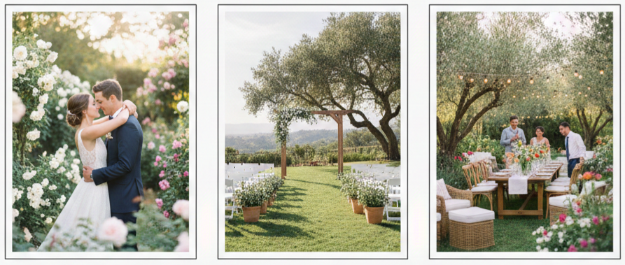
Garden weddings feel personal, beautiful, and naturally inviting. When we choose a garden setting, we get a space that already looks styled because the greenery, flowers, and open sky create a built-in backdrop. That means we can keep décor simple while still getting a polished look that photographs well from every angle.
A garden also makes it easier to shape the day around the experience we want. We can create an intimate ceremony layout, set up a relaxed cocktail space under trees, and design a reception that feels open and social. Garden weddings also suit couples who want a more eco-conscious celebration, since we can lean on seasonal elements and reuse or repurpose décor more easily than in a fully blank indoor venue.
Best Seasons For A Garden Wedding
Choosing the season affects comfort, lighting, flowers, and even how the venue looks in photos. Each season has its own strengths, so we plan around what matters most, then build a weather backup plan that matches the season.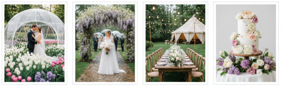
Spring
We get fresh blooms, mild temperatures, and that classic garden look with flowers like tulips, peonies, and lilacs. We also plan for quick rain changes with umbrellas, covered walkways, or a tent option.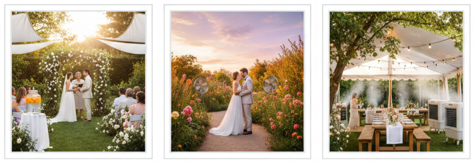
Summer
We get long daylight hours and vibrant greenery, which makes late-day ceremonies and sunset photos look incredible. We also plan for heat with shade, water stations, and airflow around seating.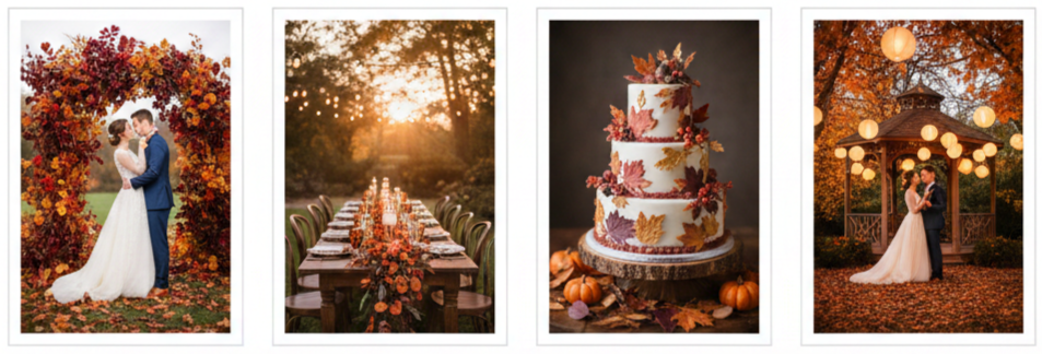
Fall
We get rich color, cooler air, and a naturally romantic feel with foliage tones that elevate the setting without extra décor. We also prepare for earlier sunsets with lighting that comes on sooner.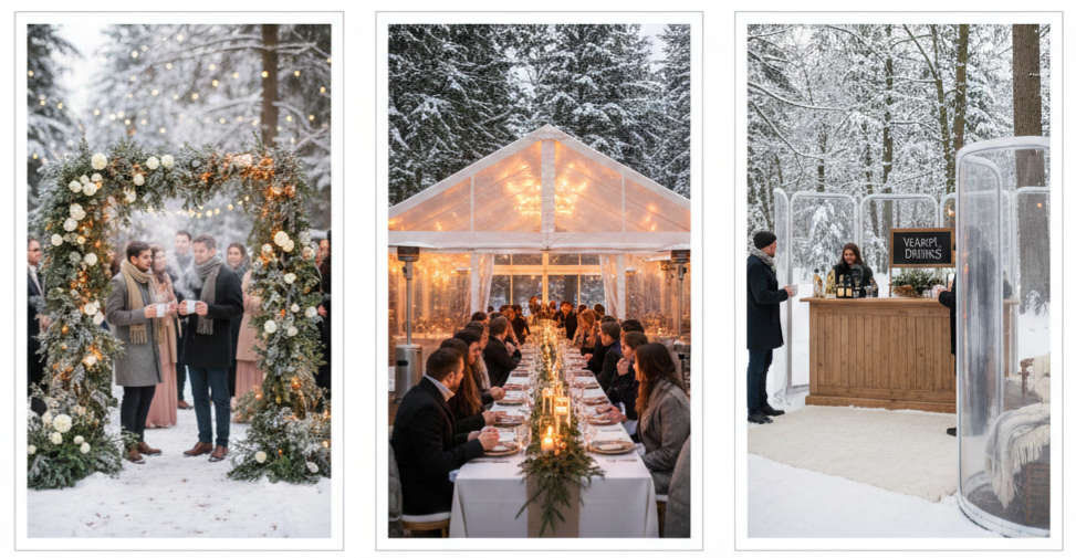
Winter
We get a unique atmosphere with evergreens, warm lighting, and a cozy mood that feels intimate. We also plan for heated tents, warm drink service, and wind protection.
Key Takeaway: We pick a season that supports the look we want, then we build a weather-ready plan that keeps the day comfortable and on schedule.
How To Choose The Perfect Garden Venue
A garden venue should look great and function smoothly. We look past the first impression and confirm the practical details that keep guests comfortable and vendors efficient. We also visit at the same time of day as the ceremony to see how the sun hits the space and how the garden feels when it’s actually in use.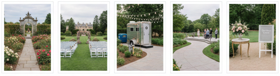
- Venue Type: We decide between public botanical gardens, private estates, or a backyard-style space, since each option comes with different rules, costs, and flexibility.
- Guest Capacity: We confirm how many people the garden comfortably fits when we include the aisle, seating, cocktail space, tables, dance area, and vendor zones.
- Amenities: We check restrooms, electricity, water access, parking, and storage areas, since missing basics can create expensive last-minute rentals.
- Accessibility: We look at pathways, slopes, and terrain for guests who need stable footing, and we plan surfaces for heels, mobility devices, and older guests.
- Restrictions: We confirm noise limits, end times, décor rules, and any requirements for approved vendors or insurance.
Elegant Garden Wedding Décor Ideas
In a garden, décor works best when it supports the setting instead of trying to overpower it. We use the landscape as the base and add details that guide the eye, define spaces, and create a warm mood once the sun goes down. The goal is to make the day feel intentional from the ceremony entrance to the final dance.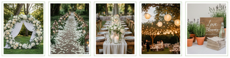
- Ceremony Backdrop: We use floral arches, greenery frames, or soft draping on wood structures to create a focal point that fits the natural surroundings.
- Aisle Styling: We line the aisle with petals, lanterns, small arrangements, or low greenery to frame the walk without blocking views.
- Table Design: We use linen runners, simple centerpieces, candlelight, and natural textures like wood and glass to keep the look cohesive and elegant.
- Lighting: We layer string lights, hanging bulbs, lanterns, and pathway lighting so the space stays inviting after sunset.
- Sustainable Details: We choose local seasonal flowers, rented pieces, reusable signage, and potted plants that can be replanted or gifted after the event.
What To Wear: Garden Wedding Outfit And Footwear Tips
Garden weddings look effortless when outfits match the setting and the weather. We aim for comfort that still looks polished, especially since outdoor celebrations involve more walking, changing temperatures, and uneven ground. Clothing choices also affect photos, since outdoor light highlights fabric texture and movement.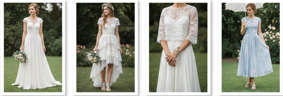
Bridal Style
We choose breathable fabrics like chiffon or lace for comfort, and we avoid overly long trains that drag through grass and pathways.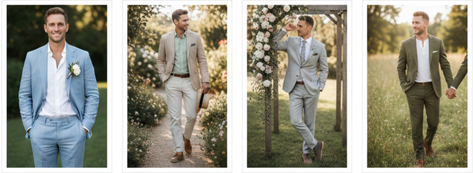
Groom Style
We use lighter fabrics like linen or cotton in warmer months, and we pick colors that work well in natural light without looking too formal for the setting.
Footwear
We choose block heels, wedges, or flats so we can move confidently on grass or gravel without sinking or twisting ankles.
Guest Dress Code
We guide guests toward comfortable outdoor-friendly outfits, especially for warm afternoons, cooler evenings, or venues with soft ground.
How To Prepare For Weather At Outdoor Weddings
Outdoor weddings succeed when we plan for weather in a way that feels seamless and calm. We treat the weather plan as part of the design instead of an emergency fix. That means we prepare for sun, wind, humidity, temperature drops, and rain without making the space feel like a compromise.
- Shelter Plan: We use tents, canopies, or covered structures that protect guests while preserving the garden atmosphere, including clear-top options for natural light.
- Temperature Control: We set up fans, shaded seating, misting options, or heaters depending on the season, and we keep high-heat or high-wind areas in mind.
- Ground Protection: We add flooring, rugs, or walkway runners to prevent muddy shoes, uneven footing, and trouble spots near bars or entrances.
- Pest Strategy: We schedule professional treatment when allowed, and we add discreet solutions like citronella elements and a small guest-accessible bug spray station.
- Communication Plan: We share backup details with vendors early so transitions stay smooth and the timeline remains realistic even with changes.
Ceremony And Reception Layout Tips
A garden wedding feels better when the flow makes sense. We design the space so guests always know where to go, vendors have clear working paths, and the experience stays comfortable. Layout also affects sound and photography, so we place key moments where everyone can see and hear without crowding.
- Ceremony Positioning: We orient seating so guests avoid direct sun in their eyes, and we choose a spot that stays visually balanced in wide photos.
- Reception Zones: We create separate areas for dining, dancing, and lounging so guests can move naturally without congestion.
- Food And Bar Placement: We position stations to reduce lines, keep traffic away from the ceremony space, and support easy service flow.
- Entertainment Setup: We plan speaker placement, power access, and weather protection for music equipment so the sound stays clear and consistent outdoors.
- Comfort Touches: We include shaded seating, water access, and clear signage so guests stay relaxed without needing to ask where to go.
Permits, Insurance, And Legal Considerations
Garden venues can come with rules that influence timelines, décor, and music. We handle permits and requirements early so nothing interrupts the day. Even private venues can have neighborhood rules or local ordinances, so we confirm details before finalizing major vendors.
- Permits: We check whether the venue requires permits for gatherings, amplified music, alcohol service, or large installations like tents.
- Noise Rules: We confirm volume limits and music cutoff times, especially in residential areas or public gardens with strict policies.
- Event Insurance: We secure liability coverage when needed, and we provide documentation when the venue requires proof before setup.
Photography Tips For Garden Weddings
Garden weddings can produce stunning photos, especially when we plan around light and scenery. We coordinate timing so the best natural light aligns with portraits, ceremony moments, and key reception shots. We also identify backup photo spots early, since outdoor light can shift quickly with clouds or wind.
- Golden Hour Planning: We reserve time for portraits in the hour before sunset for soft light that flatters skin tones and highlights greenery.
- Shade And Rain Options: We identify covered areas, pergolas, or tent edges that still look elegant in photos during harsh sun or light rain.
- Must-Capture Moments: We plan wide shots of the ceremony space, close-ups of natural details, candid guest reactions, and couple portraits framed by flowers or trees.
- Vendor Coordination: We share the venue layout and timeline with the photographer so they can move efficiently and stay ready for fast-changing outdoor conditions.
Common Garden Wedding Mistakes To Avoid
Garden weddings can feel effortless, yet small oversights can affect guest comfort and the overall flow. We avoid these common issues by planning around the realities of outdoor events and making decisions that support the experience from start to finish.
- Weather History Oversight: We check typical conditions for the date and location instead of relying on guesswork, then we plan shelter and timing accordingly.
- Pest Control Skipped: We handle bugs proactively so food service and seating areas stay comfortable.
- Shade Not Considered: We add shade options for ceremonies in direct sun and for cocktail areas during warm hours.
- Sound Underestimated: We use microphones and do a sound check, since outdoor spaces absorb sound and guests still need to hear vows and speeches.
- Terrain Ignored: We plan pathways and stable flooring in high-traffic zones, especially near seating, bars, and dance areas.
Conclusion
Garden weddings offer a naturally stunning setting that feels relaxed, elegant, and memorable without needing heavy décor. When we plan the season, venue logistics, layout, and weather setup with care, the celebration flows smoothly and guests stay comfortable from the ceremony to the reception. The result is a day that feels intentional and beautiful, with nature adding atmosphere in every photo and every moment.
Key Takeaway: A garden wedding feels effortlessly special when we match the season to the setting, plan for weather and terrain, and design a layout that keeps guests comfortable and the celebration moving smoothly.
FAQs
How do we keep guests comfortable during a garden wedding without overcomplicating the setup?
We focus on shade, hydration, seating, and clear pathways. We also add small comfort touches like hand fans for warm days or light blankets for cooler evenings, especially when the reception runs past sunset.
Do garden weddings usually end earlier because of noise rules?
Some venues enforce strict cutoff times, especially in residential areas or public gardens. We confirm music limits and end times early, then we structure the timeline so key moments like speeches and dancing happen before restrictions apply.
Can we serve a full dinner outdoors without risking food quality?
Yes, with the right catering plan. We work with vendors who use covered prep areas, temperature-safe holding methods, and efficient service flow, and we avoid leaving food exposed in direct sun or windy spots.
How do we handle guest footwear expectations without sounding controlling?
We set a clear dress code note that highlights practical details, such as “grassy terrain” or “garden pathways.” Guests appreciate guidance when it’s framed as comfort-focused and specific to the venue.
What’s a smart way to create privacy in a public garden setting?
We use layout and design to create separation, including strategic ceremony placement, tall floral installations, greenery screens, and controlled entry points. We also time the event around less crowded hours when possible.